BAAM AI Blog
Why Digital Marketing And Web Designing Must Work Together
Digital marketing and web designing are often treated like two separate jobs. One team brings traffic, the other team makes the site look good. That sounds organized, but it usually creates a broken customer journey.
Why Digital Marketing And Web Designing Must Work Together
Digital marketing and web designing are often treated like two separate jobs. One team brings traffic, the other team makes the site look good. That sounds organized, but it usually creates a broken customer journey.
A website is not just a brochure anymore. It is the place where your ads, SEO, emails, social posts, referrals, and sales conversations either turn into revenue or quietly disappear. When the design does not support the marketing strategy, you end up paying for attention that the website cannot convert.
This is why the best-performing businesses do not ask, “Does the website look nice?” They ask better questions. Does it explain the offer fast? Does it match the promise made in the ad? Does it remove doubt? Does it make the next step obvious? That is where digital marketing and web designing become one system instead of two disconnected projects.
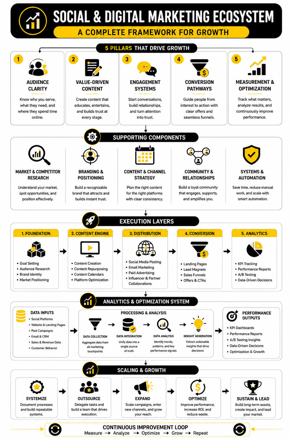
Your Website Is The Center Of The Marketing System
Every marketing channel eventually needs a destination. SEO sends people to service pages and blog posts. Paid ads send people to landing pages. Email campaigns send people to offers, booking pages, or product pages. Social media sends people to profiles, links, lead magnets, and checkout flows.
If the website is weak, every channel gets more expensive. You can improve targeting, write better ad copy, post more often, and publish more content, but a confusing website will still leak leads. That is why web design should never be judged only by visuals. It should be judged by how well it supports the business goal behind the traffic.
The current digital environment makes this even more important. The Digital 2026 Global Overview Report shows how deeply internet use, social media, and AI-assisted discovery are now built into everyday behavior. People move between platforms quickly, compare options fast, and expect the website to confirm that they are in the right place almost immediately.
Start With Intent Before You Start With Design
A strong website begins before colors, fonts, or layouts. It begins with intent. You need to know what type of visitor is arriving, what they already believe, what they are trying to solve, and what action you want them to take next.
Someone coming from a Google search may be comparing solutions. Someone coming from an Instagram post may still be problem-aware, not product-aware. Someone clicking an email link may already trust you and simply need a clear offer. These visitors should not all land on the same generic page with the same generic message.
This is where digital marketing and web designing need to share the same strategy. The marketer defines the audience, the offer, and the message. The designer turns that into a page structure that makes the decision easier. When both sides work together, the site feels natural instead of forced.
A practical way to do this is to map each main traffic source to a page goal:
This sounds simple, but most websites skip it. They build one homepage and expect it to do everything. That is usually where conversions start falling apart.
Design For Clarity First, Creativity Second
Creative design matters, but clarity matters more. A visitor should know what you do, who it is for, and why it matters within seconds. If they need to decode your headline, hunt for the offer, or scroll endlessly to understand the value, the page is doing too much work in the wrong direction.
Good web design makes the visitor feel oriented. The headline sets the context. The subheading adds specificity. The first call to action gives a clear next step. The supporting sections answer the natural questions that come up in the visitor’s mind.
This does not mean your website should be boring. It means every creative choice needs a job. Animation should guide attention, not distract from the offer. Visuals should support understanding, not just fill space. Layout should reduce friction, not create a maze.
For landing pages and campaign-specific pages, tools like Replo can be useful because they help teams build ecommerce pages around conversion structure, not just decoration. The point is not the tool itself. The point is that a marketing page should be built around the action you want the visitor to take.
The First Screen Carries More Weight Than Most People Think
The first screen of a page is not the whole website, but it sets the frame for everything that follows. If it is vague, the visitor starts with doubt. If it is clear, relevant, and believable, the visitor is more likely to keep reading.
A strong first screen usually includes four things. It has a clear promise, a specific audience or problem, a believable reason to continue, and one obvious action. You do not need to explain everything immediately, but you do need to make the visitor feel that staying is worth it.
This is especially important for paid traffic. When someone clicks an ad, they arrive with a specific expectation. If the page does not match that expectation, the visitor feels a disconnect. That disconnect creates hesitation, and hesitation kills conversions.
A better first screen might include:
The mistake is trying to sound clever before being clear. Clever is optional. Clear is not.
Speed, Stability, And Mobile Experience Are Marketing Problems
Website performance is not just a technical issue. It is a marketing issue because slow pages waste traffic. A visitor who leaves before the page loads never sees your offer, your copy, your proof, or your call to action.
Google’s own documentation says site owners should aim for good Core Web Vitals because these metrics reflect real user experience. The key areas are loading performance, visual stability, and responsiveness. In plain language, the page should load quickly, not jump around, and respond smoothly when people interact with it.
This matters even more on mobile. Many users discover brands on phones, compare options on phones, and complete forms or purchases on phones. A design that looks impressive on desktop but feels cramped, slow, or awkward on mobile is not finished. It is only half-built.
A practical mobile-first checklist is simple:
Digital marketing and web designing both depend on this. Marketing creates the reason to visit. Design and performance decide whether the visitor stays long enough to care.
Trust Signals Should Be Built Into The Page, Not Bolted On Later
Trust is not created by one testimonial block near the bottom of the page. It is built throughout the experience. Every section either increases confidence or creates doubt.
Visitors look for signs that the business is real, competent, and relevant to their situation. They notice whether the copy is specific, whether the design feels current, whether the claims are believable, and whether the next step feels safe. They also notice missing details. No pricing context, no real contact information, no examples, weak service descriptions, or vague promises can all create friction.
For ecommerce, this becomes even more obvious near checkout. Baymard’s checkout research continues to show that a large share of shoppers abandon carts, with its research hub noting that around 70% of users leave after adding items to cart. That is not only a checkout problem. It is a trust, clarity, cost, timing, and friction problem.
Strong trust signals can include:
The key is placement. Put proof close to the claim it supports. If you say you help businesses generate leads, show proof near that claim. If you say setup is fast, explain what fast means. If you ask someone to book a call, reduce the perceived risk before the button.
Calls To Action Need To Match The Visitor’s Stage
Not every visitor is ready to buy now. Some are ready to compare. Some want pricing. Some want to see examples. Some want a quick answer before they commit to a call. If your only call to action is “Contact us,” you may be pushing too hard too early.
Good digital marketing and web designing create multiple paths without making the page messy. The primary call to action should support the main business goal. Secondary calls to action should help people who need more information before taking that step.
For example, a service business might use “Book a strategy call” as the main action and “See case studies” as the secondary action. An ecommerce brand might use “Shop the collection” first and “Take the quiz” second. A SaaS company might use “Start free trial” first and “Watch demo” second.
Automation can help once someone takes a smaller step. If a visitor starts a chat, downloads a guide, or asks a product question, a tool like ManyChat can support follow-up across messaging channels. For agencies and local service businesses that need funnels, CRM, automation, and follow-up in one place, GoHighLevel can fit naturally into the system.
The call to action is not just a button. It is the next logical step in the relationship. When that step feels too big, people avoid it. When it feels natural, they move forward.
SEO And Web Design Should Not Fight Each Other
SEO teams often want more content. Designers often want cleaner pages. Both sides are right, but only when they work toward the same goal. A page can be useful for search engines and still feel clean for humans.
The mistake is stuffing keywords into headings, hiding important copy behind vague design blocks, or creating thin pages that look good but do not answer enough questions. Search visibility depends on relevance and usefulness. Conversion depends on clarity and trust. The best pages do both.
AI search has made this even more important. Semrush analyzed millions of keywords in its AI Overviews study and found that search results are changing as AI-generated answers appear across more query types. That means brands need pages that are not only optimized for rankings, but also structured clearly enough for both people and machines to understand.
A strong SEO-friendly design usually includes:
This is where the primary keyword, digital marketing and web designing, should be used naturally. It should appear where it helps explain the topic, not where it makes the sentence sound robotic. Search engines have moved far beyond simple repetition, and readers were never impressed by it anyway.
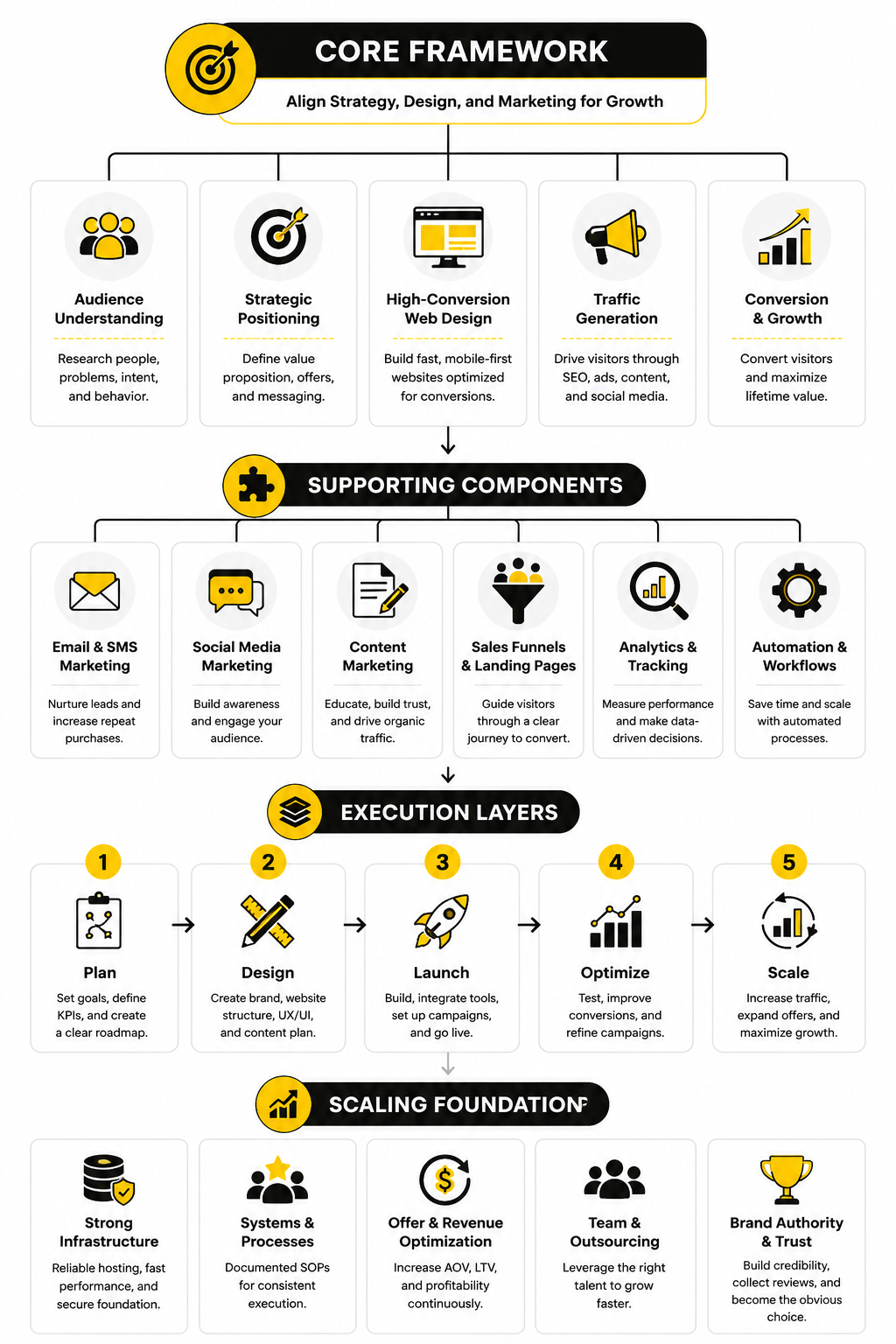
Build The Implementation Around The Customer Journey
Once the strategy is clear, the next step is turning it into a working system. This is where digital marketing and web designing become practical. You stop talking about “a better website” in vague terms and start building the exact path a visitor should take.
The customer journey should guide the page structure, not the other way around. A person usually moves from awareness to interest, then from evaluation to action. Your website needs to support that movement with the right information at the right moment.
Start by writing down the visitor’s likely questions before you design anything. What problem brought them here? What do they need to believe before they continue? What proof would reduce their doubt? What step feels natural after reading the page? These questions keep the project grounded in real behavior instead of personal preference.
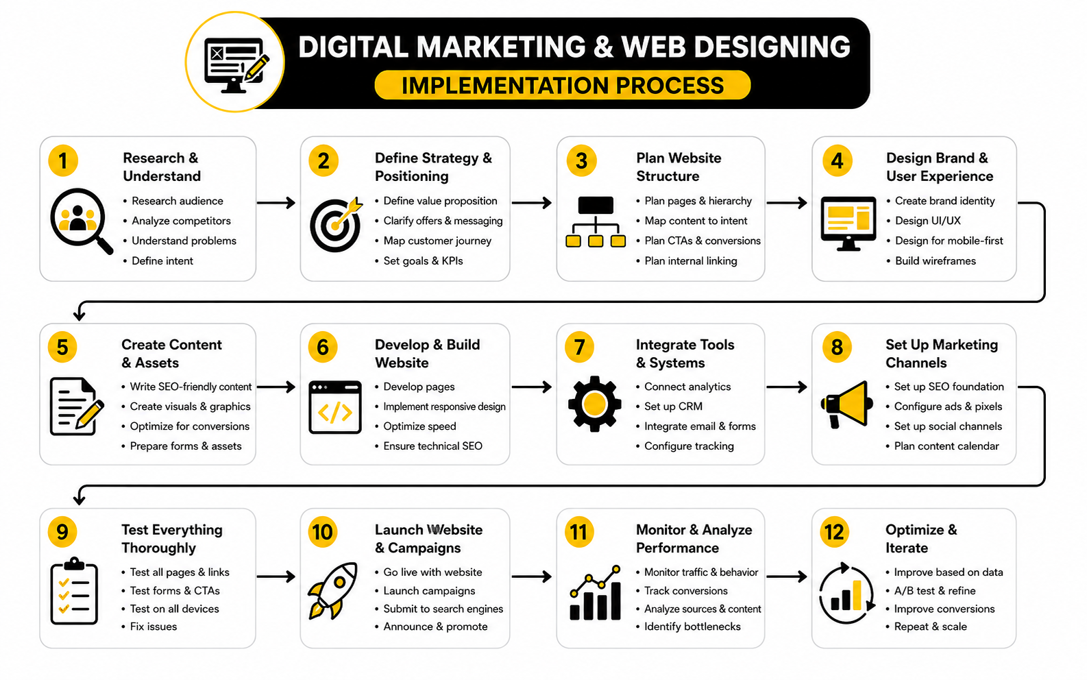
Step 1: Audit The Current Website And Marketing Flow
Do not rebuild blindly. First, look at what is already happening. You need to know which pages bring traffic, where visitors drop off, which calls to action get clicks, and which pages create leads or sales.
This audit should include both marketing and design details. A page might rank well but convert poorly. Another page might look polished but fail because the offer is unclear. A third page might have strong copy but lose people because it loads slowly or feels awkward on mobile.
A useful audit covers:
The goal is not to criticize the old website. The goal is to find the biggest leaks. Fixing one serious leak can sometimes do more than redesigning twenty pages for the sake of looking modern.
Step 2: Define One Primary Goal For Each Page
Every important page needs one main job. A homepage can guide different visitor types, but a landing page should usually focus on one action. A service page should help the visitor understand the offer and move toward an inquiry. A product page should help the buyer evaluate, trust, and buy.
This is where many websites become messy. They try to make every page do everything. The result is usually a page with too many buttons, too many messages, and no clear priority.
For each page, define:
Once this is clear, the design becomes easier. You are no longer guessing where to place content. You are building a decision path.
Step 3: Create The Message Before The Layout
The message should come before the mockup. If you design first and write later, the copy usually gets squeezed into boxes that were never built for persuasion. That is how you end up with pretty sections that say almost nothing.
A strong page message starts with the visitor’s problem and connects it to a clear outcome. It avoids vague claims like “innovative solutions” or “next-level growth” unless those claims are backed by specifics. People do not convert because a brand sounds impressive. They convert because they understand the value and believe it applies to them.
For a practical page draft, write these elements before design begins:
This does not mean the first draft must be perfect. It means the page has a persuasive structure before the visuals arrive. Good design then makes the message easier to understand, scan, and act on.
Step 4: Wireframe The Page Before Designing It
A wireframe is the rough structure of the page. It shows what goes where without getting distracted by colors, images, or final styling. This step is boring to some people, but it saves a lot of expensive mistakes.
The wireframe should follow the visitor’s decision process. Start with the core promise. Add the context they need. Show the proof. Explain the offer. Remove objections. Then make the action obvious. That flow matters more than whether the first draft looks exciting.
A basic conversion-focused wireframe might follow this order:
This structure can change depending on the business. A local service page, ecommerce product page, SaaS landing page, and agency funnel do not need the exact same layout. But they all need a logical path from attention to trust to action.
Step 5: Build The Page With Conversion And Tracking In Mind
The build stage is where strategy becomes real. This is also where many projects lose discipline. The team starts adding extra plugins, animations, scripts, popups, forms, tracking tags, and design effects until the page becomes slower and harder to use.
Build lean. Every element should earn its place. If a feature does not improve understanding, trust, speed, measurement, or conversion, it probably does not belong on the first version.
For funnel-heavy businesses, ClickFunnels can be useful when the priority is fast campaign execution, offer testing, and sales page flow. For simpler all-in-one funnels, emails, and digital product setups, Systeme.io may fit teams that want fewer moving parts. The tool matters less than the discipline: build around the visitor’s next step, not around every feature the platform offers.
Before launch, make sure tracking is in place for:
You cannot improve what you cannot see. A page without tracking is just a guess with a design attached.
Step 6: Connect Forms, CRM, Email, And Follow-Up
A conversion does not end when someone fills out a form. That is only the handoff. If the follow-up is slow, messy, or generic, the website did its job but the system still failed.
This is why implementation needs to include CRM, email, calendar, and automation from the beginning. The visitor should receive the right next message. The sales team should get the right context. The lead should be tagged properly. The follow-up should match the page or offer that created the inquiry.
For appointment-based businesses, a scheduling tool like Cal.com can reduce back-and-forth when booking is the main conversion goal. For forms, quizzes, lead capture, and intake flows, Fillout can help create cleaner data collection without making the page feel heavy.
A good follow-up system should answer these questions:
This is not glamorous work. It is also where a lot of money is made or lost.
Step 7: Launch Small, Then Improve With Real Data
The first version of a page should be strong, but it will not be perfect. Real visitors will show you what your internal team missed. They will click unexpected things, ignore sections you thought were important, and ask questions you assumed were already answered.
That is why launch should be treated as the beginning of optimization, not the end of the project. Watch how the page performs. Look at conversion rates, scroll behavior, form starts, drop-offs, and lead quality. Then improve the page based on evidence.
Useful post-launch improvements include:
Digital marketing and web designing are never truly finished because the market changes, traffic sources change, offers change, and customer expectations change. The goal is not to redesign constantly. The goal is to build a system that can be measured and improved without starting from zero every time.
A Practical Implementation Checklist
The easiest way to keep the process clean is to use a checklist. Not a bloated checklist with a hundred tiny tasks. A focused one that keeps the team aligned and prevents the common mistakes.
Use this before launching a new campaign page, service page, or website section:
This checklist keeps implementation practical. It stops the project from turning into a design debate and brings the conversation back to business outcomes.
The Process Should Feel Simple To The Visitor
Behind the scenes, the system may include SEO, ads, analytics, landing pages, forms, automation, CRM stages, email sequences, and sales follow-up. The visitor should not feel any of that complexity. They should feel like the next step is obvious.
That is the real skill in combining digital marketing and web designing. You use strategy, data, tools, and structure to create an experience that feels effortless. The visitor does not care how many systems are connected in the background. They care whether the page understands their problem and helps them move forward.
When the process is done right, the website stops being a passive asset. It becomes an active part of the growth system. It attracts the right people, explains the offer clearly, captures demand, and gives the business a cleaner path to revenue.
Statistics And Data
Data is useful only when it changes what you do next. Random benchmarks can make a report look impressive, but they do not automatically improve a website. The real job is to connect each number to a decision.
That matters a lot in digital marketing and web designing because the same metric can mean different things depending on the page, traffic source, offer, and visitor intent. A low conversion rate on a cold educational page may be normal. The same rate on a high-intent paid landing page may be a serious problem. Context comes first.
The goal is not to chase perfect numbers. The goal is to understand where the journey is healthy, where it is leaking, and which improvement has the best chance of creating more revenue.
Benchmarks Are Starting Points, Not Targets
Benchmarks help you see whether your performance is roughly in the right range. They should never become the whole strategy. If the average conversion rate in your industry is 3%, that does not mean 3% is good for your offer, your audience, or your traffic quality.
Landing page benchmarks show why context matters. The Unbounce Conversion Benchmark Report uses data from more than 57 million conversions across over 41,000 landing pages, and the ranges vary widely by industry. That means a “good” number in one market can be weak in another.
For ecommerce, device behavior adds another layer. Triple Whale’s 2025 ecommerce benchmark data shows desktop users converting at around 3.9% compared with mobile users at around 1.8%, while mobile still accounts for the majority of traffic in many stores. The lesson is not “mobile traffic is bad.” The lesson is that mobile design, product discovery, checkout friction, and trust signals need separate measurement instead of being averaged into one blended number.
A blended average hides the real story. If desktop converts well and mobile underperforms, the answer is not always more traffic. It may be better mobile page speed, clearer product information, easier forms, better payment options, or a cleaner checkout.
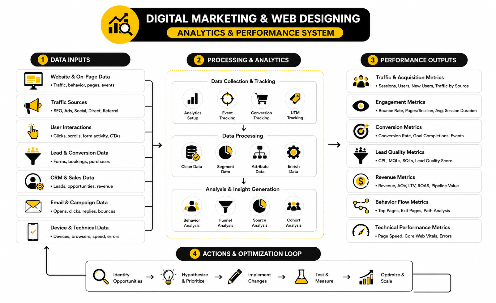
Measure The Journey, Not Just The Final Conversion
A final conversion rate tells you what happened, but it rarely tells you why it happened. If 100 people visit a page and 3 convert, you know the outcome. You do not yet know where the other 97 lost interest.
That is why a proper analytics setup needs journey metrics. You want to see how people arrive, how far they scroll, what they click, where they hesitate, where forms are abandoned, and which traffic sources produce leads that actually become customers.
A practical measurement system should include:
This is where digital marketing and web designing stop relying on opinions. If visitors click the call to action but do not finish the form, the form may be too long or unclear. If visitors scroll but never click, the offer may not feel urgent enough. If mobile users leave before the page loads, design and performance are the problem before copy ever gets a chance.
The Most Important Website Metrics To Track
Not every metric deserves equal attention. Page views, impressions, and followers can be useful, but they do not automatically mean the business is growing. The most useful metrics connect behavior to business outcomes.
For most websites, these are the numbers that matter:
The strongest websites do not just measure “did we get more traffic?” They measure whether the traffic was useful. A smaller number of high-intent visitors can beat a larger number of low-quality visitors every time.
Core Web Vitals Turn User Experience Into Measurable Signals
Performance is one of the easiest areas to underestimate because a website can look fine during a team review and still perform badly for real users. Your team may test it on fast Wi-Fi, a new laptop, and a clean browser. Your customers may be on mobile data, older phones, and distracted browsing sessions.
Google defines Core Web Vitals as real-world user experience metrics for loading performance, interactivity, and visual stability. In practical terms, they answer three questions. Does the main content load quickly? Does the page respond when someone interacts with it? Does the layout stay stable instead of jumping around?
The key metrics are:
These are not vanity technical scores. They affect how the page feels. A slow hero section delays understanding. A laggy button makes the site feel broken. A shifting layout can cause people to tap the wrong thing. That is bad design, bad marketing, and bad customer experience at the same time.
Friction Is A Revenue Metric
Friction is anything that makes the visitor work harder than necessary. It can be a slow page, unclear navigation, a confusing form, hidden shipping costs, weak product information, or a call to action that does not match the visitor’s intent. Most businesses notice friction only after performance drops, but the signs are usually visible earlier in the data.
The Contentsquare 2025 Digital Experience Benchmarks found that frustrating experiences lowered conversion rates by 6.1%. That number matters because it connects experience directly to money. When acquisition costs rise, a leaky website becomes even more expensive.
This is why optimization should not start with cosmetic redesigns. Start with friction. Find the places where visitors slow down, bounce, abandon forms, or fail to continue. Then fix the cause.
Common friction signals include:
Each of these numbers points to a different problem. Treating them all as “the website needs a redesign” is lazy. The better move is to diagnose the specific bottleneck.
Cart And Checkout Data Needs Special Attention
For ecommerce, cart and checkout data deserve their own review. A person who adds to cart has already shown intent. Losing them at that point is different from losing a casual blog reader.
Baymard’s checkout research tracks a long-running global average cart abandonment rate of about 70.19%. That does not mean every store should panic if abandonment is high, because comparison shopping and delayed buying are normal. But it does mean checkout friction is one of the highest-value areas to inspect.
The key is to break abandonment into causes. Are shoppers leaving after shipping costs appear? Are they being forced to create an account? Are payment options limited? Is delivery timing unclear? Is the checkout too long on mobile? These are design and marketing questions, not just ecommerce platform questions.
For stores, track:
A checkout page should feel boring in the best possible way. Clear, predictable, fast, and trustworthy. Do not get clever when someone is trying to give you money.
Lead Generation Data Needs Quality Filters
Lead generation websites often celebrate form submissions too early. More leads are not always better. If the website attracts the wrong people, the sales team gets busier while revenue stays flat.
This is why lead quality must be part of the measurement system. A campaign that produces cheap leads can still be a bad campaign if those leads do not book, show up, qualify, or buy. A service page that produces fewer inquiries can be more valuable if those inquiries are serious and better matched to the offer.
Track the full lead path:
This full path changes how you judge digital marketing and web designing. A page with a lower form conversion rate may still win if it filters out poor-fit leads and improves close rate. The point is not to maximize every micro-conversion. The point is to maximize useful outcomes.
Channel Data Should Influence Page Design
Different channels create different expectations. SEO traffic often needs depth and clarity. Paid search traffic needs tight message match. Social traffic needs fast trust-building. Email traffic needs continuity from the message that triggered the click.
That means channel data should shape page design. If paid traffic is bouncing quickly, compare the ad promise with the page headline. If organic visitors read deeply but rarely convert, add stronger internal calls to action. If email traffic converts well, study what that audience already believes and reuse those insights in other channels.
Useful channel-level questions include:
Averages are comfortable, but segmentation is where the truth usually appears. Look at the data by channel, device, page, intent, and offer. That is where the next improvement usually becomes obvious.
Email, CRM, And Follow-Up Metrics Complete The Picture
The website is only one part of the conversion system. If someone submits a form and then the follow-up is slow or irrelevant, the website may get blamed for a sales process problem. Measurement needs to follow the lead beyond the page.
Email and CRM data help show whether the next steps are working. Opens and clicks are not enough by themselves, but they can reveal whether the message is relevant. Reply rates, booking rates, show-up rates, and close rates matter more because they connect follow-up to revenue.
For email platforms, tools like Brevo or Moosend can support segmentation and campaign tracking when email is a meaningful part of the journey. For relationship-heavy sales, a CRM like Copper can help connect lead source, activity, pipeline, and outcome. The tool is not the strategy, but the right setup makes the strategy measurable.
The biggest mistake is measuring the website in isolation. A strong analytics system connects the ad, landing page, form, email, CRM, sales action, and revenue. That is how you stop guessing.
What The Data Should Actually Drive
Data should lead to decisions. If a dashboard does not help you decide what to change, it is decoration. Pretty charts do not matter if nobody uses them.
Here is how to translate common signals into action:
This is the practical side of measurement. You are not looking for numbers to report. You are looking for clues that tell you what to fix next.
Build A Simple Weekly Measurement Rhythm
Analytics gets ignored when it feels overwhelming. The solution is not more dashboards. The solution is a simple rhythm that the team can actually maintain.
A useful weekly review can be simple:
This rhythm keeps digital marketing and web designing connected after launch. Marketing sees which traffic is valuable. Design sees where the experience creates friction. Sales sees whether the leads are real. Everyone works from the same evidence.
Do not try to fix ten things at once. Pick the highest-impact bottleneck, improve it, and measure the result. That is how a website becomes a growth asset instead of a static project.
Advanced Strategy: Where Digital Marketing And Web Designing Get Harder
Once the basics are working, the next challenge is not adding more tactics. It is making better tradeoffs. More pages, more campaigns, more tools, more automation, and more personalization can help growth, but they can also make the system harder to manage.
This is where digital marketing and web designing need stronger judgment. A simple site can be too limited, but a complex site can become slow, confusing, and impossible to maintain. The goal is not to build the most advanced system possible. The goal is to build the simplest system that can still support the next stage of growth.
Advanced strategy is mostly about knowing what not to do. Do not personalize before the core message is clear. Do not scale traffic before conversion is stable. Do not automate a broken follow-up process. Do not redesign because the team is bored. Fix the highest-leverage constraint first.
Personalization Sounds Powerful, But It Needs Boundaries
Personalization can improve relevance, but it can also create a messy experience if it is used without discipline. A returning customer, a cold ad visitor, and a high-intent search visitor may need different messages. That does not mean every visitor needs a completely different website.
The best personalization usually starts small. Segment by obvious signals first, such as source, location, product interest, lifecycle stage, or previous action. Then tailor the next step, not the entire experience.
McKinsey’s work on personalized marketing highlights how AI can help brands scale more relevant interactions, but the strategic point is simple. Personalization should make the journey clearer, not creepier. If the visitor feels understood, good. If the visitor feels tracked, you have gone too far.
A practical personalization setup might include:
The risk is overengineering. If your team cannot explain what each segment sees and why, the system is too complicated.
Privacy Is Now A Design Constraint
Marketing data is not free anymore. Consent, transparency, and data minimization have become real operating constraints, not legal footnotes hidden in the footer. This affects tracking, personalization, retargeting, analytics, forms, CRM workflows, and email follow-up.
The IAPP’s 2025 U.S. State Comprehensive Privacy Laws Report shows how privacy obligations continue to expand across states and markets. For businesses operating internationally, the complexity gets even higher because consent expectations and data rules vary by region. This means digital marketing and web designing teams need to plan privacy into the experience from the beginning.
A privacy-aware website should make data collection feel clear and reasonable. Ask only for what you need. Explain why a form field matters. Make consent choices understandable. Avoid burying important tracking or communication details in language nobody reads.
This is not just about compliance. It is about trust. If the page asks for too much too soon, people hesitate. If the experience feels transparent, the conversion step feels safer.
AI Search Changes What Content And Design Need To Do
Search is no longer just a list of blue links. AI-generated answers, featured snippets, forums, videos, comparison content, and brand mentions are all shaping how people discover businesses. This changes the role of the website.
Google’s guidance on AI features and your website makes it clear that site owners still need useful, crawlable, well-structured content. The difference is that content now has to work for multiple discovery surfaces. It should help a human visitor, support traditional SEO, and be understandable enough for AI-driven search experiences.
This is where web design can either help or hurt content performance. If important answers are hidden inside scripts, vague tabs, image-only text, or thin design sections, the page becomes harder to understand. Clean structure matters. Strong headings matter. Clear summaries matter. Internal linking matters.
For advanced SEO and AI visibility, focus on:
Do not panic and rewrite everything for AI. Build pages that are genuinely useful, specific, and technically clean. That is still the base.
Accessibility Is Not Optional Design Polish
Accessibility should not be treated as a final QA task. It affects how real people use the website, and it often improves the experience for everyone. Clear contrast, readable text, keyboard navigation, logical headings, descriptive links, and usable forms are not niche concerns.
The W3C’s WCAG 2.2 guidelines are the modern reference point for making web content more accessible to people with disabilities. The practical takeaway is not that every marketer needs to memorize every criterion. The takeaway is that accessibility must be part of design, content, development, and testing.
Accessibility also supports performance. A page with logical headings is easier to scan. A form with clear labels is easier to complete. A button with descriptive text is easier to understand. A site that works with keyboard navigation is usually better structured overall.
Advanced teams build accessibility into the workflow:
This is one of those areas where doing the right thing also improves the business outcome. Better access usually means less friction.
Scaling Content Requires Governance, Not Just Output
At a certain point, content growth becomes dangerous. A business starts publishing more pages, more blogs, more landing pages, more comparisons, more email sequences, and more campaign assets. Without governance, the brand becomes inconsistent and the site gets bloated.
The problem is not content volume. The problem is unmanaged content volume. Old offers stay live. Outdated claims remain indexed. Similar pages compete with each other. Blog posts attract traffic but lead nowhere. Landing pages use different promises than the sales team.
A mature content system needs rules. Who owns page updates? How often are high-value pages reviewed? Which pages should be merged, redirected, refreshed, or removed? What proof is allowed in marketing claims? What tone should the brand use across service pages, emails, and funnels?
A simple governance system should define:
This keeps the website from turning into a junk drawer. Growth creates complexity. Governance keeps complexity from killing performance.
Tool Stacks Can Help Or Slow You Down
A good tool stack makes execution faster. A bad one creates duplicate data, broken handoffs, slow pages, confused teams, and monthly bills nobody wants to review. The difference is rarely the tool itself. It is whether the tool has a clear role in the system.
Before adding another platform, ask what job it will do. Will it improve page creation, analytics, CRM visibility, email follow-up, chatbot support, scheduling, personalization, or reporting? If the job is not clear, the tool will become clutter.
For content planning and social distribution, Buffer can help keep publishing organized across channels. For AI-assisted customer support or site chat, Chatbase can fit when visitors repeatedly ask similar questions before converting. For teams that need cleaner short links, attribution, and campaign tracking, Dub.co can help keep links more manageable.
The rule is simple. Every tool should either increase speed, improve clarity, reduce manual work, or make performance easier to measure. If it does none of those things, it is not a growth tool. It is decoration.
Automation Should Support The Human Decision, Not Replace It
Automation is powerful when it handles repetitive work. It is risky when it tries to replace judgment. A form confirmation email can be automated. Lead routing can be automated. Reminder messages can be automated. But the strategy behind those messages still needs human thinking.
The biggest automation mistake is sending everyone through the same sequence. A cold lead who downloaded a checklist, a warm lead who requested pricing, and a returning customer who asked for support should not all receive the same follow-up. That creates friction and makes the brand feel lazy.
Good automation respects intent. It responds to what the person did and where they are in the journey. It also gives the team enough context to step in when a human conversation matters.
Useful automation rules include:
Automation should make the experience feel faster and more relevant. If it makes the business feel robotic, it is working against you.
Advanced Testing Requires Patience
Testing is valuable, but only when the test is designed properly. Changing a button color and calling it conversion optimization is not serious testing. The best tests come from a real hypothesis about visitor behavior.
For example, “This page is not converting” is not a hypothesis. “Visitors understand the service but do not trust the outcome, so moving proof closer to the primary call to action should increase qualified inquiries” is much better. It gives you a reason, a change, and a metric to watch.
Advanced testing should focus on meaningful elements:
Do not test tiny details before fixing obvious problems. If the page is slow, confusing, or mismatched to the traffic source, start there. Testing works best when the foundation is already solid.
Brand Consistency Becomes Harder As You Grow
Small teams can often maintain consistency through direct communication. Everyone knows the offer, the tone, and the customer. As the business grows, more people touch the website, ads, emails, funnels, social content, and sales materials. That is when inconsistency creeps in.
Inconsistent messaging creates doubt. The ad promises one thing. The landing page says another. The sales call uses different language. The follow-up email introduces a new angle. The visitor may not consciously notice every mismatch, but the experience feels less trustworthy.
A strong brand system does not need to be complicated. It should give the team shared language, clear visual rules, and examples of what good looks like. That makes digital marketing and web designing faster because people are no longer reinventing the brand every time they create a page.
At minimum, document:
Consistency does not mean every page sounds identical. It means every page feels like it belongs to the same business.
The Biggest Risk Is Scaling A Broken System
Scaling makes everything louder. If the website converts well, more traffic can create more revenue. If the website leaks trust, more traffic just makes the leak more expensive. That is why scaling should come after the core journey is proven.
Before increasing spend, launching more campaigns, or publishing large amounts of content, check whether the foundation can handle it. Can the site explain the offer clearly? Can the forms pass clean data? Can the team follow up quickly? Can analytics show what is working? Can the CRM connect leads to revenue?
If the answer is no, scaling will hide the problem for a while and then make it worse. More leads will create more confusion. More pages will create more maintenance. More channels will create more attribution gaps. More automation will create more irrelevant communication.
Scale only when these pieces are stable:
This is the part many businesses want to skip. Do not skip it. Growth is much easier when the system underneath it is not fighting you.
The Expert Move Is Prioritization
Most websites do not fail because the team lacks ideas. They fail because the team chases too many ideas at once. There is always another page to build, another tool to try, another channel to test, another redesign to debate, and another dashboard to create.
Expert-level digital marketing and web designing comes down to prioritization. What constraint is blocking growth right now? Is it traffic quality, message clarity, page speed, trust, offer strength, lead quality, follow-up, or sales conversion? Pick the constraint, fix it, then move to the next one.
A simple priority filter helps:
The best teams are not the ones doing the most. They are the ones doing the right thing in the right order. That is what separates a busy website from a useful growth system.
Bringing The Whole System Together
At this point, the pattern should be clear. Digital marketing and web designing are not separate layers that get stacked on top of each other. They are parts of the same growth system.
Marketing brings people into the journey. Design helps them understand, trust, and act. Analytics shows what is working. Automation and follow-up keep the relationship moving after the first click. When these parts are connected, the website becomes more than a digital presence. It becomes a measurable business asset.
The final goal is simple. Build a system where the right people can find you, understand your offer, believe your promise, and take the next step without friction. That sounds basic, but it is exactly where most websites fail.
The Website Should Act Like A Growth Hub
A strong website connects every major marketing activity. SEO content builds discovery. Landing pages convert campaign traffic. Forms and bookings capture demand. CRM and email systems continue the conversation. Reporting shows which actions are producing real outcomes.
This is why the best websites are not judged only by design quality. They are judged by how well they support the business model. A beautiful website that does not generate leads, sales, bookings, or meaningful engagement is not doing enough.
Think of the website as the center of the ecosystem. Every channel should have a clear reason to send people there. Every important page should have a clear role. Every conversion point should connect to a follow-up process that makes sense.
What To Fix First When Everything Feels Broken
When a website is underperforming, the natural reaction is to want a full redesign. Sometimes that is the right move. But many times, the faster win is fixing the highest-impact bottleneck first.
Start with the part of the journey closest to revenue. If people are reaching checkout but not buying, fix checkout before writing more blog posts. If leads are coming in but not closing, fix qualification and follow-up before buying more ads. If paid traffic bounces immediately, fix message match before changing the logo or color palette.
A practical priority order looks like this:
This order keeps you from wasting time on low-impact work. It also keeps the team focused on business outcomes instead of endless design opinions.
When To Redesign And When To Optimize
A redesign makes sense when the current website structure cannot support the business anymore. Maybe the offer has changed, the audience has shifted, the brand is outdated, the site is technically fragile, or the content architecture is too messy to fix with small edits. In that case, optimization alone will not solve the deeper problem.
Optimization makes sense when the foundation is usable but specific parts are leaking. A headline can be rewritten. A form can be shortened. A landing page can be rebuilt. A checkout flow can be simplified. A mobile layout can be improved without rebuilding the entire brand.
The wrong move is redesigning because the team is tired of looking at the same site. Customers do not care that your team is bored. They care whether the website helps them solve a problem, compare options, and act with confidence.
Use this simple rule. If the strategy is wrong, redesign. If the journey is mostly right but performance is weak in specific places, optimize. If you are not sure, audit first.
The Final Standard: Clear, Fast, Useful, And Measurable
A good website does not need to be complicated. It needs to be clear, fast, useful, and measurable. Those four standards cover most of what matters.
Clear means the visitor understands what you do and why it matters. Fast means the page loads and responds without making people wait. Useful means the content actually helps the visitor make a better decision. Measurable means the business can see what happens after people arrive.
Digital marketing and web designing work best when these standards guide every decision. Do not add sections because competitors have them. Do not add tools because they are trendy. Do not add automation because it sounds advanced. Add what improves clarity, speed, usefulness, or measurement.
That is how you build a site that can grow with the business instead of becoming another expensive project that needs to be replaced in a year.
What Is The Relationship Between Digital Marketing And Web Designing?
Digital marketing creates demand, brings traffic, and communicates the offer across channels. Web designing turns that attention into a usable experience where visitors can understand the offer and take action. The two work best when they are planned together instead of handed off separately.
Why Does Web Design Matter For Digital Marketing Results?
Web design affects how quickly visitors understand the page, how much they trust the business, and whether they can complete the next step easily. A campaign can bring the right traffic, but poor design can still lose that traffic. This is why design is not just visual polish; it directly affects conversion and revenue.
What Should Come First, Marketing Strategy Or Website Design?
Marketing strategy should come first because it defines the audience, offer, message, and goal. Design should then turn that strategy into a clear page structure and smooth user experience. When design happens first, the website often looks good but fails to support the actual customer journey.
How Do I Know If My Website Needs A Redesign?
A redesign is worth considering when the site no longer reflects the offer, blocks important user actions, performs poorly on mobile, or cannot support tracking and campaign growth. If only a few pages or conversion points are weak, optimization may be enough. The decision should come from an audit, not personal taste.
What Metrics Matter Most For A Marketing Website?
The most important metrics are conversion rate, qualified lead rate, cost per acquisition, revenue per visitor, mobile conversion rate, and lead-to-customer rate. Traffic volume matters, but it is not enough by itself. A smaller amount of high-quality traffic can be more valuable than a large amount of low-intent traffic.
How Often Should A Website Be Updated?
High-value pages should be reviewed regularly, especially when offers, pricing, traffic sources, or customer questions change. A full redesign may only be needed every few years, but optimization should happen continuously. The best approach is to review performance monthly and make focused improvements based on real data.
What Is The Biggest Mistake Businesses Make With Website Design?
The biggest mistake is designing around internal opinions instead of visitor intent. Teams often debate colors, layouts, and animations while ignoring clarity, speed, proof, and conversion flow. A website should be built around what the visitor needs to understand before taking action.
How Does SEO Fit Into Digital Marketing And Web Designing?
SEO helps people discover the website, but design affects whether those visitors stay and convert. A good SEO page needs useful content, clear structure, fast performance, and a logical next step. Search traffic becomes much more valuable when the page is designed for both understanding and action.
Should Every Campaign Have Its Own Landing Page?
Not every campaign needs a separate landing page, but high-intent or paid campaigns often perform better with focused pages. A dedicated page can match the message, audience, and call to action more closely than a general homepage. The more specific the campaign promise, the more important message match becomes.
How Important Is Mobile Design?
Mobile design is critical because many visitors discover, compare, and contact businesses from their phones. A page that looks strong on desktop can still fail if buttons are hard to tap, forms are awkward, or content feels cramped on mobile. Mobile experience should be tested on real devices before launch.
What Tools Are Needed To Connect Marketing And Web Design?
The exact tools depend on the business, but most teams need analytics, landing page or website tools, forms, CRM, email, scheduling, and reporting. The tool stack should make the journey easier to build, measure, and improve. If a tool adds complexity without improving clarity, speed, automation, or measurement, it should be questioned.
How Can A Small Business Start Improving Without A Big Budget?
Start with the pages closest to revenue. Improve the main offer page, simplify the call to action, reduce form friction, add stronger proof, and make sure tracking is working. Small, focused improvements can create real gains before a full redesign is needed.
Is AI Changing Digital Marketing And Web Designing?
AI is changing how people search, compare, write, analyze, and interact with websites. That makes clear structure, useful content, strong brand trust, and clean technical foundations even more important. AI can support execution, but it does not replace the need for a sharp offer and a website that makes sense to real people.
What Is The Best Way To Improve Conversions?
The best way is to find the biggest bottleneck in the journey and fix that first. That might be unclear messaging, slow page speed, weak proof, poor mobile design, form friction, or bad follow-up. Conversion improvement is not one trick; it is a process of removing the right friction in the right order.
Build a stronger local presence with BAAM AI
Turn your website, Google profile, social channels, and AI visibility into one growth engine
Most businesses do not need more random marketing activity. They need a consistent presence system that helps the right people find them, trust them, and take action. BAAM AI brings strategy, local SEO, website updates, Google Maps visibility, social content, AI-search readiness, media production, and reporting into one practical monthly engine.
If you want your marketing to keep working after the campaign ends, start with a free BAAM AI presence audit. See how your business shows up today and where the fastest visibility wins are at BAAM AI.