BAAM AI Blog
What “Mailchimp Newsletter Size” Actually Means
When people search for mailchimp newsletter size, they usually mean one of three different things. They might mean the width of the email design, the size of the images inside the campaign, or the total HTML weight...
What “Mailchimp Newsletter Size” Actually Means
When people search for mailchimp newsletter size, they usually mean one of three different things. They might mean the width of the email design, the size of the images inside the campaign, or the total HTML weight that can trigger clipping in Gmail. These are related, but they are not the same problem.
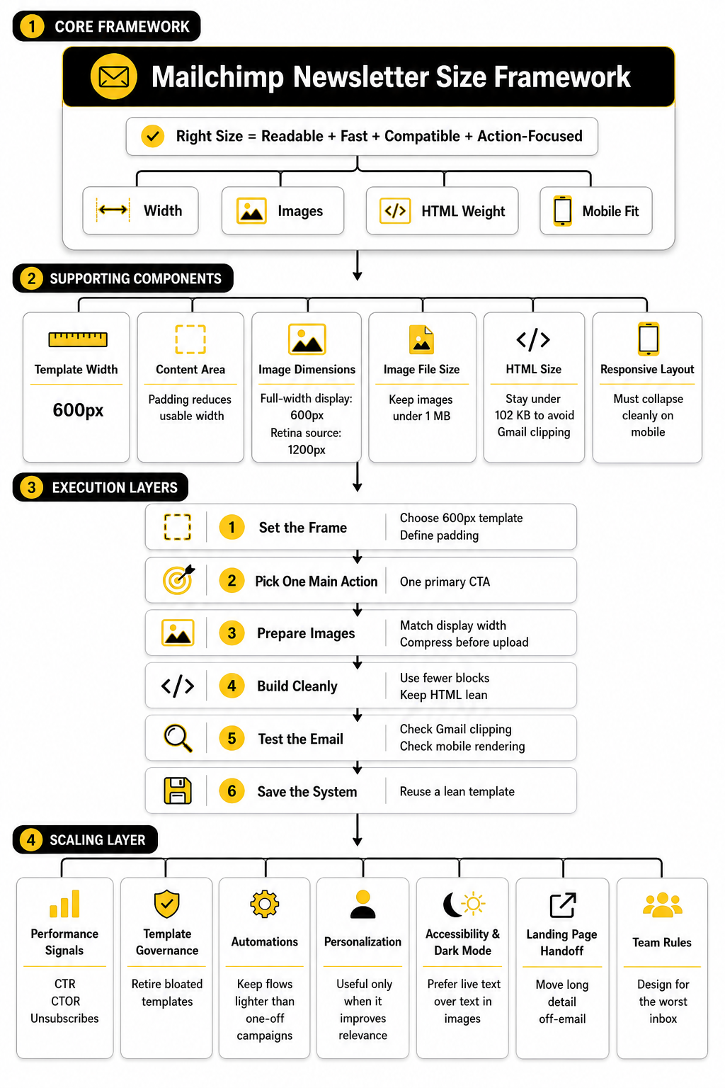
The design width is about how wide your email appears on screen. Mailchimp says its templates are generally built to be no wider than 600 pixels for compatibility with most email clients. That does not mean every image should be 600 pixels wide, and it definitely does not mean the whole email file should be 600 KB.
Image size is about file weight and pixel dimensions. Mailchimp recommends keeping image files to a maximum of 1 MB and avoiding images that are much larger than the content area. The cleaner way to think about it is simple: upload images large enough to look sharp, but not so large that they slow everything down.
Then there is HTML size, which is the hidden weight of your email code. This matters because Gmail clips messages larger than 102 KB, which can hide the bottom of your campaign behind a “View entire message” link. That is why the best Mailchimp newsletter size is not just a visual design choice. It is also a deliverability and user experience choice.
The Best Width For A Mailchimp Newsletter
For most newsletters, the safest Mailchimp email width is 600 pixels. It works because it fits the old reality of email clients: Outlook, Gmail, Apple Mail, mobile apps, desktop previews, and corporate inboxes all render email a little differently. A 600-pixel layout gives you enough room for a clean design without pushing the edges of what many inboxes handle well.
You can technically go wider, but wider does not automatically mean better. Mailchimp allows custom-coded templates to exceed that width, but it also recommends testing wider campaigns across email clients before sending. In practice, most brands do not need a wider email unless they are building a very specific editorial or ecommerce layout.
The more important point is that your email should be responsive. A 600-pixel desktop layout should collapse neatly on mobile, with text remaining readable and buttons easy to tap. If your newsletter only looks good on a laptop, the size is wrong even if the pixel width is technically correct.
A practical default is this:
That setup gives you a solid balance between image clarity, mobile behavior, and inbox compatibility.
Mailchimp Image Sizes That Usually Work Best
The best Mailchimp image size depends on the block you are using. A header image, a product image, and a small icon should not be treated the same way. The goal is to match the image to the space it will occupy inside the email.
For a full-width newsletter image, start with a 600px display width. If you want it to look sharper on high-resolution screens, create the image at 1200px wide and let Mailchimp scale it down inside the template. This keeps the image crisp without making the layout wider than it needs to be.
For smaller content images, size them close to their actual display width. If an image will appear in a two-column block, it probably does not need to be 1200px wide. Uploading oversized images into small blocks creates unnecessary weight and can make the email feel slow, especially on mobile connections.
Mailchimp also warns against uploading images that are significantly larger than the template content area. Its image guidance recommends a maximum file size of 1 MB and notes that padding affects the final usable width. For example, if your email has padding on both sides, your image may need to be slightly narrower than the full template width.
Use these practical image targets:
Do not obsess over exact height. Height depends on the creative, but extremely tall images can push your email into a long scroll and bury the call to action. The width and file weight matter more than forcing every image into one universal rectangle.
The 102 KB Problem Most People Miss
Here is where Mailchimp newsletter size gets confusing. Gmail clipping is not mainly about the image file size. It is about the size of the email’s HTML code.
Gmail clips emails when the message size passes 102 KB. Email testing companies also treat this as a serious rendering issue because Gmail may hide the lower part of the email, including your footer, unsubscribe link, offer details, or final CTA. Litmus explains that once Gmail clips the message, the remaining content is hidden behind a “View entire message” link.
This is why a short email can still get clipped. If the template has bloated code, repeated inline styles, too many content blocks, long tracking links, or messy copied-and-pasted formatting, the HTML can become heavy even when the visible email looks normal. The reader does not see that code, but Gmail does.
This matters because clipping creates friction at the worst possible moment. Someone may never see your final button. They may miss the discount terms. They may not reach the footer. And if they cannot easily find the unsubscribe link, they might mark the email as spam instead.
The practical target is simple: keep your final email HTML comfortably under 102 KB. Do not aim for 101 KB and hope. Leave margin, because tracking parameters, personalization tags, and last-minute edits can add weight before the email lands in the inbox.
How To Keep A Mailchimp Newsletter Lightweight
A lightweight Mailchimp newsletter is not plain or boring. It is focused. Every block has a job, every image earns its place, and the template does not carry unnecessary code.
Start by shortening the email itself. A newsletter does not need to contain the whole blog post, the whole product page, and the whole sales pitch. Use the email to create interest, then send people to the full page when they want the details.
Next, reduce template clutter. Too many dividers, nested sections, columns, buttons, social blocks, and repeated styling can add weight quickly. Mailchimp templates are convenient, but every extra block adds more structure behind the scenes.
Also be careful when copying content from Google Docs, Word, Notion, or old emails. Hidden formatting can come along for the ride and make your campaign heavier than it looks. Paste as plain text when possible, then apply formatting inside Mailchimp.
A cleaner workflow looks like this:
This is the unglamorous part of email design, but it matters. The best Mailchimp newsletter size is the one that loads quickly, renders cleanly, and gets the reader to the next step without making the inbox fight your design.
How To Set Up The Right Mailchimp Newsletter Size Before You Build
Do not start by dragging blocks into Mailchimp. Start with the frame. If you define the newsletter size first, the whole campaign becomes easier to design, compress, test, and reuse.
Use a 600px-wide layout as your baseline because Mailchimp templates are built to stay no wider than 600px for broad email client compatibility. From there, decide how much padding you want on the left and right. If your template has 20px padding on each side, your real content area is closer to 560px, so a full-width image inside that padded area should be built for that space instead of blindly using 600px.
This is also the point where you should decide what the email is supposed to do. A weekly editorial newsletter can usually be lighter and simpler than a product launch email. A sales email with several sections needs stricter control because every extra block adds code, and Gmail can clip messages larger than 102 KB.
A Simple Mailchimp Newsletter Size Workflow
The easiest way to control Mailchimp newsletter size is to use the same process every time. You are not trying to make every campaign identical. You are trying to remove the guesswork so the email looks good, loads fast, and does not fall apart in Gmail or on mobile.
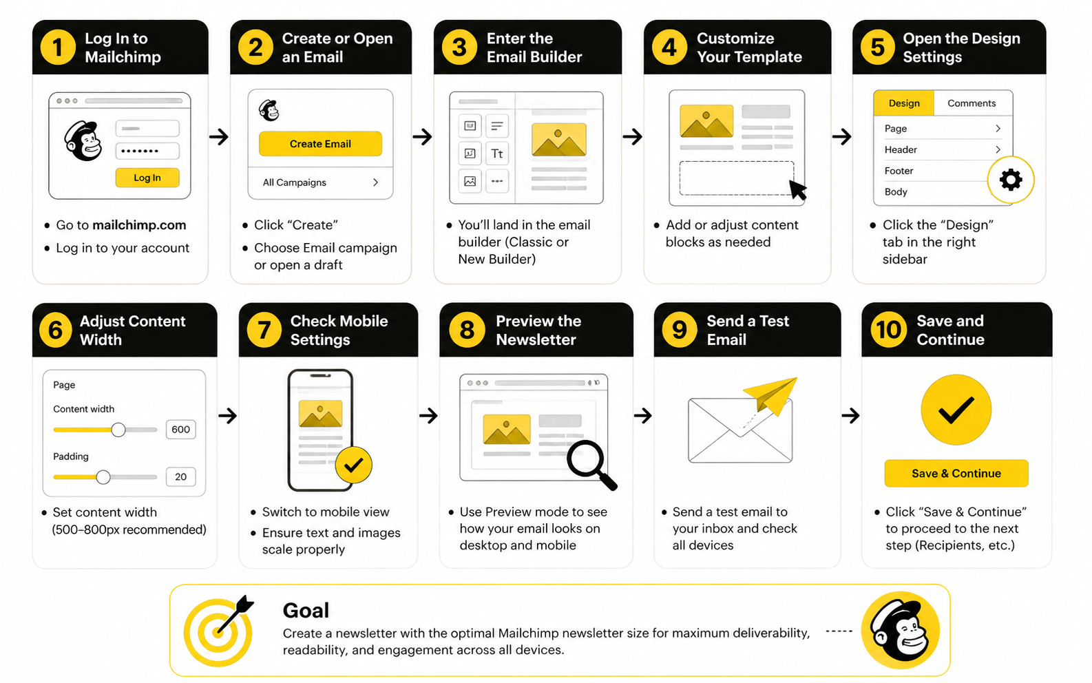
Start with the message before the design. Write the subject, preview text, headline, body copy, and CTA in plain text first. This keeps you focused on what the reader actually needs to understand before you start adding visual weight.
Then build the email in this order:
This process is basic, but it works. Most Mailchimp size problems happen because people design first and troubleshoot later. Flip that order and you avoid most of the mess.
Step 1: Build The Email Around One Main Action
A newsletter becomes heavy when it tries to do too many jobs. One section promotes a new blog post, another promotes a webinar, another pushes a product, another adds a founder note, and suddenly the email has five competing CTAs. That is not just a strategy problem. It also creates a size problem.
Before you open Mailchimp, choose the one action that matters most. It could be reading an article, buying a product, booking a call, downloading a guide, or replying to the email. Everything in the newsletter should support that action or get cut.
This makes the design lighter by default. You need fewer blocks, fewer images, fewer buttons, and less code. The final email feels cleaner because the reader is not being asked to make ten decisions at once.
Step 2: Prepare Images Before Uploading Them
Mailchimp can resize images inside the editor, but that does not mean you should upload giant files and let the platform handle everything. If you upload a 4000px-wide image for a 600px email, you are starting with unnecessary weight. It may still display correctly, but it is not an efficient way to build a campaign.
Create the image for the space it will occupy. A full-width hero can be 1200px wide as a source file for sharpness, but a small author headshot, icon, or product thumbnail does not need that much resolution. The more accurately you size each image before upload, the easier it is to keep the campaign fast.
Use JPEG for most photos and PNG only when you need transparency or crisp graphics. Add useful alt text so the message still makes sense if images are blocked. This is not just a technical detail; it protects the email experience when a subscriber’s inbox does not load visuals by default.
Step 3: Keep The HTML Clean While Editing
The hidden enemy in Mailchimp newsletter size is messy formatting. Copying text from Google Docs, Word, old campaigns, or web pages can bring extra formatting into the email. You may not see that junk in the visual editor, but it can still add weight to the final message.
Paste as plain text whenever possible. Then style the email inside Mailchimp using the editor’s own controls. This keeps the HTML cleaner and makes the campaign easier to adjust later.
Be especially careful with repeated sections. Duplicating blocks is convenient, but every duplicated block brings more code with it. If a section does not make the reader more likely to act, remove it instead of polishing it.
Step 4: Test The Real Email, Not Just The Preview
The preview is useful, but it is not enough. You need to send an actual test email and open it in the places your audience is likely to read it. At minimum, test Gmail on desktop, Gmail on mobile, Apple Mail if relevant, and a smaller phone screen.
Check the basics first. Does the email clip? Does the first screen make sense before images load? Are buttons easy to tap? Does the design stay inside the screen without forcing the reader to pinch or scroll sideways?
Then check the bottom of the email. This is where Gmail clipping hurts the most because it can hide your footer, final CTA, legal details, or unsubscribe link. If the email is clipped, reduce copy, remove unnecessary blocks, simplify formatting, and test again before sending.
Step 5: Save A Lean Reusable Template
Once you have a newsletter that renders cleanly, save it as your working template. This gives you a reliable starting point for future campaigns. You do not need to rebuild the structure every week.
Your reusable template should include only the sections you actually use. For most newsletters, that means a logo area, headline area, body content, one main CTA, optional supporting content, and footer. Anything else should be added only when the campaign genuinely needs it.
This is where consistency pays off. A lean template protects your brand style while keeping each campaign under control. Over time, your team will spend less energy fixing layout issues and more energy improving the message itself.
Statistics and Data
The numbers around Mailchimp newsletter size only matter when they help you make better decisions. A 600px template width is not useful because it sounds neat. It is useful because Mailchimp templates are built around a width that works across most email clients, and Mailchimp’s own template guidance says standard templates are no wider than 600px.
The same goes for image size. A 1 MB image limit is not a badge to aim for; it is a ceiling you should usually stay well under. Mailchimp’s image guidance says images should generally be kept to 1 MB or smaller, but the better habit is to compress until the image still looks good and loads quickly.
The most important number is still 102 KB. Gmail clips emails with a message size larger than 102 KB, which means part of your newsletter can be hidden behind a “View entire message” link. That number should shape how you measure every campaign, because it affects whether subscribers actually see the full message.
The Four Metrics That Tell You If Size Is Hurting Performance
You do not need a giant dashboard to understand whether your Mailchimp newsletter size is helping or hurting you. You need a few signals that connect design weight to reader behavior. The goal is not to admire the data; the goal is to know what to fix.
Start with these four metrics:
Clipping rate is the most direct technical signal. If your Gmail test message clips, the email is too heavy or too messy, even if the design looks polished in the builder. Fix that before worrying about subject line tweaks, button colors, or send time.
Click-through rate tells you whether people are taking action. Mailchimp’s benchmark guidance treats click-through rate as one of the core campaign performance indicators because it shows whether subscribers move from the email to the next step. If clicks are weak and the email is long, image-heavy, or clipped, size may be part of the problem.
Click-to-open rate is useful because it narrows the question. Open rate can be affected by subject lines, sender name, inbox placement, and privacy changes, but click-to-open rate focuses more on what happened after someone opened. If people open but do not click, the email may be visually overloaded, too slow to scan, or asking for too many actions.
Unsubscribes and spam complaints are the warning lights. A heavy newsletter that loads slowly, hides key information, or makes the unsubscribe link hard to reach creates frustration. If those negative signals rise after you move to longer, more image-heavy campaigns, your size and structure deserve a serious look.
Benchmarks Are Directional, Not Personal Truth
Industry benchmarks are useful, but they are not your scoreboard. Mailchimp’s email marketing benchmarks are designed to help compare open rates, click-through rates, conversion rates, and similar KPIs against broader patterns. That helps you understand whether your campaign is unusually strong, average, or clearly underperforming.
But benchmarks do not know your list quality, offer, audience maturity, sales cycle, or relationship with subscribers. A small B2B list with high buying intent can behave very differently from a large ecommerce discount list. A founder-led newsletter can also behave differently from a polished brand campaign.
Use benchmarks to spot obvious problems, not to copy someone else’s average. If your clicks are below your industry range and your email is also long, clipped, or packed with oversized graphics, you have a practical next step. Reduce the weight, simplify the layout, and test whether engagement improves.
What Open Rate Can And Cannot Tell You
Open rate is still useful, but it is not as clean as people want it to be. Apple’s Mail Privacy Protection can affect open tracking because it may load email content in ways that do not always represent a human opening the message. That means open rate should not be the only metric you use to judge a newsletter.
For Mailchimp newsletter size, open rate is mostly a supporting signal. If opens are strong but clicks are weak, the problem is probably inside the email. The subject line did its job, but the content, layout, size, or offer did not carry the reader forward.
If opens are weak and clicks are weak, do not blame the design immediately. First check your subject line, sender name, list segment, and deliverability basics. Size matters most after the email has been opened, because that is when loading speed, clipping, mobile layout, and visual hierarchy start affecting behavior.
How To Read Click Data Without Fooling Yourself
Click data gets more useful when you look at where people clicked, not just whether they clicked. If most clicks happen near the top, your email may be too long or the lower sections may not be visible enough. If clicks are scattered across too many links, the email may lack a clear primary action.
A good newsletter usually has one obvious click path. That does not mean you can never include secondary links, but the main action should be easy to identify. When every section fights for attention, the design gets heavier and the data gets harder to interpret.
Look at click maps when available. If subscribers ignore image-based sections but click simple text links, that tells you something. It may mean your audience values clarity over design, and reducing visual weight could improve both newsletter size and performance.
The Size And Performance Audit
A practical audit connects the technical numbers to the marketing numbers. Do this after important sends, not randomly when something already feels broken. The more consistent your process, the faster you will see patterns.
Review each campaign using this sequence:
This is not complicated, but it is powerful. You are matching what subscribers did with what the email asked them to do. That is how you turn Mailchimp newsletter size from a design preference into a performance lever.
What Good Data Should Make You Change
Good data should lead to action. If your email clips in Gmail, shorten the email and simplify the template. If your images are heavy, resize and compress them before uploading. If clicks only happen above the fold, move the strongest CTA earlier and cut weaker sections.
If click-to-open rate improves after you simplify the layout, that is a strong sign your audience wants clarity. Keep the leaner structure and resist the urge to add back every old block. More design does not always mean more persuasion.
If performance drops after reducing visuals, do not assume simplicity failed. Check whether the offer, copy, segment, or timing changed too. Measurement only works when you compare campaigns carefully instead of blaming one variable because it is easy to see.
A Clean Reporting Template For Newsletter Size
You can track Mailchimp newsletter size with a simple campaign note instead of a complex reporting system. After each important send, record the key details while the campaign is still fresh. Over time, this gives you a useful internal benchmark that is better than generic industry averages.
Track these fields:
The goal is to build your own evidence. After a few campaigns, you will see whether shorter emails outperform longer ones, whether image-heavy sends hurt clicks, and whether certain templates create clipping risk. That is the data that actually matters, because it comes from your list, your offers, and your subscribers.
Advanced Mailchimp Newsletter Size Decisions
Once the basics are handled, Mailchimp newsletter size becomes less about “what dimensions should I use?” and more about tradeoffs. A short text-heavy email can feel personal and fast, but it may not show enough product context. A visual campaign can look premium, but it can also become heavier, slower, and harder to render consistently across inboxes.
This is where you need to think like an operator, not just a designer. The right size depends on the job of the campaign, the audience, the device mix, and the action you want the reader to take. A weekly newsletter, a flash sale, a product education email, and a reactivation campaign should not all use the same structure just because they live in the same Mailchimp account.
The mistake is treating every campaign like a blank canvas. Mature email programs use constraints on purpose. They know when to keep the email lean, when to use stronger visuals, and when to move detail onto a landing page instead of forcing the inbox to carry everything.
When A Bigger Email Is Worth It
A bigger email can be worth it when the extra content genuinely helps the reader decide. Product launches, visual portfolios, event announcements, and ecommerce campaigns sometimes need more context than a plain-text note can provide. If the images explain the offer better than words alone, they can earn their place.
But “bigger” still needs boundaries. Mailchimp’s own template guidance keeps standard templates no wider than 600px, and its image guidance recommends keeping image files at 1 MB or smaller. That gives you room to build a strong visual email, but it does not give you permission to turn the newsletter into a full web page.
Use bigger emails when the content reduces uncertainty. A product photo, comparison section, or clear event agenda can help the reader act. Extra banners, decorative dividers, repeated CTAs, and oversized lifestyle graphics usually just add weight.
When A Smaller Email Will Perform Better
A smaller email often wins when the relationship with the reader is already warm. If subscribers trust the sender, they may not need a heavily designed campaign to click. A direct message with one useful idea and one clear link can outperform a polished layout because it feels easier to read.
Smaller emails also help when the goal is reply, booking, or consultation. In those cases, the email should feel like a human is starting a conversation, not like a brand is broadcasting a brochure. Heavy visuals can create distance when the better move is to sound direct and personal.
This is especially true for expert, agency, coaching, and B2B offers. If the reader needs to think, compare, or reply, clarity beats decoration. Keep the Mailchimp newsletter size lean and put the deeper explanation on the page you link to.
The Scaling Problem: One Template Becomes Ten Bad Habits
A single oversized campaign is annoying. A whole system of oversized campaigns becomes expensive. As your email program grows, small design habits get copied across every campaign, automation, segment, and seasonal promotion.
That is how size problems scale quietly. Someone duplicates an old campaign with bloated formatting. Someone else adds extra sections because “that block was already there.” A third person uploads new images without compressing them. Six months later, the team has a library of templates that look familiar but carry too much weight.
The fix is to create a clean template system instead of relying on memory. Keep one lean master newsletter, one visual promotional template, and one simple plain-text-style template. Retire old versions aggressively, because a messy template library creates messy campaigns.
Automation Emails Need Even Stricter Size Control
Automations deserve tighter size limits than one-off campaigns. A newsletter is usually read once, but automation emails may run for months or years. If the structure is heavy, outdated, or clipped, that problem keeps repeating in the background.
Welcome sequences, abandoned cart emails, lead nurture campaigns, and reactivation flows should be simple enough to survive changes in inbox behavior. Gmail clipping still matters because messages over 102 KB can hide key content, and automated emails often contain tracking links, conditional blocks, personalization, and repeated styling. All of that can add weight before you notice it.
Review automations on a schedule. Open the live email, not just the saved template. Check the links, mobile rendering, image loading, footer visibility, and whether the message still matches the offer. Automation is not “set and forget” if it is quietly leaking clicks.
Personalization Can Add Weight And Complexity
Personalization is useful, but it is not free. Merge tags, dynamic content, conditional sections, product recommendations, and segmented blocks can make a newsletter more relevant. They can also make it harder to test because different subscribers may receive different versions of the same campaign.
This matters for Mailchimp newsletter size because the version you preview may not be the heaviest version someone receives. A subscriber who qualifies for several dynamic blocks could get a longer email than your default test profile. That creates risk if your campaign is already close to the Gmail clipping line.
Use personalization where it changes behavior. A first name in the subject line is not the same as a relevant offer based on a subscriber’s interest. If dynamic content does not improve the reader’s decision, it is just complexity wearing a marketing badge.
Dark Mode And Accessibility Change The Size Conversation
Newsletter size is not only about pixels and kilobytes. It is also about whether the email can be read comfortably in real inbox conditions. Dark mode is now a normal email environment, and dark mode rendering can change backgrounds, text colors, logos, borders, and buttons depending on the email client.
That means image-heavy emails carry a hidden risk. If important text is baked into an image, it may look fine in your design file but become hard to read on a small screen or in a dark interface. If the image is blocked, the message may disappear completely.
Keep important copy as live text whenever possible. Use strong contrast, readable font sizes, useful alt text, and buttons that still make sense if images do not load. A newsletter that looks beautiful but becomes unreadable under common inbox conditions is not well-sized; it is fragile.
The Landing Page Tradeoff
One of the smartest ways to control Mailchimp newsletter size is to stop making the email do the landing page’s job. The email should create enough interest to earn the click. The landing page should carry the detailed explanation, screenshots, testimonials, pricing, and long-form persuasion.
This is especially important for launches, webinars, lead magnets, and product comparisons. Instead of stuffing every detail into the campaign, give the email a sharp promise and send the reader to a focused page. If you are building campaign pages outside Mailchimp, tools like ClickFunnels, Systeme.io, or GoHighLevel can make that handoff cleaner.
The tradeoff is simple. Shorter emails usually need stronger landing pages. Longer emails can explain more upfront, but they increase the risk of clutter, clipping, and weaker scanning. Pick the path based on what the reader needs before they click.
Ecommerce Newsletters Need A Different Balance
Ecommerce emails often need more visuals than a service newsletter. Product photos, categories, bundles, discounts, and seasonal collections are easier to understand when people can see them. The trick is keeping the email shoppable without turning it into a catalog.
Use fewer product blocks with better hierarchy. Lead with the hero offer, then show a small number of supporting products or categories. If everything is featured, nothing is featured.
For stores, the best Mailchimp newsletter size usually comes from restraint. Show enough to create desire, then move the shopper to the product page. The inbox is not the place to recreate your entire storefront.
B2B Newsletters Should Prioritize Reading Flow
B2B newsletters usually need less visual weight and more logical flow. The reader may be checking email between meetings, on a commute, or while deciding whether your idea is worth forwarding to a colleague. Dense design gets in the way when the real value is insight.
Use headings that let people scan quickly. Keep paragraphs short enough to read on mobile. Put the strongest idea near the top, then support it with one or two useful links.
For B2B, the risk is not that the email looks too simple. The risk is that it looks like marketing before it proves it is useful. A lean structure gives the idea room to breathe.
Team Rules For Keeping Newsletter Size Under Control
If more than one person touches email, you need rules. Not vague preferences. Actual rules people can follow without guessing.
Use a simple internal checklist:
These rules are not there to make the work boring. They are there to protect performance. Creative freedom is useful only when the email still renders, loads, and drives the reader to act.
The Expert Rule: Design For The Worst Inbox
The best email teams do not design for the perfect preview. They design for the worst realistic inbox. That means a small phone, a slow connection, dark mode, blocked images, Gmail clipping risk, and a distracted reader who gives the email only a few seconds.
If the newsletter works there, it will usually work everywhere else. If it only works in the builder preview, the design is not finished. This is the difference between making an email that looks good and making an email that survives contact with the inbox.
That is the advanced way to think about Mailchimp newsletter size. It is not a single number. It is a set of constraints that helps your message arrive cleanly, stay readable, and make the next action obvious.
Final Mailchimp Newsletter Size Checklist
At this point, the right Mailchimp newsletter size should feel less like a mystery and more like a system. You are not guessing the perfect width, throwing in a few images, and hoping Gmail behaves. You are building within clear constraints so the email stays readable, fast, and focused.
A strong final check looks at the whole email ecosystem. That means the template, images, HTML weight, mobile layout, CTA, tracking, and landing page all need to work together. If one part is bloated, the whole campaign can suffer.
Use this checklist before sending any important campaign:
That is the real answer. Mailchimp newsletter size is not one number. It is a set of smart limits that help your campaign survive the inbox and drive action.
What is the best Mailchimp newsletter size?
The best default Mailchimp newsletter size is a 600px-wide layout with responsive behavior on mobile. That width is safe because Mailchimp’s standard templates are built around a maximum width of 600 pixels, which helps campaigns render more consistently across inboxes. From there, your job is to keep the email clean, compressed, and easy to scan.
What size should Mailchimp newsletter images be?
For a full-width image, use a source file around 1200px wide and display it at 600px or less inside the email. This helps the image look sharp on high-resolution screens without forcing the email layout to become wider. For smaller blocks, size the image close to the space it will actually occupy.
What is the maximum image size in Mailchimp?
Mailchimp recommends keeping image files at 1 MB or smaller. That does not mean every image should be close to 1 MB. A better rule is to compress every image as much as possible while keeping it visually clean.
Why does Gmail clip Mailchimp emails?
Gmail clips emails when the message size is larger than 102 KB. This is mainly about the HTML weight of the email, not just how big your images are. Long campaigns, messy formatting, duplicated blocks, and heavy code can all push the email over the limit.
Does Gmail clipping affect performance?
Yes, it can. When Gmail clips an email, subscribers may not see your footer, final CTA, offer details, or unsubscribe link. That creates friction, and friction usually hurts clicks.
Is a wider Mailchimp newsletter better?
Usually, no. A wider email can look impressive in a design file, but the inbox is not a website canvas. A 600px layout is still the practical default because it gives you enough space to design well while staying compatible with common email clients.
Can I use 1200px images in Mailchimp?
Yes, but use them correctly. A 1200px-wide image can work well as a high-resolution source file when it is displayed at 600px inside the email. Do not use huge images just because they look sharper in your design tool.
How many images should a Mailchimp newsletter have?
There is no universal number, but every image should have a job. If an image explains the offer, shows the product, supports the story, or improves clarity, it can belong. If it is only decorative, it may be adding weight without improving results.
Should important text be inside images?
No, not if you can avoid it. Important copy should usually be live text so it stays readable on mobile, works better with accessibility tools, and still appears if images are blocked. Image-based text can also become hard to read in dark mode or on small screens.
How do I know if my Mailchimp email is too long?
Send a test email to Gmail and check whether it clips. Then open it on mobile and ask whether the main point is obvious without a lot of scrolling. If the reader needs to work too hard to understand the email, it is too long even before you check the file size.
What should I do if my Mailchimp email gets clipped?
Cut weak sections first. Remove unnecessary blocks, shorten the copy, compress images, simplify formatting, and avoid copying styled content from outside tools. Then send another Gmail test before scheduling.
Does Mailchimp automatically resize images?
Mailchimp can automatically fit images into the email layout, but that does not mean you should upload oversized files. Pre-sizing and compressing images before upload gives you more control. It also helps keep the campaign lighter and easier to manage.
What is more important: image size or HTML size?
Both matter, but they affect different things. Image size affects loading speed and visual experience. HTML size affects clipping risk, especially in Gmail.
Should newsletters be shorter than promotional emails?
Usually, yes. A regular newsletter should be easy to read and repeatable, while a promotional email may need more context depending on the offer. But even promotional emails should not become full landing pages inside the inbox.
What is the safest Mailchimp newsletter size for mobile?
Use a responsive 600px desktop layout that collapses cleanly on smaller screens. Avoid fixed-width elements that force horizontal scrolling. Buttons, images, and text should all remain readable without pinching or zooming.
Build a stronger local presence with BAAM AI
Turn your website, Google profile, social channels, and AI visibility into one growth engine
Most businesses do not need more random marketing activity. They need a consistent presence system that helps the right people find them, trust them, and take action. BAAM AI brings strategy, local SEO, website updates, Google Maps visibility, social content, AI-search readiness, media production, and reporting into one practical monthly engine.
If you want your marketing to keep working after the campaign ends, start with a free BAAM AI presence audit. See how your business shows up today and where the fastest visibility wins are at BAAM AI.