BAAM AI Blog
Welcome Email Examples Ecommerce Brands Can Use to Turn New Subscribers Into First-Time Buyers
A welcome email is not just a polite hello. In ecommerce, it is usually the first owned-channel moment after someone shows interest, joins your list, claims a discount, creates an account, or buys for the first time...
A welcome email is not just a polite hello. In ecommerce, it is usually the first owned-channel moment after someone shows interest, joins your list, claims a discount, creates an account, or buys for the first time. That makes it one of the few emails where attention, timing, and intent are all working in your favor at the same time.
The problem is that many brands waste that moment. They send a generic “thanks for subscribing” message, paste in a coupon code, and hope the customer figures out what to do next. Better welcome emails do something more useful: they confirm the promise, reduce doubt, introduce the brand, guide the next click, and make the first purchase feel easy.
This guide breaks down welcome email examples ecommerce brands can actually learn from without copying blindly. Instead of treating examples like templates, we will look at the strategy underneath them: why they work, when they fail, and how to adapt the same thinking to your own store.
Why Welcome Emails Matter in Ecommerce
Welcome emails matter because the subscriber has just taken action. They may not be ready to buy yet, but they have given you permission to speak to them directly. That is a much stronger signal than a cold ad impression, a passive social media view, or a one-time product page visit.
This is also where expectations get set. If your signup form promises 10% off, early access, a quiz result, a guide, or a product recommendation, the welcome email needs to deliver that clearly. When the first email feels confusing, slow, or generic, the brand immediately trains the subscriber to ignore future emails.
The best ecommerce welcome emails do not try to say everything. They create momentum. One email might focus on the offer, another on the brand story, another on bestsellers, and another on reassurance such as shipping, returns, reviews, or guarantees. That sequence is often more effective than cramming every possible message into a single oversized email.
A welcome email also helps protect your margin. If every new subscriber only receives a discount, the brand teaches people to wait for discounts. A stronger welcome flow can combine the incentive with product education, trust-building, social proof, and preference collection, which gives customers more reasons to buy than price alone.
Welcome Email Framework Overview
A useful welcome email framework starts with one question: what does this person need to believe before they buy? For a low-priced impulse product, the answer may be as simple as “this looks good, the discount works, and checkout is easy.” For a premium product, the customer may need proof, comparison help, founder credibility, sizing guidance, ingredient education, or reassurance that returns are simple.
That is why ecommerce welcome emails should be built around the customer’s stage of awareness. A new subscriber who came from a giveaway is different from someone who joined from a product page. A first-time buyer is different from a newsletter subscriber who has not purchased yet. The framework should respect those differences instead of pushing everyone through the same generic message.
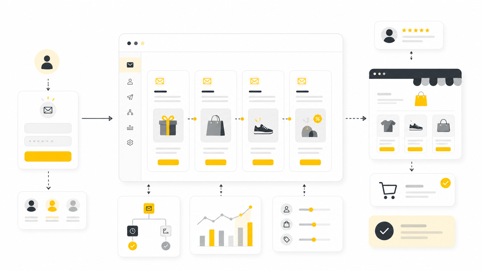
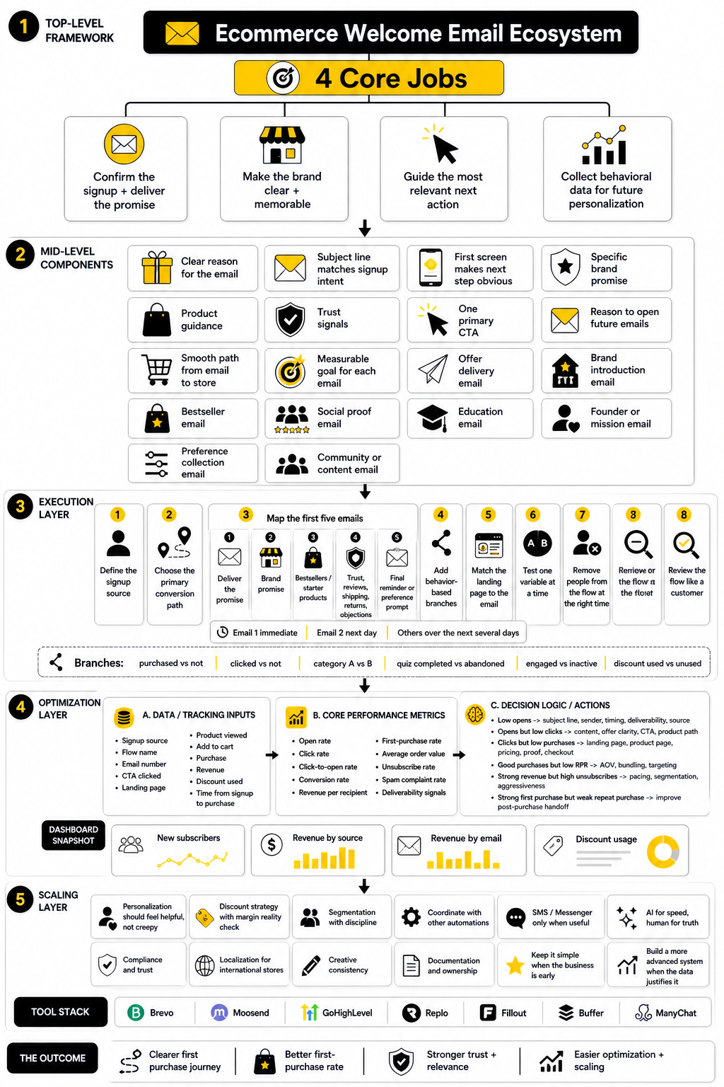
At a practical level, the welcome framework has four jobs. First, confirm the signup and deliver whatever was promised. Second, make the brand feel clear and memorable. Third, guide the subscriber toward the most relevant next action. Fourth, collect enough behavioral data to make future emails more personal.
For many stores, this means the welcome flow should not be one email. A simple starting point is a three-to-five email sequence: instant delivery of the promise, brand and product orientation, social proof, objection handling, and a final reminder or next-step email. If the brand already has strong segmentation, the sequence can branch based on what the subscriber clicked, viewed, bought, or ignored.
Tools can help, but the strategy still matters more than the platform. An ecommerce brand can build a clean welcome sequence in platforms like Brevo, Moosend, or broader customer journey systems like GoHighLevel, but the email will only perform if the message matches the customer’s intent. Automation does not fix a weak offer, unclear positioning, or lazy copy.
The rest of this guide will move from framework to execution. First, we will break down the core components every strong ecommerce welcome email needs. Then we will look at real example patterns, implementation decisions, and a final checklist you can use before publishing your own welcome flow.
Core Components of High-Converting Welcome Emails
A strong welcome email is not built from one magic subject line or one clever discount angle. It works because several small pieces line up: the timing, the promise, the message, the proof, the offer, and the next step. When those pieces are clear, the email feels helpful instead of pushy.
This is especially important because ecommerce shoppers are cautious by default. Research on online shopping trust keeps pointing back to the same pattern: people are more willing to buy when the brand feels reputable, the site feels secure, and the shopping experience feels easy to understand. One recent study on ecommerce trust found that company reputation, perceived security, and website quality all influence trust, which then affects purchase intent through the customer journey consumer trust in online shopping research.
That is the real job of the welcome flow. It should not just announce that someone joined your list. It should help a new subscriber feel, “Yes, this brand makes sense for me, and buying from them does not feel risky.”
1. A Clear Reason for the Email
The first component is clarity. The subscriber should instantly understand why they are receiving the email and what they are supposed to do next. If they signed up for a discount, quiz result, early access, guide, or product recommendation, that promise should be obvious near the top of the email.
This sounds basic, but plenty of ecommerce welcome emails fail here. They start with a huge brand statement, a founder quote, a lifestyle image, or a long story before delivering the thing the subscriber asked for. That creates friction at the exact moment when the customer is most reachable.
The fix is simple: lead with the reason they joined. You can still add personality, brand story, or product education later, but the first job is to meet the expectation you created. A welcome email should feel like a clean handoff from the signup form, not a disconnected marketing blast.
Good first-email angles include:
Each version tells the subscriber what happened and where to go next. That tiny bit of orientation matters because confused people rarely click, and they almost never buy.
2. A Subject Line That Matches the Signup Intent
The subject line should not try to be clever at the cost of being useful. In a welcome email, the subscriber has just completed an action, so the best subject lines usually confirm that action. The more closely the subject line matches the signup promise, the more natural the email feels in the inbox.
For ecommerce welcome emails, this often means using simple language. “Your 10% off code is inside” is not exciting, but it is clear. “Welcome to the club” may sound branded, but it is weaker if the subscriber joined specifically to receive an offer. The inbox is not the place to make people decode your intent.
There is room for personality, but only after clarity is handled. A skincare brand can sound calm and expert. A streetwear brand can sound sharper and more casual. A premium home goods brand can sound polished and understated. The tone should fit the brand, but the message still needs to be obvious.
Strong subject lines often do one of these jobs:
A welcome subject line is not trying to win an award. It is trying to get the right person to open the right email for the right reason.
3. A First Screen That Makes the Next Step Obvious
The top of the email needs to do heavy lifting. Many subscribers will decide whether to keep reading within seconds, especially on mobile. That means the first screen should communicate the main value before the reader has to scroll.
For a discount-led welcome email, the code should be visible. For a product recommendation flow, the first recommended category or product path should be visible. For a brand-led welcome email, the value proposition should be sharp enough that a new subscriber understands what the store sells and why it is different.
This does not mean the design has to be minimal. It means the hierarchy has to be disciplined. The reader should not have to hunt for the offer, the button, or the reason to care. Your best welcome email examples ecommerce swipe file should be judged by this standard first, not by how pretty the layout looks.
A strong first screen usually includes:
The mistake is adding too many competing actions at once. “Shop bestsellers,” “follow us,” “read our story,” “take the quiz,” “refer a friend,” and “join SMS” can all be useful actions, but not all in the same first screen. Pick the action that matters most for that email.
4. A Brand Promise That Is Specific Enough to Remember
A welcome email should make the brand easier to remember. That does not happen when the copy says generic things like “quality products,” “great customer service,” or “made for everyday life.” Those phrases could describe almost any ecommerce store.
A stronger brand promise explains the specific transformation, standard, or point of view behind the product. For example, a supplement brand should not only say it sells wellness products. It should explain what problem it helps customers solve, what makes the formulation credible, and why the buyer can trust it. A fashion brand should not only say it makes stylish clothing. It should clarify the fit, use case, aesthetic, or customer identity it serves.
This matters because the subscriber may not buy immediately. If they remember only the discount, you are easy to replace. If they remember the reason your product exists, your brand has a better chance of staying in their mind after the first email is closed.
A useful brand promise answers at least one of these questions:
You do not need to answer all five in one email. In fact, trying to do that can make the message bloated. But across the welcome sequence, those questions should be handled clearly.
5. Product Guidance That Reduces Decision Fatigue
New subscribers often need direction. They may like the brand, but they do not know what to buy first. If your store has dozens or hundreds of products, simply sending people to the homepage can create more friction than momentum.
This is where product guidance becomes a core part of the welcome flow. Instead of saying “shop now,” the email can point people toward bestsellers, starter kits, bundles, giftable products, new arrivals, or category-specific entry points. The goal is not to show everything. The goal is to make the first decision easier.
This works particularly well when the guidance matches the context of the signup. If someone joined through a quiz, show the recommended products. If they joined from a category page, start with that category. If they joined through a seasonal campaign, keep the first product path aligned with that campaign.
Useful product guidance can look like:
The best ecommerce welcome emails make the store feel easier to navigate. That is not just a design choice. It is a conversion choice.
6. Trust Signals That Feel Earned, Not Forced
Trust signals are essential, but they need to feel natural. A row of random icons saying “secure checkout,” “fast shipping,” and “premium quality” is better than nothing, but it is not enough if the customer has real doubts. Trust becomes stronger when the proof directly supports the buying decision.
Reviews are one of the most obvious examples. Academic research continues to show that online reviews shape consumer trust and purchase behavior, especially when shoppers are evaluating unfamiliar brands or products research on reviews and ecommerce trust. Another study on product quality trust found that review attributes such as star ratings, review type, and review length can influence how people evaluate products before buying product review trust research.
For welcome emails, this means social proof should be specific. A strong review snippet about fit, durability, taste, comfort, shipping speed, or customer support is more useful than a vague five-star quote. The proof should remove an actual objection.
Good trust signals include:
Do not overload the first welcome email with every trust signal you have. Place the right proof near the right decision. If the email is pushing a first purchase, reviews and return reassurance may matter most. If the email is introducing a premium product, materials, process, and expert credibility may carry more weight.
7. One Primary Call to Action
Every welcome email should have one primary action. That action can appear more than once, but it should not compete with five different goals. The more choices you add, the easier it becomes for the subscriber to do nothing.
For ecommerce, the primary call to action is often a shopping action. But it does not always need to be “Shop Now.” Depending on the email, the better CTA might be “Find Your Match,” “Claim Your Code,” “Build Your Routine,” “Shop Bestsellers,” “Choose Your Bundle,” or “See What Fits You.” The wording should match the customer’s mental next step.
This is where many welcome emails become too brand-centered. They ask the subscriber to follow, read, explore, join, refer, watch, and buy all at once. Those actions may matter later, but each email should have a clear job.
A practical CTA test is this: if the subscriber clicks the main button, does it move them closer to the outcome the email promised? If yes, the CTA is doing its job. If it sends them somewhere vague, like a cluttered homepage with no clear next step, the email is leaking intent.
8. A Reason to Continue Opening Future Emails
The welcome flow should not only push the first click. It should also teach subscribers that future emails are worth opening. This is where expectation-setting becomes powerful.
You can tell subscribers what they will receive next, but the promise needs to be useful. “Stay tuned for updates” is weak. “Over the next few days, we’ll send our bestsellers, sizing tips, and real customer favorites” is stronger because it gives people a reason to keep paying attention.
This also helps reduce unsubscribes caused by surprise. If someone joins for a discount and suddenly receives daily promotional emails with no context, that can feel aggressive. A welcome sequence that explains what is coming feels more intentional.
Strong expectation-setting can include:
This is a small detail, but it changes the tone. The brand stops acting like it has unlimited permission and starts acting like it respects the inbox.
9. A Smooth Path From Email to Store
The welcome email does not end at the click. If the landing page is slow, confusing, mismatched, or missing the promised offer, the email has not really done its job. The customer experience needs to continue cleanly after the subscriber leaves the inbox.
For example, if the email promotes bestsellers, the click should go to a bestseller collection or a curated product section. If the email promotes a quiz result, the click should go to the result or recommended products. If the email promotes a discount, the code should be easy to apply and the terms should be clear.
This is where ecommerce brands should think beyond email copy. The email, landing page, product page, cart, and checkout all need to feel like one connected path. When the message changes from step to step, the customer starts second-guessing.
Before publishing a welcome email, check the full journey:
If those steps match, the email feels effortless. If they do not, even good copy can underperform.
10. A Measurable Goal for Each Email in the Sequence
Every email in the welcome sequence needs a measurable job. The first email might be judged by offer clicks and first purchases. The second might be judged by product discovery. The third might be judged by review clicks, quiz completions, or category engagement. Without a goal, optimization becomes guesswork.
The right metric depends on the email’s purpose. Not every welcome email should be judged only by immediate revenue. Some emails are meant to collect preferences, educate the buyer, or move the subscriber into a more relevant segment. Those actions can improve future performance even if the email itself is not the biggest revenue driver.
That said, ecommerce brands should not hide behind soft metrics forever. A welcome flow exists to help turn new attention into customer relationships and sales. If the sequence gets opens but no clicks, the offer or CTA may be weak. If it gets clicks but no purchases, the landing page, product page, pricing, proof, or checkout may be the issue.
Track these metrics at a minimum:
A good welcome flow is not something you write once and forget. It is a living part of the store’s acquisition system. The brands that win here keep tightening the message, improving the offer, and removing friction from the path to purchase.
Welcome Email Examples Ecommerce Brands Can Learn From
Once the core components are clear, examples become much more useful. You stop looking at them like templates to copy and start seeing the decision behind each email. That is the point of studying welcome email examples ecommerce brands can use: not to steal the layout, but to understand the job each message is doing.
A good ecommerce welcome flow usually includes several example types, not just one. Some subscribers need the discount immediately. Some need product guidance. Some need proof. Some need to understand the brand before they buy. The implementation process is about matching the right email type to the right moment in the customer journey.
The best way to build this is to start with the customer’s first problem. They have entered your world, but they do not fully know you yet. Your welcome sequence should move them from curiosity to clarity, then from clarity to action.
Example Type 1: The Offer Delivery Email
The offer delivery email is the most direct version of a welcome email. Someone signs up for a code, early access, free shipping, a sample, or a first-order incentive, and the email gives it to them immediately. This is not the moment to get cute.
The subject line should make the benefit obvious. The headline should repeat the promise. The button should take the shopper to a relevant buying path, not a random homepage where they have to start over. If the discount has terms, those terms should be easy to understand without making the email feel like legal copy.
A clean offer delivery email usually includes:
This works well for stores with simple products, impulse-friendly pricing, or strong bestsellers. It is less effective when the product requires education, sizing, comparison, or a longer decision cycle. In those cases, the offer email should still deliver the promise, but it should also guide the subscriber toward the right product path.
Example Type 2: The Brand Introduction Email
The brand introduction email is useful when the customer needs more than a coupon. It explains what the store stands for, who it serves, and why the products exist. This is especially important for premium ecommerce brands, mission-led brands, technical products, and categories where trust matters.
The mistake is turning this email into a long “about us” page. New subscribers do not need your entire company history yet. They need the clearest version of your positioning: what you sell, why it is different, and why that difference matters to them.
A strong brand introduction email should make one idea stick. Maybe the product is built around better materials. Maybe it solves a specific frustration. Maybe it gives customers a simpler routine. Maybe the founder created it because the existing options were too complicated, wasteful, uncomfortable, or overpriced.
This type of email often works best as the second message in the sequence. The first email handles the immediate promise. The second email gives the subscriber a reason to care beyond the incentive.
Example Type 3: The Bestseller Email
The bestseller email reduces decision fatigue. Instead of asking a new subscriber to browse everything, it points them toward the products other customers already choose most often. This is simple, practical, and effective when the store has clear winners.
The key is to explain why each product is popular. A grid of product images and prices is not enough. The email should give a short reason to click, such as “best for first-time buyers,” “most gifted,” “made for sensitive skin,” “ideal for daily use,” or “the easiest place to start.”
This email can also segment future behavior. If someone clicks a skincare bundle, a gift set, or a specific apparel category, that click tells you what they may want next. The welcome flow can then become more relevant instead of treating every subscriber the same.
A strong bestseller email includes:
This works because new shoppers often want confidence more than variety. They do not need to see the entire catalog. They need a smart first step.
Example Type 4: The Social Proof Email
The social proof email answers the quiet question every new customer has: “Can I trust this brand?” That question gets louder when the product is expensive, personal, technical, or unfamiliar. Reviews, customer photos, press mentions, expert endorsements, and clear policies can all help.
The proof has to be specific. Generic praise does not remove much doubt. A review that mentions fit, comfort, taste, texture, shipping, customer service, durability, or results is more persuasive because it speaks to a real buying concern.
Recent research on ecommerce behavior continues to connect trust, reviews, and purchase intention, especially when shoppers cannot physically inspect a product before buying online review trust research. That matters for welcome emails because a new subscriber has not built enough direct experience with the brand yet. The email has to borrow confidence from proof the customer can understand quickly.
A strong social proof email can include:
Do not fake urgency here. Do not overhype. Let the proof do the work.
Example Type 5: The Education Email
The education email is useful when customers need help choosing, using, or understanding the product. This is common in beauty, supplements, home goods, apparel sizing, specialty food, fitness, electronics accessories, and high-consideration products. If the customer has questions before buying, education can be the difference between hesitation and action.
This email should not feel like a lecture. It should solve one practical problem. For example, “How to choose the right size,” “How to build your first routine,” “Which bundle is right for you,” or “What makes this material different” can all work well.
The best education emails are short, specific, and connected to a buying path. If you teach someone how to pick the right product, the next click should take them to the relevant product, quiz, guide, or collection. Education without a next step creates interest but not momentum.
This type of email is also where a simple quiz or form can be useful. A brand can collect preferences, recommend products, and improve segmentation using tools like Fillout when the product choice depends on customer input. The key is to keep the quiz useful, not intrusive.
Example Type 6: The Founder or Mission Email
A founder or mission email can work extremely well when the backstory genuinely explains why the product is better. It should not be used as filler. If the story does not make the customer trust the product more, understand the brand faster, or feel closer to the mission, it probably does not belong in the welcome flow.
This email is strongest when there is a clear point of view. Maybe the brand rejects disposable products. Maybe it was created because the founder could not find an option that fit a specific need. Maybe the company is built around a manufacturing standard, sourcing philosophy, or customer problem that competitors ignore.
The writing should stay customer-focused. A founder note that only talks about the founder becomes self-indulgent. A founder note that connects the origin story to the customer’s problem feels useful.
A good founder or mission email includes:
This is usually not the hardest-selling email in the flow. Its job is to create affinity and make the brand feel human.
Example Type 7: The Preference Collection Email
The preference collection email helps the brand learn what the subscriber actually wants. This is useful when the catalog has multiple categories, use cases, sizes, goals, or buyer types. Instead of guessing, you ask the subscriber to choose.
The simplest version is a “What are you shopping for?” email. The subscriber clicks one of several paths, and each click updates their segment. A fashion brand might ask about men’s, women’s, kids’, or gifts. A skincare brand might ask about dryness, acne, aging, sensitivity, or routine building. A home brand might ask about room type, style, or budget.
This email is not only good for personalization. It also gives the subscriber a feeling of control. They are not just being pushed through a generic sequence. They are shaping what they receive next.
Preference collection works best when the options are clear and limited. Too many choices feel like homework. Three to six options are usually enough to route people into a more relevant path.
Example Type 8: The Community or Content Email
The community or content email works when the brand has a real reason to keep people engaged beyond product promotions. This can include styling ideas, recipes, routines, tutorials, buyer guides, user-generated content, loyalty programs, or community challenges. The point is to make the inbox relationship feel useful before the next sale.
This email should still be tied to commercial intent. Content for the sake of content can dilute the welcome flow. A recipe should lead naturally to the product used in it. A styling guide should lead to a collection. A tutorial should make the product easier to understand or use.
Social channels can support this, but they should not become the main CTA too early. Asking a brand-new subscriber to leave email and follow you somewhere else can distract from the first purchase. Use community content when it deepens trust or product desire, not just because the brand wants more followers.
For brands that rely heavily on social content calendars, tools like Buffer can help keep social proof, launches, and educational content organized across channels. But the welcome email itself still needs a clear job. Do not turn it into a dumping ground for every platform the brand uses.
Professional Implementation: Segments, Timing, Tools, and Testing
Implementation is where the strategy becomes real. The welcome email examples ecommerce marketers admire usually look simple from the outside, but behind the scenes they rely on clean triggers, smart timing, solid segmentation, and consistent testing. This is not complicated, but it does require discipline.
The goal is to build a sequence that responds to behavior. A subscriber who buys after email one should not receive the same pressure as someone who ignored every email. A person who clicks “gifts” should not be treated the same as someone who clicks “starter kit.” A shopper who visits a product page three times may need a different message than someone who only opened the first email.
This does not mean you need a giant automation map on day one. Start with a clean core flow, then add branches when the data proves they are useful.
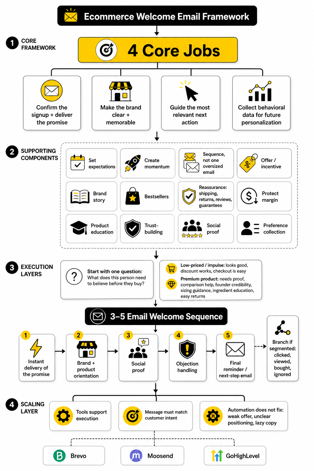
Step 1: Define the Signup Source
Before writing the sequence, identify where the subscriber came from. A homepage popup, product page popup, quiz, giveaway, checkout checkbox, landing page, and content download all create different expectations. If you ignore the source, your first email may feel disconnected.
For example, a subscriber from a discount popup wants the incentive quickly. A subscriber from a quiz wants their result or recommendation. A subscriber from a product page may already have a specific item in mind. The first email should acknowledge that context, even if the rest of the flow eventually moves into broader brand education.
This step also helps you avoid over-segmentation. You do not need twenty welcome flows if the signup intent is basically the same. But you should separate clearly different intents, because the first message needs to feel like a natural continuation of the action the subscriber just took.
Step 2: Choose the Primary Conversion Path
Every welcome flow needs a main path. That path might be bestsellers, a starter bundle, a quiz result, a first-order offer, a category collection, or a product education page. Without this decision, the emails become scattered.
This is where many brands make the wrong move. They send every new subscriber to the homepage because it feels safe. But the homepage is often too broad for a new subscriber who needs direction. A curated path usually works better because it removes unnecessary choices.
Pick the path based on buying intent and product complexity. If the product is simple, send people to bestsellers or the promoted offer. If the product requires matching, send them to a quiz or guide. If the brand sells premium products, send them toward proof, comparison, or a curated starter collection.
Step 3: Map the First Five Emails
A practical welcome flow usually starts with three to five emails. That is enough to deliver the promise, introduce the brand, guide product discovery, build trust, and make one final push without feeling chaotic. The exact number depends on the category and sales cycle.
A simple five-email structure can look like this:
The spacing should feel human. For many stores, email one goes out immediately, email two arrives within the next day, and the remaining emails follow over the next several days. High-consideration products may need slower pacing. Fast-moving discount-led offers may need tighter timing.
Step 4: Add Behavior-Based Branches
Once the core flow is live, behavior-based branches can make it more carefully. The easiest branches are based on purchase, click behavior, and engagement. You do not need advanced personalization to make this useful.
If someone purchases after email one, move them out of the prospect welcome flow and into a post-purchase experience. If someone clicks a product category, follow up with more relevant products or education. If someone does not open or click, test a different angle instead of sending the exact same message again.
Useful branches include:
This is where automation platforms matter. Tools like Brevo and Moosend can support ecommerce-friendly automation, while GoHighLevel can make sense for brands or agencies that want broader CRM, funnel, and customer journey control in one place. The tool is not the strategy, but the right tool makes the strategy easier to execute cleanly.
Step 5: Match the Landing Page to the Email
The welcome email and landing page need to feel like the same conversation. If the email promotes a first-order offer, the landing page should reinforce the offer and make the shopping path obvious. If the email promotes a product recommendation, the click should not dump the customer into a generic category with no context.
This is especially important for paid acquisition. If someone moves from ad to popup to welcome email to landing page, each step needs to keep the same promise. When the message changes too much, trust drops and the customer has to re-evaluate the brand all over again.
For brands that need dedicated landing pages for welcome offers, seasonal campaigns, bundles, or product education, a page builder like Replo can be useful. The point is not to create prettier pages for the sake of it. The point is to give each welcome email a destination that matches the intent of the click.
Step 6: Test One Variable at a Time
Testing is where welcome flows improve. But testing only works when you keep it focused. If you change the subject line, offer, layout, CTA, product selection, and timing all at once, you will not know what caused the result.
Start with the variables that affect the biggest decisions. Test the offer structure. Test the primary CTA. Test the first-email timing. Test a bestseller path against a quiz path. Test review-led proof against product education. These tests can reveal what new subscribers actually need before they buy.
Track more than opens. Open rates can be useful, but privacy changes and inbox behavior make them less reliable as the main performance metric. Clicks, revenue per recipient, first-purchase rate, and unsubscribe rate usually tell a clearer story for ecommerce welcome flows.
Step 7: Remove People From the Flow at the Right Time
A welcome flow should not keep selling like nothing happened after someone buys. Once the subscriber becomes a customer, their context changes. They need order reassurance, product usage help, delivery updates, review prompts, replenishment reminders, cross-sells, or loyalty messaging.
This is a basic detail, but it matters. Sending a “use your first-order discount” email after someone already bought feels careless. It tells the customer the brand is not paying attention. That is the opposite of what automation is supposed to do.
Set clear exit rules. Remove or skip subscribers when they purchase, unsubscribe, become inactive for a defined period, or enter a higher-priority flow such as abandoned cart or post-purchase. Clean logic protects the customer experience and keeps the brand from sounding tone-deaf.
Step 8: Review the Flow Like a Customer
Before launching, go through the entire flow as a real subscriber. Sign up from the form. Wait for the email. Click every main link. Check the mobile view. Test the code. Read the landing page. Add a product to cart. Look for anything that feels confusing, repetitive, or disconnected.
This review should include more than the marketing team. Ask someone who has not stared at the flow for hours to go through it. Fresh eyes catch unclear copy, broken assumptions, and awkward transitions much faster.
The final test is simple: does the sequence make buying feel easier? If yes, you are close. If the subscriber has to work too hard to understand the offer, choose the product, trust the brand, or find the next step, the welcome flow needs more tightening.
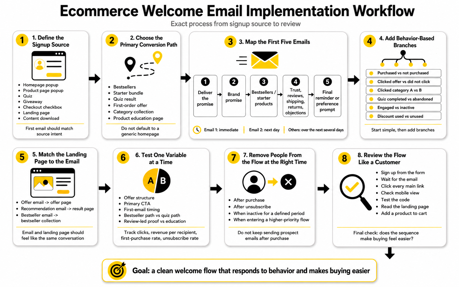
Statistics and Data That Actually Matter
Benchmarks are useful, but only when you know what they are for. A benchmark should not become a target you chase blindly. It should help you spot whether your welcome flow is healthy, where the friction lives, and which part of the customer journey needs attention next.
This matters because welcome emails naturally perform differently from regular campaigns. A campaign email goes to a broader audience with mixed intent. A welcome email reaches someone who just took action, so higher engagement is expected. If your welcome flow performs like a normal newsletter, that is usually a signal that the offer, timing, segmentation, or landing path is weaker than it should be.
The smartest way to measure welcome email examples ecommerce teams build is to separate curiosity metrics from business metrics. Opens tell you something about inbox attention, but they do not prove buying intent. Clicks tell you the message created enough interest to move someone. Purchases, revenue per recipient, and first-purchase rate tell you whether the flow actually helped the business.
Open Rate Shows Attention, Not Revenue
Open rate is still worth watching, but it has to be handled carefully. Privacy changes have made opens less reliable as a clean engagement signal, especially for lists with a large Apple Mail audience. Apple’s Mail Privacy Protection can preload tracking pixels, which means an “open” may not always represent a human reading the email Apple Mail Privacy Protection impact.
That does not mean open rate is useless. It can still help you compare subject lines inside the same audience, spot major deliverability issues, and notice when a welcome email is being ignored. But it should not be the main metric you use to decide whether the welcome flow is working.
For welcome emails, a weak open rate usually points to one of four issues. The subject line may not match the signup promise. The sender name may not be recognizable. The email may be arriving too late. Or the subscriber source may be low-quality, such as a giveaway list that never had real buying intent.
Use open rate to ask better questions, not to declare victory. A high open rate with poor clicks means people were curious but not convinced. A high open rate with strong purchases means the message and offer are aligned. A low open rate on the first email means something is broken very early in the relationship.
Click Rate Shows Message Strength
Click rate is usually a more useful signal than open rate because it shows action. The subscriber did not just notice the email. They found something valuable enough to click. In a welcome sequence, that click might go to a product, collection, quiz, offer page, size guide, review page, or educational resource.
A low click rate often means the email is trying to do too much or not enough. If there are too many CTAs, the reader may not know where to go. If the copy is generic, they may not feel a reason to click. If the product path is vague, the email may create interest but not direction.
Klaviyo’s ecommerce welcome guidance reports that welcome emails average a 51% open rate, while top-performing welcome emails can reach 15% click rates and placed order rates near 10% welcome email benchmark guidance. That does not mean every store should expect those numbers immediately. It means welcome emails have enough natural intent that weak click behavior deserves attention.
The action is straightforward: look at the click map. If everyone clicks the discount code but not the products, your offer may be stronger than your merchandising. If people click a product category but do not buy, the landing page or product page may need work. If no CTA gets meaningful clicks, the email probably lacks a clear value proposition.
Click-To-Open Rate Shows Whether the Email Kept Its Promise
Click-to-open rate is useful because it looks at what happened after the open. It asks a sharper question: once people opened the email, did the content make them act? That makes it a helpful diagnostic metric for welcome email quality.
A strong open rate with a weak click-to-open rate usually means the subject line did its job, but the email body did not. The promise may be buried. The offer may be unclear. The design may be distracting. The CTA may be weak. Or the email may not match the reason the subscriber joined.
This is why click-to-open rate is valuable when comparing different welcome email versions. If two subject lines create similar opens but one email gets more clicks from those opens, the second email is probably doing a better job of turning attention into intent. That is more useful than celebrating opens alone.
Do not overcomplicate this. If people open but do not click, improve the message. Tighten the headline. Move the offer higher. Make the product path clearer. Remove secondary CTAs that distract from the main action.
Conversion Rate Shows Whether the Click Was Worth Anything
Conversion rate tells you whether the email attracted the right click. A welcome email can have a good click rate and still fail commercially if the landing page, product offer, price, proof, or checkout experience does not support the purchase. That is why conversion rate should be read together with click rate, not separately.
Omnisend’s 2025 ecommerce marketing report found that automated emails made up only 2% of total email volume but drove 37% of email-driven sales, with one in three people who clicked an automated message going on to purchase 2025 ecommerce automation data. That is the important lesson: automated flows work because they are behavior-based and timely, not because automation is magically better.
For welcome flows, conversion rate helps you find the gap between interest and trust. If people click but do not buy, they may need stronger reviews, clearer sizing, better product comparison, a stronger guarantee, more transparent shipping, or a landing page that matches the email better. The email is only one part of the conversion path.
The fix depends on where the drop happens. If clicks go to a collection page and users bounce, the collection may be too broad. If users reach product pages but do not add to cart, the product page may lack proof or clarity. If add-to-cart is healthy but checkout completion is weak, the problem is likely price surprise, shipping, payment options, or discount-code friction.
Revenue Per Recipient Keeps the Flow Honest
Revenue per recipient is one of the cleanest ecommerce welcome flow metrics because it connects the email to business value. It shows how much revenue the flow generates across everyone who receives it, not just the people who click. That makes it useful for comparing subject lines, offers, segments, and entire sequence versions.
This metric also prevents misleading conclusions. A version with fewer clicks may still win if the clicks are more qualified and the orders are larger. A discount-heavy version may create more orders but lower margin. A product-education version may produce fewer immediate purchases but better average order value or repeat purchase behavior.
Revenue per recipient should be tracked by email and by full flow. Looking at individual emails helps you see where revenue is created. Looking at the full flow helps you avoid killing an email that assists conversion later. Some emails do not close the sale directly, but they may increase trust, reduce doubt, or guide the buyer toward the product they eventually purchase.
The practical move is to compare revenue per recipient across segments. Homepage popup subscribers may behave differently from quiz subscribers. Paid traffic subscribers may behave differently from organic content subscribers. First-time discount seekers may behave differently from early-access subscribers. The average hides these differences.
First-Purchase Rate Is the Welcome Flow’s Core Business Metric
The welcome flow exists to help turn new subscribers into customers. That makes first-purchase rate one of the most important metrics in the entire system. It tells you what percentage of new subscribers become buyers after entering the flow.
This is the metric that keeps the team focused on the real outcome. A welcome series can have nice design, high opens, decent clicks, and still underperform if it does not help enough people make their first purchase. The point is not engagement for its own sake. The point is profitable customer acquisition and a better first buying experience.
Track first-purchase rate over a defined window, such as 7, 14, or 30 days after signup. The right window depends on the product. A low-priced impulse item may convert quickly. A premium product, considered gift, or technical item may need a longer buying window.
Then compare first-purchase rate by source and offer. If quiz leads convert better than discount popup leads, that tells you something important about intent. If product-page signups convert better than homepage signups, you may want different welcome paths. If paid social signups convert poorly, the ad promise may be attracting the wrong audience.
Unsubscribe and Spam Complaint Rates Show When the Flow Becomes Too Aggressive
Unsubscribes are not automatically bad. Some people will join, get the offer, and leave. That is part of email marketing. But sudden spikes in unsubscribes or spam complaints are a warning that the welcome flow is breaking trust.
This usually happens when the message does not match the signup expectation. Someone joins for a guide and immediately receives hard-sell discount emails. Someone joins for early access and gets generic promotions. Someone buys and still receives prospect emails pushing a first-order code. These mistakes make automation feel careless.
Unsubscribe rate should be reviewed by email position. If email one causes a spike, the signup promise and first message are misaligned. If email four or five causes the spike, the sequence may be too long, too repetitive, or too promotional. If spam complaints rise, the list source, consent language, or sending frequency needs serious review.
The action is not always to send fewer emails. Sometimes the fix is better segmentation, clearer expectations, or more useful content between sales pushes. The welcome flow should feel like a helpful guided path, not a brand grabbing the subscriber by the collar.
Deliverability Metrics Protect the Whole Program
Deliverability is not glamorous, but it decides whether your welcome emails even get a chance. If inbox placement is weak, the best copy in the world will not matter. The welcome flow should be monitored for bounces, spam complaints, sudden engagement drops, and unusual domain-level issues.
This is especially important because welcome emails often go to new addresses. Some will be mistyped. Some will be low-quality leads. Some may come from bots or fake signup attempts if your forms are not protected. A messy signup source can damage the performance of the entire email program.
Watch these deliverability signals:
If you see a problem, do not just rewrite the welcome email. Check the acquisition source, form protection, consent language, sender reputation, authentication setup, and email frequency. Deliverability problems are often system problems, not copy problems.
Benchmarks Should Be Used as Ranges, Not Rules
Benchmarks are directional. They help you understand whether your performance is obviously weak, healthy, or unusually strong. They should not be treated like universal laws because category, price point, traffic source, brand awareness, list quality, offer strength, and product complexity all change the numbers.
Salesforce’s benchmark guidance puts a typical email click-through rate in the 2% to 5% range while noting that performance varies by industry, business size, email type, and historical baseline email benchmark guidance. Welcome flows often outperform broad campaigns because they are triggered by recent intent, but that does not mean every welcome email should be judged against the same number.
A new apparel brand with cold paid-social traffic should not compare itself directly to a beloved beauty brand with strong organic demand. A $25 impulse product should not use the same conversion expectations as a $400 premium item. A brand using a clear first-order offer should not compare too literally with a brand that refuses discounts and relies on education.
Use benchmarks in three ways:
Your best benchmark is still your own historical performance. Once the flow is live, your job is to improve against your own baseline while keeping an eye on broader industry ranges.
The Measurement System Should Follow the Customer Journey
Good analytics does not start inside the email platform. It starts with the customer journey. You need to know where the subscriber came from, what they received, what they clicked, where they landed, what they bought, and what happened after the first purchase.
That requires clean tracking. Use consistent UTM parameters on email links so traffic and revenue can be analyzed outside the email platform. Google’s ecommerce measurement documentation explains that ecommerce events help track shopping behavior, product popularity, promotions, and revenue impact across the buying journey GA4 ecommerce measurement.
At a minimum, your tracking should identify:
This is where the analytics system becomes practical. You are not collecting data to make a dashboard look impressive. You are collecting data so you can decide what to fix next.
How to Read the Data and Choose the Next Action
The data should point to action. If it does not, the report is too noisy. Every metric should help you make a decision about copy, creative, timing, segmentation, offer, landing page, product merchandising, or checkout friction.
A simple diagnosis model works well:
This is the difference between reporting and optimization. Reporting says, “Email two has a 3.4% click rate.” Optimization asks, “What does that tell us, and what should we change?” The second question is where money is made.
The Metrics Dashboard for a Serious Welcome Flow
A serious welcome flow should have one simple dashboard that the team can review consistently. It does not need to be fancy. It needs to make the next decision obvious.
Track the full flow first, then each email. The full-flow view tells you whether the welcome sequence is doing its job overall. The email-level view tells you which message needs improvement. The segment-level view tells you which subscribers are worth treating differently.
A practical dashboard should include:
Once that dashboard exists, the welcome flow becomes easier to manage. You are no longer guessing based on screenshots, opinions, or someone’s favorite example. You are using real behavior to improve the first customer experience.
Advanced Considerations Before You Scale the Welcome Flow
A welcome flow becomes more complicated as the store grows. More products, more traffic sources, more customer types, more markets, and more acquisition campaigns all create more variation. That is when a simple welcome sequence can either become a serious growth asset or a messy automation that nobody fully understands.
The goal is not to build the most complex system possible. The goal is to build the simplest system that still responds intelligently to customer intent. Complexity only helps when it makes the customer experience clearer, more relevant, or more profitable.
This is where many ecommerce teams get stuck. They look at welcome email examples ecommerce brands publish online, then try to copy the visible email without thinking about the backend logic. But the real advantage is usually not the screenshot. It is the segmentation, timing, offer strategy, landing page match, and lifecycle handoff behind it.
Personalization Should Feel Helpful, Not Creepy
Personalization can improve welcome emails, but only when it is based on useful context. A subscriber who clicked a product category, completed a quiz, or joined from a specific collection page has given you a meaningful signal. Using that signal to recommend a better starting point feels helpful.
The problem starts when personalization feels invasive or strangely specific. If the email acts like it knows too much, the brand can lose trust before the first purchase. This is especially risky for sensitive categories like health, wellness, beauty concerns, finances, parenting, and anything connected to identity or private life.
A better rule is simple: personalize around the shopping task, not the person’s private life. “Here are products for dry skin” is useful if the customer selected dry skin in a quiz. “We noticed you might be insecure about dry skin” is uncomfortable and unnecessary. The same data can create two very different feelings.
Good personalization in a welcome flow can include:
Bad personalization usually comes from overreaching. Just because you can use a signal does not mean you should. The best ecommerce welcome emails make the customer think, “That was useful,” not “Why do they know that?”
Discount Strategy Needs a Margin Reality Check
Discounts can work extremely well in welcome emails, but they are not free. A first-order code can increase conversion, but it can also train customers to wait for promotions, attract low-intent subscribers, and weaken perceived value. If the brand already has tight margins, the welcome discount needs to be tested carefully.
The first question is whether the incentive matches the product and customer. A simple percentage discount may work for apparel, accessories, beauty, and low-friction consumer products. Free shipping may work better when shipping cost is the main objection. A bundle offer may work better when the brand wants to increase average order value.
The second question is whether the discount is doing work that better messaging could do instead. If customers are hesitating because they do not understand the product, a code may not fix the real problem. Product education, reviews, comparison help, sizing clarity, or a stronger guarantee may convert more profitably.
Common welcome offer options include:
Do not choose the offer because competitors use it. Choose it because it moves the right customer toward the right first purchase without damaging the economics of the business.
Segmentation Can Help or Hurt Depending on Discipline
Segmentation is powerful, but messy segmentation creates operational drag. If every campaign, popup, traffic source, and product category gets its own welcome flow, the team may end up managing a system that is too complex to optimize. That is how brands end up with outdated emails, broken logic, conflicting offers, and subscribers receiving the wrong message.
A better approach is to segment only when the difference changes the message. If two subscriber groups need the same first offer, same product path, and same trust-building sequence, they probably do not need separate flows. If their buying intent, product need, or offer expectation is different, segmentation makes sense.
Start with a few meaningful branches. Discount subscribers, quiz subscribers, product-page subscribers, and post-purchase subscribers usually deserve different treatment. After that, let data prove which extra branches are worth building.
Useful segmentation questions include:
Segmentation should make the flow easier for the customer and more profitable for the brand. If it only makes the automation map look impressive, cut it.
The Welcome Flow Must Coordinate With Other Automations
The welcome flow does not live alone. It overlaps with abandoned cart, browse abandonment, post-purchase, winback, loyalty, referral, review request, replenishment, and promotional campaigns. If these automations are not coordinated, the subscriber experience can get messy fast.
For example, a new subscriber might enter the welcome flow, browse a product, abandon a cart, receive a discount reminder, get a promotional campaign, and then receive another welcome email on the same day. Each email may make sense individually, but together they feel noisy. That noise reduces trust and can increase unsubscribes.
The fix is flow priority. High-intent behavior should usually take precedence. If someone abandons a cart, the cart flow may temporarily matter more than the next brand-introduction welcome email. If someone purchases, the post-purchase flow should replace prospect messaging. If someone is inactive, the brand may need to slow down rather than keep pushing.
A clean automation hierarchy might look like this:
This hierarchy does not need to be universal. The point is to decide what matters most so the customer does not get caught in conflicting messages.
SMS and Messenger Should Not Be Added Just Because They Exist
Adding SMS, WhatsApp, Messenger, or Instagram DM automation can improve the welcome journey in the right context. But it can also feel aggressive if the customer did not clearly ask for that channel. Email is already a permission-based channel. More channels require even more care.
The strongest use case is when the channel genuinely improves speed or convenience. SMS can work for time-sensitive offers, delivery updates, or VIP early access. Messenger or Instagram automation can work when the brand is already driving subscribers from social conversations. But none of these should be used as a blunt-force replacement for better email strategy.
Tools like ManyChat can support automated conversations across social and messaging channels, but the logic still has to respect intent. A customer who joined an email list did not automatically ask to be chased everywhere else. The transition into another channel should feel optional, valuable, and clearly explained.
A safe approach is to invite, not force. Offer SMS for order updates, launch reminders, or exclusive access. Offer chat automation when the shopper needs product guidance. Keep the main welcome flow strong enough that extra channels support it instead of compensating for weak email.
AI Can Speed Up Execution, but It Cannot Own the Strategy
AI can help ecommerce teams draft subject lines, summarize reviews, suggest product groupings, create testing ideas, and personalize email blocks. That can save time. But AI should not be allowed to invent claims, exaggerate benefits, or write emails that the brand cannot support.
This matters because welcome emails are often the first serious trust moment. If the copy overpromises, sounds generic, or makes unsupported claims, the brand may win a click and lose credibility. AI-generated copy needs human editing, product knowledge, legal common sense, and brand judgment.
A practical AI workflow is to use it for speed, then edit for truth. Ask it for headline options, objection angles, review themes, or CTA variations. Then check every claim against the actual product, reviews, policies, and customer experience. The final email should sound like the brand, not like a generic ecommerce template.
AI is best used for:
AI is risky for:
If a human would not feel comfortable defending the statement to a customer, it should not go into the welcome email.
Compliance Is Part of the Customer Experience
Compliance is not just a legal checkbox. It is part of how the brand earns trust. Clear consent, easy unsubscribe, accurate claims, and honest offers all make the welcome experience feel more professional.
This is especially important when the welcome flow uses discounts, urgency, personalization, reviews, or SMS. A countdown timer that resets forever is not urgency. A “limited time” offer that never ends is not honest. A review snippet taken out of context can mislead. These things may improve short-term clicks, but they weaken the brand.
The basics matter:
A professional welcome flow should feel safe to receive. That is not soft. It is good business.
International Stores Need Localized Welcome Logic
If the store sells across countries, one generic welcome flow may not be enough. Shipping times, currency, return policies, taxes, product availability, language, and compliance expectations can change by market. A welcome email that works in one country can create confusion in another.
Localization is not only translation. It is making the buying path feel native to the customer. That can mean showing the right currency, linking to the right collection, mentioning local shipping thresholds, adjusting seasonal references, or removing products that are not available in that region.
The most important localization points are practical:
Do not localize everything at once. Start with the details that affect purchase confidence. If customers are unsure what they will pay, when the order will arrive, or whether they can return it, the welcome flow will struggle no matter how polished the copy is.
Creative Consistency Matters More as the Brand Grows
A small store can get away with a welcome email that feels slightly different from the website. A larger brand cannot. As more people, tools, campaigns, agencies, and freelancers touch the customer journey, consistency becomes harder and more important.
The welcome flow should match the brand’s visual and verbal system. The tone should feel like the website. The offer should match the popup. The product names should match the product pages. The promise should match the ads. The design should support the same hierarchy customers see elsewhere.
This is not about being boring. It is about reducing cognitive friction. When every step feels connected, the customer does not have to keep re-learning what the brand is saying. That makes the experience feel more trustworthy.
A useful brand consistency check includes:
Creative inconsistency is expensive because it forces the customer to do extra work. The welcome flow should remove friction, not add it.
Scaling Requires Documentation, Not Just Automation
Once the welcome flow starts generating revenue, it needs documentation. This sounds boring, but it is what prevents the system from breaking later. If nobody knows why an email exists, what segment it serves, what offer it uses, or when it should be updated, the flow becomes fragile.
Documentation is especially important when multiple people touch the system. A copywriter may update the email. A designer may change the layout. A retention marketer may adjust the timing. A developer may change the popup. A founder may request a new offer. Without documentation, small changes can create big inconsistencies.
At minimum, document:
This is where many brands mature. They stop treating the welcome flow like a set of emails and start treating it like a revenue system. That shift matters.
When to Keep the Flow Simple
Not every store needs advanced branching, AI product blocks, SMS, quizzes, and localized paths on day one. If the brand is early, traffic is small, or the catalog is simple, complexity can slow everything down. A clean three-email flow can outperform a bloated system if the message is sharper.
The simple version should still be strategic. Deliver the promise. Explain the brand. Guide the first product choice. Add proof. Make the next step obvious. That is enough to start.
Keep the flow simple when:
Simple does not mean lazy. It means focused. A simple welcome flow with clear intent is far better than an advanced automation map full of weak emails.
When to Build a More Advanced System
A more advanced welcome system makes sense when the brand has enough traffic, enough product variety, and enough behavioral data to justify it. At that point, treating every subscriber the same leaves money on the table. The brand can start matching different customer paths with different messages.
This is where welcome flow strategy becomes lifecycle strategy. The welcome sequence should connect acquisition, merchandising, segmentation, conversion, post-purchase, retention, and customer research. It becomes one of the most useful learning systems in the business.
Build a more advanced system when:
The key is to earn complexity. Do not build advanced logic because it looks impressive. Build it because the customer experience and the numbers both justify it.
The Biggest Welcome Flow Risks to Avoid
Most welcome flow problems are predictable. They come from unclear intent, weak handoffs, messy automation, or overconfidence in one tactic. The brands that avoid these mistakes usually perform better because they respect the customer’s attention.
The first big risk is sending a generic welcome email to every subscriber. The second is relying too much on discounts. The third is building a flow that keeps selling after the customer already purchased. The fourth is tracking the wrong numbers and optimizing for opens instead of first-purchase quality.
Avoid these mistakes:
The welcome flow is not the place for sloppy execution. It is the start of the customer relationship. Treat it that way.
The Expert-Level Mindset
The best ecommerce operators do not ask, “What welcome email should we send?” They ask, “What does this customer need next?” That shift changes everything.
A new subscriber may need the offer. They may need reassurance. They may need product guidance. They may need education. They may need a reason to believe the brand. The welcome flow should respond to those needs in a clear order.
That is why the strongest welcome email examples ecommerce teams study are not just beautiful designs. They are structured customer journeys. Each email has a job, each click has a destination, and each metric tells the team what to improve next.
Welcome Email Templates, Checklist, and FAQ
At this point, the welcome flow should be clear as a system. It starts with the subscriber’s intent, delivers the promise, guides the first product decision, builds trust, measures the right behavior, and hands buyers into the next stage of the customer journey. That is the difference between a welcome email and a welcome engine.
The useful thing about studying welcome email examples ecommerce brands publish is that you can see patterns. The risky thing is copying the surface-level design without understanding the strategy. A welcome email is not good because it has a nice hero image or a clever headline. It is good because it helps the right person take the next step with less doubt.
The final step is turning that strategy into repeatable assets. Templates help you move faster. A checklist keeps the team honest. The FAQ removes common confusion before it turns into a bad implementation decision.
Simple Welcome Email Template for a Discount Offer
Use this when the subscriber joined because they wanted a first-order incentive. Keep it direct, because the customer’s expectation is clear. The email should deliver the offer quickly, then add just enough brand value to make the purchase feel worth it.
Subject line ideas:
Email structure:
Example copy framework:
Thanks for joining us. Your first-order offer is ready, and the easiest place to start is with our customer favorites.
Use your code at checkout and choose the product that fits what you need right now. If you are new here, start with the bestsellers because they are the products customers come back to most often.
Simple Welcome Email Template for a Brand Introduction
Use this when the brand needs to explain its difference before pushing too hard for the sale. This works well for premium products, founder-led brands, mission-led brands, and stores where the customer needs trust before buying. The goal is not to write a full origin story. The goal is to make the brand easier to remember.
Subject line ideas:
Email structure:
Example copy framework:
Most products in this category make the buying decision harder than it needs to be. We built ours around a simpler idea: help customers choose confidently, use the product easily, and feel good about coming back.
Start with the collection we recommend for first-time buyers. It gives you the clearest path into the brand without making you sort through everything at once.
Simple Welcome Email Template for Product Guidance
Use this when the biggest obstacle is choice. If the customer does not know which product to buy first, do not send them to a broad homepage and hope they figure it out. Give them a short path.
Subject line ideas:
Email structure:
Example copy framework:
If you are new here, you do not need to browse everything. Start with the option that matches what you care about most.
Choose the everyday favorite if you want the safest first pick. Choose the bundle if you want better value. Choose the specialist product if you already know the exact problem you want to solve.
Simple Welcome Email Template for Social Proof
Use this when trust is the main barrier. This is useful for new brands, expensive products, personal products, or categories where shoppers rely heavily on customer experience before buying. The email should not scream “people love us.” It should show believable proof that helps the subscriber feel safer.
Subject line ideas:
Email structure:
Example copy framework:
Trying a new brand should not feel like a gamble. That is why we pay attention to what first-time buyers mention most: the product is easy to choose, simple to use, and backed by a customer experience that does not make things complicated.
Start with the products customers review most often, then choose the one that fits your need best.
Simple Welcome Email Template for Preference Collection
Use this when the brand has multiple customer types or product paths. The email should feel like a helpful shortcut, not a survey. Ask one practical question and use the answer to personalize the next step.
Subject line ideas:
Email structure:
Example copy framework:
We can make this easier. Tell us what you are looking for, and we will point you toward the most relevant products instead of sending you everything.
Choose the option that fits you best, and we will use that to make your next email more useful.
Final Welcome Flow Checklist
Before the welcome flow goes live, check it like a customer, not like a marketer. The subscriber does not care how clever the automation is. They care whether the experience makes sense.
Use this checklist before publishing:
A welcome flow does not need to be perfect before launch. It needs to be coherent, trackable, and easy to improve. That is enough to start producing useful data.
Recommended Tool Stack for Ecommerce Welcome Flows
The tool stack should match the maturity of the business. A small store does not need a complicated setup. A growing store needs cleaner segmentation, better landing pages, stronger automation, and a measurement system the team can actually trust.
A practical stack can include:
Do not buy tools to avoid making strategic decisions. The best platform will not fix a vague offer, weak product positioning, poor landing page, or confusing customer journey. Tools should make a strong strategy easier to execute.
What is a welcome email in ecommerce?
A welcome email is the first marketing email a new subscriber receives after joining an ecommerce brand’s list. It usually confirms the signup, delivers the promised offer or resource, and guides the subscriber toward a useful next step. In ecommerce, that next step is often a first purchase, product discovery, quiz completion, or category visit.
A good welcome email does more than say hello. It helps the shopper understand why the brand matters, what to buy first, and why they can trust the store. That is why welcome email examples ecommerce brands use should be judged by clarity and customer movement, not just design.
How many emails should an ecommerce welcome flow have?
Most ecommerce brands should start with three to five welcome emails. That is usually enough to deliver the promise, introduce the brand, show product guidance, add trust, and make a final useful prompt. A longer flow can work, but only if each email adds something new.
The right length depends on the product. A simple impulse product may need fewer emails. A premium, technical, or personal product may need more education and reassurance before the first purchase. The key is to avoid repeating the same sales message over and over.
What should the first welcome email include?
The first welcome email should include the reason the subscriber joined. If they signed up for a discount, show the code clearly. If they took a quiz, deliver the result or next step. If they requested early access, confirm what happens next.
It should also include one primary CTA and a short reason to trust the brand. Do not overload the first email with every brand story, product category, social link, and promotion. The first email should feel like a clean continuation of the signup experience.
Should ecommerce welcome emails include a discount?
A discount can work, but it is not always the best choice. If the customer is price-sensitive or the category is competitive, a first-order incentive may help convert new subscribers. If the brand sells premium products or has tight margins, education, bundles, free shipping, samples, or better product guidance may be more carefully.
The real question is what is stopping the customer from buying. If the obstacle is price, a discount may help. If the obstacle is confusion, low trust, unclear sizing, weak product education, or poor landing page alignment, a discount may hide the real problem instead of fixing it.
What is a good subject line for an ecommerce welcome email?
A good welcome subject line should match the subscriber’s intent. If they joined for a discount, the subject line should make the offer clear. If they joined for guidance, the subject line should promise a helpful next step. Cleverness is optional. Clarity is not.
Examples include “Your first-order code is inside,” “Welcome - start here,” “Your recommendations are ready,” and “Not sure where to start?” The best subject line depends on what the subscriber expected when they signed up.
When should the first welcome email be sent?
The first welcome email should be sent immediately after signup. The subscriber’s attention is highest right after they take action, so delaying the first email wastes intent. This is especially true if the signup form promised a discount, guide, quiz result, or early access confirmation.
Later emails can be spaced over several days depending on the product and buying cycle. Fast-moving products can use tighter timing. Higher-consideration products often need a slower sequence that gives the customer time to understand the offer and compare options.
What metrics should ecommerce brands track for welcome emails?
The most useful metrics are click rate, click-to-open rate, placed order rate, first-purchase rate, revenue per recipient, unsubscribe rate, spam complaint rate, and revenue by signup source. Open rate can still be watched, but it should not be the main success metric because opens are less reliable than clicks and purchases.
The point is to understand where the flow breaks. Low opens suggest a subject line, sender, timing, source, or deliverability issue. High opens but low clicks suggest weak email content. High clicks but low purchases suggest landing page, product page, pricing, proof, or checkout friction.
What is the biggest mistake ecommerce brands make with welcome emails?
The biggest mistake is treating the welcome email like a generic greeting instead of a customer journey. A weak welcome email says, “Thanks for subscribing.” A strong welcome flow says, “Here is what you asked for, here is why this brand matters, here is the easiest place to start, and here is why you can buy with confidence.”
Another common mistake is sending everyone the same message. A quiz subscriber, discount subscriber, product-page subscriber, and first-time buyer may need different next steps. The more the welcome flow respects intent, the better it usually performs.
Should welcome emails link to the homepage?
Usually, the homepage is not the best destination. It can work if the homepage is extremely clear and designed for first-time buyers, but many ecommerce homepages are too broad. A new subscriber often needs a more guided path.
Better destinations include a bestseller collection, starter kit, quiz result page, category page, welcome offer landing page, sizing guide, or curated product page. The click should continue the promise made in the email. If the email says “start with our bestsellers,” the button should not dump the shopper onto a generic homepage.
How often should a welcome flow be updated?
Review the welcome flow at least once per quarter, and sooner if the brand changes its offer, product catalog, positioning, shipping policy, or acquisition strategy. A flow that worked six months ago may become outdated if products, customer objections, or traffic sources change. Welcome emails are not set-and-forget assets.
The review should include performance data and customer experience. Check the metrics, but also sign up like a real customer and click through the full path. Broken links, expired codes, outdated product references, and mismatched landing pages can quietly damage performance.
Can AI write ecommerce welcome emails?
AI can help draft welcome emails, but it should not be trusted without editing. It can generate subject line ideas, outline flows, summarize review themes, and create first drafts. A human still needs to verify claims, adjust the brand voice, check the offer, and make sure the email matches the actual customer journey.
This matters because welcome emails build trust early. If AI copy exaggerates benefits, invents urgency, or sounds like a generic template, it can hurt the brand. Use AI for speed, but keep strategy and final judgment human.
What makes the best welcome email examples ecommerce brands should study?
The best examples are clear, intentional, and connected to a real customer action. They do not just look good. They deliver the promised value, explain the brand quickly, guide product discovery, remove doubt, and send the subscriber to the right next page.
When studying examples, look beyond the design. Ask what the email is trying to accomplish, what customer objection it addresses, what CTA it uses, and how the landing page continues the journey. That is where the real lesson is.
Build a stronger local presence with BAAM AI
Turn your website, Google profile, social channels, and AI visibility into one growth engine
Most businesses do not need more random marketing activity. They need a consistent presence system that helps the right people find them, trust them, and take action. BAAM AI brings strategy, local SEO, website updates, Google Maps visibility, social content, AI-search readiness, media production, and reporting into one practical monthly engine.
If you want your marketing to keep working after the campaign ends, start with a free BAAM AI presence audit. See how your business shows up today and where the fastest visibility wins are at BAAM AI.