BAAM AI Blog
UX Copywriter: What the Role Really Does and How to Build Copy That Makes Products Easier to Use
A ux copywriter does not just “make buttons sound better.” The job is to help people understand what is happening, what they can do next, and why it matters inside a digital product. That includes button labels...
A ux copywriter does not just “make buttons sound better.” The job is to help people understand what is happening, what they can do next, and why it matters inside a digital product. That includes button labels, onboarding screens, error messages, empty states, form helper text, upgrade prompts, confirmation messages, chatbot flows, product emails, and the tiny pieces of interface language that either reduce friction or quietly create it.
The difference between good UX copy and generic copy is intent. Marketing copy often persuades someone to take interest, while UX copy helps someone complete a task with less confusion. That distinction matters because product language sits at the moment of action, where vague words, clever labels, unclear errors, and missing context can cost trust fast.
Strong UX copy is not about sounding cute, trendy, or overly branded. It is about making decisions easier. Nielsen Norman Group defines UX writing as writing information around people’s context, needs, and behavior, which is a useful baseline because it keeps the work grounded in usability rather than wordplay: UX writing should align with user needs and online reading behavior.
this guide is split into six parts so the role, process, framework, and implementation details build in the right order. Part 1 sets the foundation and gives you the full map. The rest of the article will move from strategy into practical execution, so each section can stand on its own while still feeling like one guide.
Why UX Copywriting Matters
UX copy matters because users rarely experience a product as a clean design file. They experience it as a sequence of decisions: sign up, skip, continue, confirm, cancel, upgrade, retry, save, delete, recover, or ask for help. Every one of those moments needs language that removes hesitation instead of adding more mental work.
This is why UX copy is closely tied to accessibility, product strategy, and conversion. Clear language helps users understand the interface faster, and W3C’s guidance around reading level treats understandable content as part of accessibility, especially for people with cognitive disabilities or lower reading confidence: clear writing can make content more understandable for more users. That does not mean every product must sound simplistic. It means the copy should match the user’s task, emotional state, and level of knowledge at that exact moment.
The business impact is also practical. Checkout flows, forms, onboarding steps, and self-serve product experiences often fail because the user does not know what a field means, why information is required, what happens after clicking, or how to recover from an error. Baymard’s checkout research has documented tens of thousands of usability examples across ecommerce checkout experiences, which is a reminder that small interface decisions are rarely small when they appear at scale: checkout UX depends heavily on clear forms, labels, and interaction patterns.
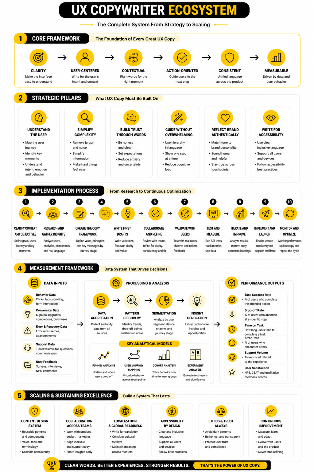
The UX Copywriting Framework
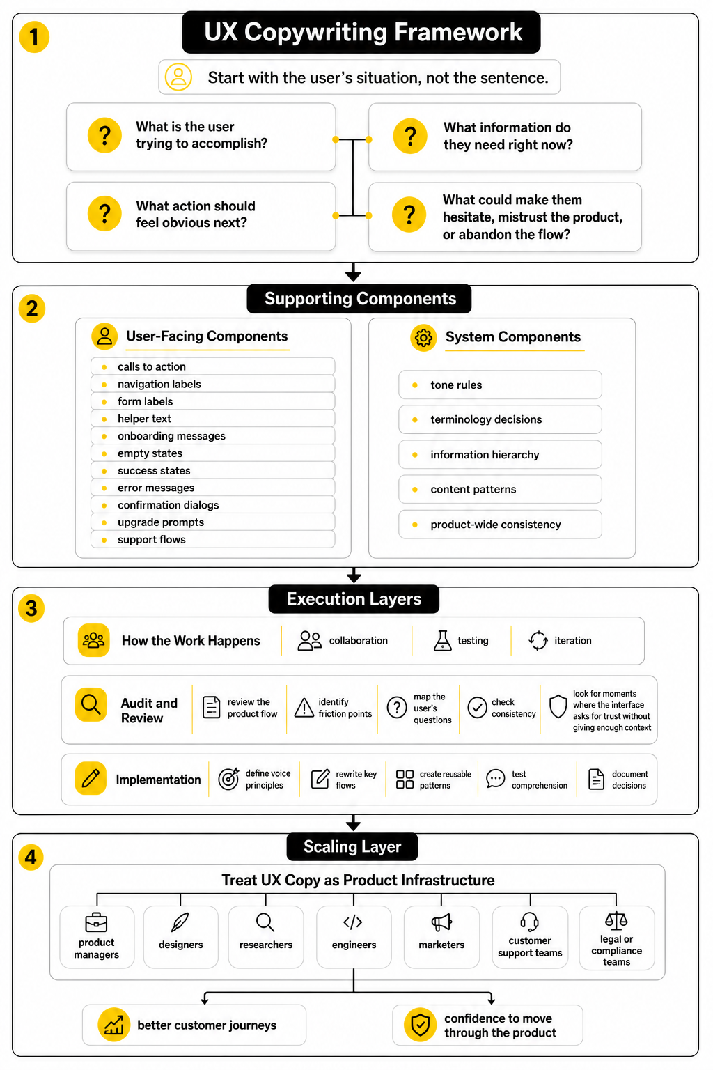
A useful UX copywriting framework starts with the user’s situation, not the sentence. Before writing a button, modal, tooltip, or onboarding step, a ux copywriter needs to understand what the user is trying to do, what they already know, what they might misunderstand, and what the product needs from them. That context turns copy from decoration into guidance.
The framework here is built around four questions. What is the user trying to accomplish? What information do they need right now? What action should feel obvious next? What could make them hesitate, mistrust the product, or abandon the flow? These questions keep the work focused on behavior instead of preference.
The same framework applies whether you are improving a SaaS onboarding flow, a checkout page, a mobile app, or a lead-generation funnel. For example, a landing page builder like Replo still needs clear product-page copy, form guidance, and post-click reassurance. A conversational flow built in ManyChat still needs user-centered prompts, recovery paths, and confirmation messages that make the next step feel safe.
Core Components of UX Copywriting
UX copy is made from small pieces, but those pieces work as a system. The most visible components are calls to action, navigation labels, form labels, helper text, onboarding messages, empty states, success states, error messages, confirmation dialogs, upgrade prompts, and support flows. The less visible components are tone rules, terminology decisions, information hierarchy, content patterns, and product-wide consistency.
The strongest UX copy usually feels obvious after it is written. It tells users what will happen, uses the same term for the same thing, avoids unnecessary cleverness, and gives recovery instructions when something goes wrong. Microsoft’s guidance on error messages is useful here because it emphasizes clear, concise, actionable language rather than blame or vague failure states: effective error messages should help users resolve issues efficiently.
This is also where many teams misunderstand the role. A ux copywriter is not only responsible for “words after design.” In a mature product workflow, they help shape the flow itself because unclear copy often exposes unclear product logic. When a button needs five words to explain itself, the real issue may be the interaction, not the sentence.
Professional Implementation
Professional UX copywriting happens through collaboration, testing, and iteration. The copywriter works with product managers, designers, researchers, engineers, marketers, customer support teams, and sometimes legal or compliance teams. The goal is not to win a writing debate; the goal is to ship language that helps real users complete real tasks.
Implementation usually starts with an audit. The ux copywriter reviews the product flow, identifies friction points, maps the user’s questions, checks consistency, and looks for moments where the interface asks for trust without giving enough context. From there, the work becomes more strategic: define voice principles, rewrite key flows, create reusable patterns, test comprehension, and document decisions so the product does not drift over time.
The best teams treat UX copy as product infrastructure. A form builder like Fillout, a chatbot tool like Chatbase, or a CRM and automation platform like GoHighLevel can all support better customer journeys, but the experience still depends on how clearly each step is framed. Tools can give you the interface. UX copy gives users the confidence to move through it.
What a UX Copywriter Actually Does
A ux copywriter writes the words people see and use while moving through a product. That sounds simple until you look at how many moments need language: sign-up screens, menus, buttons, onboarding steps, empty states, form fields, permissions, alerts, error messages, plan limits, upgrade prompts, cancellation flows, help text, and confirmation screens. The role is not about filling empty boxes with copy after the design is finished; it is about shaping the experience so the product makes sense before the user has to think too hard.
This is why the best UX copywriters behave more like product partners than traditional copywriters. They ask why a screen exists, what decision the user needs to make, what the product is asking from them, and what could make them hesitate. Nielsen Norman Group frames UX writing around information that fits people’s context, needs, and behaviors, which is the right lens because product copy lives inside a task, not in a vacuum: UX writing supports users through context-aware product information.
A ux copywriter also protects the product from vague internal language. Teams often use terms that make sense in meetings but fail inside the interface. The copywriter translates product logic into user-facing language without watering down the product, and that translation is where a lot of usability wins happen.
They Clarify the User’s Next Step
The first job of UX copy is to make the next step obvious. A button label like “Submit” might technically work, but it often hides the real action. A better label tells the user what will happen next, especially when the action involves payment, publishing, deleting, inviting someone, sending data, or changing account settings.
This does not mean every button needs a long explanation. It means the copy should carry enough meaning for the user to act with confidence. Google’s Material guidance puts this simply: clear and concise writing helps users get where they want to go, which is exactly what interface language should do: Material’s UX writing guidance emphasizes clear, concise UI text.
The same principle applies to helper text, tooltips, and confirmation messages. If the user is about to connect a CRM, generate a report, invite a client, or publish a funnel, the copy should answer the obvious question before anxiety appears. What happens after this? Can I undo it? Will anyone be notified? Is this private or public?
They Reduce Friction in Forms and Flows
Forms are where weak UX copy gets exposed fast. Users do not want to decode field labels, guess formatting rules, or wonder why a company needs certain information. A ux copywriter improves these moments by making labels specific, adding helper text only where it genuinely helps, and turning validation messages into recovery instructions.
This is especially important in checkout and lead-generation flows, where unclear form language can directly affect completion. Baymard’s checkout research tracks more than 41,000 checkout performance scores and more than 33,000 best-practice and worst-practice examples, which shows how much small interaction details matter at scale: checkout UX depends on the quality of forms, labels, and flow decisions. The copy is not the only factor, but it is often the part users rely on when the interface becomes uncertain.
A practical ux copywriter looks for friction in places most teams overlook. Are required fields marked clearly? Does the error message explain the fix? Does the placeholder disappear before it has done its job? Does the user know whether they are creating an account, requesting access, joining a waitlist, or starting a trial?
They Make Errors Useful Instead of Annoying
Error messages are not just technical leftovers. They are moments where the product has already failed to help the user complete a task, so the copy needs to be direct, calm, and useful. A bad error message says something went wrong; a good one helps the user recover.
Microsoft’s error-message guidance focuses on clear, concise, actionable language that helps users resolve issues efficiently, which is the standard every product should aim for: effective error messages should explain the issue and guide the fix. Nielsen Norman Group also emphasizes that errors should be visible, constructive, and respectful of user effort: error messages should support recovery instead of creating more frustration.
This is where tone matters, but not in the shallow “make it friendly” way. If a payment fails, a file disappears, or a user cannot access something they expected to use, cute copy can feel careless. A ux copywriter knows when to be warm, when to be plain, and when to get out of the way.
They Keep Product Language Consistent
Consistency is one of the most underrated parts of UX copywriting. If one screen says “workspace,” another says “account,” and another says “team,” users may wonder whether those words mean different things. That confusion slows people down, even when the design looks polished.
A ux copywriter helps define product terminology so the same concept has the same name across the interface, help docs, onboarding emails, upgrade pages, and support flows. This matters even more when a product grows and multiple teams start writing copy independently. Without a shared language system, the product begins to feel stitched together.
Content design teams often solve this with style guides, terminology lists, message patterns, and reusable components. GOV.UK’s content design guidance starts with user needs rather than internal preferences, which is a strong model for keeping language useful and consistent across complex services: content decisions should begin with what users need to do.
They Work Across the Whole Customer Journey
A ux copywriter usually touches more than the product interface. The same clarity that helps inside the app also matters in onboarding emails, lifecycle messages, chatbot flows, support articles, cancellation screens, and upgrade journeys. The user does not care which team owns the copy; they only experience one brand.
That is why UX copy connects naturally with tools that manage customer journeys. A team building automated follow-ups in Brevo, social scheduling in Buffer, or client pipelines in Copper still needs the same discipline: clear prompts, clear expectations, and clear next steps. The platform can organize the journey, but the copy determines whether people understand it.
This is also where the role becomes strategic. A ux copywriter can spot when the sales page promises one thing, the onboarding flow explains another, and the product UI uses a third term entirely. Fixing that gap is not just editing. It is experience design.
They Collaborate Before the Copy Is Written
Good UX copy rarely starts with a blank document. It starts in product discussions, research reviews, wireframes, design critiques, support tickets, analytics reports, and user interviews. The copywriter needs to understand the user’s mental model before deciding what the interface should say.
That collaboration changes the quality of the work. If a designer shows a confusing flow and asks for “better words,” the copywriter might improve the sentence, but the user may still struggle. If the copywriter joins earlier, they can question the structure, suggest clearer choices, reduce unnecessary steps, and help the team avoid building confusion into the product.
This is why mature teams do not treat UX copy as polish. They treat it as part of the product decision-making process. The words reveal whether the flow is clear, whether the value is obvious, and whether the user has enough confidence to keep going.
The UX Copywriting Framework
The framework is where UX copy stops being a “wordsmithing” task and becomes a repeatable product process. A ux copywriter needs a way to move from messy product context to clear interface language without guessing, over-polishing, or relying on personal taste. The goal is simple: understand the user’s task, write for the moment, test whether the language works, and turn the best decisions into reusable patterns.
The process below works for SaaS products, ecommerce flows, mobile apps, onboarding sequences, support experiences, and funnel tools. It also works when the product is still rough, because unclear copy often reveals unclear thinking. That is valuable. When the words are hard to write, the flow may need a better decision, not a better adjective.
Good UX copy is built in layers. First comes research, then structure, then drafting, then validation, then documentation. Skip one of those layers and the copy may still sound good, but it will be weaker under real user pressure.
Start With the User’s Task
The first question is not “What should this screen say?” The first question is “What is the user trying to do here?” That shift matters because UX copy is not written for a page; it is written for a moment inside a task.
A ux copywriter should define the user’s goal before touching the copy. Are they trying to create something, compare options, fix a problem, complete a purchase, recover access, invite a teammate, or understand a limitation? GOV.UK’s content design guidance is useful here because it treats user needs as the foundation for content decisions, not a decorative research step: content should be planned around what users need to do.
This is also where internal assumptions get challenged. A product team might describe a feature as “workspace provisioning,” but the user may simply think, “I’m setting up my team.” The ux copywriter’s job is to close that gap without losing accuracy.
Map the User’s Questions
Once the task is clear, map the questions that appear in the user’s mind. These questions are rarely complicated, but they are powerful. What is this? Why do I need to do it? What happens next? Can I undo it? How long will it take? Will this cost money? Will this notify someone? What happens if I skip it?
This step prevents copy from becoming too thin. Minimal copy can be elegant, but missing context is not minimalism. It is friction. Nielsen Norman Group’s UX writing guidance centers on information that fits people’s context, needs, and behavior, which is exactly why the ux copywriter has to understand the user’s questions before choosing the words: UX writing should address users’ context, needs, and behaviors.
The best way to do this is to annotate the flow. Look at each screen, modal, field, and action, then write down the user’s likely question at that point. If a screen has no clear user question, it may not need more copy. It may need less interface.
Define the Message Before the Microcopy
Microcopy should not be written one isolated label at a time. Before writing buttons, tooltips, empty states, and alerts, define the main message of the moment. The message is the point the user needs to understand; the microcopy is how that point shows up inside the interface.
For example, a pricing upgrade modal might need to communicate that the user has reached a plan limit, that upgrading adds a specific capability, and that their current work will not be lost. Those ideas need to be clear before the headline or button is written. Otherwise, the copy may sound persuasive but still fail to answer the real concern.
This is especially important in products with automations, funnels, AI assistants, or customer data. A workflow builder in GoHighLevel, a chatbot experience in Chatbase, or a conversational campaign in ManyChat can become confusing fast if the copy does not explain cause and effect. Users need to know what triggers what, who receives what, and what can be changed later.
Turn the Process Into Clear Steps
The execution process becomes tangible when the ux copywriter turns research into a simple workflow. This does not need to be heavy. It needs to be consistent enough that the team can repeat it every time a new flow, feature, or funnel is created.
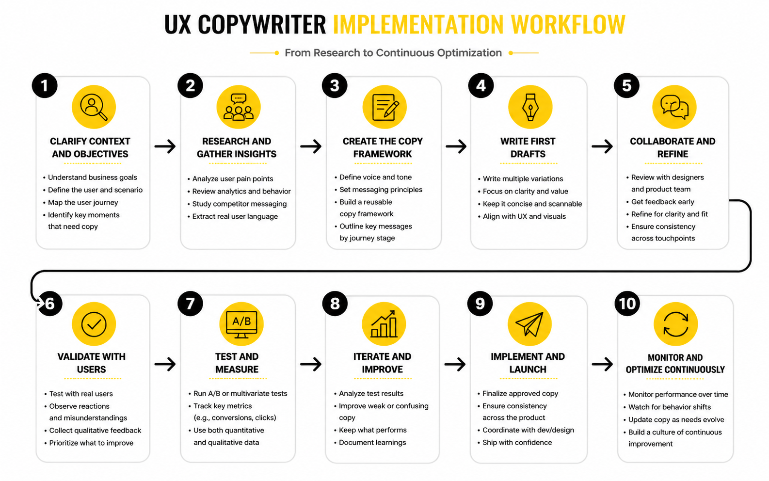
A practical UX copywriting process usually looks like this:
This step-by-step process matters because UX copy is rarely one-and-done. Products change, flows expand, and teams ship fast. Without a process, every new feature becomes a new language decision, and that is how products become inconsistent.
Draft for Clarity Before Personality
Personality can make product copy feel human, but clarity has to come first. A ux copywriter should write the plain version before adding brand voice. If the plain version is confusing, the branded version will only hide the problem for a moment.
Material’s UX writing guidance is a strong reference here because it prioritizes clear and concise UI text that helps users get where they want to go: clear UI writing helps users move through experiences. That does not mean every product should sound the same. It means brand voice should support comprehension, not compete with it.
A good drafting pass often starts with blunt copy. Say exactly what is happening, what the user can do, and what happens next. Then make it smoother, tighter, and more aligned with the brand. Never reverse that order.
Review the Copy in the Interface
UX copy should be reviewed where users will actually see it. A sentence that looks fine in a document may feel too long inside a modal. A button that looks clear in isolation may feel vague when it appears beside two other actions. Context changes everything.
This is why a ux copywriter should review copy inside wireframes, prototypes, staging environments, or live product screens whenever possible. The layout affects meaning. The surrounding UI affects priority. The user’s emotional state affects how much explanation they can tolerate.
This review should also include edge cases. What happens when the user has no data yet? What happens when a payment fails? What happens when an integration disconnects? What happens when a file is too large, a field is invalid, or a permission is missing? These are not minor details. They are the moments where users decide whether the product feels reliable.
Validate With Real Signals
Validation does not always require a huge research project. Sometimes the best signal is a usability test where users explain what they think a button will do. Sometimes it is support tickets showing that people keep asking the same question. Sometimes it is analytics showing that users abandon a step after seeing a confusing requirement.
The point is to avoid treating copy approval as an opinion contest. If three stakeholders prefer three different button labels, the deciding question should be which label users understand fastest and most accurately. That keeps the discussion grounded.
Error messages are a good example. Microsoft’s guidance emphasizes clear, concise, actionable error text that helps users resolve issues efficiently: error messages should guide users toward resolution. That is testable. If users still do not know what to fix after reading the error, the copy is not working.
Document What Works
The final step is documentation, and it is not bureaucracy. It is how teams stop solving the same copy problems every sprint. A ux copywriter should document terms, recurring patterns, voice rules, button conventions, error-message structures, empty-state formulas, and product-specific wording decisions.
This becomes especially useful when marketing, product, support, and lifecycle teams all communicate with the same users. If the product says “workspace,” the help center says “account,” and onboarding emails say “team area,” users have to do extra interpretation. A shared content system prevents that.
Documentation also makes future optimization faster. When a team builds a new signup flow in Systeme.io, launches a funnel in ClickFunnels, or creates a product page in Replo, the ux copywriter should not have to reinvent every label, prompt, and confirmation message from scratch. The system should already know what good looks like.
Statistics and Data
Measurement matters because UX copy is easy to judge subjectively if nobody defines what “better” means. One stakeholder likes shorter labels, another prefers warmer language, and someone else wants stronger conversion copy. Data does not remove judgment, but it gives the team a better question: did the new copy help users complete the task with less friction?
A ux copywriter should never dump random statistics into a product discussion just to sound strategic. The useful numbers are the ones tied to a specific user behavior. If the copy supports onboarding, measure activation signals. If it supports checkout, measure form completion and payment errors. If it supports support flows, measure issue resolution, contact rate, and repeat questions.
The strongest measurement system combines behavioral data with qualitative evidence. Analytics can show where users drop, hesitate, retry, or abandon. Research can explain why that behavior is happening. You need both, because a dashboard can tell you that a step is underperforming, but it cannot always tell you whether the problem is the copy, the design, the offer, the technical flow, or the user’s expectations.
Measure Task Success First
Task success is the cleanest starting point because UX copy exists to help people do something. If users cannot complete the task, the interface language is not doing its job. Nielsen Norman Group describes success rate as one of the simplest usability metrics because it shows whether users can complete a defined task at all: task success rate is a direct measure of usability.
For a ux copywriter, this means every important flow should have a clear task statement. “Create a workspace,” “invite a teammate,” “recover a password,” “connect an integration,” “complete checkout,” and “upgrade a plan” are measurable tasks. Vague goals like “improve the onboarding copy” are harder to measure because they do not define what user behavior should change.
The action this should drive is simple. Before rewriting copy, define the task and the completion signal. After rewriting, compare whether more users complete the task, whether fewer users make errors, and whether the flow creates fewer support questions.
Track Drop-Off Where Decisions Happen
Drop-off is useful when it is connected to a decision point. If users leave after landing on a dashboard, the copy may be part of the problem, but the cause could be broad. If users leave after seeing a required field, an upgrade modal, a permissions request, or a confirmation screen, the copy becomes a stronger suspect.
This is why measurement should follow the user journey, not just the page view. A product team should know where users pause, go back, abandon, retry, or contact support. Baymard’s checkout research is a good reminder that checkout abandonment is often tied to flow and form issues, including moments where users do not know how to complete a field or lose confidence in the process: checkout usability problems can directly cause users to abandon purchases.
The action is not to rewrite everything at once. Start with the highest-friction decision point, then inspect the copy around it. Ask whether the user understands what is being requested, why it matters, what happens next, and how to recover if something goes wrong.
Build a Simple Analytics System
A practical analytics system for UX copy should connect user behavior to copy decisions. It does not need to be complicated. It needs to be clear enough that the team can see whether the words are helping or hiding friction.
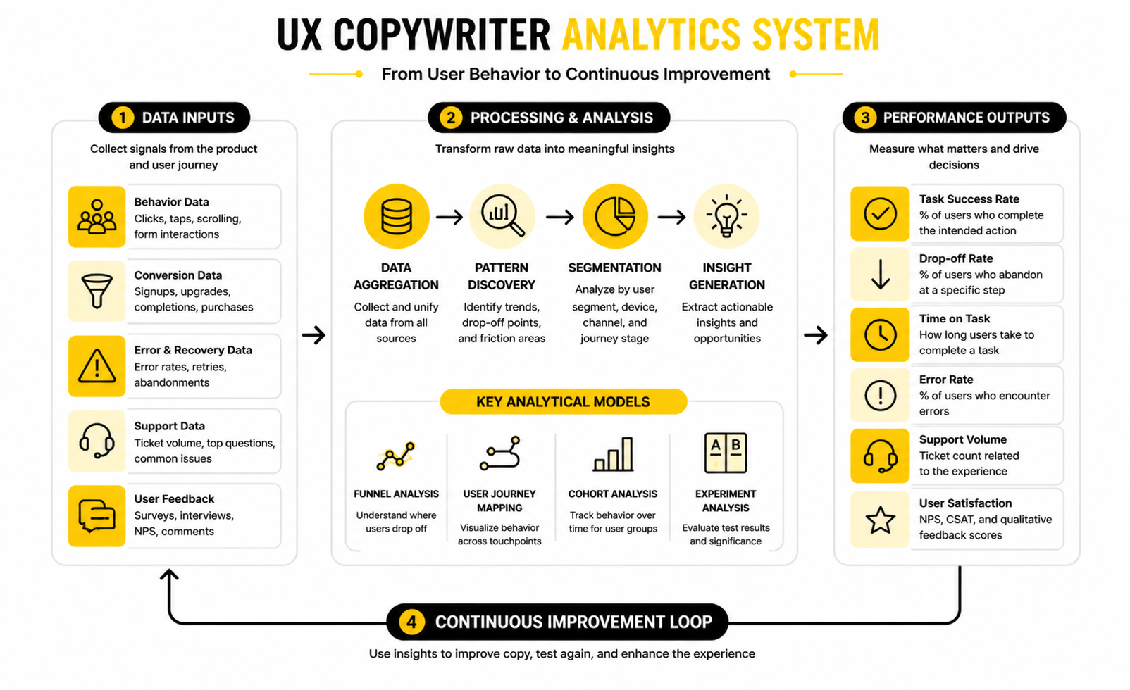
The system can be built around five signal groups:
This structure keeps measurement focused. A ux copywriter does not need to track every possible number. They need to track the signals that prove whether the language is making the product easier to use.
Interpret Time Carefully
Time on task can be useful, but it is easy to misread. Faster is usually better when the task is simple, repetitive, or low-risk. A shorter form completion time, faster password recovery, or quicker team invitation flow can suggest that the copy is reducing confusion.
But slower is not always bad. If users spend more time reviewing a pricing change, permission warning, cancellation message, or legal confirmation, that may be appropriate. The goal is not always speed. The goal is informed confidence.
A ux copywriter should interpret time alongside the task type. For routine actions, copy should reduce hesitation. For high-stakes actions, copy should reduce uncertainty, even if the user takes a little longer before clicking.
Watch Error Rates and Recovery
Error rates are one of the clearest signs that interface language is failing. If users keep entering the wrong format, skipping a required field, misunderstanding a password rule, or failing to complete a setup step, the copy should be reviewed before the team blames the user. The issue may be a label, helper text, sequencing problem, or missing example.
Error recovery matters just as much as error prevention. A vague message like “Invalid input” forces the user to diagnose the problem alone. Microsoft’s guidance on error messages emphasizes clear, concise, actionable content that helps users resolve the issue efficiently: effective error messages should help users recover.
The action is to measure what happens after the error appears. Do users fix the issue and continue? Do they repeat the same mistake? Do they abandon the flow? The answer tells you whether the error copy is working.
Use Support Data as a Copy Signal
Support tickets are a goldmine for UX copywriters because they show where the product is not explaining itself. If users keep asking what a setting means, whether an action can be undone, why a charge happened, or how to connect a tool, the interface may be under-explaining the moment. That does not mean every answer belongs on the screen, but it does mean the copy deserves review.
Support data is especially useful because it captures real language. Users describe problems in their own words, not in the company’s internal terminology. That helps a ux copywriter rewrite product language around the user’s mental model instead of the team’s vocabulary.
The action is to tag recurring questions by flow, feature, and user intent. Then compare those questions against the interface. If the same confusion appears repeatedly, the product probably needs clearer labels, better helper text, stronger confirmation messages, or a more useful empty state.
Connect UX Copy to Conversion Without Overselling It
UX copy can improve conversion, but it should not be treated like magic. A button rewrite will not fix a weak offer, broken pricing logic, slow performance, poor targeting, or a product that does not solve the user’s problem. The honest way to connect UX copy to conversion is to isolate the moment where language affects the user’s decision.
For funnels, that might mean measuring opt-in completion, checkout completion, trial activation, webinar registration, or booked calls. Tools like ClickFunnels, Systeme.io, and GoHighLevel can help teams build those journeys, but the copy still needs to make each step feel clear, credible, and worth completing.
The action is to measure conversion at the step level. Do not just ask whether the whole funnel improved. Ask whether the rewritten step reduced hesitation, answered a key objection, clarified the next action, or improved completion without creating lower-quality leads.
Benchmark Against Yourself First
Benchmarks are useful, but they can also become a distraction. A generic industry average will not tell you whether your onboarding copy is good, because your audience, product complexity, pricing, traffic source, and user intent may be completely different. Your best benchmark is usually your own baseline.
This is why a ux copywriter should document current performance before making major changes. Capture the existing completion rate, error rate, drop-off point, support volume, and qualitative feedback. Then make the improvement and compare against that baseline.
External research is still useful when it shows patterns. For example, Baymard’s work on checkout form fields shows that many checkout flows ask for more information than necessary, with older research showing average checkouts containing far more fields than optimized flows need: checkout form reduction can remove unnecessary friction. The action is not to copy a benchmark blindly. The action is to audit whether your own flow asks for more effort than the task requires.
Turn Data Into Copy Decisions
Data only matters if it changes what the team does next. If users abandon a permissions screen, the copywriter might clarify why access is needed and what will happen after approval. If users repeat the same form error, the fix might be a clearer label, format example, or inline validation message. If users misunderstand an upgrade prompt, the copy may need to explain the limit, the benefit, and the consequence of not upgrading.
This is where the ux copywriter becomes more valuable than someone who only writes polished sentences. They translate signals into decisions. They connect user behavior to language, language to product flow, and product flow to business outcomes.
The best measurement habit is to write down the hypothesis before changing the copy. For example: “If we clarify that this action does not publish changes immediately, more users will complete setup.” That gives the team something real to test, and it keeps the work focused on solving a user problem rather than chasing nicer wording.
Professional Implementation Across Products and Funnels
At an advanced level, UX copywriting becomes less about individual screens and more about system behavior. A ux copywriter has to think across the product, the funnel, the help experience, the lifecycle messages, and the moments where users move between them. If those pieces do not speak the same language, the experience starts to feel more complicated than it really is.
This is where professional implementation gets harder. A startup can survive with one person fixing labels manually for a while, but that breaks once more teams, features, markets, and customer segments enter the picture. The copy needs structure, ownership, and standards, or every new release creates more language debt.
Language debt is real. It happens when old labels remain in the product, new terminology appears without governance, support articles explain things differently from the UI, and marketing pages promise outcomes the product never names clearly. A good ux copywriter helps prevent that by treating product language as part of the operating system.
Scale Copy With a Content Design System
A content design system gives teams reusable language patterns instead of forcing every writer, designer, product manager, and marketer to make fresh copy decisions every time. It can include button patterns, form guidance, empty-state formulas, error-message rules, confirmation-message structures, terminology, tone guidance, and examples of what not to do. The goal is not to make the product sound robotic; the goal is to make the experience predictable.
This matters because design systems are strongest when content is treated as part of the component, not as an afterthought. If a modal component has design rules but no message structure, teams will keep creating inconsistent headings, vague buttons, and confusing secondary actions. Design-system thinking works best when visual patterns and content patterns support each other, which is why modern product teams increasingly treat content standards as part of scalable UX governance: design systems help teams maintain consistency, accessibility, and scalability across products.
A practical content design system does not need to start huge. Start with the flows that repeat most often: signup, onboarding, errors, confirmations, upgrades, cancellations, forms, notifications, and empty states. Then document the structure behind each pattern so future teams know why the copy works, not just what sentence to copy.
Balance Clarity, Brand Voice, and Conversion
The biggest tradeoff in UX copy is usually not “short versus long.” It is clarity versus pressure. Product teams often want copy that converts harder, while UX teams want copy that feels calmer and more usable. The best answer depends on the moment.
A pricing page, funnel step, or trial upgrade message can use stronger conversion language because the user is evaluating value. But a permission request, cancellation flow, failed payment message, or destructive action needs more care. If the copy pushes too hard when the user needs reassurance, it can damage trust.
This is where the ux copywriter has to be firm. Brand voice should never make the product less clear. Conversion copy should never hide material information. A confident product can still be persuasive without becoming manipulative.
Avoid Dark Patterns and Trust Damage
Advanced UX copywriting also means knowing where not to optimize. Some copy can increase short-term clicks while making the experience worse. That includes guilt-based cancellation messages, confusing unsubscribe language, hidden fees, unclear trial terms, vague consent prompts, and buttons designed to make one choice look safer than it is.
This is not just a moral issue. It is a trust issue and, in many markets, a regulatory risk. The FTC has taken action against companies using deceptive subscription and cancellation practices, and its guidance around negative-option programs makes clear that businesses should present terms clearly and avoid misleading users during enrollment or cancellation: subscription and cancellation experiences must avoid deceptive practices.
A ux copywriter should challenge copy that depends on confusion. If the only way a message works is by making the user misunderstand the choice, it is not good UX copy. It is a liability disguised as growth.
Write for Accessibility From the Start
Accessibility is not a final compliance pass. It should shape the copy from the beginning. Clear headings, predictable labels, descriptive links, plain language, useful error messages, and consistent terminology all help more people use the product with less effort.
This matters for users with disabilities, but it also helps users who are tired, distracted, under pressure, using a small screen, reading in a second language, or trying to complete a task quickly. Accessible UX writing focuses on clarity, structure, compatibility with assistive technology, and consistency, which are all core parts of good product language: accessible UX writing reduces friction through clear and inclusive content.
The practical rule is simple. Do not write copy that only works visually, only works for expert users, or only makes sense when someone has perfect context. If a button, message, or instruction cannot stand up to real-world conditions, rewrite it.
Plan for Localization Before Translation
Localization is one of the easiest places to expose weak UX copy. Short English labels may expand in other languages. Casual idioms may not translate cleanly. Jokes, metaphors, and culturally specific phrases can create confusion. Even date formats, name fields, address fields, and form validation rules can fail if the original flow was designed around one market.
A ux copywriter should write source copy that can travel. That means avoiding unnecessary wordplay, documenting context for translators, keeping variables clear, and making sure product terminology has approved equivalents. Cross-cultural UX writing goes beyond direct translation because different audiences bring different expectations, language conventions, and trust signals to the same interface: global UX copy needs cultural adaptation, not just translated words.
This becomes especially important for SaaS, ecommerce, finance, healthcare, travel, education, and marketplace products. The words are not just labels. They are instructions, promises, warnings, and trust signals across languages.
Align Product Copy With Lifecycle Messaging
Users do not separate product copy from email copy, chat copy, onboarding sequences, or support messages. If a feature is called one thing inside the app and something else in an onboarding email, the user has to connect the dots. That is unnecessary work.
The ux copywriter should help align product terminology across the full customer journey. A welcome email should use the same core terms as the onboarding screen. A help article should explain the same flow the interface shows. A chatbot response should not introduce a new phrase for an existing feature.
This is where tools can help, but only when the language strategy is clear. Teams using Brevo for lifecycle emails, ManyChat for conversational flows, or GoHighLevel for CRM and automation should define the product vocabulary before scaling the messages. Automation multiplies whatever clarity or confusion already exists.
Know When Copy Cannot Fix the Flow
One of the most expert things a ux copywriter can say is, “This is not a copy problem.” Sometimes a screen is confusing because the product is asking for too much at once. Sometimes the sequence is wrong. Sometimes the user does not have enough context before a decision. Sometimes the feature itself is unclear.
In those cases, rewriting the sentence might make the screen slightly better, but it will not solve the root problem. The copywriter should be able to recommend structural changes: split the step, change the order, remove a field, rename the feature, add progressive disclosure, or move the explanation closer to the action. This is where UX copywriting becomes product thinking.
The risk is that teams use copy as a bandage. They ask the ux copywriter to explain complexity instead of reducing it. The better move is to treat hard-to-write copy as a signal that the experience needs design work.
Build Review Rituals That Prevent Drift
Copy quality declines when nobody owns review. A product can launch with strong patterns and still become messy six months later if every team ships copy independently. Review rituals prevent that drift.
The review does not need to be slow. A lightweight UX copy review can check clarity, terminology, accessibility, tone, legal sensitivity, localization risk, and measurement intent before release. The point is not to block shipping. The point is to catch language problems while they are still cheap to fix.
For growing teams, ownership matters. Decide who approves new terms, who maintains the content system, who reviews high-risk flows, and who updates patterns after testing. Without ownership, consistency becomes everyone’s responsibility, which usually means nobody protects it.
Use AI Carefully, Not Lazily
AI can help a ux copywriter draft alternatives, simplify dense text, summarize research, generate message variants, and explore tone directions. That can speed up the work. But AI should not become the source of truth for product language.
The risk is that AI-generated UX copy often sounds plausible while missing context. It may not understand the user’s emotional state, the legal sensitivity of a message, the exact product behavior, the localization constraints, or the company’s established terminology. A polished sentence can still be wrong.
The practical approach is to use AI for exploration, then apply human judgment through the framework already covered here. Define the task, map the user’s question, check the product behavior, review accessibility, validate with signals, and document the final pattern. AI can help move faster, but the ux copywriter is still responsible for making the experience clear, accurate, and trustworthy.
Measurement, Optimization, and FAQ
By this point, the role of a ux copywriter should feel much bigger than “write better buttons.” The real job is to help users move through a product with less confusion, more confidence, and fewer unnecessary questions. That means the final system has to connect strategy, execution, measurement, governance, and continuous improvement.
The mistake is treating UX copy as a one-time cleanup project. Products change, users change, pricing changes, onboarding changes, and support patterns change. If the copy does not evolve with the product, even a strong experience can slowly become unclear.
The closeout system is simple: write from user intent, measure the actual behavior, document what works, and keep improving the product language as the experience grows. That is how a ux copywriter creates long-term value instead of just shipping polished sentences.
What does a ux copywriter do?
A ux copywriter writes the words inside digital products and customer journeys so users can understand what is happening and what to do next. That includes buttons, menus, onboarding screens, error messages, helper text, empty states, confirmation messages, upgrade prompts, chatbot flows, and lifecycle messages. The role sits between writing, product strategy, UX design, research, and conversion because the words directly affect how people use the product.
Is UX copywriting the same as UX writing?
The terms are often used closely, but they can carry slightly different meanings depending on the company. UX writing usually refers to interface language inside a product, while UX copywriting may also include conversion-focused product journeys, onboarding emails, chatbot flows, upgrade paths, and funnel copy. In practice, a strong ux copywriter should understand both usability and persuasion without letting persuasion damage clarity.
How is UX copy different from marketing copy?
Marketing copy usually helps people understand why they should care about a product before they use it. UX copy helps people use the product after they have already entered the experience. The difference matters because UX copy appears at moments of action, where the user needs clarity more than hype.
What skills does a ux copywriter need?
A ux copywriter needs clear writing, product thinking, research judgment, information architecture, accessibility awareness, testing discipline, and strong collaboration skills. They also need to understand how users behave inside flows, not just how headlines sound on a page. The strongest writers can explain why a phrase works, what user problem it solves, and how the team should measure the result.
Does a ux copywriter need design skills?
A ux copywriter does not need to be a full product designer, but they do need to understand design context. Copy changes meaning depending on layout, hierarchy, interaction state, and surrounding choices. If the writer cannot review copy inside the actual interface, they will miss issues that never appear in a document.
When should a team hire a ux copywriter?
A team should consider hiring a ux copywriter when users are confused, support tickets repeat the same questions, onboarding underperforms, checkout or signup flows have avoidable drop-off, product terminology is inconsistent, or new features are hard to explain. The role becomes especially valuable when multiple teams are writing product language without shared standards. At that point, the issue is not just copy quality; it is product clarity.
Can AI replace a ux copywriter?
AI can help generate options, simplify rough text, summarize research, and speed up drafting. It cannot reliably replace the judgment needed to understand product behavior, user context, legal risk, accessibility, localization, support patterns, and brand trust. A ux copywriter can use AI well, but they still need to own the decision behind the final language.
What should a UX copy audit include?
A UX copy audit should review the user journey, task clarity, button labels, form labels, helper text, error messages, empty states, confirmation messages, upgrade prompts, terminology, tone, accessibility, and consistency across product and lifecycle touchpoints. It should also connect findings to behavior signals such as task success, drop-off, error rates, and support tickets. The output should not just be a list of rewritten sentences; it should explain what is confusing, why it matters, and what should change.
How do you measure whether UX copy is working?
Start with the task the copy supports. Then measure completion rate, drop-off, time on task, error rate, recovery rate, support volume, and user comprehension. Nielsen Norman Group treats task success as a simple usability metric because it shows whether users can complete the intended action: task success rate shows whether users can complete a defined task.
What makes error-message copy effective?
A strong error message explains what happened, tells the user how to fix it, and avoids blaming them. It should be specific enough to help but short enough to understand quickly. Nielsen Norman Group’s error-message guidance emphasizes helping users recognize, diagnose, and recover from problems, which is the right standard for product copy: error messages should help users recover from issues.
How does UX copy affect accessibility?
UX copy affects accessibility because clear language, predictable labels, descriptive links, useful headings, and actionable error messages help more people understand and use a product. W3C guidance on writing for accessibility emphasizes clear page titles, meaningful headings, descriptive link text, and understandable instructions: accessible writing helps more users understand content and interfaces. This helps users with disabilities, but it also helps anyone who is distracted, rushed, using a small screen, or reading in a second language.
How does a ux copywriter work with product managers?
A ux copywriter helps product managers clarify what the feature does, who it is for, what decisions the user must make, and where the experience may create confusion. Product managers usually own the business and product requirements, while the writer helps turn those requirements into clear user-facing language. The best collaboration happens early, before the team has locked the flow and left copy to patch the gaps.
How does a ux copywriter work with designers?
A ux copywriter works with designers to shape hierarchy, labels, prompts, flows, and interaction states. The writer can help identify when a screen is trying to say too much, when a button is vague, or when a flow needs structural changes instead of more explanatory text. Good design and good copy are not separate layers; they should solve the same user problem together.
What tools help with UX copywriting?
The most important tool is still a clear process, but platforms can support the work. A team might use Fillout to build clearer forms, Chatbase to improve chatbot experiences, Brevo for lifecycle emails, ManyChat for conversational flows, Replo for ecommerce landing pages, or GoHighLevel for CRM and funnel automation. The tool does not create clarity by itself, but it can help execute the system once the language strategy is right.
What is the biggest mistake in UX copywriting?
The biggest mistake is writing before understanding the user’s task. When teams jump straight into wording, they often polish the wrong thing. A ux copywriter should first understand the user’s goal, the product behavior, the decision point, the emotional context, and the risk of misunderstanding.
How can beginners build a UX copywriting portfolio?
Beginners can build a portfolio by auditing real product flows, rewriting confusing screens, explaining the reasoning behind each change, and showing how the new copy supports user behavior. The portfolio should include before-and-after examples, but the explanation matters more than the polish. Hiring teams want to see how you think, not just whether you can make a sentence sound nice.
Is UX copywriting good for freelancers?
UX copywriting can be strong freelance work because many companies need clearer onboarding, better forms, stronger product messaging, cleaner support flows, and more consistent customer journeys. Freelancers can package audits, onboarding rewrites, checkout improvements, chatbot flow reviews, lifecycle copy systems, and product terminology guides. The key is positioning the service around business and user outcomes, not just “microcopy.”
Build a stronger local presence with BAAM AI
Turn your website, Google profile, social channels, and AI visibility into one growth engine
Most businesses do not need more random marketing activity. They need a consistent presence system that helps the right people find them, trust them, and take action. BAAM AI brings strategy, local SEO, website updates, Google Maps visibility, social content, AI-search readiness, media production, and reporting into one practical monthly engine.
If you want your marketing to keep working after the campaign ends, start with a free BAAM AI presence audit. See how your business shows up today and where the fastest visibility wins are at BAAM AI.