BAAM AI Blog
Start With Decisions, Not Widgets
A good online marketing dashboard is not a wall of charts. It is a decision tool. If a metric does not help you decide what to do next, it probably does not deserve prime space.
Affiliate disclosure: this article may include compensated links. Recommendations should still be evaluated against your use case, budget, and current provider terms.
Should you choose this tool?
this tool is worth considering when the use case, budget, and implementation effort match what you actually need to do next.
teams that want a practical tool decision without reading another generic feature list
Check this toolStart With Decisions, Not Widgets
A good online marketing dashboard is not a wall of charts. It is a decision tool. If a metric does not help you decide what to do next, it probably does not deserve prime space.
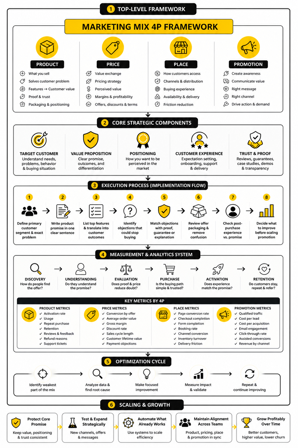
This is where many dashboards go wrong. Teams add traffic, impressions, clicks, followers, subscribers, leads, revenue, open rates, conversion rates, bounce rates, ROAS, CAC, LTV, and twenty other numbers because all of them feel “important.” The result looks impressive for about five minutes, then nobody uses it because nobody knows what the dashboard is actually trying to answer.
Start with one simple question: What decision should this dashboard help us make faster? For most businesses, the answer falls into one of these categories:
That framing matters because marketing budgets are under pressure. Gartner’s 2024 CMO Spend Survey found that average marketing budgets dropped to 7.7% of company revenue, down from 9.1% the year before. When leadership expects more output from less budget, a dashboard that only shows activity is not enough. You need a dashboard that shows what is working, what is leaking money, and what deserves the next dollar.
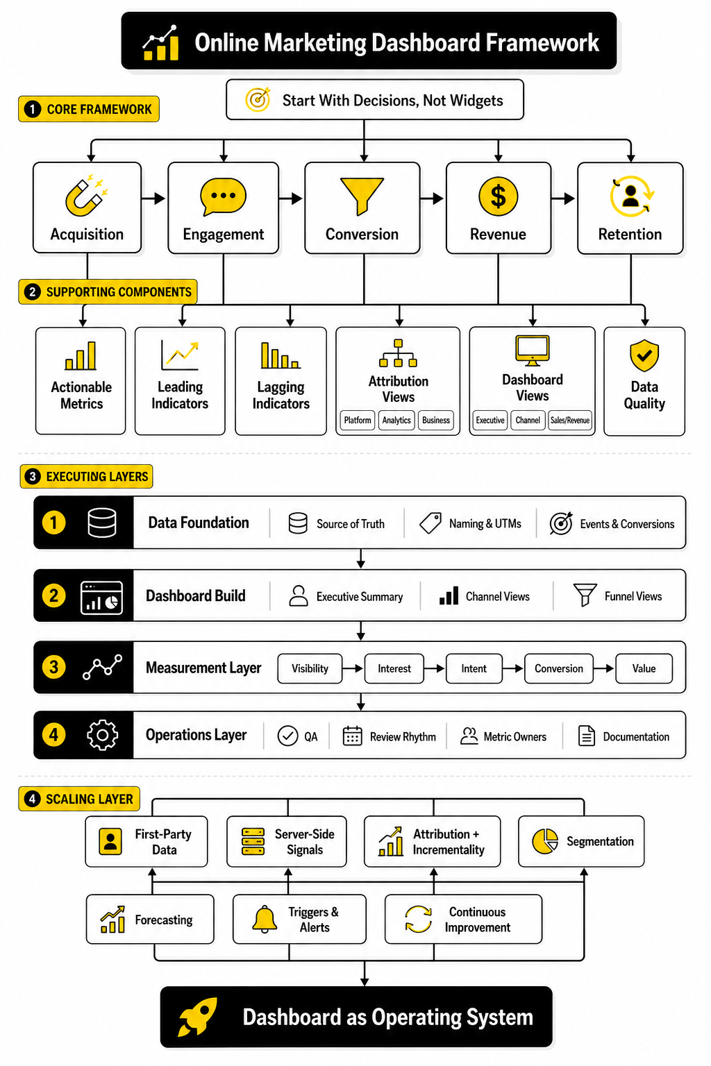
Map the Dashboard to the Customer Journey
The cleanest way to structure an online marketing dashboard is to follow the customer journey from first touch to revenue. This keeps the dashboard useful because every metric has a place. It also prevents the classic mistake of mixing top-of-funnel awareness numbers with bottom-of-funnel revenue numbers without context.
A practical structure looks like this:
This structure works whether you run an ecommerce store, a SaaS funnel, a service business, or a creator-led offer. The labels may change, but the logic stays the same. You are not just tracking marketing activity; you are tracking movement through the business.
For acquisition, your dashboard should separate channels clearly. Organic search, paid search, paid social, email, referral, direct, affiliates, and partnerships should not be mashed together into one traffic number. Google Analytics 4 separates acquisition into user acquisition and traffic acquisition, which is useful because first-time discovery and total session behavior answer different questions in GA4 acquisition reporting.
For engagement, focus on signals that imply intent. Page views alone are weak. Better indicators include landing page engagement, product page views, form starts, quiz completions, booked calls, cart activity, return visits, demo page visits, and email clicks that lead back to high-intent pages.
For conversion, define the primary action before building the report. In ecommerce, that may be purchases. In B2B, it may be qualified demos or pipeline created. In a local service business, it may be booked appointments, calls, or completed quote forms.
For revenue, do not stop at leads unless your business truly cannot connect marketing to sales. Shopify’s marketing reports, for example, are built to show how marketing contributes to visitors becoming paying customers through commerce-focused analytics. That is the right direction: less vanity reporting, more commercial reporting.
Pick Metrics That Reveal Action
The best dashboard metrics are not always the most popular metrics. They are the numbers that change your next move. A dashboard should make the next action obvious enough that a smart person can look at it and say, “We need to fix this landing page,” or “This campaign is ready for more budget.”
For acquisition, useful metrics include:
For conversion, useful metrics include:
For revenue, useful metrics include:
The deeper point is that each metric should have an owner. If nobody owns a number, nobody improves it. A paid media manager can own cost per acquisition, a CRO specialist can own landing page conversion rate, and a sales or revenue team can own lead-to-customer rate.
This is also why blended metrics need context. Blended CAC, blended ROAS, and total conversion rate are useful for leadership, but they can hide problems. A blended ROAS of 3.0 may look healthy while one channel is carrying the entire account and another is quietly wasting spend.
Separate Leading Indicators From Lagging Indicators
A strong online marketing dashboard should show both leading and lagging indicators. Leading indicators show what is likely to happen. Lagging indicators show what already happened.
This distinction keeps teams from reacting too late. Revenue is a lagging indicator. By the time revenue is down, the real problem may have started weeks earlier with lower qualified traffic, weaker click quality, fewer booked calls, or a drop in email engagement.
Leading indicators can include:
Lagging indicators can include:
You need both. Leading indicators help you act early. Lagging indicators keep you honest.
For example, if paid social click-through rate is falling and landing page engagement is dropping, the issue may be creative fatigue or poor audience-message fit. If leads are stable but sales are falling, the issue may be lead quality, sales follow-up, pricing, or offer positioning. The dashboard should help you diagnose the layer of the funnel that is actually breaking.
Use Attribution Carefully
Attribution is useful, but it is not truth. It is a model. Treating attribution as perfect is one of the fastest ways to make bad marketing decisions with confidence.
Most platforms give themselves credit in slightly different ways. Google Ads, Meta, email platforms, affiliate software, CRM tools, and analytics tools often use different attribution windows, conversion definitions, and identity matching methods. That means the same sale can appear in multiple reports with different credit assigned.
Google Ads enhanced conversions, for example, can improve measurement accuracy by using hashed first-party customer data in a privacy-safe way, as explained in Google’s documentation on enhanced conversions. That is useful, but it does not remove the need for judgment. Better tracking improves the picture; it does not make the picture complete.
Your dashboard should make attribution settings visible where they matter. Do not just show “revenue from ads.” Show the conversion source, attribution model, lookback window, and whether the number comes from the ad platform, analytics tool, ecommerce platform, or CRM.
A practical way to handle this is to separate three views:
These three views will rarely match perfectly. That is normal. The goal is not to force every number into false agreement. The goal is to understand the gap well enough to make better decisions.
Build Different Views for Different People
One online marketing dashboard cannot serve everyone equally well. The founder, CMO, paid media buyer, content lead, sales manager, and client success team do not need the same view. They may use the same data, but they need different levels of detail.
Leadership needs a clear executive view. This should focus on revenue, pipeline, CAC, ROAS, budget pacing, channel contribution, and major risks. It should not require scrolling through campaign-level naming conventions or fifty ad set rows.
Channel owners need operational views. A paid media dashboard should show spend, CTR, CPC, CPM, conversion rate, CPA, ROAS, budget pacing, creative performance, and audience performance. An SEO dashboard should show organic traffic, ranking movement, non-branded clicks, conversions from organic search, content decay, and revenue or leads from search.
Sales and revenue teams need handoff views. These should show lead source, lead quality, speed to lead, booked meetings, no-show rates, close rates, pipeline value, and revenue by source. Without this view, marketing may optimize for leads that sales cannot close.
Tools like Looker Studio are popular because they let teams connect many sources and create different report views from the same underlying data. Google describes Looker Studio as a way to build interactive dashboards using built-in and partner connectors across many data sources in its connector gallery. That flexibility is useful, but it also creates a trap: just because you can connect everything does not mean you should show everything.
A simple rule helps: one dashboard per audience, one primary decision per dashboard. That keeps the report clean and keeps people using it.
Keep the Tool Stack Practical
The right dashboard setup depends on the business stage. A small business does not need an enterprise data warehouse on day one. A larger team spending serious money across paid media, email, affiliates, SEO, and sales outreach probably should not rely on screenshots and manual spreadsheet updates forever.
A practical stack often starts with:
If the business relies heavily on funnels, client follow-up, SMS, booking pages, and CRM workflows, GoHighLevel can make sense as an all-in-one operating layer instead of stitching too many disconnected tools together. If the business is more focused on landing page testing for ecommerce, Replo may fit better because the dashboard conversation quickly connects to page performance and conversion improvements. If social scheduling and reporting are the main need, Buffer is more relevant than a heavy CRM.
The tool is not the strategy. The tool should match the reporting problem. If your biggest issue is unclear pipeline quality, buying a prettier visualization tool will not fix it. If your biggest issue is manual reporting across too many channels, then automation and connectors become much more valuable.
Make Data Quality Part of the Dashboard
A dashboard is only as useful as the data behind it. This sounds obvious, but it is where many teams quietly lose trust. Once people notice that the numbers are wrong, duplicated, delayed, or unexplained, they stop using the dashboard.
Data quality problems usually come from a few predictable places:
Your dashboard should include a small data quality section. It does not need to be fancy. It can show the percentage of traffic with clean UTM tagging, recent tracking errors, unmatched leads, duplicate events, or the last successful data refresh.
This matters even more as platforms shift toward modeled and first-party measurement. Google’s documentation notes that enhanced conversions use hashed first-party data to help attribute conversions more accurately in Google Ads through privacy-safe matching. That kind of setup can improve signal quality, but only if your forms, tags, consent setup, and conversion actions are configured correctly.
A useful dashboard should not pretend the data is perfect. It should show enough context that people know when to trust the number, when to investigate it, and when to avoid making a major decision from it.
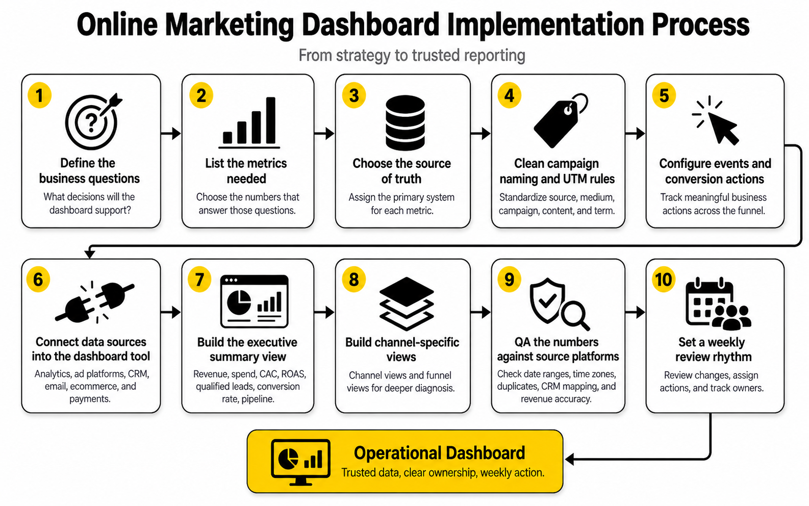
Turn the Dashboard Into an Implementation Plan
Once the strategy is clear, the next step is execution. This is where an online marketing dashboard stops being a nice reporting idea and becomes a working system. The goal is not to build everything at once; the goal is to build the smallest reliable version that helps the team make better decisions immediately.
Start with the business question, then work backward into data sources, events, naming rules, and dashboard views. This keeps the process grounded. If you start with the visualization tool first, you will usually end up decorating messy data instead of fixing the measurement system underneath it.
A practical implementation plan should answer five questions before anyone opens a dashboard builder:
That last question matters more than people think. A dashboard without an owner becomes a museum. It shows what happened, but nobody is responsible for improving what happens next.
Define the Source of Truth Before Connecting Tools
Before you connect analytics platforms, ad accounts, CRM tools, email software, and payment data, decide which system is the source of truth for each metric. This prevents arguments later. It also keeps people from cherry-picking the number that makes their channel look best.
Website behavior usually belongs in GA4 or another analytics platform. Ad spend usually belongs in the native ad platform. Revenue should usually come from the ecommerce platform, payment processor, CRM, or accounting-connected sales system. Lead quality and pipeline should usually come from the CRM, not the form builder.
This does not mean every other number is useless. Platform-reported numbers are still helpful for optimization. But your dashboard should label them clearly so nobody confuses a platform estimate with confirmed business revenue.
Use a simple source-of-truth map before building:
This small step avoids a huge amount of confusion. If Meta reports one purchase count, Google Analytics reports another, and Shopify reports a third, your team needs to know which number guides budget decisions.
Standardize Naming and Tracking
A dashboard becomes painful when campaign names, UTMs, events, and CRM fields are inconsistent. You can have the best visual layout in the world, but if the data underneath it is messy, the report will not hold up. Clean naming is boring until it saves you hours every month.
UTM parameters should be treated as a shared operating system, not a casual afterthought. Use consistent values for source, medium, campaign, content, and term. Do not let one person use “facebook,” another use “fb,” and another use “Meta Paid” for the same channel.
A simple UTM structure might look like this:
The exact format matters less than consistency. What matters is that the same channel is named the same way every time. If your dashboard needs ten cleanup formulas just to recognize a campaign, the tracking system is the problem.
Set Up Events Around Business Actions
The dashboard should track meaningful actions, not just page activity. GA4 automatically collects some events, but more useful reporting often requires recommended or custom events. Google’s developer documentation explains that recommended GA4 events need extra configuration because they are not all collected automatically.
For an online marketing dashboard, the core event set should match the funnel. Do not track every click just because you can. Track the actions that show intent, friction, or value.
Useful event categories include:
Once events are defined, document them. Give each event a name, purpose, trigger condition, required parameters, and owner. This documentation does not need to be complicated, but it must exist. Otherwise, six months from now, nobody will remember why an event was created or whether it still works.
Build the First Dashboard in Layers
The first version should be simple enough to review quickly and structured enough to expand later. Do not try to build the dream dashboard in one pass. Build the core reporting layer first, then add deeper analysis once the foundation is reliable.
A strong build sequence looks like this:
This order matters. If you connect tools before you define metrics, the dashboard becomes bloated. If you design charts before you clean naming, the visuals become misleading. If you skip QA, the team eventually stops trusting the report.
The executive summary should come first because it forces clarity. Put the most important numbers at the top: revenue, spend, CAC, ROAS, qualified leads, conversion rate, and pipeline if relevant. Then add supporting sections underneath for acquisition, conversion, revenue, and data quality.
Connect the Right Tools Without Overcomplicating the Stack
Most teams do not need a complex data warehouse on day one. They need clean tracking, clear ownership, and a dashboard that people actually review. The right stack depends on how many channels you use, how much revenue flows through the funnel, and how expensive reporting mistakes are.
A lean setup might use GA4, Google Search Console, native ad reports, an email tool, a CRM, and Looker Studio. Google’s Looker Studio connector ecosystem makes it possible to build reports from many sources through its connector gallery. That makes it a common starting point for teams that want visibility without committing to a heavy business intelligence setup.
A more advanced setup might include server-side tracking, CRM attribution, data warehouse storage, and automated reporting pipelines. This is more useful when ad spend is high, sales cycles are longer, or leadership needs reliable revenue attribution across many channels. The upgrade should be driven by business need, not tool envy.
For funnel-heavy businesses that want CRM, forms, booking, automations, SMS, email, and pipeline reporting in one place, GoHighLevel can be a practical option. For businesses that care more about landing page production and conversion testing, Replo fits a different part of the implementation process. For teams where social publishing and performance review are the priority, Buffer is cleaner than forcing social reporting into a tool built for sales pipelines.
The point is simple: pick tools around the workflow. Do not force the workflow around the tool.
Add First-Party and Server-Side Signals Where They Matter
Measurement is becoming more dependent on first-party data. Browser restrictions, privacy changes, consent requirements, and platform signal loss all make basic pixel-only tracking less reliable than it used to be. That does not mean tracking is dead. It means the implementation needs to be more deliberate.
Google Ads enhanced conversions allow advertisers to send hashed first-party conversion data to improve conversion measurement in a privacy-safe way through enhanced conversions for web. Meta’s Conversions API is designed to send server-side marketing data to Meta technologies, helping advertisers measure and optimize events beyond browser-only pixel signals, as described in the Conversions API overview. These setups are especially useful when purchases, leads, or sales happen after multiple sessions or outside the immediate browser event.
This does not mean every small business needs a complex server-side setup tomorrow. Start with the basics: clean tags, clean forms, clean consent, clean conversion actions, and clean CRM fields. Then add enhanced conversions or server-side events when the value of better measurement justifies the implementation work.
The dashboard should show which conversions are tracked client-side, server-side, or imported from offline sources. This context helps the team understand why numbers differ across platforms. It also makes future debugging much easier.
QA the Dashboard Before Anyone Trusts It
A dashboard should not go live just because the charts render correctly. It should go live only after the numbers have been checked against the source systems. This is the step many teams skip, and it is exactly why dashboards lose credibility.
QA should compare dashboard values against the original platforms for the same date range. Check traffic against analytics. Check spend against ad platforms. Check leads against the CRM or form tool. Check purchases and revenue against the ecommerce or payment system.
Use a simple QA checklist:
This is not glamorous work, but it is essential. If the dashboard says there were 140 leads and the CRM says there were 96, someone needs to investigate before leadership makes decisions from the report.
Create a Review Rhythm
Implementation is not finished when the dashboard is built. The real value comes from the review rhythm. A dashboard that nobody reviews is just another tab.
A weekly marketing review should focus on what changed, why it changed, and what action follows. Do not spend the meeting reading every chart out loud. Start with the executive summary, identify the biggest movement, then go into the channel or funnel layer that explains it.
A useful weekly review can follow this structure:
That rhythm turns the online marketing dashboard into a management system. It also keeps the dashboard from becoming stale because every review exposes missing context, confusing labels, weak metrics, or unnecessary charts.
Assign Owners to Every Important Metric
Every important metric should have a person responsible for improving it. This does not mean one person controls everything that affects the number. It means one person is responsible for watching it, explaining movement, and pushing the next action forward.
For example, paid media may own cost per qualified lead, but sales still affects close rate. The website owner may own landing page conversion rate, but offer positioning and traffic quality still influence the result. Ownership is not about blame. It is about momentum.
A simple ownership model might look like this:
This is where the dashboard becomes operational. When a number drops, the team knows who investigates. When a number improves, the team knows where to double down. When nobody owns the number, it becomes background noise.
Document the System So It Survives Team Changes
The final implementation step is documentation. Not a 60-page manual. Just enough documentation that a new team member can understand how the dashboard works without reverse-engineering everything.
Document the key pieces:
This documentation should live somewhere easy to find. It can be a shared doc, internal wiki, or project management page. The format matters less than accessibility.
Good documentation protects the dashboard from slow decay. Campaign names change, tools get replaced, team members leave, tracking scripts break, and business priorities shift. Without documentation, the dashboard slowly becomes a mystery. With documentation, it stays maintainable.
Statistics and Data
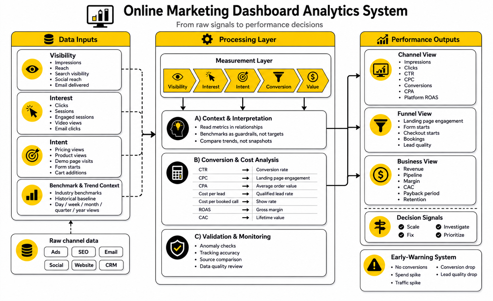
The statistics inside an online marketing dashboard should not sit there like decorations. They should explain what is happening, where the business is gaining or losing momentum, and which action deserves priority. A good dashboard does not just show “traffic is up” or “conversion rate is down.” It helps you understand whether that movement is meaningful, expected, profitable, and worth acting on.
This is why benchmarks are useful but dangerous. They give you context, but they do not know your offer, margins, sales cycle, audience quality, or funnel depth. A 3% conversion rate can be excellent for a high-ticket consulting offer and weak for a low-friction lead magnet. The dashboard should use benchmarks as reference points, not as universal rules.
The real job is interpretation. When a number moves, ask what it means in the business, not just whether it looks green or red. If cost per lead drops but close rate falls harder, the dashboard should make that obvious before the team celebrates cheap leads that do not buy.
Read Every Metric in Context
A single metric can mislead you when it is viewed alone. Traffic growth sounds good until you realize the new visitors are coming from low-intent sources. A higher click-through rate sounds good until the clicks produce fewer qualified leads. A lower cost per acquisition sounds good until the customers have weaker retention or smaller order values.
That is why performance signals should be grouped into relationships. Instead of looking at traffic alone, compare traffic with engagement and conversion. Instead of looking at leads alone, compare leads with qualified leads, pipeline, and revenue. Instead of looking at ROAS alone, compare it with margin, refund rate, and customer lifetime value.
A practical online marketing dashboard should help you read the chain:
When the chain breaks, the dashboard has done its job. The problem is not that the number is “bad.” The problem is that the dashboard should show you where the system stopped working.
Use Benchmarks as Guardrails, Not Targets
Benchmarks help you avoid operating in a vacuum. WordStream’s 2025 search advertising benchmarks show that performance varies heavily by industry across click-through rate, cost per click, conversion rate, and cost per lead, which is exactly why one universal “good” number is usually lazy thinking. The useful move is to compare your account against your category, your historical baseline, and your economics at the same time.
Landing page benchmarks work the same way. Unbounce’s 2024 conversion benchmark data was built from more than 57 million conversions across over 41,000 landing pages, and its own guidance makes the key point clearly: industry, traffic source, offer type, and page goal all change what “good” conversion performance means. A newsletter signup page, a product page, and a $10,000 service application should not be judged by the same standard.
Email benchmarks are another example. Mailchimp’s email benchmark guidance frames open rates, click-through rates, and conversions as comparison points for diagnosing campaign performance, not as trophies. Opens are especially tricky because privacy features can inflate or obscure them, so clicks, conversions, and revenue usually deserve more attention in the dashboard.
Use benchmarks to ask better questions:
The action should come from the diagnosis, not from the benchmark alone.
Build a Measurement Layer Around the Funnel
The analytics system should connect each stage of the funnel so the dashboard can explain cause and effect. If your dashboard only shows the final sale, you react too late. If it only shows early activity, you optimize for attention instead of money.
A clear measurement layer connects five levels:
This structure keeps the dashboard honest. If visibility is rising but interest is flat, your message may not be strong enough to earn the click. If interest is rising but intent is flat, your landing page or offer may not be pulling people deeper. If intent is rising but conversion is flat, the form, checkout, booking flow, price, or trust layer may be the problem.
The best dashboards make these transitions visible. They do not bury the story in ten separate tabs. They show the funnel as a connected system so the team can see where attention turns into action and where action turns into revenue.
Measure Conversion Rate the Right Way
Conversion rate is one of the most useful metrics in an online marketing dashboard, but only when the conversion is defined properly. A purchase, a demo request, a booked call, and a newsletter signup are not equal. Each one should be tracked separately because each one represents a different level of business value.
GA4 treats important business actions as key events, and Google’s documentation explains that key events can be used to measure important actions across channels such as search, email, and social. That matters because your dashboard should not treat every event as equally important. A scroll, a page view, and a purchase do not belong in the same decision layer.
There are also different ways to read conversion rate. Session conversion rate tells you how many sessions converted. User conversion rate tells you how many users converted. For short purchase paths, session conversion rate can be useful. For longer journeys, user conversion rate may tell a more realistic story because one person may visit several times before taking action.
The action from conversion rate depends on where the weakness appears. If paid search traffic converts well but paid social converts poorly, the issue may be audience intent. If mobile conversion is much lower than desktop, the issue may be page speed, layout, form usability, or checkout friction. If conversion rate is stable but revenue falls, the problem may be average order value or lead quality, not the page itself.
Track Cost Metrics With Quality Metrics
Cost per lead is a dangerous metric when it is separated from quality. Cheap leads can make a campaign look efficient while quietly wasting sales time. Expensive leads can look bad while producing higher-value customers.
Your dashboard should pair cost metrics with downstream quality signals. Cost per lead should sit next to qualified lead rate. Cost per booked call should sit next to show rate and close rate. Cost per purchase should sit next to average order value, gross margin, and repeat purchase rate.
This is the practical way to avoid bad optimization. If a campaign generates leads at half the cost but those leads close at one-third the rate, it may actually be worse. If another campaign has a higher CPA but produces customers with stronger retention, it may deserve more budget.
For paid acquisition, watch these metric pairs:
The dashboard should make trade-offs visible. Marketing is not about lowering every cost. It is about buying profitable growth at a cost the business can support.
Separate Channel Performance From Business Performance
Channel dashboards and business dashboards answer different questions. A channel dashboard tells you how Google Ads, Meta, email, SEO, social, affiliates, or partnerships are performing. A business dashboard tells you whether the company is growing profitably.
Do not confuse the two. A channel can look great inside its own reporting environment while the business sees weak revenue. That can happen because of attribution overlap, poor lead quality, margin pressure, refunds, delayed sales cycles, or repeat customers being counted as new wins.
A healthy reporting setup separates channel metrics from business outcomes:
This makes discussions more honest. A media buyer can still optimize campaign performance, but leadership can judge whether that performance is creating real business value. Both views matter, but they should not be blended into one vague scorecard.
Watch Trends More Than Snapshots
A dashboard snapshot can create panic or false confidence. One bad day does not mean the funnel is broken. One great day does not mean the campaign is scalable. Trends are usually more useful than isolated numbers.
Look at performance across multiple time frames:
This is especially important in seasonal businesses. A December ecommerce spike may be normal. A January drop may not be a crisis. A B2B pipeline slowdown around holidays may be expected, while the same slowdown in a normal sales month may need attention.
Your dashboard should show enough history to separate signal from noise. Use rolling averages where useful. Mark campaign launches, pricing changes, website updates, email pushes, promo periods, and tracking changes. Otherwise, people will argue about numbers without remembering what caused them.
Use Anomaly Checks to Catch Problems Early
A strong online marketing dashboard should help detect problems before they become expensive. You do not need a complex data science setup to start. Even basic anomaly checks can catch broken forms, tracking errors, budget spikes, traffic drops, or sudden conversion issues.
Set simple alert thresholds for the numbers that matter most. If spend rises by 30% while conversions stay flat, someone should look. If leads drop to zero during normal business hours, someone should test the form. If revenue falls while traffic stays stable, someone should check checkout, pricing, payment errors, or offer changes.
Useful anomaly checks include:
These checks turn the dashboard from a passive report into an early-warning system. That is when analytics becomes operational instead of decorative.
Focus on Decisions, Not Data Volume
More data does not automatically mean better decisions. In many teams, it does the opposite. Too many charts create hesitation because everyone can find one number that supports their opinion.
The better approach is to keep the main dashboard focused and push deeper analysis into secondary views. The primary dashboard should show the core performance story. Drill-down views can explain channel details, campaign details, landing page details, email details, and sales pipeline details.
A clean main view should answer:
That is the standard. If your online marketing dashboard cannot answer those questions quickly, it needs sharper structure, not more charts.
Scale the Dashboard Without Making It Bloated
At this stage, the online marketing dashboard should already have a clean measurement layer, a working review rhythm, and enough context to guide weekly decisions. The next challenge is scale. As campaigns, channels, products, landing pages, and team members grow, the dashboard can either become more valuable or become a confusing mess.
Scaling does not mean adding every possible chart. It means adding the next layer of intelligence without destroying clarity. The dashboard should become more useful as the business gets more complex, not harder to read.
The best way to scale is to keep the main view simple and push complexity into drill-down sections. Leadership should still see the commercial story quickly. Channel owners should still have enough detail to diagnose performance. Operators should still be able to trace a problem from top-level movement down to the campaign, page, audience, or workflow that caused it.
Know When the Dashboard Needs a More Advanced Setup
A basic dashboard is usually enough when the business has a simple funnel, a small number of channels, and a short path from click to conversion. The moment sales cycles get longer, attribution gets messier, or offline revenue matters, the dashboard needs a more serious measurement setup. This is not about looking sophisticated. It is about avoiding bad decisions from incomplete data.
You probably need a more advanced setup when:
Marketing budgets have not suddenly become generous again. Gartner’s 2025 CMO Spend Survey showed marketing budgets holding at 7.7% of company revenue, and 59% of CMOs said they still lacked enough budget to execute their strategy. That makes dashboard accuracy more than a reporting issue. When money is tight, measurement mistakes turn into budget mistakes.
The upgrade should usually happen in layers. First, clean the data collection. Then improve CRM and revenue mapping. Then add automation. Then consider a warehouse, BI layer, or more advanced attribution model if the business case is clear.
Avoid the Attribution Trap
Attribution is useful, but it can become a trap when teams treat it as a courtroom verdict. A dashboard can show which channels touched a customer, but it cannot perfectly recreate every influence behind a buying decision. A buyer may see a social post, search the brand later, read reviews, ask a friend, click an email, and finally convert from direct traffic.
That does not mean attribution is pointless. It means the online marketing dashboard should use attribution to guide decisions, not pretend it can explain everything. Google Analytics lets teams choose how credit is assigned to key events across ads, clicks, and other touchpoints through GA4 attribution settings. That flexibility is helpful, but the model still depends on what can be observed and connected.
The problem gets worse when every platform claims credit for the same conversion. Ad platforms are built to optimize their own delivery systems, so their reporting often looks different from analytics, CRM, or finance numbers. This is normal. What matters is that the dashboard clearly labels which view is being used for which decision.
Use attribution like this:
That last point is important. If a channel looks profitable in attribution but turning it down does not hurt revenue, the channel may be taking credit for demand that would have happened anyway. A mature dashboard should leave room for incrementality thinking, especially when budgets are large.
Add Incrementality When Attribution Is Not Enough
Incrementality answers a sharper question: what happened because of the marketing activity that would not have happened otherwise? That is different from asking which platform received credit. It is the difference between reporting activity and proving lift.
You do not need to run complex experiments for every campaign. But once spend is meaningful, some form of incrementality testing becomes valuable. Geo tests, holdout groups, audience exclusions, matched market tests, and conversion lift studies can all help separate real impact from credited impact.
This matters most in channels that are close to existing demand. Branded search, retargeting, affiliate, and email can all produce strong reported performance because they often touch people who were already interested. That does not make them bad channels. It just means the dashboard should not overstate their role in creating new demand.
A simple approach is to separate metrics into three layers:
This keeps the conversation grounded. You are not asking the dashboard to be magical. You are asking it to show enough evidence to make a better bet.
Build for Privacy, Consent, and First-Party Data
Modern marketing measurement has to work in a world with more privacy expectations, more platform restrictions, and less dependable third-party signal. The IAB’s 2025 State of Data report describes the shift toward first-party data, alternative IDs, and data clean rooms as a direct response to signal loss in digital advertising. That trend is not a side issue. It affects what your dashboard can measure and how confidently you can interpret performance.
A stronger dashboard strategy should prioritize first-party data. That includes email subscribers, customers, form submissions, CRM records, purchase history, account activity, bookings, and support interactions. These signals are closer to the business than anonymous platform metrics, and they are usually more useful for long-term decision-making.
The practical move is to design the dashboard around consent-aware data collection. Make sure forms capture the fields needed for reporting. Make sure CRM stages are consistent. Make sure users understand what they are signing up for. Make sure tracking respects the rules in the markets where you operate.
This is not just legal housekeeping. It is a measurement advantage. The companies with cleaner first-party data will usually have better segmentation, better lifecycle reporting, better retention analysis, and better budget decisions.
Watch for Dashboard Bias
Every dashboard has bias because every dashboard is a simplified version of reality. The danger is not bias itself. The danger is pretending it does not exist.
An online marketing dashboard can bias decisions in subtle ways. It can overvalue channels that are easy to track. It can undervalue brand, word of mouth, organic content, community, partnerships, and sales conversations. It can make short-term conversions look more important than long-term trust. It can push the team toward campaigns that produce fast numbers while ignoring work that builds future demand.
This is why dashboard design is strategic. The metrics you put at the top tell the team what matters. If you only show leads, the team will chase leads. If you only show ROAS, the team may over-focus on bottom-of-funnel demand. If you only show revenue, the team may miss early signals that future revenue is weakening.
Balance the dashboard with a few different types of signal:
That mix helps prevent the dashboard from becoming a machine that rewards the wrong behavior.
Do Not Let Automation Replace Judgment
Automation is useful. AI summaries, anomaly detection, data connectors, scheduled reports, and automated alerts can save time and catch problems faster. But automation does not remove the need for marketing judgment.
The IAB’s 2025 State of Data research surveyed more than 500 advertising and media experts and framed AI as a major force in campaign planning, activation, optimization, and measurement. That direction makes sense. AI can help teams process more data, find patterns faster, and reduce manual reporting work.
But AI-generated dashboard commentary still needs human review. A tool can tell you conversions dropped. It may even suggest that a channel caused the drop. It usually cannot fully understand a pricing change, a competitor launch, a sales team issue, a delayed shipment, a tracking bug, a seasonal shift, or a weak offer.
Use automation for speed. Use humans for interpretation. That split is healthy.
Plan for Tool Sprawl Before It Gets Expensive
A growing marketing team can easily end up with too many tools doing overlapping jobs. One tool reports email. Another reports funnels. Another reports CRM. Another reports ads. Another reports social. Another reports landing pages. Suddenly the dashboard becomes less of a measurement system and more of a negotiation between disconnected platforms.
This is where strategic tradeoffs matter. An all-in-one system can reduce integration pain, but it may not be best-in-class for every function. A best-in-class stack can be powerful, but it requires stronger operations and cleaner data governance. Neither choice is automatically right.
A CRM-centered setup such as GoHighLevel can make sense when the business needs pipeline visibility, follow-up automation, bookings, forms, and client communication in one place. A funnel-centered setup such as ClickFunnels or Systeme.io may fit better when the core need is launching offers quickly and measuring funnel movement. A specialized tool still has value when it solves one painful problem clearly, like Fillout for forms, Cal.com for scheduling, or Brevo for email and customer communication.
The expert move is not to buy fewer tools at all costs. It is to make every tool justify its place in the reporting chain. If a tool creates important data, that data should feed the dashboard or the CRM. If it does not create useful data or improve execution, it may be adding noise.
Prepare the Dashboard for Multiple Products or Offers
A dashboard that works for one offer can break when the business adds more products, services, markets, or customer segments. The top-line numbers may still look fine while one offer is carrying everything and another is quietly underperforming. This is why scaling requires segmentation.
Segment performance by the categories that actually affect decisions. For some businesses, that means product line. For others, it means geography, customer type, lifecycle stage, acquisition channel, offer, pricing tier, or sales team. The point is to separate performance where the business model changes.
Useful segments can include:
Segmentation prevents the average from lying to you. A blended conversion rate may look stable while one segment is improving and another is collapsing. A blended CAC may look acceptable while the highest-value customer segment is becoming too expensive to acquire.
Treat Forecasting as a Range, Not a Promise
Once a dashboard becomes reliable, teams naturally want forecasts. That is useful, but forecasting should be handled carefully. A forecast is not a promise. It is a structured estimate based on assumptions.
A practical dashboard forecast can show expected leads, pipeline, revenue, spend, CAC, and payback based on current trends. But it should also show the assumptions behind the forecast. Conversion rate, close rate, average order value, sales cycle length, and retention all affect the outcome.
Use ranges instead of single-point predictions. A conservative, expected, and aggressive forecast is more honest than one precise-looking number. The business can then see what happens if conversion rate drops, costs rise, or sales close rate improves.
Forecasting becomes more useful when it is tied to decisions. If the dashboard says the current pipeline is not enough to hit next quarter’s target, the team needs to know whether to increase spend, improve conversion, launch a campaign, fix sales follow-up, or adjust expectations. That is the point of the forecast.
Know What Not to Put in the Dashboard
Advanced dashboard strategy is not only about what to add. It is also about what to remove. A dashboard gets stronger when weak metrics, duplicate charts, and unused views are cut.
Remove metrics that do not change decisions. Remove charts that nobody discusses. Remove tables that exist only because the data was available. Remove vanity metrics from the main view unless they clearly connect to future business value.
This can feel uncomfortable because teams often use dashboards to prove they are doing work. But the goal is not to prove activity. The goal is to improve performance.
A strong online marketing dashboard should earn its space every week. If a chart does not help someone decide, diagnose, prioritize, or act, it belongs somewhere else or nowhere at all.
Make the Dashboard Part of the Operating System
A mature online marketing dashboard is not just a report people check when something goes wrong. It becomes part of how the business operates. It helps marketing, sales, leadership, finance, and operations look at the same reality instead of debating numbers from five different tools.
This is the final shift. The dashboard moves from “What happened?” to “What are we doing next?” That sounds small, but it changes everything. When the dashboard is connected to ownership, planning, budget decisions, and weekly execution, it becomes a growth system instead of a reporting file.
The best final version does three jobs at once. It shows the current health of the funnel, explains what changed, and points the team toward the next action. If it can do those three things without creating confusion, it is doing its job.
Connect Marketing Data to Business Planning
Marketing data becomes more valuable when it connects to planning. A dashboard should help the team understand whether current activity is enough to hit the next revenue target. If the business needs a certain amount of pipeline next month, the dashboard should show whether traffic, leads, qualified opportunities, and close rates are on pace.
This is where marketing stops being treated like a collection of campaigns and starts being treated like a business engine. Spend, conversion rate, lead quality, sales cycle length, average order value, retention, and margin all influence the plan. Looking at any one of them alone is too shallow.
A useful planning view can answer:
This is also why marketing budgets need sharper control. Gartner’s 2025 CMO Spend Survey found that marketing budgets remained at 7.7% of company revenue, which means teams have to make better use of the resources they already have. A dashboard should make tradeoffs visible before the budget is already spent.
Create a Single View of the Customer Journey
The final system should show how people move from first contact to customer value. That does not mean every interaction will be perfectly tracked. It means the dashboard should connect enough of the journey to make more carefully decisions.
A complete customer journey view usually includes:
This ecosystem view is especially useful because marketing performance is rarely created by one channel alone. Someone may discover the brand through search, return through retargeting, join the email list, book a call, and convert after a sales conversation. If the dashboard only gives credit to the last click, the team may underinvest in the earlier work that created the opportunity.
The point is not perfection. The point is visibility. A dashboard that shows the journey clearly enough will usually beat a dashboard that reports every channel separately and leaves the team to guess how everything connects.
Decide What the Dashboard Should Trigger
A dashboard becomes powerful when specific numbers trigger specific actions. Without triggers, people stare at charts and argue. With triggers, the team knows what to do when performance moves.
For example, if conversion rate drops below a defined threshold, the next step might be a landing page review. If qualified lead rate falls, the next step might be a campaign targeting review. If booked calls are stable but close rate falls, the next step might belong to sales enablement, pricing, or offer clarity.
Useful triggers can include:
This is where discipline matters. Do not create alerts for every tiny movement. Too many alerts train people to ignore the system. Use triggers for the movements that actually threaten revenue, waste budget, or reveal a clear opportunity.
Keep Improving the Dashboard Over Time
A dashboard is never truly finished. Campaigns change, channels change, privacy rules change, customer behavior changes, and the business model changes. The dashboard should evolve with the business without turning into a bloated archive of old priorities.
Review the dashboard itself at least once per quarter. Ask which charts are used, which metrics drove decisions, which views created confusion, and which data points are missing. Remove what no longer matters. Add only what supports a decision.
A simple quarterly dashboard review can ask:
This keeps the online marketing dashboard alive. More importantly, it keeps the dashboard honest. A stale dashboard is dangerous because it gives the illusion of control while the business has already moved on.
What is an online marketing dashboard?
An online marketing dashboard is a centralized view of your marketing performance across channels, campaigns, funnel stages, and business outcomes. It usually combines data from analytics tools, ad platforms, email software, CRM systems, ecommerce platforms, and other marketing tools. The goal is to help you understand what is working, what is not working, and what action to take next.
What should an online marketing dashboard include?
It should include the metrics that connect marketing activity to business results. That usually means traffic, source performance, conversion rate, cost per lead or acquisition, revenue, pipeline, ROAS, CAC, customer quality, and data quality indicators. The exact metrics depend on your business model, but every metric should support a decision.
How often should I check my marketing dashboard?
Most teams should review the main dashboard weekly and monitor critical alerts daily. Daily checks are useful for spotting tracking issues, spend spikes, broken forms, or sudden conversion drops. Weekly reviews are better for interpreting trends and deciding what to change.
What is the biggest mistake people make with marketing dashboards?
The biggest mistake is adding too much data without deciding what the dashboard is supposed to help with. A dashboard with fifty charts can look impressive but still fail to guide action. A smaller dashboard with clear decisions, clean data, and strong ownership is usually much more useful.
Which metrics matter most for an online marketing dashboard?
The most important metrics are the ones closest to business value. For most teams, that means qualified leads, purchases, revenue, pipeline, conversion rate, CAC, ROAS, retention, and customer lifetime value. Early indicators like traffic, clicks, and engagement still matter, but they should be interpreted through the lens of downstream outcomes.
Should I use benchmarks in my dashboard?
Yes, but use them carefully. Benchmarks help you understand whether your numbers are unusually high, low, or normal for your category. They should not replace your own historical performance, margins, funnel structure, and business goals.
Why do numbers differ between Google Analytics, ad platforms, and my CRM?
Different systems use different attribution models, time zones, conversion windows, identity matching methods, and event definitions. Google Analytics may record behavior differently than an ad platform, and your CRM may only count leads or deals after they pass a certain stage. The dashboard should label sources clearly so people know which number should guide each decision.
Do I need server-side tracking for my dashboard?
Not always. Smaller businesses can often start with clean browser tracking, proper events, strong UTM rules, and accurate CRM fields. Server-side tracking becomes more valuable when ad spend is meaningful, conversion paths are complex, or browser-based tracking is losing too much signal.
How do I know if my dashboard data is trustworthy?
Compare dashboard numbers against the source systems for the same date range. Check spend against ad platforms, leads against the CRM, purchases against the ecommerce platform, and revenue against the payment or sales system. Also check time zones, duplicate events, test transactions, missing UTM values, and refresh timing.
What is the best tool for building an online marketing dashboard?
There is no single best tool for every business. Looker Studio can work well for flexible reporting, CRM platforms can work well for pipeline-heavy businesses, and funnel tools can work well for offer-focused teams. If your business needs CRM, automation, booking, follow-up, and pipeline visibility together, GoHighLevel is worth considering. If you need to build and test conversion-focused pages, Replo may be a better fit.
How simple should the first version be?
The first version should be simple enough that the team actually uses it. Start with the core business questions, the most important metrics, clean source-of-truth rules, and a weekly review process. You can add deeper channel views and advanced reporting after the foundation is trusted.
How do I stop my dashboard from becoming bloated?
Remove metrics that do not drive decisions. Keep the main view focused on performance, profitability, funnel health, and risks. Move deeper diagnostic data into secondary views instead of forcing everything into one screen.
Should social media metrics be included?
Yes, but they should not dominate the dashboard unless social is a major revenue channel. Reach, engagement, clicks, and follower growth can be useful early signals, but they need to connect to traffic, leads, sales, or brand demand. If social publishing and reporting are a big part of your workflow, Buffer can help keep that layer organized.
How should email marketing appear in the dashboard?
Email should be measured by more than opens. Clicks, conversions, revenue, list growth, unsubscribe rate, deliverability, segment performance, and automation performance are more useful. For businesses that rely on newsletters, lifecycle campaigns, and customer communication, Brevo or Moosend can fit naturally into the reporting stack.
What should I do when the dashboard shows a problem?
Start by checking whether the data is accurate. Then identify which funnel stage moved first. Once you know whether the issue is traffic, engagement, intent, conversion, revenue, or retention, assign the next action to the person who owns that part of the system.
Build a stronger local presence with BAAM AI
Turn your website, Google profile, social channels, and AI visibility into one growth engine
Most businesses do not need more random marketing activity. They need a consistent presence system that helps the right people find them, trust them, and take action. BAAM AI brings strategy, local SEO, website updates, Google Maps visibility, social content, AI-search readiness, media production, and reporting into one practical monthly engine.
If you want your marketing to keep working after the campaign ends, start with a free BAAM AI presence audit. See how your business shows up today and where the fastest visibility wins are at BAAM AI.