BAAM AI Blog
Mailchimp Emojis: A Practical Guide To Using Emojis Without Hurting Your Email Marketing
Mailchimp emojis can make a subject line easier to notice, but they are not magic open-rate buttons. Used well, they add tone, context, and visual contrast in a crowded inbox. Used badly, they make a campaign feel...
Mailchimp emojis can make a subject line easier to notice, but they are not magic open-rate buttons. Used well, they add tone, context, and visual contrast in a crowded inbox. Used badly, they make a campaign feel cheap, unclear, or less trustworthy.
That is the real tension. Mailchimp makes emojis easy to add, and its own subject line guidance says the built-in emoji picker can add visual interest, but it also recommends using no more than one emoji at a time, using emojis to support words rather than replace them, and testing because emoji designs render differently across operating systems in Mailchimp’s subject line best practices.
So the question is not “Should you use emojis in Mailchimp?” The better question is: when does an emoji make the message clearer, more clickable, and still aligned with your brand? That is what this guide will help you decide.
Why Mailchimp Emojis Matter
Emojis matter because inbox attention is brutally limited. A small symbol can create contrast beside plain-text subject lines, especially for seasonal campaigns, product launches, sale reminders, event invites, and casual brand updates. But contrast alone is not the same as persuasion.
The stronger reason to use mailchimp emojis is emotional clarity. A simple symbol can help the reader understand the mood of the message before they open it. A gift emoji can signal a promotion, a calendar emoji can signal an event, and a warning-style symbol can signal urgency, but only when the subject line still makes sense without the emoji.
This is where many marketers get it wrong. Research from Nielsen Norman Group found that emojis in subject lines can increase negative sentiment and do not automatically improve the likelihood of an email being opened in its email emoji usability research. That does not mean emojis should never be used. It means they should be treated as a small messaging tool, not a shortcut around relevance, segmentation, or a strong offer.
The Mailchimp Emoji Framework
A good emoji decision starts with the reader, not the emoji picker. Before adding anything visual, ask whether the symbol makes the subject line clearer, more emotionally accurate, or easier to scan. If the answer is no, leave it out.
The framework for using mailchimp emojis has four parts: intent, audience, placement, and testing. Intent defines why the emoji is there. Audience decides whether that tone fits the people receiving the campaign. Placement controls whether the subject line still reads naturally. Testing confirms whether the emoji actually helps performance instead of just making the campaign look more interesting to the sender.
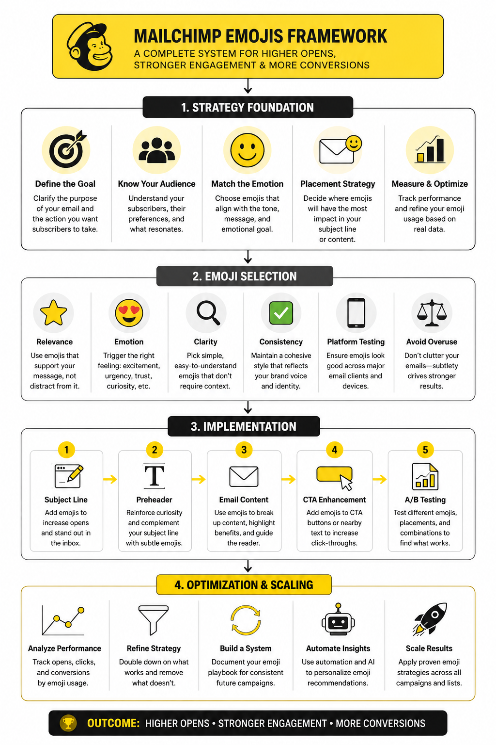
This framework keeps emojis in their proper role. They are not the message. They are a modifier that can sharpen the message when the fundamentals are already strong. In Mailchimp, that means the offer, sender name, preview text, segmentation, and timing still do most of the heavy lifting.
Intent
Start by naming the job of the emoji. It might create urgency, signal a holiday, show excitement, soften a reminder, or make a recurring newsletter easier to recognize. If you cannot explain the job in one sentence, the emoji probably does not belong.
This matters because vague emoji use creates friction. A random sparkle, fire, or eyes emoji may grab attention for a second, but the reader still has to decode what the email is about. That extra decoding can make the message feel less professional, especially in B2B, finance, legal, healthcare, or high-ticket services.
Audience
Not every list reacts the same way. A lifestyle ecommerce audience may accept playful subject lines more easily than a cold B2B lead list. A customer segment that already knows your brand may also tolerate more personality than first-time subscribers.
Audience expectations should shape how often you use mailchimp emojis. If your brand voice is calm, expert, and premium, emojis should be rare and subtle. If your brand is casual, creator-led, or community-driven, emojis may feel more natural, but they still need restraint.
Placement
Placement changes how the subject line feels. An emoji at the beginning creates immediate visual contrast. An emoji at the end feels more like a tone cue. An emoji in the middle can work, but it often interrupts readability.
Mailchimp’s own guidance is practical here: use emojis to supplement words, not replace them in its subject line recommendations. A subject line should still communicate the offer if the emoji fails to render, looks different on another device, or is skipped by someone using assistive technology.
Testing
Testing is where opinion becomes evidence. You may think an emoji makes a campaign feel more exciting, but your audience may read it as spammy, childish, or unnecessary. That is why the decision should be based on campaign results, not personal taste.
In Mailchimp, test emojis against a clean no-emoji version when the campaign volume is large enough to give useful signal. Watch open rate, click rate, unsubscribe rate, spam complaints, and revenue or lead quality. The goal is not to prove that emojis work. The goal is to find out when they work for your list.
Where Emojis Work Best In Mailchimp
Mailchimp emojis work best when they reduce friction instead of adding decoration. That usually means they belong in places where a small visual cue helps the reader understand the campaign faster. The safest use cases are subject lines, preview text support, section labels inside the email, and light brand personality in recurring campaigns.
The biggest mistake is using emojis because the campaign feels boring. If the offer is weak, the segment is wrong, or the subject line is vague, an emoji will not fix it. It may even make the campaign feel more desperate because the visual cue draws attention to a message that still does not give the reader a strong reason to care.
A better approach is to match the emoji to the reader’s intent. A launch email can use an emoji to signal newness. A webinar reminder can use one to signal timing. A discount email can use one to signal the offer category, but the actual value still needs to be written clearly in words.
Subject Lines
The subject line is the most obvious place to use mailchimp emojis because it is where inbox scanning happens first. A single emoji can help a campaign stand out when it supports the message naturally. For example, a calendar-style symbol can make sense for an event reminder, while a gift-style symbol can make sense for a limited promotion.
The rule is simple: the subject line must still work if the emoji disappears. Some email clients, devices, and operating systems may render emojis differently, and older environments may show a missing character box instead of the intended symbol. That is why the emoji should never carry the main meaning of the subject line.
This also protects accessibility. Screen readers may announce emoji names in ways that interrupt the sentence, especially when several emojis appear together. One relevant emoji is usually enough, and Mailchimp’s own subject line guidance recommends using emojis as support rather than replacements in its subject line best practices.
Preview Text
Preview text is often more useful than marketers treat it. It gives you a second line to clarify the promise, reduce uncertainty, or add urgency without stuffing the subject line. If you already used an emoji in the subject line, the preview text usually does not need another one.
The best preview text explains the value behind the visual cue. If the subject line uses a gift emoji, the preview text should say what the offer is, who it is for, or when it ends. If the subject line uses a calendar emoji, the preview text should confirm the date, topic, or reason to attend.
This keeps the campaign from feeling gimmicky. The emoji gets attention, and the preview text earns the open. That combination is much stronger than using two or three symbols and hoping the reader figures out why the email matters.
Email Body
Emojis inside the body of a Mailchimp campaign need even more restraint. They can help break up short, casual sections, but they should not replace proper formatting, hierarchy, or clear copy. If the email already has strong headings, bullets, product visuals, and buttons, extra emojis may add noise rather than clarity.
A practical use is section labeling. A small symbol beside a short label can help separate benefits, steps, event details, or reminders. This works best in newsletters, creator updates, community emails, and lightweight promotional campaigns.
For more formal campaigns, keep body emojis rare. B2B buyers, high-ticket leads, and compliance-sensitive audiences often care more about clarity and credibility than personality. In those situations, strong plain-language copy usually beats a playful visual cue.
Buttons And Calls To Action
Emojis in buttons can work, but they are easy to overdo. A button already has visual weight, so adding an emoji can make it feel louder than necessary. The best CTA buttons are clear, action-oriented, and specific.
If you use an emoji near a CTA, place it in nearby supporting text rather than inside the button itself. For example, a short reminder above the button can create urgency while the button stays clean. This keeps the action easy to understand and avoids turning the most important click target into a novelty element.
There is also a trust issue here. A button that says “Get My Discount” is usually stronger than one overloaded with symbols. The reader should never have to pause to understand what happens after the click.
How To Choose The Right Emoji
Choosing the right emoji is mostly about restraint. The goal is not to find the most exciting symbol. The goal is to find the one symbol that makes the message feel clearer, more timely, or more emotionally accurate.
Start with the campaign type. A newsletter, event reminder, product drop, cart recovery email, onboarding email, and reactivation campaign all have different emotional jobs. The emoji should match that job without making the message feel less credible.
Then check the tone. A playful emoji may fit a creator newsletter but feel strange in a serious service announcement. A warning-style emoji may create urgency, but it can also feel manipulative if the campaign is not genuinely time-sensitive. This is where judgment matters.
Match The Emoji To The Message
The emoji should make immediate sense beside the subject line. If readers need to interpret it, the symbol is probably too clever. Clear beats clever in email because the inbox is not a place where people want to solve puzzles.
For a sale, use language that states the actual offer rather than relying on a money or fire emoji. For an event, make the date or topic clear instead of depending on a calendar symbol alone. For a product launch, explain what is new rather than letting a rocket emoji do the work.
This is especially important for brands that sell services, software, consulting, or anything with a longer decision cycle. The reader is not just deciding whether the email looks fun. They are deciding whether the sender feels useful, trustworthy, and worth their attention.
Avoid Symbols That Create The Wrong Signal
Some emojis carry baggage. Money bags, flames, sirens, shocked faces, and excessive celebration symbols can make a campaign feel spammy even when the email is legitimate. They may attract attention, but attention with lower trust is not a win.
This is why mailchimp emojis should be selected for meaning, not volume. A subtle symbol can support the subject line without making the email feel like a hard sell. A loud symbol can create the wrong expectation before the reader even sees the offer.
The safest test is to read the subject line out loud without the emoji. Then read it again with the emoji in mind. If the emoji changes the tone from useful to pushy, remove it.
Keep Brand Consistency
Your emoji style should feel like your brand voice. If your emails are usually calm, practical, and expert-led, suddenly adding three playful symbols to a campaign can feel inconsistent. Readers notice that shift, even if they do not consciously think about it.
A simple internal rule helps. Decide which campaign types can use emojis, which ones should not, and which symbols fit your brand. This prevents random decisions every time someone builds a new Mailchimp campaign.
Consistency also makes performance easier to understand. If emoji use is chaotic, you cannot tell whether a result came from the offer, timing, subject line, or the visual cue. When your rules are consistent, your testing becomes cleaner.
Professional Implementation In Mailchimp
Once the strategy is clear, implementation should be boring in the best possible way. You do not want every campaign to become a debate about whether the subject line needs a sparkle, rocket, siren, or gift. You want a repeatable process that helps you use mailchimp emojis intentionally and remove them when they do not add value.
The process starts before you open the emoji picker. Write the subject line in plain text first, then decide whether an emoji improves it. If the plain version is weak, fix the message before adding anything visual.
Mailchimp already gives you the core places to control how the campaign appears in the inbox: subject line, preview text, from name, and from email address. Its preview text guidance defines preview text as the copy that appears next to the subject line in many inboxes, which means the emoji decision should never be isolated from the rest of the inbox package in Mailchimp’s preview text documentation. The inbox is a tiny first impression, and every part of it needs to work together.
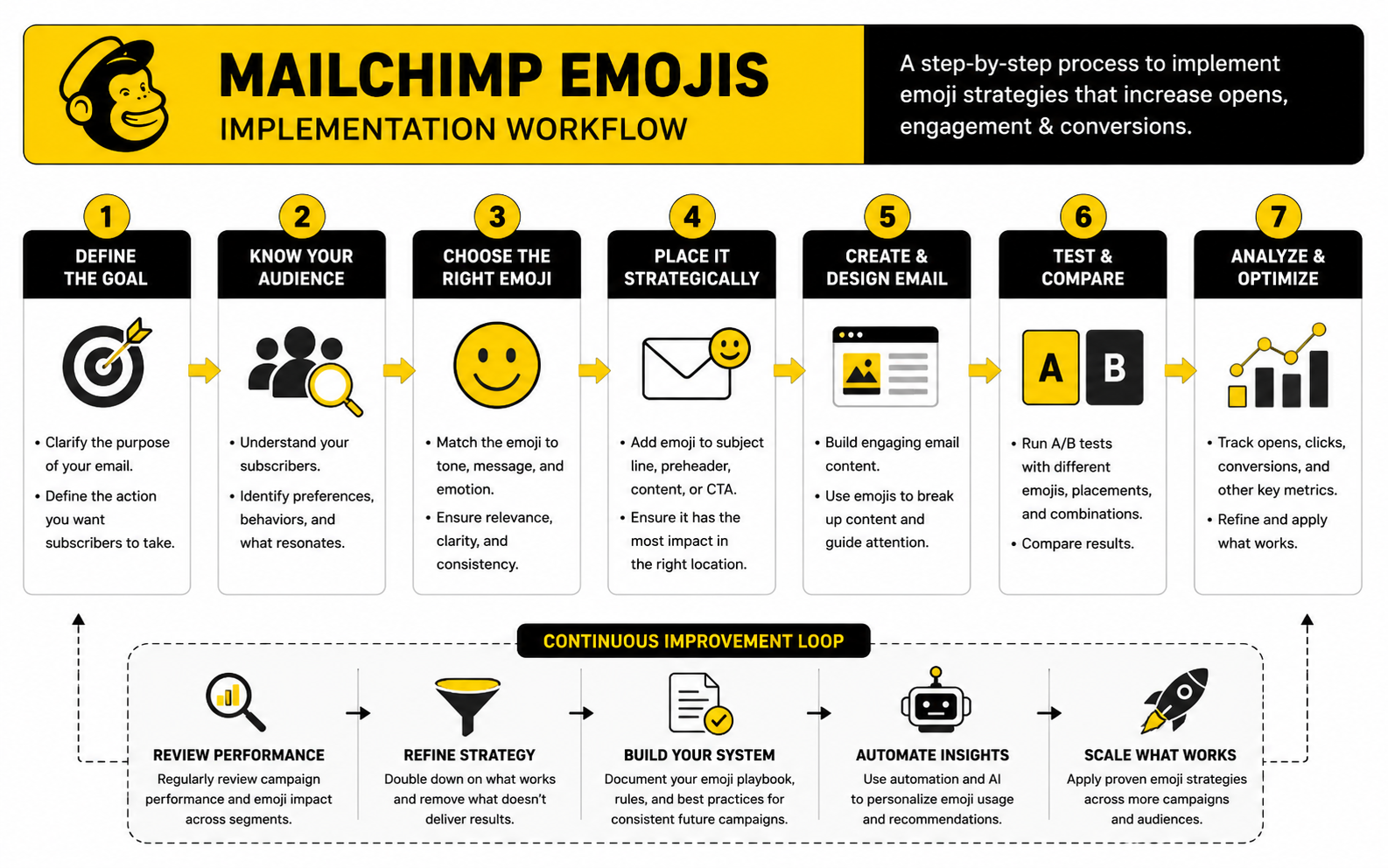
Step 1: Write The Plain Subject Line First
Start with a version that has no emoji at all. This forces the subject line to stand on its own. It should tell the reader what the email is about, why it matters, or what action is worth taking.
A good plain subject line usually has one clear promise. It might point to a deadline, a benefit, a product update, an event, or a useful piece of content. If it needs an emoji to feel interesting, the problem is probably the angle, not the formatting.
After you have a strong plain version, then test whether one emoji makes it easier to scan. Put the emoji at the start if you want immediate visual contrast. Put it at the end if you want a lighter tone cue. Avoid placing it in a way that breaks the sentence.
Step 2: Choose One Emoji With A Clear Job
One emoji is usually enough. Mailchimp’s subject line guidance recommends using no more than one emoji at a time, using emojis to supplement words instead of replacing them, and testing because different operating systems can display different emoji designs in its subject line best practices. That is a good default rule because it keeps the message readable and lowers the chance of the campaign looking gimmicky.
Give the emoji a job before you use it. It should signal timing, category, emotion, or format. A calendar-style emoji can support an event reminder, a gift-style emoji can support a promotion, and a notebook-style emoji can support a guide or resource.
Do not use emojis as filler. A fire emoji on a normal newsletter does not make the content more valuable. A rocket emoji on every launch email gets tired quickly. Repetition makes symbols invisible, and worse, it can train readers to ignore your campaigns.
Step 3: Pair The Subject Line With Useful Preview Text
Preview text should finish the thought that the subject line starts. If the emoji adds attention, the preview text should add clarity. This is where you explain the offer, the deadline, the benefit, or the reason the reader should open now.
For example, if the subject line signals an event, the preview text should mention the topic or timing. If the subject line signals a sale, the preview text should clarify the product, discount, or end date. This keeps the inbox experience practical instead of decorative.
The preview text should not repeat the subject line word for word. It should add a second useful layer. When the subject line and preview text work together, the emoji becomes a small support element rather than the main trick.
Step 4: Check Rendering Before Sending
Emojis do not always look identical across devices. Apple, Google, Microsoft, Samsung, and other platforms can render the same Unicode emoji with different visual styles. That means a symbol that looks friendly on one device may look louder, flatter, or less polished somewhere else.
This is not a reason to panic. It is a reason to test. Mailchimp’s own emoji guidance calls out the importance of testing because operating systems render different versions of emojis in its subject line recommendations.
Before sending, preview the email, send a test to yourself, and check it on the devices your audience is most likely to use. If the emoji looks odd, unclear, or too aggressive in a common inbox, remove it. The campaign should never depend on one symbol rendering perfectly.
Step 5: Review Accessibility And Readability
Accessibility is not a bonus detail. It affects how real people experience the campaign. Screen readers may announce emojis out loud, and repeated symbols can become annoying or confusing for people listening to the email instead of visually scanning it.
Litmus has documented that special characters and emojis can sound clunky when read by screen readers, especially when they are used decoratively or repeated in its screen reader optimization guidance. That is why the cleanest approach is also the most professional one: use one relevant emoji, keep the main meaning in words, and avoid emoji strings.
Readability matters for everyone else too. A subject line packed with symbols slows people down. A subject line with one clear cue can help, but only if the sentence still feels natural.
Step 6: Send, Measure, And Document The Result
After the campaign goes out, look beyond the open rate. Opens are useful, but they do not tell the whole story, especially as privacy changes have made open tracking less reliable across parts of the email ecosystem. Clicks, conversions, unsubscribes, spam complaints, and replies often tell you more about whether the campaign attracted the right attention.
Document what you tested. Save the subject line, emoji, preview text, segment, send date, offer type, and performance notes. Over time, this becomes your internal emoji playbook.
This step is what separates professional email marketing from guessing. You are not trying to prove that mailchimp emojis always work. You are learning which symbols, campaign types, and audience segments can use them without hurting clarity or trust.
A Practical Emoji Workflow For Campaigns
A simple workflow prevents overthinking. It also protects the brand from random creative decisions that feel fun in the moment but weaken the campaign. Use the same checklist before every Mailchimp send where an emoji is being considered.
This workflow is intentionally simple. Most teams do not need a massive emoji governance document. They need a practical rule that keeps the campaign focused on the reader.
The most important checkpoint is number three. If the emoji only decorates the campaign, it is optional. If it makes the campaign easier to understand at a glance, it may be worth testing. That distinction matters more than personal preference.
When To Use A/B Testing
A/B testing is useful when the list size is large enough to give meaningful results and the campaign matters enough to justify the extra setup. Test one variable at a time. If you change the emoji, subject line wording, preview text, and offer angle all at once, you will not know what caused the result.
For mailchimp emojis, the cleanest test is usually emoji versus no emoji with the same subject line wording. Keep the preview text, sender name, send time, and audience segment as consistent as possible. That gives you a cleaner read on whether the symbol helped or hurt.
Do not overreact to one test. A holiday campaign, product launch, and educational newsletter can all behave differently. Look for patterns across campaign types before turning one result into a permanent rule.
When To Skip Emojis Completely
Some campaigns should stay plain. Legal updates, billing notices, security alerts, crisis communications, apology emails, and sensitive customer messages rarely need visual personality. In those moments, the reader wants clarity and trust, not decoration.
You should also skip emojis when the brand relationship is still cold. If someone barely knows you, a playful subject line can feel premature. It is better to earn trust first with relevance, specificity, and useful timing.
Finally, skip emojis when everyone else in your category is overusing them. If the inbox is full of flames, sirens, and sparkles, plain clarity can become the stronger pattern interrupt. Professional does not have to mean boring. It means the email respects the reader’s attention.
Statistics And Data
The numbers around mailchimp emojis only matter when they help you make a better decision. A higher open rate looks nice, but it does not automatically mean the emoji worked. It may mean the audience was warmer, the offer was stronger, the send time was better, or Apple Mail Privacy Protection inflated the open data.
This is why emoji performance should be measured like a messaging variable, not like a magic tactic. You are testing whether one small visual cue improves attention without lowering trust or click intent. That means the right dashboard should connect inbox behavior, on-email behavior, and business outcomes.
Benchmarks are useful, but they are not the target. Mailchimp’s benchmark data is based on billions of emails sent through its system, with campaign tracking activated and campaigns sent to at least 1,000 subscribers, and it notes that the benchmark page was last updated in December 2023 in its email marketing benchmarks. That gives you context, not a guarantee. Your own list quality, category, offer, and relationship with subscribers will always matter more.
What Open Rate Can And Cannot Tell You
Open rate can still help you spot directional changes. If a plain subject line usually gets steady engagement and the emoji version suddenly drops, that is a useful warning sign. If opens rise across a few similar campaigns while clicks and complaints stay healthy, the emoji may be helping with inbox attention.
But open rate is weaker than it used to be. Apple Mail Privacy Protection changed how marketers interpret opens because it can preload tracking pixels and make opens less reliable as a human engagement signal. Litmus notes that more than 50% of email opens happen on a device with Apple’s Mail Privacy Protection activated, which can mean inflated opens, unknown open times, and less reliable location data in its Mail Privacy Protection resource.
That means you should not declare victory because an emoji subject line got more opens once. Treat open rate as a diagnostic signal, not the final score. If opens rise but clicks, replies, leads, or purchases do not move, the emoji may have created curiosity without creating qualified interest.
Click Rate Is The Cleaner Signal
Click rate is usually more useful because it shows that the subscriber did something after opening. Mailchimp describes click rate as the percentage of successfully delivered emails that prompted subscribers to click, and frames it as a signal of how relevant and valuable the campaign content is to the audience in its benchmark guidance. That is exactly the kind of signal you need when judging mailchimp emojis.
If an emoji increases opens but lowers click rate, the subject line may be attracting the wrong kind of attention. It may be too playful, too vague, or too disconnected from the actual email body. That is not a win, even if the top-line open metric looks better.
If opens stay similar but click rate improves, the emoji may be doing something more subtle. It may be setting the right expectation, making the campaign easier to recognize, or matching the intent of the message more clearly. That is the kind of performance lift worth investigating.
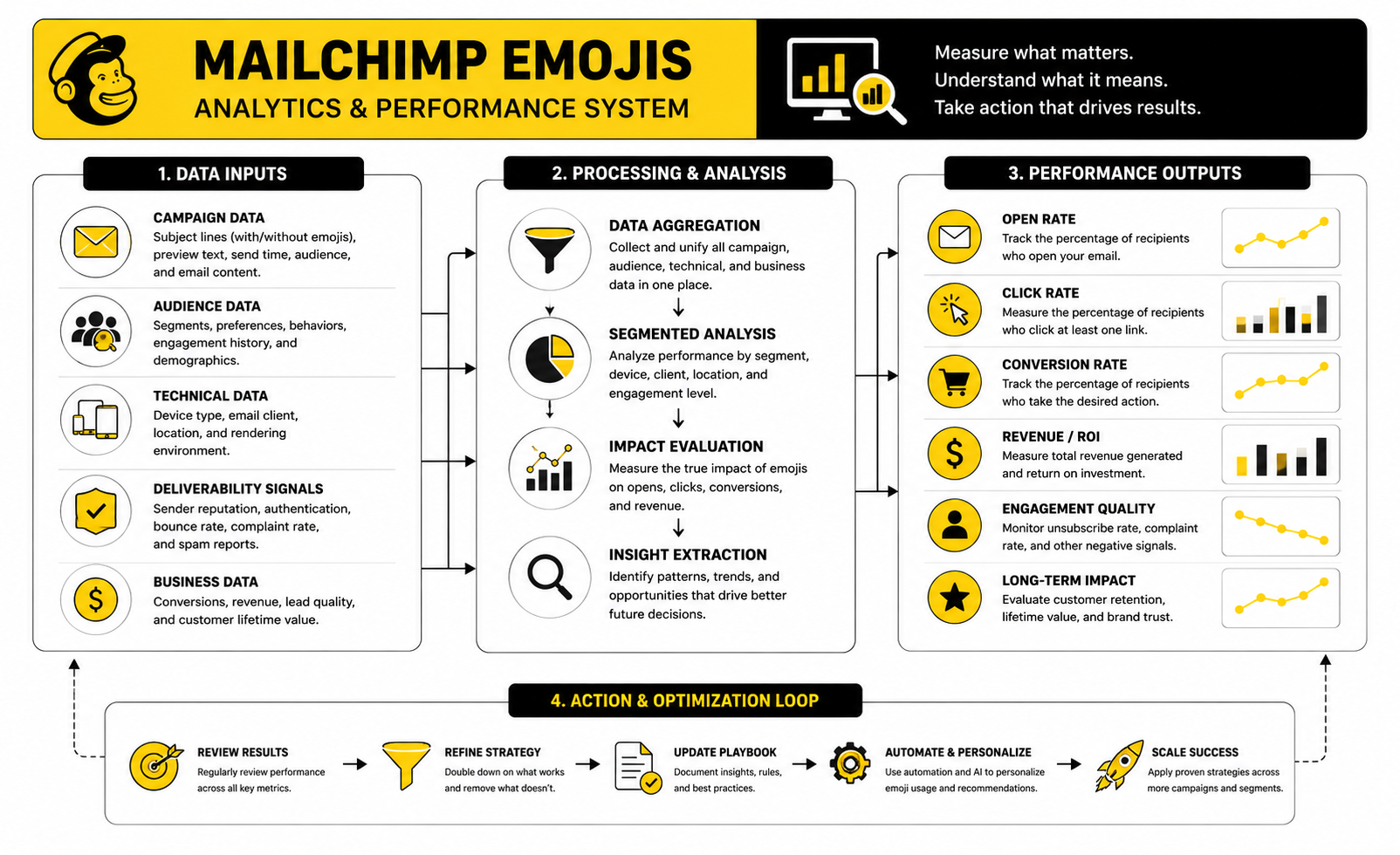
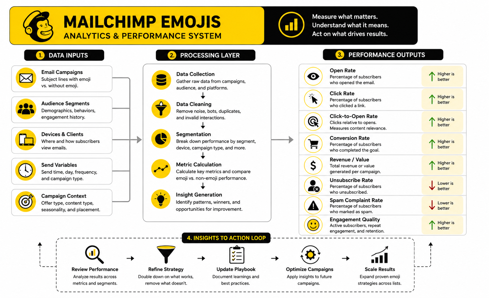
The Analytics System To Use
The cleanest way to measure mailchimp emojis is to separate attention, engagement, and outcome. Attention tells you whether the inbox package earned the open. Engagement tells you whether the content earned the click. Outcome tells you whether the campaign produced the action that actually matters.
Use a simple three-layer system:
This structure keeps you honest. A mailchimp emojis test should not be judged only at the top of the funnel. The symbol has to help the campaign create useful attention, not just more attention.
Benchmarks Should Set Context, Not Decisions
Benchmarks are helpful when you want to know whether a campaign is wildly underperforming or roughly in range. They are not helpful when you use them to excuse weak testing. A subject line with an emoji should be compared first against your own recent campaigns in the same category.
Industry benchmarks also mix many different sender types. A nonprofit newsletter, ecommerce sale, SaaS onboarding email, and local service reminder are not playing the same game. Even inside one industry, a warm customer list behaves differently from a cold lead magnet list.
The practical move is to build your own benchmark table inside Mailchimp or your reporting sheet. Track campaign type, audience segment, subject line format, emoji used, preview text, send day, open rate, click rate, unsubscribe rate, complaint rate, and conversion result. After 10 to 20 similar campaigns, your own data will beat generic averages.
What A Good Emoji Test Looks Like
A good emoji test changes one thing at a time. The cleanest version is the same subject line with and without one emoji. The audience, send time, offer, preview text, and email body should stay as consistent as possible.
For example, you might test a product update subject line with a simple visual cue against the same subject line without it. You are not testing a completely different angle. You are testing whether the emoji adds clarity, attention, or tone.
Do not run this once and build a religion around the result. One campaign can be affected by timing, seasonality, list fatigue, or the strength of the offer. Look for repeated patterns before deciding that emojis should become part of your regular Mailchimp style.
The Metrics That Should Make You Remove The Emoji
Sometimes the data tells you to stop. If emoji subject lines get more opens but weaker clicks, that is a mismatch. The subject line may be creating shallow curiosity instead of qualified intent.
You should also be careful if unsubscribe rate or spam complaints rise. That can mean the emoji made the message feel less relevant, less serious, or more promotional than subscribers expected. Small changes in complaint rate matter because deliverability is fragile and reputation compounds over time.
The strongest warning sign is performance decay. If the first few emoji campaigns perform well and later campaigns flatten or drop, your audience may be getting used to the pattern. Once the visual cue stops adding meaning, it becomes noise.
How To Read Results Without Fooling Yourself
Do not compare a Black Friday promotion with a Tuesday newsletter and call it an emoji test. Do not compare a warm customer segment with a broad prospect list and blame the symbol. Do not compare a campaign with a strong deadline to a campaign with no urgency and pretend the emoji caused the difference.
Read results in context. Ask what the reader already knew, how strong the offer was, how familiar the sender was, and whether the preview text supported the subject line. The emoji is only one small part of the inbox experience.
The best interpretation is usually practical, not dramatic. If a relevant emoji repeatedly improves attention without hurting clicks, conversions, unsubscribes, or complaints, keep testing it in that campaign type. If it creates noise, remove it and let the words do the work.
Advanced Risks And Strategic Tradeoffs
The deeper you go with mailchimp emojis, the more you realize the tactic is not really about emojis. It is about signal quality. Every subject line sends a signal about what kind of brand you are, what kind of relationship you want with the subscriber, and how seriously the reader should take the message.
That is why the advanced move is not “use more emojis” or “never use emojis.” The advanced move is knowing when the visual cue improves the relationship and when it quietly weakens it. A small symbol can make a campaign feel timely and human, but the same symbol can also make a serious message feel less credible.
This is the tradeoff that matters most. Emojis can create attention, but attention is only valuable when it attracts the right reader for the right reason. If the symbol gets the open but lowers trust, increases unsubscribes, or makes the offer feel cheaper, it did not help.
Deliverability Is About Patterns, Not One Emoji
An emoji by itself is not usually the thing that destroys deliverability. Email providers look at broader patterns: sender reputation, authentication, complaint rates, engagement, bounce behavior, list quality, and the relationship between the sender and recipient. A relevant emoji in a clean campaign is very different from a spammy campaign with weak permission and aggressive wording.
Still, symbols can contribute to the wrong pattern. If your subject lines regularly use sirens, flames, money symbols, excessive urgency, and heavy promotional language, the campaign can start to look like low-trust inbox clutter. Even if the emoji is not the direct technical cause, it may be part of a style that creates weaker engagement and more negative signals.
The practical rule is simple. Do not judge deliverability by whether one emoji is allowed. Judge it by whether your overall campaign style earns trust over time. If the emoji makes the subject line feel less honest, less clear, or more sensational, it is not worth the risk.
Brand Positioning Changes The Rules
A discount-heavy ecommerce brand can often use emojis more freely than a financial advisor, B2B consultant, SaaS company, or healthcare provider. That does not mean serious brands can never use mailchimp emojis. It means the threshold is higher.
For premium or expert-led brands, emojis should feel like light context, not personality overload. A subtle calendar cue for a live session may work. A string of celebration symbols for a normal content email probably will not. The more expensive, sensitive, or complex the buying decision, the more your subject line needs to protect credibility.
This is also where consistency matters. If your website, sales calls, onboarding, and customer support all feel polished and precise, the email subject line should not suddenly sound like a flash sale from a random marketplace. The inbox is part of the brand experience, not a separate playground.
List Segments Should Not All Get The Same Treatment
Your whole list does not need the same emoji strategy. New subscribers, loyal buyers, inactive contacts, high-intent leads, and long-term newsletter readers all have different levels of familiarity with your brand. A playful symbol can feel warm to one group and strange to another.
For cold or recently acquired subscribers, clarity should usually win. They are still deciding whether your emails deserve attention. A clean subject line with a concrete promise often builds trust faster than a visual hook.
For loyal subscribers, emojis can sometimes act as recognition cues. A recurring newsletter, weekly drop, monthly roundup, or community update can use a consistent light symbol to make the campaign easier to spot. Just keep it useful. Once the cue stops helping readers recognize something valuable, it becomes decoration.
Scaling Emoji Use Across A Team
Emoji use gets messy when multiple people write campaigns. One person uses a gift emoji for promotions, another uses a flame emoji for urgency, another adds three symbols because the subject line “looks fun.” Before long, the brand voice feels inconsistent and the data becomes hard to interpret.
A small style guide fixes most of this. It should define where emojis are allowed, where they are not allowed, which campaign types can use them, and which symbols are off-brand. It should also include a testing rule so the team knows when to run an emoji version against a plain version.
Keep the guide short. The goal is not to slow everyone down. The goal is to prevent random choices from becoming brand habits.
Create An Emoji Decision Matrix
A decision matrix helps remove personal opinion from the process. It turns “I like this emoji” into “Does this symbol support the campaign goal?” That is a much better standard.
Use four questions before approving mailchimp emojis:
If the answer is yes to all four, the emoji is probably safe to test. If one answer is no, revise the subject line. If two or more are no, remove the emoji and keep the campaign clean.
International Audiences Need Extra Care
Emojis can carry different meanings across cultures, age groups, and communities. A symbol that feels harmless in one market may feel confusing, immature, overly familiar, or even inappropriate somewhere else. That matters when your Mailchimp audience spans countries, languages, or professional contexts.
Rendering differences add another layer. Mailchimp has previously noted that emoji-using campaigns often had different email client mixes, including much higher iPhone usage among emoji senders in its historical analysis of subject line emoji support in its emoji support research. The exact device mix for your list may be different, so do not assume your audience sees the same polished symbol you see.
For international lists, keep emojis simple and literal. Avoid symbols with slang meanings, double meanings, or tone that depends on local culture. When in doubt, choose plain words.
Automation Makes Restraint More Important
Automated emails are different from one-off campaigns. A welcome sequence, abandoned cart flow, reactivation flow, onboarding series, or post-purchase email may run for months. An emoji that feels fresh today can become stale when people see it repeatedly across the customer journey.
Automation also changes context. A subscriber may receive a promotional campaign, then an automated reminder, then a transactional-style message close together. If every subject line uses visual urgency, the brand starts to feel noisy.
Use mailchimp emojis sparingly in automations. They work best when they help identify a specific moment, such as a welcome email, event reminder, or limited-time offer. For lifecycle emails that need to build trust, plain clarity usually wins.
AI-Written Subject Lines Still Need Human Judgment
AI can generate subject line variations quickly, but it can also overuse emojis because symbols make outputs look more lively. That is not the same as making them more effective. A subject line can be energetic and still be wrong for the audience.
If you use AI to brainstorm Mailchimp subject lines, treat emojis as suggestions, not finished decisions. Run each version through the same intent, audience, placement, accessibility, and measurement checks. The final call should come from your positioning and campaign data.
This matters even more when AI is used at scale. Without a review process, your campaigns can drift into the same generic patterns everyone else is using. The brands that win will not be the ones with the most emojis. They will be the ones with the clearest message and the strongest reader trust.
Common Mistakes To Avoid Before The Final Send
Most emoji mistakes are not technical. They are judgment mistakes. The campaign builder makes it easy to add symbols, so the real discipline is knowing when not to.
The most common mistake is using emojis to compensate for weak copy. If the offer is vague, the emoji only decorates the vagueness. A better subject line will almost always beat a mediocre subject line with a symbol attached.
Another mistake is treating every campaign like a promotion. Not every email needs urgency, excitement, or visual contrast. Some emails need calm confidence. Some need precision. Some need to feel almost invisible because the value is in the timing and relevance.
Overusing Urgency Symbols
Urgency symbols are powerful only when the urgency is real. Sirens, alarms, warning signs, and fire emojis can make sense for a genuine deadline, but they lose force quickly when used too often. Worse, they can make subscribers feel manipulated.
If every campaign looks urgent, none of them are. Readers learn the pattern and stop believing the signal. That is how a short-term attention trick becomes a long-term trust problem.
Reserve urgency symbols for campaigns where timing genuinely matters. If the deadline is soft, use plain language instead. Trust compounds when the reader feels that your emails mean what they say.
Ignoring The From Name
Subject lines do not work alone. The from name often has more influence on whether someone trusts the email enough to open it. If the sender name is unfamiliar, an emoji may not help much because the reader has not yet decided that the message deserves attention.
A recognizable from name plus a clear subject line is a stronger foundation than an emoji-heavy subject line from a sender the reader barely remembers. This is especially true for newsletters, creators, agencies, and personal brands. People open emails from senders they trust.
Before testing mailchimp emojis, make sure your from name is stable and recognizable. If you change sender identity often, your subject line tests will be harder to interpret. You will not know whether the emoji performed differently or whether subscribers simply did not recognize the sender.
Forgetting The Landing Page Experience
An emoji can help win the open, but the click still has to land somewhere that matches the promise. If the subject line creates excitement and the landing page feels slow, generic, or disconnected, the campaign loses momentum. The inbox promise and post-click experience need to feel like one journey.
This matters most for promotions, launches, and lead generation campaigns. If the email is playful but the landing page is confusing, the tone shift can hurt trust. If the email promises speed or simplicity but the page asks for too much too soon, the click will not convert well.
For campaigns where the landing page is the bottleneck, fixing the page will usually create more value than testing another emoji. Strong email marketing is not just about the email. It is about the whole path from attention to action.
Final System For Mailchimp Emojis
At this point, the right way to think about mailchimp emojis is simple: they are a small part of a bigger email system. They touch subject lines, preview text, accessibility, testing, brand voice, deliverability signals, and conversion quality. When they are treated as one isolated trick, they usually get overused.
A strong system protects you from that. It gives you a repeatable way to decide when emojis belong, how they should appear, what they should be measured against, and when they should be removed. That is how you keep the tactic useful without letting it take over the campaign.
The best system is not complicated. Use one emoji only when it supports the message, keep the meaning in words, test against a plain version when the campaign matters, and judge the result by clicks, conversions, complaints, and long-term trust. That is the professional standard.
Can You Use Emojis In Mailchimp Subject Lines?
Yes, you can use emojis in Mailchimp subject lines. Mailchimp supports emoji use in campaign subject lines and also gives practical guidance on using them carefully. The key is to use them as support, not as the main message.
A subject line should still make sense if the emoji does not render correctly. That protects readability across devices and inboxes. It also makes the campaign easier to understand for subscribers using assistive technology.
How Many Emojis Should I Use In A Mailchimp Subject Line?
Use one emoji at most in most campaigns. Mailchimp’s own subject line guidance recommends using no more than one emoji and using emojis to support words rather than replace them in its subject line best practices. That is a smart default because it keeps the subject line clean.
Multiple emojis can make an email feel noisy or promotional. They can also create awkward screen reader experiences. If one emoji does not make the message clearer, more emojis will not fix it.
Do Mailchimp Emojis Improve Open Rates?
Sometimes they can, but not reliably enough to treat them as a guaranteed open-rate hack. Emojis can help a subject line stand out, but the real performance depends on the audience, offer, sender reputation, preview text, timing, and brand trust. A weak campaign with an emoji is still a weak campaign.
Open rates are also harder to interpret now because privacy features can inflate or distort open tracking. Apple Mail Privacy Protection can affect opens, open timing, and location signals, which means open rate should be treated as directional rather than final proof in Litmus’s Mail Privacy Protection resource. Look at clicks and conversions before deciding whether the emoji actually helped.
Do Emojis Hurt Email Deliverability?
An emoji alone is usually not the main deliverability problem. Deliverability depends on bigger signals like permission quality, engagement, complaint rates, bounces, authentication, and sender reputation. A relevant emoji in a trusted campaign is very different from a spammy campaign with aggressive language and poor list quality.
Still, emojis can contribute to a low-trust pattern if they are used with exaggerated urgency or misleading copy. Sirens, flames, money symbols, and fake scarcity can make a legitimate email feel less credible. If the emoji makes the subject line feel pushy, remove it.
Where Should I Put Emojis In Mailchimp?
The safest places are the beginning or end of the subject line. An emoji at the beginning creates a stronger visual cue, while an emoji at the end feels more like a tone marker. Placing one in the middle can work, but it often interrupts the sentence.
You can also use light emojis inside the email body for casual newsletters or section labels. Be careful with buttons and calls to action because the button should stay clear and action-focused. The more important the action, the less decorative the copy should be.
Should I Use Emojis In Preview Text?
Usually, no. If the subject line already uses an emoji, the preview text should add clarity with words. Preview text appears next to the subject line in many inboxes, so it is better used to explain the offer, benefit, deadline, or reason to open in Mailchimp’s preview text documentation.
That does not mean preview text can never include an emoji. It means the default should be restraint. The subject line can create attention, and the preview text should earn the open.
Are Mailchimp Emojis Accessible?
They can be accessible when used carefully, but they can also create problems. Screen readers may announce emoji names, and repeated symbols can interrupt the message. That is why the safest approach is to keep the main meaning in plain words.
Accessibility improves when you use one relevant emoji, avoid emoji strings, and never replace essential words with symbols. Litmus has shown practical issues around special characters, emojis, and screen reader behavior in email, which is a strong reason to test before sending in its screen reader optimization guidance. Professional email marketing should work for more people, not fewer.
Which Emojis Work Best For Email Campaigns?
The best emojis are simple, literal, and connected to the campaign’s intent. A calendar-style emoji can fit an event reminder. A gift-style emoji can fit a promotion. A notebook-style symbol can fit a guide, checklist, or resource.
Avoid emojis that depend on slang, irony, or cultural interpretation. They are more likely to confuse people or create the wrong tone. The best mailchimp emojis are not the cleverest ones; they are the ones readers understand instantly.
Should B2B Brands Use Emojis In Mailchimp?
B2B brands can use emojis, but they should be more selective. A subtle symbol for a webinar, product update, or monthly roundup may feel natural. A loud promotional emoji in a serious sales sequence may weaken credibility.
The buying context matters. If your audience is making a high-ticket, complex, or risk-sensitive decision, your subject line should feel calm and useful. Personality is fine, but trust comes first.
Should Ecommerce Brands Use More Emojis?
Ecommerce brands often have more room to use emojis because promotions, launches, drops, and seasonal campaigns are more visual by nature. A well-matched symbol can help shoppers quickly identify the type of message. That can be useful when the offer is already clear.
But ecommerce brands can overuse them too. If every subject line has a fire, gift, sparkle, or siren, the symbols lose meaning. The better approach is to reserve emojis for campaigns where the visual cue genuinely helps the reader understand the offer faster.
How Do I Test Mailchimp Emojis Properly?
Test one variable at a time. The cleanest version is the same subject line with and without one emoji. Keep the audience, send time, preview text, offer, and email body as consistent as possible.
Then judge the result beyond opens. Review click rate, click-to-open rate, conversions, unsubscribes, complaints, and revenue or lead quality. If the emoji earns more opens but weaker downstream results, it may be attracting the wrong attention.
When Should I Avoid Emojis Completely?
Avoid emojis in sensitive, serious, or high-trust messages. Billing notices, apology emails, legal updates, security alerts, crisis communications, and important account information should usually stay plain. In those moments, clarity matters more than personality.
You should also avoid emojis when the brand relationship is cold or when the subject line already feels clear without one. If the symbol does not improve the message, it is not needed. Clean copy is often the most professional choice.
Can Emojis Replace Words In Mailchimp Campaigns?
No, they should not replace important words. Emojis should support the subject line, not carry the meaning. If the emoji disappears, renders differently, or gets read awkwardly by a screen reader, the subscriber should still understand the message.
This is a simple but important rule. Words create clarity. Emojis add tone or quick recognition. Do not reverse those roles.
What Is The Best Long-Term Strategy For Mailchimp Emojis?
Build a small internal rule set. Decide which campaign types can use emojis, which ones should stay plain, and which symbols fit your brand. Then track results by campaign type instead of judging every send in isolation.
The long-term goal is not to use emojis more often. The goal is to use them better. When mailchimp emojis help readers understand the message faster and take the right action, keep testing them. When they add noise, cut them.
Build a stronger local presence with BAAM AI
Turn your website, Google profile, social channels, and AI visibility into one growth engine
Most businesses do not need more random marketing activity. They need a consistent presence system that helps the right people find them, trust them, and take action. BAAM AI brings strategy, local SEO, website updates, Google Maps visibility, social content, AI-search readiness, media production, and reporting into one practical monthly engine.
If you want your marketing to keep working after the campaign ends, start with a free BAAM AI presence audit. See how your business shows up today and where the fastest visibility wins are at BAAM AI.