BAAM AI Blog
Mailchimp Email Design: A Practical Framework For Emails People Actually Read
Mailchimp email design is not about making a newsletter look “nice.” It is about making one decision easy for the reader: open, understand, click, reply, buy, book, or come back later. When design works, the email...
Mailchimp email design is not about making a newsletter look “nice.” It is about making one decision easy for the reader: open, understand, click, reply, buy, book, or come back later. When design works, the email feels simple on the surface, but underneath it has a clear message hierarchy, readable structure, useful visuals, mobile-aware spacing, and a call to action that does not make people think too hard.
That matters because email is still one of the few channels where you are not fully renting attention from an algorithm. The inbox is crowded, though, so weak design gets punished fast. Mailchimp’s public benchmark data is built from campaigns sent to at least 1,000 subscribers, which is a useful reminder that your email performance should be judged against real audience behavior, not against vanity expectations from one campaign that happened to spike once Mailchimp email marketing benchmarks.
Good design also has to survive the messy reality of the inbox. People read on phones, desktops, tablets, Gmail, Apple Mail, Outlook, dark mode, light mode, slow connections, and distracted five-minute breaks. Litmus notes that email accessibility is tied to how people with visual, physical, cognitive, and neurological disabilities experience your campaigns, and its 2026 accessibility guide also references Statista’s projection of 4.89 billion email users worldwide by 2027 Litmus email accessibility guide.
this guide is built as one six-part guide, so each section will build on the previous one instead of repeating the same generic email tips. The structure starts with strategy, then moves into layout, components, execution inside Mailchimp, and finally measurement. Use it as a working system, not a checklist you skim once and forget.
Why Mailchimp Email Design Matters
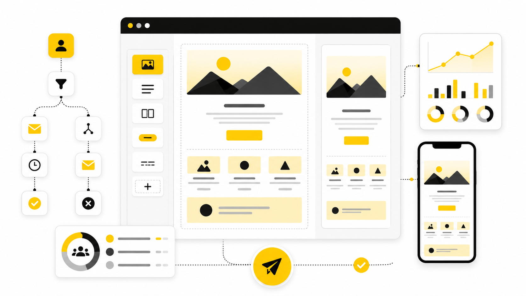
Mailchimp gives you templates, content blocks, brand tools, preview options, subject line helpers, automation email actions, and testing features. That is useful, but it also creates a trap: because the builder is easy to use, many teams start designing before they know what the email is supposed to do. The result is a polished-looking campaign with too many sections, vague copy, weak hierarchy, and no obvious next step.
The real job of Mailchimp email design is to translate a business goal into a readable inbox experience. A welcome email needs trust and orientation. A product launch email needs fast context, proof, and a focused click. A re-engagement email needs honesty, relevance, and a reason to stay subscribed.
This is why design cannot be separated from message strategy. Mailchimp’s own subject line guidance says strong subject lines are often personal or descriptive, and it recommends testing different wording to learn what your audience prefers Mailchimp subject line best practices. That same logic applies to the body of the email: design should not decorate the message; it should make the message easier to act on.
Professional email design also protects deliverability and brand trust indirectly. If the email looks broken on mobile, buries the offer, hides the unsubscribe link, or uses image-heavy blocks with no readable fallback, people are less likely to engage. Low engagement does not automatically mean “bad design,” but bad design makes every other part of email marketing work harder.
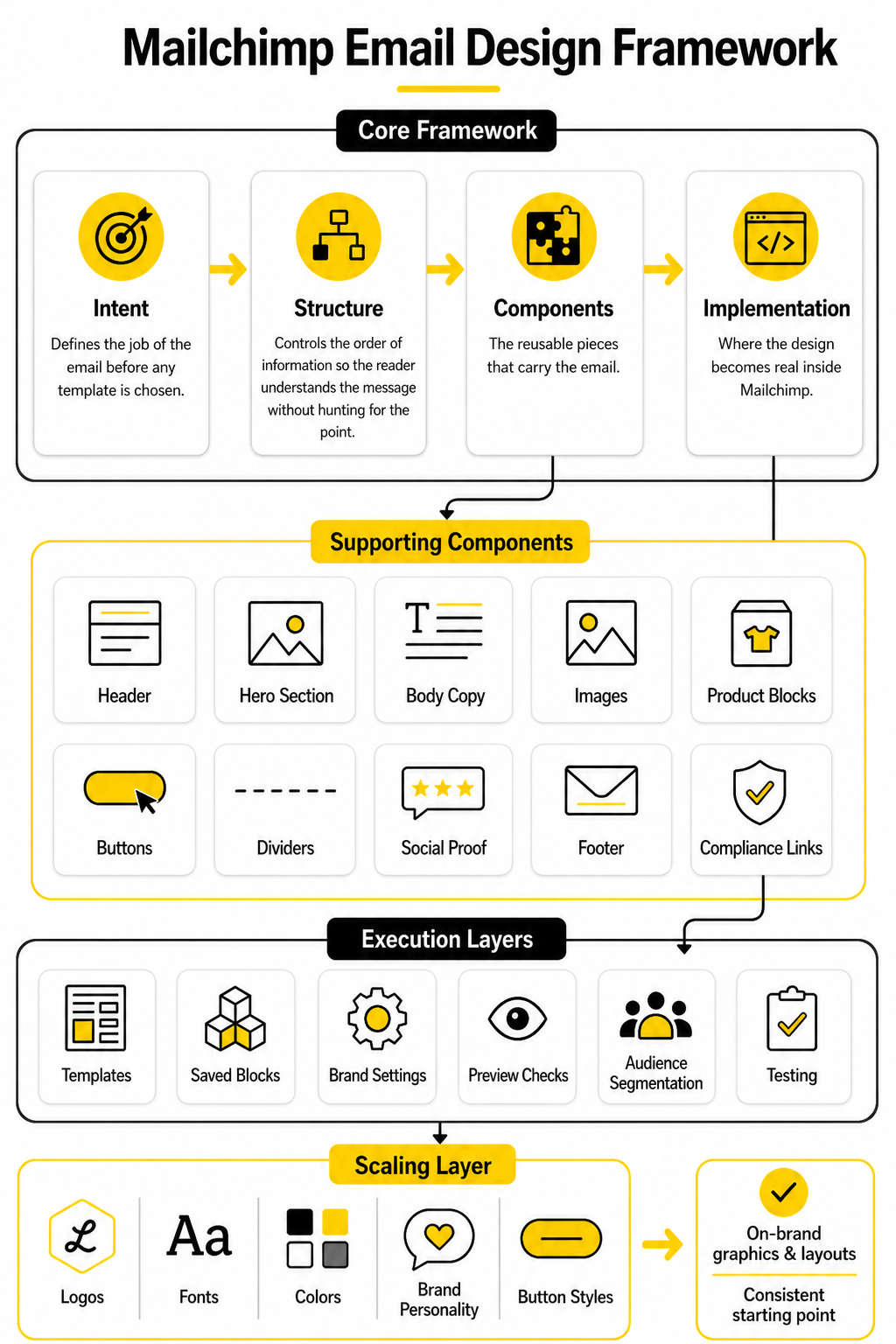
The Mailchimp Email Design Framework
A strong Mailchimp email design framework has four layers: intent, structure, components, and implementation. Intent defines the job of the email before any template is chosen. Structure controls the order of information, so the reader understands the message without hunting for the point.
Components are the reusable pieces that carry the email: header, hero section, body copy, images, product blocks, buttons, dividers, social proof, footer, and compliance links. Implementation is where the design becomes real inside Mailchimp, using templates, saved blocks, brand settings, preview checks, audience segmentation, and testing. When these four layers work together, the email feels clean because the thinking is clean.
Mailchimp’s new email builder is designed around templates, content blocks, brand customization, and desktop/mobile style controls Mailchimp new email builder. Its template workflow also encourages previewing emails on desktop and mobile and checking inbox rendering across clients before saving Mailchimp template builder. That is the right workflow: design, preview, test, refine, then send.
The framework is simple on purpose. Most email design problems are not solved by adding more sections. They are solved by removing friction, making the first screen clearer, tightening the copy, strengthening the CTA, and making sure the email still works when images are blocked or colors shift in dark mode.
Dark mode deserves special attention because email clients do not handle it consistently. Litmus explains that some clients partially adjust colors while others invert them more aggressively, which can affect readability, brand consistency, and image treatment Litmus dark mode email guide. A professional Mailchimp workflow should treat dark mode as part of design QA, not as an afterthought after the campaign is already approved.
What This Framework Changes In Practice
This framework changes the way you start. Instead of opening Mailchimp and asking, “Which template looks good?” you ask, “What does this email need to make the reader do next?” That one shift prevents most bloated campaigns before they happen.
It also changes how you evaluate the finished email. A design is not strong because it uses a large hero image, a trendy font pairing, or a colorful button. It is strong when the message is obvious, the layout is scannable, the CTA is easy to find, and the campaign still feels like your brand across devices and inboxes.
Mailchimp’s Brand Kit is useful here because it can store logos, fonts, colors, brand personality, and button styles, then use those assets to generate on-brand graphics and layouts Mailchimp Brand Kit. That does not replace judgment. It gives you a consistent starting point, so your team can spend less time rebuilding the same visual decisions and more time improving the offer, copy, and flow.
Build The Brand System Before The Template
The fastest way to make Mailchimp email design look amateur is to treat every campaign like a fresh design project. One week the button is rounded, the next week it is square. One promo uses a giant lifestyle image, the next uses a dense product grid, and the next looks like a plain internal memo with a logo slapped on top.
That kind of inconsistency is not just a visual problem. It makes the reader relearn your email language every time you send. A strong brand system gives every campaign a familiar rhythm, so subscribers can recognize your message quickly and focus on the actual offer, update, or story.
Mailchimp gives you tools for this, but the thinking has to come first. The platform’s Brand Kit can store brand colors, logos, fonts, button styles, and brand personality details, then help generate branded layouts and graphics from those assets Mailchimp Brand Kit. That is useful only when your brand rules are clear enough to guide the tool instead of letting the tool make random creative decisions for you.
Start With The Reader’s Mental State
Before choosing colors or blocks, decide what the reader is bringing into the inbox. A new subscriber is asking, “Can I trust this brand?” A returning buyer is asking, “Is this relevant to me?” A cold lead is asking, “Why should I care right now?”
That mental state should shape the design. A welcome email can afford a little more orientation because the relationship is new. A flash sale email needs speed, clarity, and a strong visual path to the offer. A newsletter needs better scanning because readers may only want one useful idea, not the entire issue.
This is where many Mailchimp campaigns go wrong. They use the same visual intensity for everything. A brand announcement, discount email, product education email, and customer story should not all feel identical, because the reader’s motivation is different in each one.
Define The Design Job For Each Email Type
A useful brand system has categories, not just colors. You need to know what a welcome email, promotional email, editorial email, product update, event invite, and re-engagement email should generally look like. That does not mean every email becomes formulaic. It means every email starts from a proven structure instead of a blank page.
For example, a promotional campaign usually needs a short opening, one dominant offer, a clear benefit stack, proof or urgency, and one primary CTA. A newsletter may need a stronger content hierarchy, with one main story and a few secondary links. A product education email may need more screenshots, labels, short captions, and a softer CTA because the reader is learning before buying.
Mailchimp’s template builder supports this kind of repeatable system because templates can be created from scratch, selected from pre-designed options, or built from recently sent emails Mailchimp template builder. The practical move is simple: build templates around email jobs, not around vague names like “Template 1” or “Monthly Design.”
Set Rules For Typography And Spacing
Typography does most of the heavy lifting in email. Readers should be able to tell the headline, subhead, body text, supporting detail, and CTA apart at a glance. If everything is similar in size, weight, or spacing, the email becomes work.
Keep body copy comfortable and avoid tiny text, especially for mobile readers. Mailchimp’s mobile style guidance emphasizes designing with phones and tablets in mind, then previewing and testing before sending Mailchimp mobile styles. That matters because an email that looks balanced on desktop can feel cramped, heavy, or exhausting on a phone.
Spacing is just as important as font choice. Give sections enough room to breathe, but do not create giant dead zones that push the CTA too far down. A strong Mailchimp email design usually feels calm, not because it is empty, but because every block has a clear role and enough space around it to be understood.
Build A Color System That Supports Action
Color should guide attention, not compete for it. Your primary CTA color should be easy to recognize and should not be reused for random decorative elements throughout the email. When every badge, divider, icon, and button fights for attention, the reader has no visual priority.
A practical color system has a small number of roles. Use one primary action color, one secondary support color, one neutral background range, and one alert or urgency color when the message genuinely needs it. This keeps the email flexible without turning every send into a rainbow.
Accessibility also belongs here. Mailchimp’s accessibility guidance highlights proper structure, color contrast, and useful alt text as part of making campaigns easier for more people to use Mailchimp accessibility in email marketing. Design that depends on low-contrast text, color-only meaning, or image-only messaging is fragile before the campaign even reaches the inbox.
Treat Images As Message Carriers, Not Decoration
Images can make an email feel polished, but they can also slow the reader down. A beautiful image that does not clarify the offer is not helping. It is just taking up space in one of the most expensive parts of the email: the reader’s first few seconds.
Use images when they add information, emotion, proof, or context. Product photos should make the product easier to understand. Screenshots should show the thing being explained. Lifestyle images should support the positioning, not act as generic filler because the template had an empty image block.
Alt text is part of the design system too. Mailchimp explains that alt text appears when recipients cannot view images and can also help people using screen readers understand the content Mailchimp alt text guidance. If the image carries meaning, write alt text that explains that meaning clearly. If the image is purely decorative, do not pretend it contains a key message.
Create A CTA Hierarchy Before You Write The Email
The call to action should not be decided at the end. It should be decided before the layout exists. When the main action is clear, the design can support it from the headline to the button.
Most emails should have one primary CTA. That does not mean there can never be secondary links, but the hierarchy must be obvious. If the reader sees three equally loud buttons, the campaign is asking them to make a decision that the marketer should have made already.
The CTA also needs to match the stage of intent. “Buy now” may work for a hot promotional email, but it can feel too aggressive in an educational email. “See how it works,” “Browse the collection,” “Reserve your spot,” or “Get the checklist” can be stronger when they match what the reader is actually ready to do.
Save Reusable Blocks With A Clear Purpose
Reusable blocks are one of the simplest ways to improve consistency inside Mailchimp. Save your best header, footer, product feature block, testimonial block, event block, offer block, and CTA section. Then name them clearly so your future self or your team knows when to use them.
This is not about being lazy. It is about protecting quality. When every campaign starts from approved building blocks, there are fewer chances to introduce odd spacing, off-brand colors, inconsistent buttons, or messy footer formatting.
Mailchimp’s section manager lets you organize email structure by moving, renaming, duplicating, deleting, and adding sections Mailchimp section manager. Use that structure deliberately. A reusable block should not just look good; it should solve a specific communication problem you face often.
Design The Core Email Components
Once the brand system is clear, the next step is turning it into actual email sections. This is where Mailchimp email design becomes practical. You are no longer thinking in abstract terms like “make it branded” or “make it engaging.” You are deciding what each block must do, where it belongs, and how it moves the reader toward the next action.
Every component needs a job. The header should orient the reader. The hero section should make the main point obvious. The body should create enough interest, clarity, or trust to continue. The CTA should remove friction, and the footer should close the email cleanly without feeling like an afterthought.
This matters because email is consumed fast. Litmus’ February 2026 email client market share report is based on more than 1.1 billion opens and shows Apple and Gmail dominating observed opens, with Outlook still representing a meaningful share of inbox behavior Litmus email client market share. Your design has to work across that reality, not just inside the Mailchimp editor where everything looks controlled.
The Header Should Be Useful, Not Heavy
The header is not the place to show off. It should tell the reader who the email is from and create a smooth entry into the message. A logo, a simple navigation row, or a short brand cue can work, but the header should never push the real message too far down.
For most campaigns, keep the header lean. A large branded masthead might make sense for an editorial newsletter, but it can slow down a promotional or lifecycle email. If the first screen is all logo and empty spacing, you are spending valuable attention before giving the reader a reason to stay.
The header also needs consistency. Readers should not wonder whether the email is really from you because the top of the design changes dramatically every week. A familiar header builds recognition, but a bloated header creates drag.
The Hero Section Must Make The Main Point Obvious
The hero section is where many email campaigns either win or lose. It should answer three questions quickly: what is this, why should I care, and what should I do next? If the reader has to scroll past a vague headline, a generic image, and a soft CTA before understanding the point, the design is working against the campaign.
A strong hero does not need to be loud. It needs to be clear. The headline should carry the main promise, the supporting line should explain the value, and the visual should reinforce the message instead of decorating it.
For Mailchimp email design, this often means resisting the default impulse to start with a huge image. If the image explains the offer, use it. If the image only fills space, lead with words and let the design support the copy.
Body Sections Should Build Momentum
The body of the email is where the argument develops. That does not mean it should be long. It means each section should make the next section feel natural.
A product email might move from problem to product benefit to proof to CTA. A newsletter might move from main insight to supporting resources. A launch email might move from announcement to feature explanation to early access details. The right sequence depends on intent, but the principle is the same: no random blocks.
This is where reusable components help. You can build blocks for benefits, feature explanations, testimonials, event details, product cards, and content previews. But do not drop them in because they exist. Add a block only when it helps the reader make a better decision.
Buttons Need Clear Language
Buttons are small, but they carry a lot of responsibility. A weak button says “Learn more” when the reader needs to know what happens next. A stronger button says “See the new collection,” “Book your demo,” “Read the guide,” or “Save your seat.”
The button should be visually obvious without overwhelming the email. Use your primary CTA color consistently, give the button enough space, and avoid placing several equally strong buttons close together. When every button looks primary, none of them feel primary.
Mailchimp’s preview tools are especially useful here because a button that looks balanced on desktop can dominate the screen on mobile or feel too small to tap comfortably Mailchimp preview and test your email. Preview the email the way subscribers will actually experience it, not just in the builder view.
Images Need A Fallback Plan
Images should never be the only place where critical information appears. Some recipients use screen readers. Some have images blocked. Some email clients delay loading. Some people are on bad connections and skim before the visuals fully render.
Mailchimp’s accessibility guidance is blunt on this point: do not hide important information in images, and use proper alt text when images are part of the message Mailchimp accessibility in email marketing. This is not just an accessibility issue. It is a conversion issue because image-only campaigns often fail the moment the image does not load.
Write the essential message in live text. Use images to support, prove, or clarify that message. Then add short, descriptive alt text so the email still makes sense when the visual layer is missing.
Product Blocks Should Be Easy To Compare
Product blocks are common in ecommerce emails, but they can get messy fast. Too many products, inconsistent image crops, uneven text lengths, and competing buttons make the email feel like a crowded shelf. The reader should not need to decode the layout before choosing what to click.
Keep product blocks visually consistent. Use similar image ratios, short product names, clear pricing when relevant, and one simple action per product. If the campaign is built around one hero product, do not dilute it with a huge grid of alternatives unless comparison is the point.
This is also where segmentation matters. A clean product block sent to the wrong audience will still underperform. The design can make a relevant offer easier to understand, but it cannot rescue an offer that should not have been sent to that segment in the first place.
Social Proof Should Support The Claim
Social proof is useful when it reduces doubt. It is not useful when it feels generic, exaggerated, or randomly inserted. A short customer quote, review snippet, press mention, usage stat, or recognizable brand logo can help, but only if it connects directly to the promise of the email.
Do not use proof as decoration. If the email says the product saves time, use proof that supports speed or simplicity. If the email promotes a premium service, use proof that supports trust, quality, or expertise.
This is why fake case studies and vague “customers love us” blocks are weak. They take up space without making the decision easier. Good proof sharpens the message; weak proof just makes the design longer.
Professional Implementation In Mailchimp
Now the framework becomes a process. You have the brand rules, the email type, the component roles, and the message hierarchy. The next step is building the campaign in Mailchimp in a way that is consistent, testable, and easy to improve later.
This is the difference between designing an email and operating an email design system. A one-off email can look good once. A system helps you produce good campaigns repeatedly, even when deadlines are tight and multiple people touch the work.
Mailchimp’s new email builder is built around templates, layouts, content blocks, styles, previewing, and testing Mailchimp new email builder. Use that structure deliberately. Do not treat the builder like a blank canvas every time.
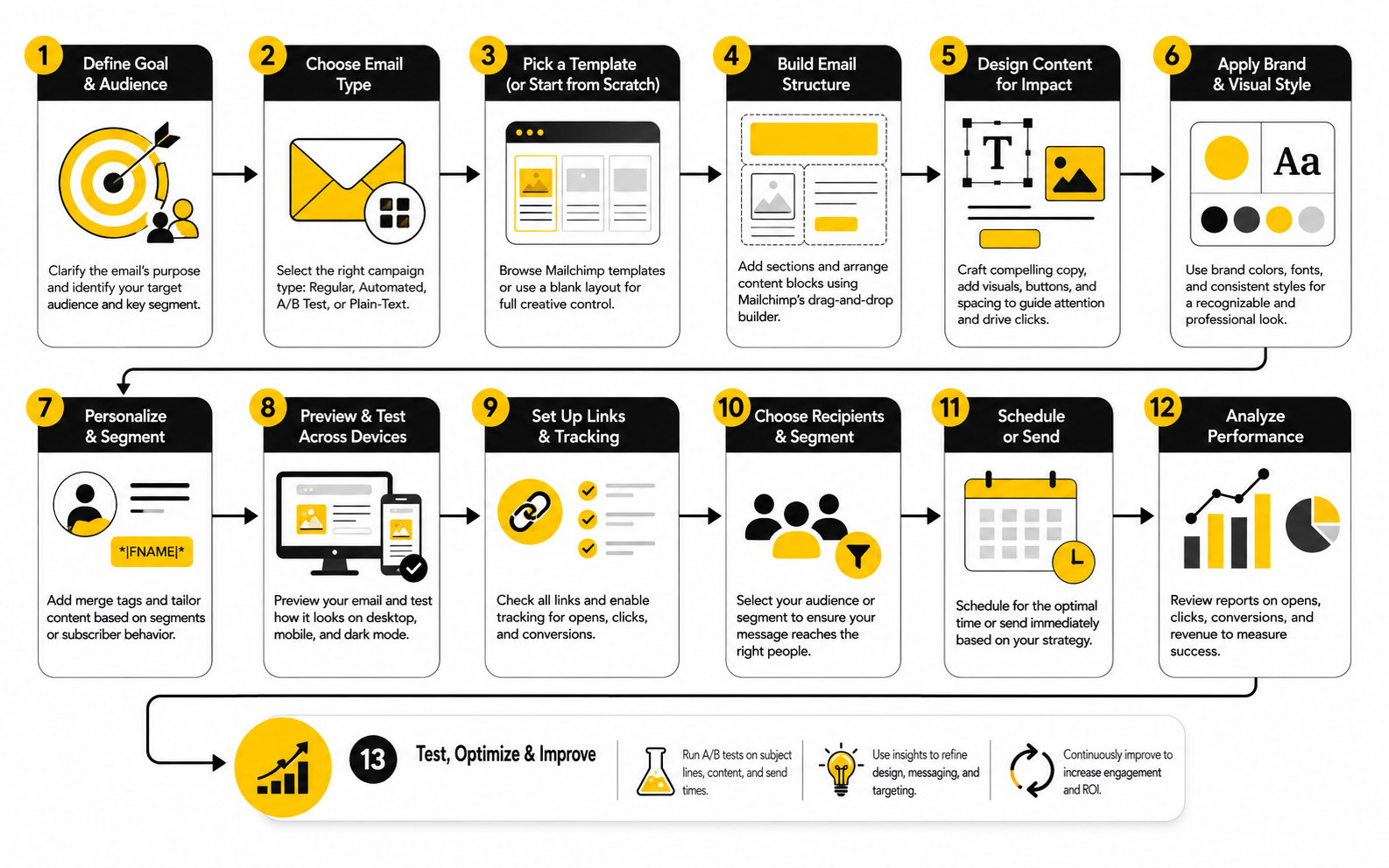
Step 1: Choose The Campaign Job
Start by naming the job of the email in plain language. Is it meant to welcome, educate, sell, announce, invite, reactivate, or follow up? This decision controls the rest of the design.
A welcome email needs orientation and trust. A sale email needs offer clarity and urgency. A product education email needs explanation and proof. When the job is specific, the layout gets easier because unnecessary sections become obvious.
This is also where you decide the primary CTA. Not three possible CTAs. One primary action. If the team cannot agree on the main action before the design starts, the email will probably feel unfocused when it is finished.
Step 2: Pick The Closest Approved Template
Do not start from scratch unless you are building a new system component. Choose the closest approved template for the campaign job. This keeps spacing, footer structure, brand elements, and CTA styling consistent.
If the template is almost right but not perfect, adjust it carefully. Change the sections that need to change, not the entire visual language. The goal is to make the campaign feel fresh while still feeling like it belongs to the same brand.
Mailchimp lets you use saved templates and recently sent emails as starting points, which is helpful for repeatable campaign production Mailchimp template builder. Use that feature to protect consistency, not to copy old emails blindly.
Step 3: Build The Message Hierarchy Before Filling Blocks
Before adding all the final copy, map the email in rough order. Headline, supporting line, proof, offer detail, CTA, secondary information, footer. This prevents the design from becoming a pile of content blocks.
The hierarchy should work even if someone only reads the headings and buttons. That is a useful test. If the skimmable layer does not communicate the point, the detailed copy will not save the email.
This step also helps with editing. When the hierarchy is visible, weak sections are easier to cut. You can see which blocks support the main action and which ones are just there because someone wanted to include them.
Step 4: Add Copy And Visuals Together
Copy and design should not be separate assembly lines. The headline affects the hero layout. The CTA language affects button width. The length of product descriptions affects grid balance. The images affect spacing, rhythm, and mobile stacking.
Build the copy and visuals together so the email feels intentional. If a paragraph is too long for the layout, rewrite it instead of shrinking the font. If a product image does not crop cleanly, choose a better image instead of forcing the block to carry it.
This is especially important for mobile. A two-column section may look sharp on desktop and become awkward when stacked. Mailchimp’s mobile style controls and preview options help catch those issues before the email reaches subscribers Mailchimp mobile styles.
Step 5: Check Accessibility Before Approval
Accessibility should be part of approval, not a separate cleanup task at the end. Check heading structure, contrast, alt text, link clarity, and whether the email still makes sense without images. These checks are practical, not theoretical.
The 2026 Litmus accessibility guide emphasizes alt attributes, readable structure, keyboard and screen reader considerations, and inclusive design practices for email Litmus accessible email guide. That aligns with the basic professional standard: people should be able to read, understand, and act on the email in more than one perfect viewing condition.
Be especially careful with low-contrast brand colors. A recent large-scale audit of the top 500 Common Crawl domains found that 40.9% of detected foreground and background color pairings failed the WCAG 2.1 and 2.2 Level AA 4.5:1 contrast threshold for normal text colour contrast accessibility audit. Brand consistency matters, but unreadable text is not brand consistency. It is just bad execution.
Step 6: Preview, Test, And Send Yourself A Real Email
The final check should happen outside the editor. Preview the email on desktop and mobile, send yourself a test, click every link, read the subject line next to the preview text, and check whether the first screen makes sense. This is where small problems become obvious.
Do not only inspect the pretty version. Look for awkward line breaks, crowded mobile stacking, missing alt text, buttons that feel too vague, and links that go to the wrong page. A beautiful email with a broken CTA is not almost done. It is not done.
When the campaign is ready, document what changed. Note the template used, the main CTA, the audience segment, and anything you want to test next time. That turns Mailchimp email design from a guessing game into a system you can improve.
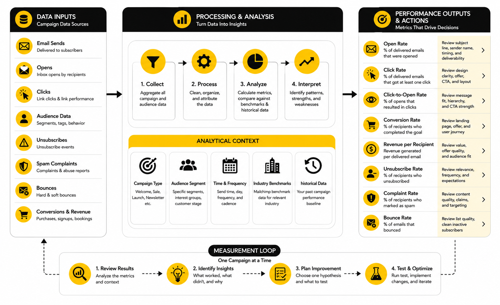
Statistics And Data
Measurement is where Mailchimp email design stops being subjective. Without data, design feedback becomes a room full of opinions: the founder likes the hero image, the designer likes the spacing, the copywriter likes the headline, and someone from sales wants three more buttons. Data does not make every decision for you, but it does show where the email helped the reader and where it created friction.
The key is to measure the design as a sequence, not as one final score. Opens tell you something about sender recognition, subject line, timing, and inbox placement. Clicks tell you whether the body, offer, layout, and CTA created enough momentum. Unsubscribes, spam complaints, bounces, and conversion data show whether the campaign matched the audience and business goal.
Mailchimp’s benchmark data is useful for context because it tracks campaigns sent to at least 1,000 subscribers and separates performance by industry Mailchimp email marketing benchmarks. But benchmarks are not commandments. A niche B2B list, an ecommerce flash sale, a local service campaign, and a nonprofit donor update should not be judged by one universal number.
Start With The Right Baseline
The first mistake is comparing every campaign to a broad industry average. That can be helpful for a reality check, but it is not enough to improve design. Your best baseline is your own list, your own segments, your own campaign types, and your own historical performance.
A welcome email should be compared with other welcome emails. A launch campaign should be compared with other launches. A weekly newsletter should be compared with previous newsletters, not a one-time discount email with a completely different audience and intent.
This matters because each campaign type has a different job. If a newsletter gets fewer clicks but drives stronger long-term engagement, that may be fine. If a sales email gets a high open rate but weak revenue, the subject line may have created curiosity that the design and offer failed to convert.
Read Open Rate Carefully
Open rate is useful, but it is not as clean as it used to be. Privacy features and automatic image loading can inflate or distort opens, especially in Apple Mail environments. Litmus’ February 2026 email client report shows Apple at 45.51% of observed opens, Gmail at 23.54%, and Outlook at 5.67%, based on more than 1.1 billion opens in Litmus Email Analytics Litmus email client market share.
That does not mean open rate is useless. It means you should treat it as a directional signal, not a perfect measurement of human attention. If open rate drops sharply across similar campaigns, look at subject line, sender name, send time, audience fatigue, and deliverability signals.
For design specifically, open rate is not the main metric. The design mostly starts working after the email is opened. So use open rate to diagnose the top of the funnel, then move quickly into click behavior, scroll depth proxies, link distribution, and downstream conversions.
Use Click Rate To Judge Clarity
Click rate is one of the most practical design signals because it shows whether recipients took action after receiving the email. Mailchimp defines click rate as the percentage of delivered emails and messages that registered at least one click Mailchimp marketing dashboard metrics. That makes it more connected to layout, copy, offer clarity, and CTA hierarchy than open rate.
A low click rate does not automatically mean the design is ugly. It may mean the offer was weak, the segment was wrong, or the email asked for too much too soon. But if the offer and audience are solid, weak clicks often point to design friction: unclear hierarchy, buried CTA, too many competing sections, vague button language, or a first screen that does not explain the value.
Look at which links get clicked, not just how many people clicked. If footer links get unexpected attention, the main CTA may be unclear. If secondary links outperform the primary button, your hierarchy may be wrong. If image clicks beat button clicks, the visual may be doing the real selling and the CTA copy needs work.
Track Click-To-Open Rate For Message Fit
Click-to-open rate is useful because it narrows the question. Instead of asking, “How many delivered emails got clicks?” it asks, “Of the people who opened, how many clicked?” That helps separate inbox-level performance from in-email performance.
If open rate is healthy but click-to-open rate is weak, the email earned attention but failed to convert it. That is a design and message problem worth studying. The headline may not match the subject line, the hero may be too vague, the offer may arrive too late, or the CTA may not feel worth clicking.
If open rate is weak but click-to-open rate is strong, the body may be doing its job for the people who see it. In that case, do not redesign the whole email first. Test subject lines, sender name, send timing, and segmentation before tearing apart a layout that may already be working.
Watch Unsubscribes And Complaints Like A Hawk
Unsubscribes are not always bad. Some list cleaning is normal, and a clear unsubscribe link is part of healthy email marketing. But spikes in unsubscribes or complaints after a design change should get your attention fast.
A design can cause this when it makes the email feel more aggressive, more frequent, less relevant, or harder to scan. If you suddenly add louder sales sections, multiple buttons, countdown-style urgency, or image-heavy promos to a list that expects useful editorial content, the design may be changing the relationship. That is not a small issue.
Mailchimp includes unsubscribe and related engagement metrics in its reporting environment, while custom report definitions include unsubscribed recipients and unsubscribe rate Mailchimp custom report metrics. Read those numbers alongside the campaign context. A high-performing sales email that burns trust may not be a win if it damages the next ten sends.
Connect Email Design To Revenue And Real Outcomes
Clicks are not the final goal for most businesses. A campaign may get strong clicks and still fail if the landing page, checkout, booking flow, or follow-up experience is weak. That is why Mailchimp email design should be measured against the full path, not just the email report.
For ecommerce, connect clicks to product views, carts, purchases, average order value, and repeat buying. For service businesses, connect email clicks to booked calls, form submissions, replies, pipeline movement, and closed revenue. For content-led brands, connect clicks to time on page, returning visitors, signups, and subscriber retention.
Mailchimp’s marketing dashboard lets users review performance over time and inspect individual message performance, conversions, and detailed engagement views Mailchimp marketing dashboard. Use those views to answer a practical question: did the email create the behavior it was designed to create? If not, the next design change should target the exact point where people dropped off.
Build A Simple Measurement Loop
You do not need a bloated analytics ritual. You need a loop your team will actually follow. After every meaningful campaign, review what happened, identify one design signal, and decide what to test next.
A practical measurement loop looks like this:
This keeps the process focused. You are not redesigning everything because one email disappointed you. You are learning whether a clearer hero, shorter copy, stronger button, simpler product grid, better mobile layout, or more relevant proof moves the number that matters.
Know What Each Metric Should Trigger
The point of analytics is action. If a number does not change what you do next, it is just dashboard decoration. Every metric should have a decision attached to it.
Use open rate to review subject line, sender recognition, timing, and list health. Use click rate to review clarity, offer strength, CTA visibility, and layout flow. Use click-to-open rate to review whether the email delivered on the promise that got the open.
Use unsubscribes and complaints to review relevance, frequency, pressure, and expectation mismatch. Use conversions to review the full journey after the click. Use revenue per recipient or lead quality when the business outcome matters more than raw engagement.
Do Not Let Benchmarks Replace Judgment
Benchmarks are helpful when you are lost. They are dangerous when they become the strategy. A campaign can beat an average and still underperform its potential, or miss an average and still work well for a small, high-value audience.
Mailchimp’s benchmark page is a good starting point because it lets you compare by industry and explains that the data may differ from benchmark data inside the Mailchimp app Mailchimp email marketing benchmarks. That caveat matters. Your own reporting environment will always be more useful than a public average when you are making design decisions.
So use benchmarks to calibrate expectations, then use your own data to improve the system. The best Mailchimp email design is not the one that looks most like everyone else’s “best practice.” It is the one that repeatedly helps your specific audience understand, trust, and act.
Advanced Mailchimp Email Design Decisions
At this stage, the basics are already handled. The brand system exists, the components have jobs, the implementation process is repeatable, and the measurement loop is in place. Now the real work is making more carefully tradeoffs as the program grows.
This is where many teams accidentally break what was working. They add more segments, more automations, more products, more stakeholders, more design variations, and more tests. Growth is good, but without clear rules, Mailchimp email design can turn from a clean system into a messy pile of exceptions.
Advanced design is not about making the email more complex. It is about knowing when complexity is worth it and when simplicity will perform better. That judgment is what separates a professional email program from a template library with a lot of noise.
Personalization Has To Earn Its Space
Personalization can improve relevance, but only when the data behind it is trustworthy and the design supports it cleanly. A personalized product block can be useful. A dynamic section based on subscriber interest can make the email feel more specific. A first-name merge tag, on its own, is not a strategy.
Mailchimp’s dynamic content feature lets a single campaign show or hide content blocks based on audience conditions Mailchimp dynamic content. That is powerful, but it also creates quality-control pressure. Every version of the email still needs to read naturally, stack properly on mobile, and make sense if a subscriber only sees one conditional block.
Use personalization where it changes the decision for the reader. If the same message would work for everyone, keep it simple. If different segments need different proof, offers, product categories, event locations, or onboarding steps, dynamic content can make the design more relevant without forcing you to build separate campaigns from scratch.
Segmentation Should Change The Message, Not Just The List
Segmentation is not just a targeting setting. It should affect what the email says, what it shows, and what it asks the reader to do. If you send the same creative to five segments with no meaningful changes, you are not really designing for those segments.
Mailchimp’s segmentation tools let marketers filter and target audiences, and its segmentation page says users have seen 20% higher open rates with segmented campaigns Mailchimp segmentation tools. The design lesson is simple: segmented campaigns usually work better when the email feels like it was built for that group, not merely sent to that group.
For a new lead, the design may need more context and trust. For an existing customer, it may need less explanation and a faster path to the next purchase or upgrade. For an inactive subscriber, it may need a plain, direct layout that feels more like a human check-in than another polished promotion.
Automations Need Their Own Design Rules
Automated emails should not feel like forgotten emails. They often reach people at moments of higher intent: after signup, after purchase, after abandonment, after a download, before an event, or when a customer hits a lifecycle milestone. That makes their design extremely important.
Mailchimp says Customer Journey Builder automations have generated on average 4x more orders for users than bulk emails alone Mailchimp Customer Journey Builder. Its marketing automation flows page also states that automated emails built with those flows saw up to a 127% increase in click rates compared with bulk emails Mailchimp marketing automation flows. Do not treat those numbers as a guarantee, but do treat them as a signal: triggered context can make design work harder because the message arrives closer to the reader’s actual behavior.
Automated design should be quieter and more functional than many broadcast campaigns. A cart recovery email needs product clarity, reassurance, and a clean return path. A welcome sequence needs progression, so each email has a distinct role instead of repeating the same brand pitch. A post-purchase flow needs useful next steps, not a desperate upsell five minutes after checkout.
Testing Should Be Disciplined, Not Random
A/B testing is useful only when the test is tied to a real hypothesis. Testing a blue button against a green button because someone asked for a test is not strategy. Testing whether a benefit-led hero beats a product-led hero for a specific segment and campaign type is much more useful.
Mailchimp’s A/B testing feature can compare subject lines, content, from names, and send times Mailchimp A/B testing. Its multivariate testing workflow lets teams test multiple variables across email versions after choosing recipients, variables, setup, and content Mailchimp multivariate testing. That flexibility is helpful, but it can also tempt teams into testing too many things without enough traffic to learn anything reliable.
Keep tests focused. For design, useful tests might compare a short hero against a longer educational opening, a single CTA against repeated CTAs, a product grid against one featured product, or a text-first email against an image-led layout. The point is not to “run tests.” The point is to learn which design choice changes behavior for a specific audience.
Deliverability Is A Design Constraint
Deliverability is not only a technical issue handled by someone else. Design decisions affect how recipients react, and recipient reactions affect sender reputation. If your emails look spammy, feel irrelevant, hide the unsubscribe path, or overuse aggressive visual tactics, the inbox will eventually push back.
Google’s sender guidelines say senders should keep spam rates below 0.1% and avoid ever reaching 0.3% or higher Google email sender guidelines FAQ. That is not a design tip in the usual sense, but it should influence design behavior. A campaign that gets clicks by annoying the wrong people is not a sustainable win.
Use design to set clear expectations. Make the sender recognizable, keep the message honest, avoid misleading subject-to-body mismatches, and make unsubscribe access easy. The more your email feels like a respectful continuation of the subscriber relationship, the less you have to rely on tricks.
Mobile Design Should Lead The Review
Desktop previews still matter, but mobile should lead the final review for most brands. The narrow screen exposes weak hierarchy immediately. If the first screen does not communicate the point, if the CTA is too far down, or if stacked sections become repetitive, mobile will show you.
This does not mean every email has to be ultra-short. It means the mobile version needs rhythm. Short paragraphs, clear headings, visible buttons, properly cropped images, and clean section breaks matter more when the reader is scrolling with one thumb.
The advanced move is to review mobile by intent. For a quick sale, the primary offer should appear fast. For a thoughtful editorial email, the opening should still earn the scroll. For a product education email, screenshots and captions must stay readable without forcing the reader to pinch or guess.
Design Systems Need Governance
The more people who touch email, the more governance matters. Without rules, everyone makes tiny exceptions. One person changes button padding. Another adds a new font size. Someone else creates a one-off footer. Three months later, the system is inconsistent and nobody knows which version is correct.
Governance does not need to be heavy. Create a simple internal reference that defines approved templates, reusable blocks, CTA styles, image ratios, footer rules, accessibility checks, and testing standards. Keep it short enough that people actually use it.
This is also where ownership matters. Someone needs authority to say no. Not every stakeholder request belongs in the email, and not every campaign needs a new design pattern. Protecting the system is part of the work.
Know When To Use Plain Text Styling
Not every important email should look like a polished campaign. Sometimes the most effective design is a clean, text-first layout that feels direct and personal. This is especially true for founder notes, re-engagement messages, high-trust service updates, and certain B2B follow-ups.
Plain-looking does not mean careless. The structure still matters. The opening needs a point, the paragraphs need rhythm, the link needs clarity, and the footer still needs to be compliant.
The mistake is thinking design always means more visual weight. In reality, good Mailchimp email design chooses the format that best fits the relationship. Sometimes that is a beautiful campaign. Sometimes it is a simple email that sounds like a real person wrote it.
Scale Without Turning Every Email Into A Machine
Automation, segmentation, and templates can make email more efficient, but they can also make it feel mechanical. The reader does not care that your workflow is sophisticated. They care whether the email feels relevant, useful, and worth their attention.
As the program scales, protect the human layer. Keep the copy specific. Remove filler blocks. Make offers honest. Review automated emails regularly so outdated language, broken links, old screenshots, and stale promises do not quietly damage trust.
This is the expert-level tradeoff: build systems so you can move faster, but keep enough judgment in the process that the emails still feel alive. The best Mailchimp email design scales production without flattening the relationship.
Final System Check
A mature Mailchimp email design system should feel simple to use, but it should not be simplistic underneath. The best systems connect strategy, creative, production, analytics, and governance into one repeatable flow. That is how you stop treating every email like a one-off project and start building a channel that gets sharper over time.
The final check is not, “Does this email look good?” That question is too vague. The better question is, “Does this email help the right reader understand the right message and take the right action with the least possible friction?”
When the answer is yes, the design has done its job. When the answer is no, you do not need more decoration. You need a clearer goal, cleaner hierarchy, stronger component choices, better audience alignment, or a more carefully test.
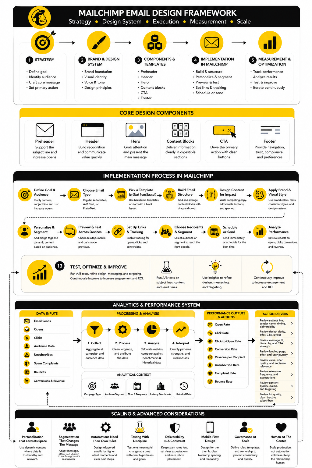
The Mailchimp Email Design System In One View
Think of the system as five connected layers. Each layer affects the next, and weak decisions at the top usually create messy execution at the bottom. If the goal is unclear, the template becomes bloated. If the audience is wrong, the CTA feels forced. If the measurement loop is missing, the team repeats the same mistakes because nobody knows what actually worked.
A practical system looks like this:
This is the part most teams skip because it sounds less exciting than new templates or AI-generated designs. Big mistake. A good system compounds because every campaign teaches the next one what to keep, what to cut, and what to test.
What Is Mailchimp Email Design?
Mailchimp email design is the process of planning, structuring, writing, styling, testing, and improving emails built inside Mailchimp. It includes the visual layout, copy hierarchy, CTA placement, mobile experience, accessibility, brand consistency, and post-send performance review. The goal is not just to make emails look professional, but to make them easier to read, understand, and act on.
Is Mailchimp Good For Email Design?
Mailchimp is good for email design when you use it with a clear system. Its builder, templates, content blocks, Brand Kit, testing tools, and analytics can support a professional workflow. The platform does not automatically create strong campaigns for you, though, so you still need strategy, good copy, strong hierarchy, and a disciplined review process.
What Makes A Good Mailchimp Email Template?
A good Mailchimp email template has a clear purpose, consistent branding, readable typography, mobile-friendly spacing, reusable sections, and an obvious CTA hierarchy. It should make common campaign types faster to build without forcing every email into the same structure. The best templates are flexible enough to adapt, but strict enough to prevent messy design drift.
How Long Should A Mailchimp Email Be?
A Mailchimp email should be as long as the decision requires and no longer. A flash sale email may need only a short hero, offer details, and a CTA. A product education email, newsletter, or onboarding email may need more explanation, but every section still has to earn its place.
Should Mailchimp Emails Use One Column Or Multiple Columns?
One-column layouts are usually safer for mobile-first email design because they stack cleanly and keep the reading path simple. Multi-column layouts can work for product grids, content roundups, and comparison sections, but they need careful mobile previewing. If the stacked version becomes repetitive or confusing, simplify the layout before sending.
How Many CTAs Should A Mailchimp Email Have?
Most emails should have one primary CTA. You can repeat that CTA in more than one place if the email is longer, but the action should feel consistent. Secondary links are fine when they support the reader, but they should not compete with the main goal of the campaign.
Should I Use Images Or Plain Text In Mailchimp Emails?
Use images when they clarify the message, show the product, create trust, or add useful context. Use plain text styling when the email needs to feel direct, personal, or high-trust. The strongest Mailchimp email design is not always the most visual one; it is the one that matches the reader’s situation and the message’s job.
How Do I Make Mailchimp Emails Look Professional?
Start with a consistent brand system, then build approved templates and reusable blocks. Keep typography readable, spacing clean, images purposeful, and CTA language specific. Professional design usually comes from removing confusion, not adding more visual effects.
How Do I Improve Click Rate In Mailchimp Emails?
Start by checking whether the email has one clear promise and one clear next step. Then review the hero section, CTA placement, button copy, mobile layout, link distribution, and audience relevance. If people open but do not click, the email probably earned attention but failed to create enough clarity, trust, or motivation.
What Metrics Matter Most For Mailchimp Email Design?
Click rate, click-to-open rate, conversion rate, unsubscribe rate, complaint rate, and revenue or lead quality are more useful for design decisions than open rate alone. Open rate helps diagnose the inbox layer, but design mostly proves itself after the email is opened. Use each metric to trigger a specific improvement instead of staring at dashboards without changing anything.
How Often Should I Redesign Mailchimp Templates?
Do not redesign templates just because they feel old internally. Redesign when performance data, brand changes, accessibility issues, mobile problems, or production inefficiencies show that the current system is holding you back. Small improvements made consistently often beat a dramatic redesign that resets everything without solving the real problem.
Can AI Help With Mailchimp Email Design?
AI can help draft sections, suggest layouts, generate variations, and speed up production, especially when the brand system is already clear. Mailchimp’s AI content tools can create layouts and copy from prompts or website URLs Mailchimp AI content creation. Still, AI should support judgment, not replace it, because your audience, offer, proof, and brand voice need human direction.
What Is The Biggest Mailchimp Email Design Mistake?
The biggest mistake is starting with the template before defining the campaign job. That leads to emails that look polished but feel unfocused. Decide the audience, message, offer, and primary action first, then choose the design structure that supports them.
How Do I Know If My Mailchimp Email Design Is Working?
Your design is working when the email consistently helps the right audience take the intended action. Look at clicks, conversions, replies, revenue, unsubscribes, complaints, and performance by campaign type. If the numbers improve because the email is clearer, more relevant, and easier to act on, the design system is doing its job.
Should I Hire A Professional For Mailchimp Email Design?
Hire a professional when email is important to revenue, retention, lead generation, or customer education and your current system feels inconsistent. A good email designer or email marketer can help turn scattered campaigns into a repeatable system with templates, reusable blocks, accessibility checks, testing rules, and measurement habits. That usually saves time and improves quality faster than endlessly tweaking one campaign at a time.
Build a stronger local presence with BAAM AI
Turn your website, Google profile, social channels, and AI visibility into one growth engine
Most businesses do not need more random marketing activity. They need a consistent presence system that helps the right people find them, trust them, and take action. BAAM AI brings strategy, local SEO, website updates, Google Maps visibility, social content, AI-search readiness, media production, and reporting into one practical monthly engine.
If you want your marketing to keep working after the campaign ends, start with a free BAAM AI presence audit. See how your business shows up today and where the fastest visibility wins are at BAAM AI.