BAAM AI Blog
Klaviyo Email Design: The Practical Framework For Emails That Look Good And Sell
Klaviyo email design is not just about making campaigns look polished. It is about turning customer data, brand positioning, offer clarity, and mobile-first layout into emails people can understand quickly and act on...
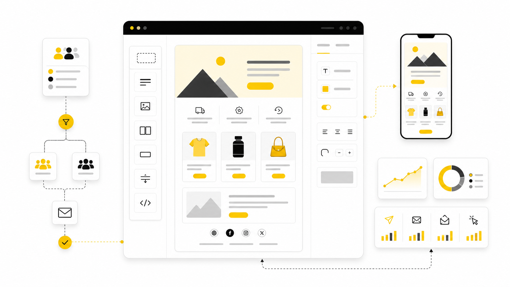
Klaviyo email design is not just about making campaigns look polished. It is about turning customer data, brand positioning, offer clarity, and mobile-first layout into emails people can understand quickly and act on without friction. A beautiful email that does not make the next step obvious is not design; it is decoration.
That matters because inbox attention is expensive now. Klaviyo’s own ecommerce email benchmarks show average campaign performance around a 39.74% open rate, 1.47% click rate, $0.11 revenue per recipient, and 0.09% placed order rate, which means small design decisions can compound fast across a large list. The gap between a forgettable email and a profitable one often comes down to hierarchy, message timing, segmentation, and how confidently the design guides the reader toward one action.
The mistake many brands make is treating Klaviyo like a newsletter builder. Klaviyo is stronger than that. It connects email design to customer behavior, product interest, purchase history, predictive data, and automated flows, so the best designs are built around intent instead of generic templates.
Why Klaviyo Email Design Matters
Klaviyo email design matters because the email is usually not the first impression. By the time someone receives a welcome email, browse abandonment email, cart recovery message, replenishment reminder, or post-purchase flow, they have already given the brand some kind of signal. The design has to respect that context instead of talking to every subscriber like they are the same person.
This is where Klaviyo becomes especially useful for ecommerce brands. A campaign can speak to a seasonal launch, while a flow can respond to specific behavior such as joining a list, viewing a product, abandoning checkout, or buying for the first time. Klaviyo’s benchmark guidance emphasizes that stronger results usually come from segmentation and automation, which is exactly why design should be built around the customer journey instead of isolated email blasts.
Good design also protects attention. Most subscribers scan before they read, so the layout has to make the value obvious in seconds. That means the hero section, headline, product block, CTA, offer framing, and supporting copy all need to work together instead of competing for attention.
The Klaviyo Email Design Framework
The simplest way to think about Klaviyo email design is as a framework with four layers: audience, message, structure, and action. Audience defines who should receive the email and what they already know. Message defines the one idea the email needs to land. Structure organizes that idea visually. Action turns the email into a measurable business outcome.
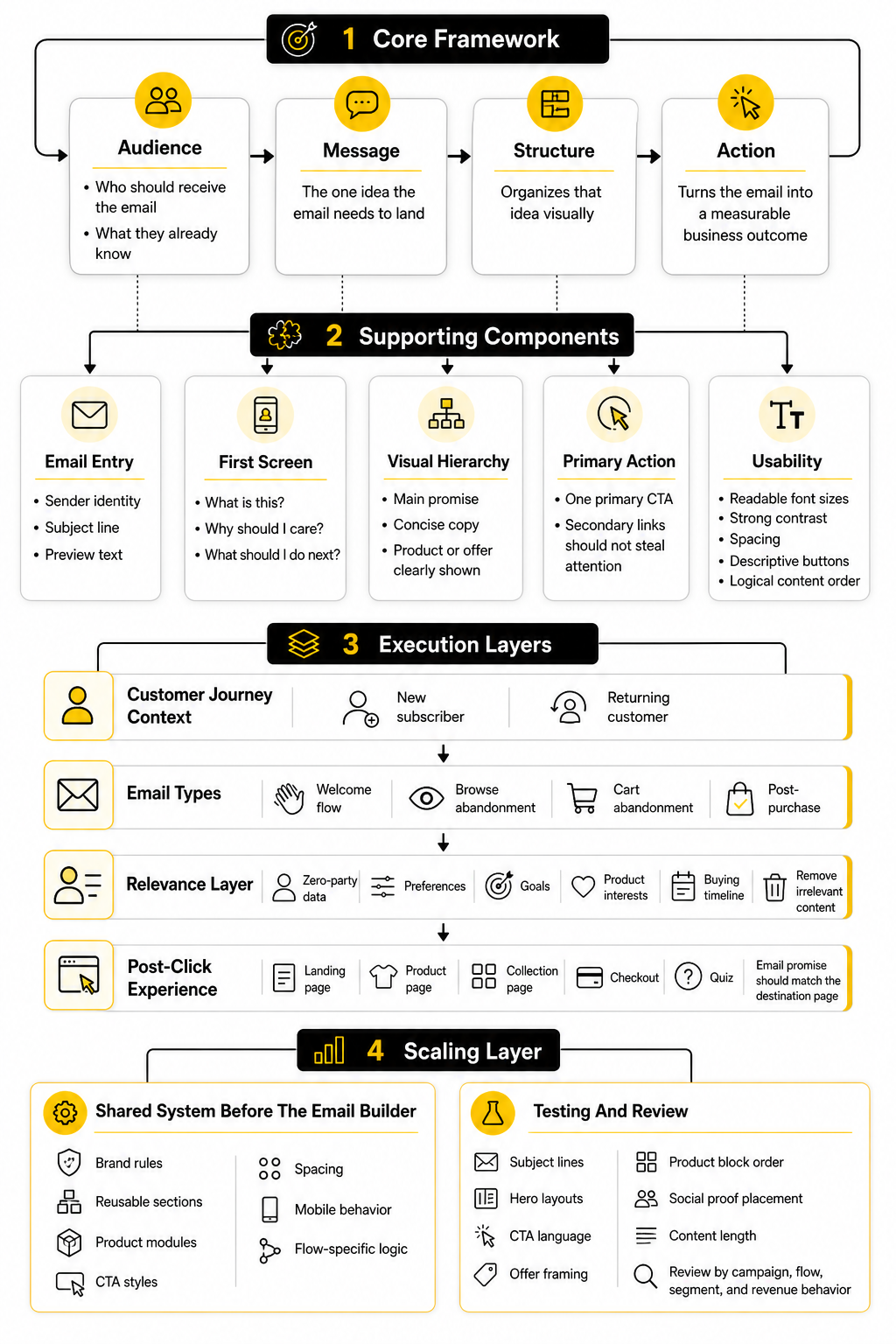
This framework prevents the most common design problem: starting with a template before knowing what the email is supposed to do. A welcome email, product education email, abandoned cart email, winback email, and VIP launch email should not all use the same structure. They may share brand elements, but the hierarchy, proof, CTA, and product emphasis should shift based on the subscriber’s intent.
A practical Klaviyo setup also connects email design with the surrounding customer experience. If the email sends traffic to a weak product page, the campaign will struggle even if the email looks excellent. For brands building dedicated ecommerce landing pages, tools like Replo can help keep the post-click experience aligned with the email promise, which matters because the click is only the middle of the conversion path.
Core Components Of A High-Converting Klaviyo Email
A strong Klaviyo email usually starts with a clear sender identity, a subject line that matches the message, and a preview text line that adds useful context instead of repeating the subject. Once the email opens, the first screen should answer three questions fast: what is this, why should I care, and what should I do next? If those answers are not obvious, the design is asking the subscriber to do too much work.
The visual hierarchy should be simple. Lead with the main promise, support it with concise copy, show the product or offer clearly, and use one primary CTA that matches the intent of the email. Secondary links can exist, but they should not steal attention from the main action.
Accessibility and mobile readability are not optional details. Litmus research on email innovation highlights ongoing marketer focus around dark mode, accessibility, modular design, segmentation, and A/B testing, which reflects a practical truth: the email has to work across inboxes, devices, and reading environments. Clean spacing, readable font sizes, strong contrast, descriptive buttons, and logical content order make the email easier to use and easier to trust.
Designing With The Whole Customer Journey In Mind
Klaviyo email design works best when every email has a job inside the broader customer journey. The welcome flow should reduce uncertainty and introduce the brand clearly. Browse and cart abandonment emails should bring the shopper back to the product with helpful reminders, not desperate pressure. Post-purchase emails should build confidence, reduce support friction, and open the door to the next relevant purchase.
This is also where zero-party data can improve design decisions. When subscribers tell you their preferences, goals, product interests, or buying timeline, Klaviyo segments can support more relevant email layouts and content blocks. A simple form built with a tool like Fillout can give the email team better inputs than guessing from generic list behavior.
The point is not to make every email hyper-personalized for the sake of sounding clever. The point is to remove irrelevant content. When the design shows the right product category, proof point, offer, or next step for the subscriber’s stage, the email feels easier to act on.
Professional Implementation Starts Before The Email Builder
Professional Klaviyo email design starts before anyone opens the drag-and-drop editor. The team needs a shared system for brand rules, reusable sections, product modules, CTA styles, spacing, mobile behavior, and flow-specific logic. Without that system, every campaign becomes a one-off design project, and consistency breaks down quickly.
A mature implementation also defines what should be tested. Subject lines are easy to test, but design teams should also test hero layouts, CTA language, offer framing, product block order, social proof placement, and content length. Klaviyo is useful here because performance can be reviewed by campaign, flow, segment, and revenue behavior instead of only surface metrics.
The rest of this guide will build that system step by step. First, it will define the full Klaviyo email design framework in more detail. Then it will break down the components, campaign and flow design patterns, professional implementation process, testing workflow, and final checklist so you can move from attractive emails to emails that consistently support revenue.
The Klaviyo Email Design Framework
The easiest way to make Klaviyo email design more profitable is to stop thinking in isolated emails. A subscriber does not experience your brand as separate campaigns, flows, popups, landing pages, and product pages. They experience one continuous path, and every email either makes that path clearer or adds more noise.
That is why the framework starts with intent. Before you design the header, choose a product block, write a CTA, or decide whether the email should be short or long, you need to know what the subscriber is trying to do next. A first-time visitor who joined for a discount needs a different email than a repeat buyer who already trusts the brand but needs a reason to come back.
Klaviyo is useful because it gives you the data to make those decisions instead of guessing. Its ecommerce benchmark guidance points to segmentation and automation as core drivers of stronger email performance, which means design should follow behavior. The layout should change because the customer context has changed.
Start With The Subscriber’s Stage
Every Klaviyo email should be designed around a specific stage in the customer journey. That stage tells you how much the subscriber knows, how much trust already exists, and how direct the CTA can be. If you skip this step, the email may still look good, but it will often feel slightly off.
A new subscriber usually needs orientation. They need to understand what the brand sells, why it exists, what makes the products different, and what they should do first. This is where clean hierarchy, a confident welcome message, and a simple first-purchase path matter more than cramming in every product category.
A returning customer needs something else. They may not need a full brand explanation again, but they may need product education, replenishment timing, loyalty recognition, early access, or a relevant cross-sell. Good Klaviyo email design adapts the amount of context based on what the subscriber has already done.
Match The Email Type To The Job
A campaign and a flow should not be designed the same way. Campaigns are usually planned around launches, promotions, announcements, seasonal moments, or content. Flows are triggered by behavior, so they need to feel more personal, more timely, and more connected to what just happened.
For example, a product launch campaign can use stronger visual storytelling because the goal is to create demand. A cart abandonment email should usually be more direct because the subscriber has already shown intent. The job is not to reintroduce the entire brand; it is to remove friction and bring the shopper back to the product.
This is where many brands accidentally weaken their email performance. They reuse the same visual template for every message because it feels efficient. Efficiency is good, but not when it flattens the strategy. A strong system gives you reusable design blocks while still letting each email type do its specific job.
Build Around One Primary Action
A high-converting email should have one obvious next step. That does not mean the email can only contain one link, but it does mean the design should make one action feel clearly primary. If the reader has to choose between five competing CTAs, the email is no longer guiding them.
This is especially important in ecommerce, where brands often want to show too much. A sale email may include the discount, bestsellers, new arrivals, reviews, shipping info, social links, and a founder note all at once. Some of those elements can be useful, but only if they support the main action instead of fighting it.
The primary action should also match the subscriber’s level of intent. “Shop now” may work when the offer is clear and the audience is warm. A colder audience may need a softer action like exploring a collection, taking a quiz, or learning what makes the product different. The CTA is not just button text; it is the bridge between the email and the next page.
Design The First Screen Like It Has To Carry The Email
The first screen does most of the heavy lifting. On mobile, that usually means the sender name, subject line, preview text, hero area, headline, and first CTA need to work together quickly. If the email takes too long to explain itself, many readers will never reach the stronger content below.
The hero section should not be treated as a decorative billboard. It should clarify the offer, product, reason to care, or customer benefit immediately. Strong visuals help, but the visual should support the message rather than replace it.
This becomes even more important because email is read across many devices, inboxes, and display settings. Litmus’ current guidance on dark mode makes it clear that email clients can handle colors and rendering differently, so brand design has to be tested instead of assumed through dark mode email practices. A design that looks premium in one inbox but unreadable in another is not finished.
Use Modular Sections Without Making The Email Feel Generic
Modular design is one of the best ways to scale Klaviyo email design without losing consistency. A strong module library can include hero blocks, product grids, review sections, educational sections, comparison blocks, offer bars, founder notes, guarantee sections, and footer templates. This helps the team move faster while keeping emails on-brand.
The danger is that modular design can become lazy. If every email is built from the same sections in the same order, subscribers start to recognize the pattern and ignore it. The modules should give the team structure, not remove strategic thinking.
A good rule is simple: reuse components, but customize the argument. The same product module can support a launch, a replenishment reminder, a gift guide, or a post-purchase cross-sell, but the surrounding copy and hierarchy should change. That is how you get speed without sounding templated.
Connect Email Design To The Destination Page
The email does not convert alone. It earns the click, then the landing page, product page, collection page, checkout, or quiz has to continue the promise. If the email says one thing and the destination page says another, the subscriber feels the gap immediately.
This is why the post-click experience should be part of the email design process. Before sending a campaign, check whether the destination page repeats the offer clearly, shows the right product or collection, loads cleanly on mobile, and makes the next action obvious. Baymard’s ecommerce UX research library is built around the reality that small usability problems can create meaningful friction across product discovery, product pages, cart, and checkout through large-scale ecommerce UX research.
For Klaviyo-heavy ecommerce teams, this is practical work. If a campaign is driving traffic to a seasonal collection, the email and page should share the same promise, visual language, and CTA logic. If a flow is recovering checkout intent, the email should make it easy to return to the exact shopping context instead of forcing the customer to start over.
Let Data Improve The Design System
Klaviyo email design should become sharper over time. Each campaign and flow gives you signals about what people opened, clicked, bought, ignored, or unsubscribed from. The point is not to obsess over one metric in isolation, but to understand how the design helped or hurt the intended action.
Open rate can tell you something about the sender, subject, timing, and audience fit. Click rate can tell you whether the message and layout created enough motivation to continue. Revenue per recipient, placed order rate, and flow performance can show whether the email actually supported business outcomes.
The design system should evolve from those signals. If educational blocks consistently help first-time buyers, keep refining them. If large lifestyle hero images reduce clicks in cart recovery emails, test a more product-focused layout. If a segment responds better to plain-text-style emails than heavy visual templates, do not fight the data just because the prettier version feels more impressive.
Keep The Framework Simple Enough To Use
A framework only works if the team can actually use it. Klaviyo email design can become complicated quickly because there are campaigns, flows, segments, dynamic blocks, product feeds, tests, integrations, and reporting views. The goal is not to create a theoretical system that slows everyone down.
Use a simple decision path before building any email:
Those questions keep the work grounded. They also make it easier to brief designers, copywriters, email marketers, founders, and agencies without turning every campaign into a guessing game. The best Klaviyo email design is not random creativity; it is structured persuasion with enough flexibility to feel human.
Core Components Of A High-Converting Klaviyo Email
The framework is only useful when it turns into a repeatable build process. This is where Klaviyo email design becomes practical: you take the strategy from the previous section and translate it into blocks, rules, content decisions, and QA steps your team can use every week. The goal is not to make every email look identical. The goal is to make every email feel intentional.
A high-converting email has several moving parts, but they should not feel complicated to the reader. The subscriber should see a clear reason to care, understand the offer or message, trust the next step, and know exactly where to click. Everything else is support.
Define The Email Brief Before Designing
Start with the brief. Not the template. Not the hero image. Not the discount code. The brief should explain who receives the email, why they receive it, what they need to believe, and what action the email should create.
A useful brief does not need to be long. It needs to be specific. If the goal is to drive first purchases from new subscribers, the design should probably reduce uncertainty, show the brand’s strongest value proposition, and make the first order feel easy. If the goal is to recover abandoned carts, the design should keep the product visible, make the return path obvious, and handle the most likely objections without overexplaining.
This step also protects the team from vague feedback. When everyone agrees on the job of the email first, design decisions become easier to defend. The question becomes, “Does this help the subscriber take the next step?” instead of “Do we like this section?”
Map The Content Hierarchy
Once the brief is clear, map the hierarchy. The hierarchy is the order in which the reader should understand the message. In most ecommerce emails, that means the strongest promise or reason to act comes first, followed by supporting proof, product detail, offer clarity, and a direct CTA.
The hierarchy should be visible at a glance. Headlines should separate ideas clearly. Buttons should look like buttons. Product sections should not feel buried under decorative copy. Klaviyo’s own email design guidance emphasizes simple CTAs, accessibility, alt text, contrast, large headers, and descriptive links in its email design tips, which all point to the same practical rule: make the email easier to scan.
This is especially important on mobile. A desktop mockup can hide a weak hierarchy because everything looks spacious. On a phone, the same email may feel long, repetitive, or unclear if the most important information is too low in the design.
Build The Email In Reusable Modules
A strong Klaviyo setup should include reusable modules for the sections your brand uses most often. These modules might include a hero block, product recommendation block, offer bar, social proof block, educational content block, testimonial section, guarantee strip, comparison section, review module, and footer. The point is to build speed without sacrificing consistency.
Reusable modules work best when each one has a clear role. A proof block should build confidence. A product grid should help selection. A guarantee block should reduce risk. A founder note should add context or trust, not just fill space.
Klaviyo’s product feed functionality can also make modules more relevant. Product feeds can use catalog and customer behavior data, including viewed or purchased products, to create custom product recommendations. That makes the design more useful because the product section can respond to intent instead of showing the same static items to everyone.
Write The Copy Around The Layout
Copy and design should be built together. If the copy is written first without structure, it often becomes too long for the email. If the design is created first without a message, the copy gets forced into boxes that may not support the argument.
A practical workflow is to write rough copy into the intended layout. Start with the headline, subheadline, primary CTA, and the one or two support sections needed to move the reader forward. Then trim anything that repeats the same point or creates friction.
This is where strong Klaviyo email design becomes more than visual polish. The layout controls attention, but the copy controls meaning. If the two do not work together, the email either looks good but says little, or says something useful but feels hard to read.
Design For Mobile First
Mobile-first design is not a trend. It is the default reality for many subscribers, so the email should be easy to read and click on a small screen before you worry about how impressive it looks on desktop. That means short sections, clear spacing, large enough text, obvious buttons, and product imagery that still makes sense when stacked vertically.
Klaviyo’s mobile optimization guidance focuses on responsive behavior, spacing, image sizing, and making emails work across device sizes through mobile-first email design. This matters because the best desktop layout can become weak when columns collapse poorly or buttons become hard to tap.
A simple mobile-first check is to preview the email as if you are busy, distracted, and only half-interested. Can you understand the message in the first few seconds? Can you find the main CTA without thinking? Can you read the text without pinching or zooming? If not, the design is not finished.
Make Accessibility Part Of The Build
Accessibility should be baked into the email build, not treated as a final cleanup task. Use readable fonts, strong contrast, descriptive link text, logical heading order, alt text for meaningful images, and live text instead of locking important information inside images. These decisions help more people use the email, and they also tend to make the design cleaner for everyone.
Litmus’ 2026 accessibility guide connects accessible email design to WCAG principles and practical execution through inclusive email practices. The business case is straightforward: if subscribers cannot read, understand, or interact with the email comfortably, the design is limiting its own performance.
Dark mode deserves attention too. Email clients do not all render dark mode the same way, and some may invert colors or change backgrounds unpredictably. Litmus’ dark mode guidance explains that inboxes can apply full, partial, or limited color adjustments through dark mode rendering differences, so logos, buttons, backgrounds, and text contrast need to be tested before sending.
Use Dynamic Content Carefully
Dynamic content can make Klaviyo emails feel more relevant, but only when the logic is clean. Showing different content based on customer behavior, preferences, purchase history, or predicted interests can improve the email experience. Showing the wrong content because the segment logic is messy does the opposite.
Start simple. Use dynamic product blocks where the data is reliable. Use conditional sections when the difference between segments is meaningful. Use personalization only when it makes the message more useful, not just because the platform makes it possible.
This is a big distinction. Personalization is not adding a first name to a headline and calling it strategy. Good personalization changes the email in a way the subscriber can feel, such as showing products related to what they browsed, post-purchase guidance for what they bought, or a replenishment reminder when timing matters.
QA The Email Before Scheduling
The final implementation step is quality assurance. This is where you catch the small problems that can quietly damage performance: broken links, wrong segments, missing UTM parameters, weak mobile rendering, poor dark mode contrast, incorrect discount codes, outdated product images, and CTA buttons that lead to the wrong page.
A practical QA checklist should include content, design, links, tracking, segmentation, compliance, and rendering. Do not rely only on how the email looks inside the builder. Send test emails, preview the message on mobile, check dark mode, and confirm the destination page matches the promise in the email.
This is not glamorous work, but it matters. A campaign can have a strong offer, good copy, and a polished layout, then lose money because the discount does not apply correctly or the CTA sends people to a generic collection page. Professional implementation is the part where you protect the strategy from avoidable mistakes.
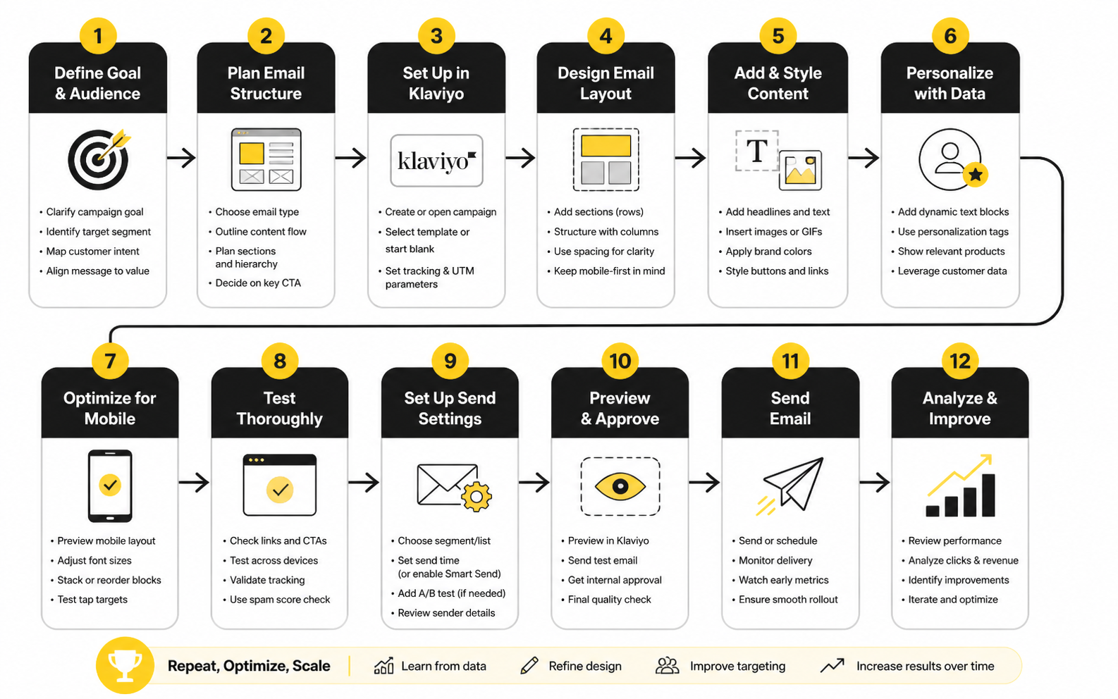
Turn The Process Into A Repeatable Workflow
The best teams do not reinvent their Klaviyo email design process every week. They use a repeatable workflow that turns strategy into execution without making the work feel mechanical. That workflow should be simple enough for campaigns, but disciplined enough for automated flows that may run for months.
A strong process looks like this:
This process keeps the team focused. It also makes performance easier to interpret later because every email was built from a clear hypothesis. When the results come in, you can improve the system instead of guessing what happened.
Statistics And Data
Measurement is where Klaviyo email design stops being subjective. Without data, teams argue about whether the email looks good. With the right data, the better question becomes much sharper: did the design help the right subscriber take the right action?
The trap is looking at numbers without context. A high open rate can still lead to weak sales. A lower click rate can still be profitable if the email reaches a smaller but more qualified segment. A strong campaign can also hide weak flow performance if the team only looks at total email revenue instead of separating campaign behavior from automated journey behavior.
The Metrics That Actually Matter
Klaviyo gives you plenty of metrics, but not every number deserves the same attention. For email design decisions, the most useful metrics are usually open rate, click rate, click-to-open rate, placed order rate, revenue per recipient, unsubscribe rate, spam complaint rate, and performance by segment. Each one tells you something different about the email.
Open rate is useful, but it should not be treated as the final score. Apple’s Mail Privacy Protection changed the reliability of open tracking, so opens are better used as a directional signal than a precise measure of subscriber intent. DMA’s 2025 email benchmarking report shows delivery rates reaching 98% in 2024, with open rates at 35.9% and unique click rates at 2.3%, but the action is still in the clicks, conversions, and revenue.
Click rate tells you whether the message and layout created enough motivation to continue. Placed order rate tells you whether the email helped create actual purchase behavior. Revenue per recipient matters because it accounts for the size of the audience and lets you compare emails more honestly than total revenue alone.
Benchmarks Are A Starting Point, Not A Strategy
Benchmarks help you understand whether your email program is roughly healthy, but they should not become the strategy. Klaviyo’s ecommerce benchmark guidance reports average email campaign performance around 39.74% open rate, 1.47% click rate, $0.11 revenue per recipient, and 0.09% placed order rate. Those numbers are useful because they give you a baseline, but your brand, category, list quality, offer, price point, and customer lifecycle will all change what “good” looks like.
A luxury skincare brand and a low-ticket snack brand should not judge email performance the same way. A higher average order value can produce strong revenue per recipient even when order rate looks modest. A lower-priced impulse product may need higher order volume to create the same business impact.
This is why the best Klaviyo email design teams use benchmarks carefully. They compare against industry averages, but they also build their own internal baselines by flow, segment, campaign type, offer type, and customer stage. That internal history is often more useful than a broad average.
Campaigns And Flows Should Be Measured Separately
Campaigns and flows behave differently because the subscriber context is different. Campaigns are usually brand-initiated. Flows are behavior-triggered. That difference changes how you should interpret the numbers.
Klaviyo’s ecommerce benchmarks show how powerful intent can be inside automated flows. For brands with a $100 to $200 average order value, Klaviyo reports average revenue per recipient of $7.01 for abandoned cart flows, $3.34 for welcome series, $1.95 for browse abandonment emails, and $0.84 for winback emails. Those numbers are not just “email performs well” stats. They show that the closer the email is to a strong buying signal, the more direct and conversion-focused the design can usually be.
Campaigns need a different lens. A product launch campaign may succeed by creating demand and warming the audience before sales fully show up. A clearance campaign may be judged more directly on revenue per recipient and order rate. A brand education campaign may need click quality, downstream purchase behavior, and segment engagement to tell the full story.
Build A Simple Analytics System
The analytics system should connect the email’s job to the metric that proves whether it worked. Do not measure every email the same way. A welcome email, cart abandonment email, post-purchase email, VIP announcement, and winback email each need different success signals.
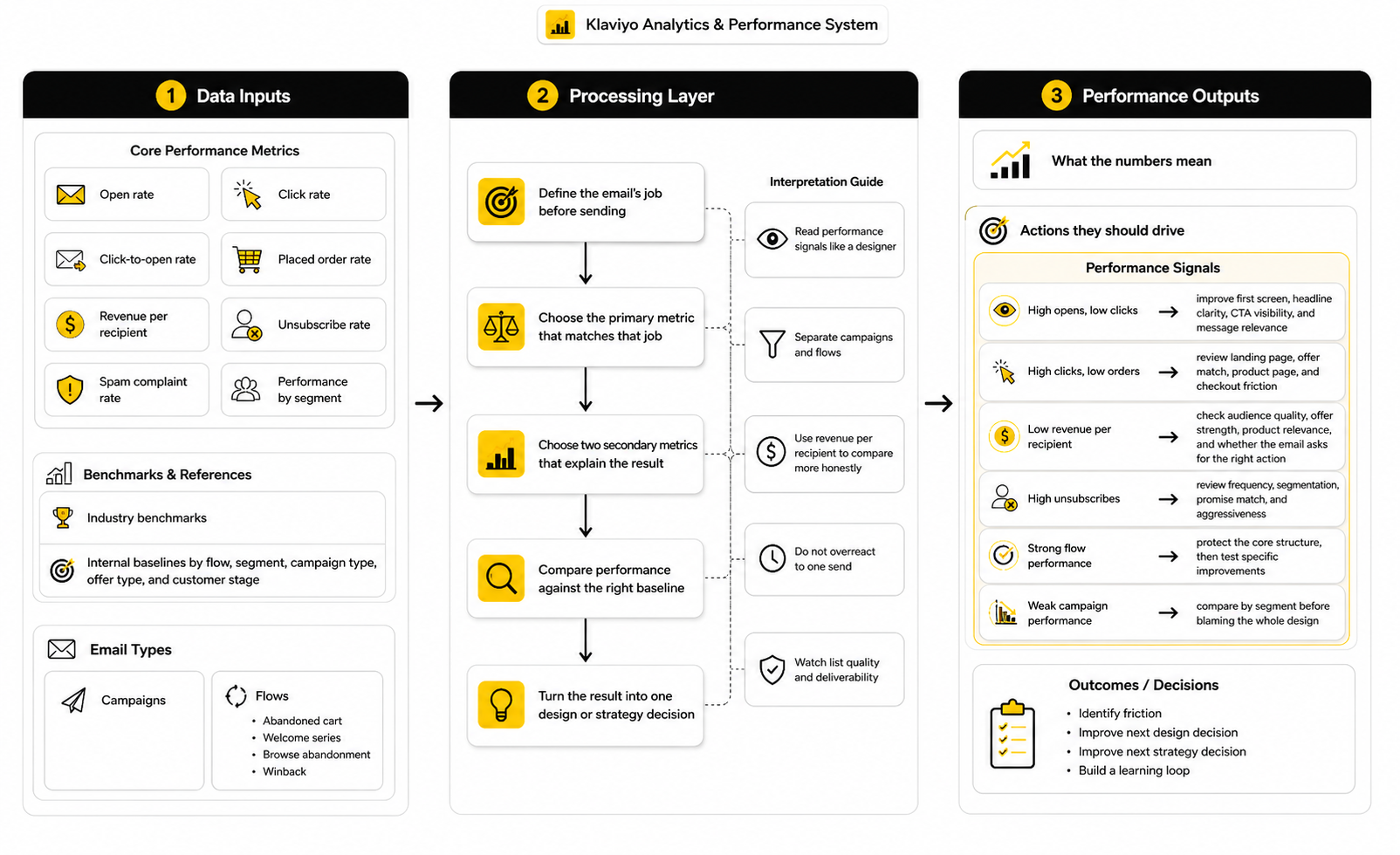
A simple system can work like this:
This keeps reporting practical. If the goal was to bring cart abandoners back, placed order rate and revenue per recipient matter more than applause for a pretty hero image. If the goal was to educate new subscribers, clicks to the right buying guide, product page engagement, and later first-purchase behavior may matter more than immediate revenue.
Read Performance Signals Like A Designer
Data becomes more useful when you connect each metric to a design question. A weak click rate usually means the email did not create enough motivation, the CTA was unclear, the hierarchy was weak, or the audience was not interested in the message. A strong click rate with weak conversion may mean the email created curiosity but the landing page, offer, product fit, or checkout experience failed.
A high unsubscribe rate is also a design signal. It may mean the email promised something the segment did not want, sent too often, used too much urgency, or failed to match the subscriber’s lifecycle stage. The layout might not be the only issue, but the email experience as a whole needs review.
A strong revenue per recipient with a modest click rate can also be a positive signal. It may mean the email reached a focused segment with high buying intent. In that case, the next move is not always to chase more clicks. It may be to protect the quality of the audience and test ways to make the purchase path smoother.
Use Revenue Per Recipient To Compare More Honestly
Revenue per recipient is one of the most useful metrics for Klaviyo email design because it adjusts for list size. Total revenue can make a large send look successful even when the email was inefficient. Revenue per recipient shows how valuable the email was for each person who received it.
This matters when comparing segments. A smaller VIP segment may generate far more revenue per recipient than a broad promotional send. That does not mean every campaign should only target VIPs, but it does show where stronger design personalization, early access, loyalty messaging, and premium product recommendations may be worth the effort.
It also matters when comparing email types. If a cart recovery flow produces a much higher revenue per recipient than a general campaign, the design should reflect that intent. The flow may need sharper product visibility, stronger objection handling, and fewer distractions, while the campaign may need more context and discovery.
Do Not Overreact To One Send
One campaign rarely proves a design rule. Timing, offer strength, list fatigue, inventory, seasonality, deliverability, audience mix, and competitive noise can all affect performance. Treat one send as a signal, not a final verdict.
Look for patterns across similar emails. If product-led hero sections repeatedly beat lifestyle-heavy hero sections in abandonment flows, that is useful. If educational sections consistently improve first-purchase behavior in welcome emails, that is useful too. If a single sale email underperforms during a slow week, that may not mean the design system is broken.
This is where disciplined testing matters. Test one meaningful variable at a time when possible, and connect the test to a real hypothesis. “Which version looks better?” is not a strong test. “Does a product-first hero increase click rate and placed order rate in cart abandonment email one?” is much better.
Watch List Quality And Deliverability
Email design performance depends on whether the email reaches the inbox and whether the audience wants to hear from you. A beautiful design cannot save a weak list. If deliverability is poor, engagement is low, or list growth is low quality, the metrics will become misleading.
Mailgun’s 2026 Email Impact Report highlights this measurement gap clearly, with reporting that fewer than half of organizations can reliably track email ROI while email remains a channel many companies continue to fund through email performance and ROI tracking challenges. That matters because poor tracking can make teams optimize the wrong thing. You cannot improve what you cannot see clearly.
In Klaviyo, this means paying attention to engaged segments, suppression logic, bounce rates, spam complaints, unsubscribes, and how different segments respond over time. A smaller, healthier audience can outperform a large list that has been over-mailed for months. Bigger is not automatically better.
Turn Data Into Design Decisions
The final step is action. Data should not sit in a report just to make the team feel informed. It should change how the next email is designed.
Use performance signals like this:
That is the practical way to measure Klaviyo email design. You are not chasing vanity metrics. You are reading subscriber behavior, finding the friction, and improving the next decision.
Professional Implementation, Testing, And Optimization
At this stage, Klaviyo email design becomes less about individual emails and more about operating discipline. The brand already has a framework, reusable modules, performance signals, and a basic measurement system. Now the question is whether the team can scale that system without making the email program feel repetitive, risky, or disconnected from the customer journey.
This is where mature email programs separate themselves. Beginners ask, “How do we make this email look better?” Stronger teams ask, “How do we make this email system more useful, more consistent, and more profitable without creating list fatigue?” That second question is harder, but it is the one that matters.
Balance Brand Consistency With Campaign Variety
Consistency is important, but consistency does not mean every email should feel the same. Your logo, typography, spacing, button style, image treatment, tone, and footer structure should feel familiar. The argument, pacing, product emphasis, and layout rhythm should still change based on the message.
If every campaign uses the same hero image format, same product grid, same discount block, and same CTA language, subscribers learn the pattern quickly. Once the pattern becomes invisible, performance usually starts depending almost entirely on the offer. That is dangerous because the brand trains the list to wait for discounts instead of paying attention to the message.
A better approach is to create a flexible design system. Keep the brand signals stable, but vary the email shape based on the job. A product education email can feel more editorial. A VIP launch email can feel more direct and exclusive. A replenishment email can be clean, short, and practical. The system should create recognition, not boredom.
Know When To Use Heavy Design And When To Pull Back
Not every Klaviyo email needs a polished visual layout. Some emails should feel designed, especially campaigns for launches, seasonal stories, gift guides, brand announcements, and product education. Other emails may perform better when they feel plain, direct, and personal.
This is a real tradeoff. Heavy design can increase perceived value and make the brand feel premium, but it can also slow down comprehension if the layout becomes too visual. Plain-text-style emails can feel more human and immediate, but they can also feel underbuilt if the brand relies on product visuals to create desire.
The decision should come from intent. If the subscriber needs to see the product, compare options, or understand the visual identity of a launch, stronger design makes sense. If the subscriber needs a quick reminder, personal note, or simple next step, a lighter layout may work better. Good Klaviyo email design is not about always choosing the most beautiful version; it is about choosing the version that helps the reader act.
Protect The List From Fatigue
Scaling email output can quietly damage the list if the team does not manage frequency, relevance, and suppression logic. More emails can create more short-term revenue, but there is a point where extra sends start training subscribers to ignore the brand. That damage may not show up immediately.
Watch the warning signs. Falling click rates, rising unsubscribes, more spam complaints, weaker flow engagement, and declining revenue per recipient can all point to fatigue. Google’s sender guidance recommends keeping spam rates below 0.1% and avoiding 0.3% or higher, which gives email teams a practical ceiling for complaint risk, not a target to casually approach.
The fix is not always sending less. Sometimes the fix is sending more carefully. Use engaged segments, exclude recent purchasers from irrelevant promotions, suppress people who are already inside a high-intent flow, and avoid blasting the full list every time the brand has something minor to say. Relevance protects revenue.
Treat Deliverability As Part Of Design
Deliverability is often treated as a technical issue, but it directly affects design strategy. If emails are too image-heavy, poorly coded, misleading, or sent to cold segments, performance can suffer before the subscriber even sees the message. The best design in the world does not matter if the email fails to reach the inbox.
Authentication, list hygiene, unsubscribe visibility, spam complaints, bounce rates, and engagement all shape deliverability. Yahoo’s sender requirements emphasize authentication, valid DNS, low complaint rates, and easy unsubscribing through sender best practices. That means email design teams cannot ignore compliance and inbox trust while focusing only on visuals.
This is also why every promotional email should make the brand instantly recognizable. A clear sender name, honest subject line, familiar branding, and predictable footer all reduce confusion. Confused subscribers are more likely to ignore, unsubscribe, or complain.
Use Personalization Without Becoming Creepy
Klaviyo gives brands plenty of ways to personalize email design. You can use profile properties, product views, purchase history, predicted customer lifetime value, location, preferences, and engagement behavior. Used well, this makes emails feel relevant. Used badly, it makes the brand feel invasive or overly automated.
The line is simple: personalization should feel helpful, not surveillance-based. Showing someone products related to a collection they browsed can feel useful. Saying too much about exactly what they did and when they did it can feel uncomfortable. The design should make the recommendation feel natural inside the shopping journey.
Consumer expectations are also moving toward relevance. Attentive’s 2025 consumer trends report highlights that 81% of consumers ignore irrelevant messages, which reinforces why generic email design is risky. But relevance does not mean over-personalizing every line. It means removing what does not belong.
Design For Segments, Not Just Templates
A template is a structure. A segment is a business decision. If the team only thinks in templates, emails can look polished while still speaking to the wrong audience.
For example, a discount-led template might work for price-sensitive prospects but weaken margin if it is sent to loyal customers who would have purchased anyway. A product education layout might work for first-time buyers but feel unnecessary to customers who already know the category. A broad launch campaign might need different hero copy, product order, or proof points for new subscribers, VIP buyers, and dormant customers.
This is where advanced Klaviyo email design becomes more strategic. You are not just deciding what the email looks like. You are deciding which version of the message each audience deserves. That can be done with separate campaigns, conditional blocks, dynamic content, or flow branches, but the principle is the same: design should reflect customer context.
Be Careful With AI-Assisted Production
AI can help email teams move faster, especially with brainstorming, first-draft copy, subject line variations, segmentation ideas, and QA checklists. But AI should not replace strategic judgment. The risk is not that AI produces nothing useful. The risk is that it produces content that sounds acceptable but does not understand the offer, audience, product nuance, or brand promise deeply enough.
Klaviyo positions itself as a B2C CRM that combines customer data, automation, analytics, and AI across channels through its AI marketing platform. That direction is useful, but the human team still has to decide what the brand should say, what should be tested, and where automation could create a bad customer experience.
Use AI to speed up the work around the strategy, not to replace the strategy. Let it help generate variations, summarize insights, or identify patterns. Keep humans responsible for the actual promise, taste level, customer empathy, offer logic, and final QA.
Coordinate Email With SMS, Landing Pages, And Support
Email does not operate alone anymore. A subscriber might receive an email, then an SMS, then visit a landing page, then ask a support question, then come back through a flow. If those touchpoints feel disconnected, the brand looks messy even if each individual message is well made.
This matters most during launches, sales, replenishment cycles, and high-volume seasonal periods. The email should not promise something the landing page hides. SMS should not repeat the same message at the wrong time. Support should know what offers or claims are going out so customers do not receive conflicting answers.
Tools outside Klaviyo can support this wider system when they genuinely fit the workflow. For example, a brand using conversational channels may connect email strategy with ManyChat for automated messaging around social or chat-based acquisition. The key is not stacking tools for the sake of it. The key is making every channel support the same customer journey.
Build Governance Before The Program Gets Messy
As email volume grows, governance becomes essential. Without clear rules, the account fills with outdated templates, duplicate flows, inconsistent naming, messy segments, unused blocks, old discount codes, and reports nobody trusts. That is how a powerful Klaviyo account turns into a cluttered machine.
Set naming conventions for campaigns, flows, segments, templates, tests, and forms. Document which modules are approved, which flows are active, who owns QA, and how often automated emails should be reviewed. Keep a simple changelog when major flow logic or design systems are updated.
This sounds boring until something breaks. Then it becomes very valuable. When revenue depends on automated emails that run every day, clarity is not admin work. It is risk management.
Review Automated Flows Like Living Assets
Flows are not one-time projects. A welcome series, abandoned cart flow, browse abandonment flow, post-purchase flow, winback flow, replenishment flow, and back-in-stock flow can keep generating revenue for months or years, but only if they stay current. Products change, offers change, inventory changes, positioning changes, and customer objections change.
Klaviyo’s 2026 benchmark guidance shows that flows can generate nearly 41% of total email revenue from just 5.3% of sends, which makes them too important to ignore after setup. If automated emails are doing that much revenue work, they deserve regular creative and strategic maintenance.
A practical review schedule works well. Check critical revenue flows monthly for broken links, outdated claims, product availability, and performance drops. Review full flow strategy quarterly. Refresh creative when the brand positioning, offer, or customer behavior changes enough that the old email no longer feels accurate.
Know What Not To Optimize
Advanced optimization also means knowing when to leave something alone. If a flow is stable, profitable, and clean, do not rebuild it just because the team is bored. Optimization should have a reason.
The best tests target friction or upside. Test when a metric suggests a problem, when a new segment deserves a better experience, when customer behavior changes, or when the brand has a stronger offer. Do not test random button colors and call it strategy.
This is important because constant tinkering can create noise. If too many variables change at once, you stop learning. The goal is not to touch everything. The goal is to improve the few things that can actually move performance.
Scale Without Losing The Human Feeling
The hardest part of scaling Klaviyo email design is keeping the emails human. More segments, more flows, more automations, more dynamic blocks, and more tests can make the program powerful. They can also make the brand sound mechanical if nobody protects the voice.
Human does not mean casual for the sake of it. It means clear, relevant, respectful, and aware of where the customer is in the journey. A good email feels like the brand understands the moment. A bad automated email feels like the customer got pushed into a machine.
That is the standard. Scale the system, but do not let the system flatten the relationship. The best Klaviyo email design uses automation to become more timely and relevant, not colder and louder.
Klaviyo Email Design FAQ And Final Checklist
By this point, the system is clear. Strong Klaviyo email design is not a single template, a prettier hero image, or a better button color. It is the connection between customer context, message clarity, reusable design systems, deliverability, testing, and the business outcome the email is supposed to create.
The final layer is making that system easy to apply. A good email program should help the team make better decisions faster, not force everyone to debate the same basics before every campaign. Use the checklist below as the final filter before a campaign goes out or a flow gets activated.
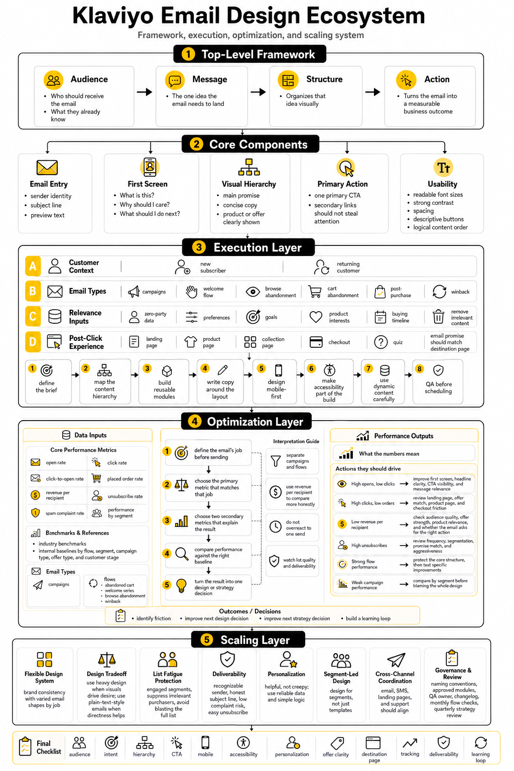
Final Klaviyo Email Design Checklist
Before sending or activating an email, check the essentials:
That checklist matters because most bad emails do not fail for one dramatic reason. They fail because of small gaps. A vague CTA, a weak mobile layout, a mismatched landing page, a messy segment, or an outdated flow can quietly reduce performance even when the email looks polished.
What Is Klaviyo Email Design?
Klaviyo email design is the process of creating emails inside Klaviyo that are visually clear, strategically structured, and connected to customer behavior. It includes layout, copy hierarchy, product blocks, CTAs, segmentation, personalization, accessibility, and post-click alignment. The best version is not just attractive; it helps the right subscriber take the right next step.
For ecommerce brands, this usually means designing both campaigns and automated flows. Campaigns support launches, promotions, announcements, and seasonal moments. Flows respond to behavior, which is why Klaviyo’s 2026 benchmark guidance showing that flows generate nearly 41% of email revenue from only 5.3% of sends is such a big deal.
Why Is Klaviyo Email Design Important?
Klaviyo email design is important because it controls how quickly subscribers understand your message. A confusing email creates friction, even if the offer is strong. A clear email reduces that friction and helps people move from interest to action.
It also matters because Klaviyo is built around customer data. If your design ignores segments, flows, purchase history, and browsing behavior, you are leaving the platform’s strongest advantages unused. The design should reflect what the subscriber already did, what they likely need next, and what action makes sense now.
What Makes A Klaviyo Email High Converting?
A high-converting Klaviyo email has a specific audience, a clear job, a strong first screen, one primary CTA, and a layout that removes distraction. It does not try to say everything at once. It guides the subscriber through one logical decision.
The email also needs strong alignment between the message and the destination page. If the email promises a specific product, offer, or collection, the landing page should continue that promise immediately. If the subscriber clicks and has to reorient themselves, the design has done only half the job.
Should Klaviyo Emails Be Designed Or Plain Text?
Both can work, but they serve different jobs. Designed emails are useful for launches, product education, collections, gift guides, brand storytelling, and visual categories where the product needs to be seen. Plain-text-style emails can work well for direct reminders, founder notes, simple announcements, and messages that need to feel personal.
The mistake is choosing one format for everything. Strong Klaviyo email design uses the format that fits the subscriber’s intent. A cart recovery email may need product visibility and a direct return path, while a simple back-in-stock note may not need a heavy visual layout.
How Often Should Klaviyo Email Templates Be Updated?
Templates should be reviewed whenever the brand positioning, product mix, offer strategy, or customer behavior changes. For active revenue flows, a monthly quick check and a deeper quarterly review is a practical rhythm. This helps catch outdated copy, broken links, old discount logic, missing products, and design choices that no longer match the brand.
Campaign templates can evolve more often because campaign needs change by season, launch, and promotion type. The key is not to redesign everything constantly. Keep the core system stable, then update the parts that create better clarity, relevance, or conversion.
What Metrics Should I Track For Klaviyo Email Design?
Track open rate, click rate, click-to-open rate, placed order rate, revenue per recipient, unsubscribe rate, spam complaint rate, and performance by segment. Each metric answers a different question. Clicks show whether the design created enough motivation to continue, while revenue per recipient shows whether the email produced business value relative to the audience size.
Do not treat every email the same way. A welcome email, abandoned cart email, product launch campaign, post-purchase email, and winback email should each have a different primary success signal. Klaviyo’s benchmarks are useful for context, but your own internal baselines by segment, flow, and campaign type are usually more useful for day-to-day decisions.
What Is A Good Klaviyo Email Design Process?
A good process starts with the audience and the job of the email. Then the team maps the content hierarchy, chooses the right modules, writes the copy inside the structure, adds useful dynamic content, checks mobile and accessibility, tests links, reviews the destination page, and measures the result after sending. That order keeps the email strategic instead of decorative.
The process should be repeatable enough to scale. If every campaign depends on last-minute creative chaos, quality will become inconsistent. A clear workflow protects the team from rushed decisions and makes it easier to improve the system over time.
How Do I Make Klaviyo Emails More Mobile Friendly?
Start by designing for the small screen first. Use readable text, clear spacing, tappable buttons, simple section order, and product images that still make sense when stacked vertically. Do not assume a desktop layout will translate cleanly to mobile.
Klaviyo’s mobile optimization guidance focuses on responsive layout behavior, image handling, spacing, and previewing emails across devices through mobile-first email design. The practical test is simple: if a busy subscriber cannot understand the email and find the CTA in a few seconds on a phone, the design needs work.
How Important Is Accessibility In Klaviyo Email Design?
Accessibility is essential. It helps more people read, understand, and act on your emails, and it usually improves clarity for everyone. Good accessibility includes readable font sizes, sufficient contrast, descriptive links, meaningful alt text, logical structure, and avoiding important information that only appears inside images.
This is not just a technical detail. Litmus’ 2026 accessibility guide connects email accessibility to WCAG principles and inclusive digital experiences through accessible email practices. If the email is hard to read or interact with, it is not a finished design.
How Should I Use Personalization In Klaviyo Emails?
Use personalization when it makes the email more useful. Product recommendations, replenishment reminders, category-specific content, post-purchase guidance, and preference-based messaging can all improve relevance. Personalization should help the subscriber, not make the brand sound like it is watching every move too closely.
Start with reliable data and simple logic. If the data is messy, dynamic content can create bad experiences fast. It is better to show a clean, relevant message to a well-defined segment than to force complex personalization that may be wrong.
How Many CTAs Should A Klaviyo Email Have?
Most Klaviyo emails should have one primary CTA. You can include secondary links when they genuinely help, but the design should make the main action obvious. Too many competing CTAs usually weaken focus.
The CTA should also match the subscriber’s stage. A high-intent cart abandonment email can use a direct CTA because the shopper has already shown interest. A newer subscriber may need a softer CTA that helps them explore, learn, or find the right product before buying.
What Is The Biggest Mistake In Klaviyo Email Design?
The biggest mistake is designing before deciding the email’s job. That leads to pretty templates with weak strategy. The email may look polished, but it does not clearly answer why the subscriber should care or what they should do next.
Another common mistake is treating campaigns and flows the same way. Flows are behavior-triggered, so they should feel more contextual and timely. Campaigns are broader and often need more positioning, segmentation, and message framing.
How Do I Know If My Klaviyo Email Design Is Working?
You know it is working when the email achieves the goal it was designed for. If the goal was revenue, look at revenue per recipient, placed order rate, and post-click behavior. If the goal was education, look at quality clicks, product page engagement, and later purchase behavior.
The key is to define success before sending. Otherwise, the team can twist the numbers after the fact. Good measurement keeps everyone honest and turns each send into a useful learning loop.
Should I Use AI For Klaviyo Email Design?
AI can help with research, content variations, subject line ideas, QA checklists, and faster production. It can also help teams brainstorm segment-specific versions of the same campaign. Used well, it saves time.
But AI should not own the strategy. The brand still needs human judgment for the offer, voice, product nuance, customer empathy, and final review. AI can support Klaviyo email design, but it should not replace the person responsible for making the message true, useful, and commercially sharp.
How Does Klaviyo Email Design Connect With SMS And Other Channels?
Klaviyo email design should connect with the wider customer journey. A subscriber may see an email, receive an SMS, visit a landing page, ask support a question, and then return through a flow. If those moments contradict each other, the brand feels disorganized.
Klaviyo describes its platform as unifying customer data across email, SMS, RCS, WhatsApp, and mobile push through its B2C CRM and AI marketing platform. That broader ecosystem matters because the email is not the whole experience. It is one part of the path.
What Should I Improve First If My Klaviyo Emails Are Underperforming?
Start with the simplest high-impact areas. Check whether the audience is right, the email has one clear job, the first screen is understandable, the CTA is obvious, the mobile layout works, and the destination page matches the message. Those issues usually matter more than tiny visual tweaks.
Then review performance by email type. If campaigns are weak but flows are strong, the problem may be segmentation, offer strategy, or campaign relevance. If flows are weak, the problem may be trigger logic, timing, outdated creative, poor product visibility, or a mismatch between the customer’s behavior and the email’s message.
Build a stronger local presence with BAAM AI
Turn your website, Google profile, social channels, and AI visibility into one growth engine
Most businesses do not need more random marketing activity. They need a consistent presence system that helps the right people find them, trust them, and take action. BAAM AI brings strategy, local SEO, website updates, Google Maps visibility, social content, AI-search readiness, media production, and reporting into one practical monthly engine.
If you want your marketing to keep working after the campaign ends, start with a free BAAM AI presence audit. See how your business shows up today and where the fastest visibility wins are at BAAM AI.