BAAM AI Blog
Core Email Metrics and What They Really Mean
The next step is to separate useful email statistics from numbers that only look impressive in a dashboard. Most teams do not fail because they lack data. They fail because they treat every metric as equally...

The next step is to separate useful email statistics from numbers that only look impressive in a dashboard. Most teams do not fail because they lack data. They fail because they treat every metric as equally important, then make decisions from the easiest number to see.
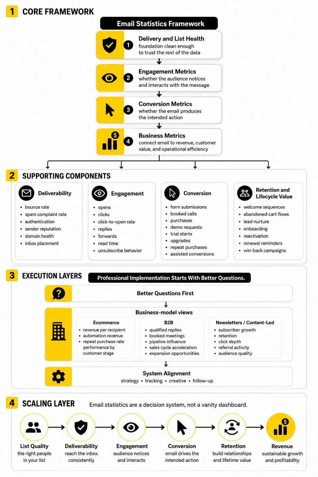
A strong email report should answer four questions. Did the email reach the right people? Did the message earn attention? Did the reader take the next step? Did that action create measurable business value?
That is the difference between reporting and management. Reporting says, “The open rate was 41%.” Management says, “This segment opened at 41%, clicked at 2.8%, converted at 0.7%, and generated a higher revenue per recipient than the larger campaign we sent last week.”
Delivery Rate
Delivery rate shows the percentage of sent emails that were accepted by recipient mail servers. It is calculated by subtracting bounced emails from total sent emails, then dividing that number by total sent emails. A high delivery rate is necessary, but it does not prove the email reached the inbox.
That last point matters. An email can be technically delivered and still land in spam, promotions, updates, or another low-visibility area. Validity’s 2025 benchmark report makes the distinction clear: inbox placement rate is a more accurate deliverability measure because it tracks emails that reach the inbox instead of only measuring technical acceptance Validity’s 2025 Email Deliverability Benchmark Report.
Use delivery rate as a basic infrastructure signal, not a final performance verdict. If delivery rate drops, check bounce sources, list quality, authentication, sending domain reputation, and sudden volume changes. If delivery rate looks strong but engagement collapses, the problem may be inbox placement rather than delivery.
Bounce Rate
Bounce rate measures the percentage of emails that could not be delivered. Hard bounces usually point to permanent issues, such as invalid or closed addresses. Soft bounces are usually temporary, such as full inboxes, server problems, or message size issues.
This metric is one of the cleanest list-quality signals you have. A rising bounce rate usually means acquisition quality is slipping, old contacts are being mailed too aggressively, or imported lists were not verified properly. It can also damage sender reputation because mailbox providers read high bounce activity as a sign of poor list hygiene.
The fix is not complicated, but it does require discipline. Remove hard bounces quickly, suppress risky contacts, validate addresses before high-volume sends, and avoid scraping or buying lists. If list growth looks exciting but bounce rate is climbing at the same time, the growth is not healthy.
Inbox Placement Rate
Inbox placement rate measures how many emails reach the visible inbox instead of spam or missing folders. It is one of the most important email statistics because it gets closer to what the subscriber actually experiences. Delivery rate tells you whether the server accepted the message; inbox placement tells you whether the person had a fair chance to see it.
Recent deliverability research shows why this deserves serious attention. Sinch Mailgun reported that nearly 18% of marketing emails failed to reach the inbox in research based on more than 400 billion emails sent in 2025 and survey responses from over 1,200 senders Sinch Mailgun email performance research. That is not a small technical issue. It is a direct leak in revenue, lead generation, and customer communication.
Inbox placement is shaped by authentication, complaint rates, engagement, list quality, sending consistency, content signals, and reputation history. If your email platform does not show inbox placement directly, use seed testing, deliverability tools, and engagement patterns to spot problems. A sudden fall in opens, clicks, and conversions across multiple campaigns can be a deliverability warning, not just a creative issue.
Open Rate
Open rate measures the percentage of delivered emails that register as opened. It is useful for reading directional trends, especially within the same audience and campaign type. It is weaker as a precise measure because privacy features and image-loading behavior can distort the number.
This is where many email statistics get misused. Apple’s Mail Privacy Protection changed open tracking by preloading remote content in a way that can inflate or obscure open data, so open rate should not be treated as a clean measure of human attention Apple Mail Privacy Protection overview. It can still help you compare subject lines, sender names, and broad engagement trends, but only when you understand its limits.
Use open rate as a top-of-funnel signal, not a business outcome. A higher open rate is good only if it leads to better clicks, conversions, replies, revenue, or retention. If open rate improves while clicks and sales stay flat, the subject line may have earned curiosity without creating meaningful demand.
Click-Through Rate
Click-through rate measures the percentage of delivered emails that generated at least one click. It is usually more useful than open rate because it shows active intent. Someone clicked because the message, offer, button, link, or next step was relevant enough to interrupt their inbox routine.
Benchmarks vary heavily by industry, audience, and email type. MailerLite’s 2025 benchmark report analyzed over 3.6 million campaigns from 181,000 approved accounts and reports benchmarks for open rate, click rate, click-to-open rate, and unsubscribe rate across many industries and regions MailerLite 2025 email marketing benchmarks. That kind of benchmark is useful, but it should be treated as context rather than a target you copy blindly.
The best way to improve click-through rate is to reduce friction. Use one primary call to action, match the email promise to the landing page, segment the audience, and make the value of the click obvious. If you are sending lead-generation emails, a connected funnel tool such as ClickFunnels or Systeme.io can help keep the journey from email to conversion simple.
Click-To-Open Rate
Click-to-open rate compares clicks with opens. It helps answer a different question from click-through rate. Instead of asking how many delivered recipients clicked, it asks how persuasive the email was among people who appeared to open it.
This metric can be useful for diagnosing creative performance. If open rate is strong but click-to-open rate is weak, the subject line may be doing its job while the email body is not. The issue could be weak copy, unclear offer framing, poor layout, too many links, or a mismatch between the subject line and the actual content.
Still, click-to-open rate inherits some of the same problems as open tracking. Because opens can be distorted, click-to-open rate should not be your only engagement metric. Use it alongside click-through rate, conversion rate, replies, unsubscribes, and revenue per recipient.
Conversion Rate
Conversion rate measures the percentage of recipients, openers, or clickers who completed the intended action. That action could be a purchase, booked call, demo request, trial signup, quote request, registration, reply, or content download. This is where email statistics start becoming genuinely useful for business decisions.
The key is to define the conversion before the campaign goes out. A newsletter may aim for article clicks, while a sales sequence may aim for qualified replies or booked calls. An abandoned cart flow may aim for recovered revenue, while an onboarding sequence may aim for product activation.
Do not measure every campaign by the same conversion event. That makes the report look tidy, but it can make the analysis useless. A retention email, a launch email, and a cold reactivation email should not be judged by identical expectations.
Revenue Per Recipient
Revenue per recipient is one of the clearest ecommerce and direct-response email statistics. It shows how much revenue each recipient generated on average. This is often more useful than total campaign revenue because it normalizes performance across different list sizes.
For example, a campaign sent to 100,000 people can generate more total revenue than a tightly segmented campaign sent to 8,000 people. But if the smaller campaign generates more revenue per recipient, it may be the stronger asset. That insight matters when you are deciding whether to send more broadly or segment more carefully.
Revenue per recipient also protects you from overvaluing volume. A bigger list is not automatically better if it contains colder subscribers, poor-fit leads, or people who rarely buy. The better question is whether each segment earns its place in your email strategy.
Unsubscribe Rate
Unsubscribe rate measures the percentage of recipients who opt out after receiving an email. A small number of unsubscribes is normal, especially when you send regularly. The danger is not the existence of unsubscribes; the danger is a sudden spike after a specific campaign, segment, or frequency change.
Unsubscribes are feedback. They tell you when the audience no longer sees enough value in staying subscribed. That can happen because of poor targeting, irrelevant offers, too many emails, misleading subject lines, or a mismatch between what people expected and what they received.
Do not panic over every unsubscribe. A clean list of interested subscribers is better than a bloated list of passive or irritated contacts. But if unsubscribe rate rises while clicks and conversions fall, the message-market fit is weakening.
Spam Complaint Rate
Spam complaint rate measures how many recipients mark your email as spam. This is one of the most dangerous metrics to ignore because complaints can damage sender reputation quickly. Mailbox providers treat complaints as a strong negative signal because they come directly from users.
A high complaint rate usually means the audience did not expect the email, does not recognize the sender, or feels the message is irrelevant. It can also happen when unsubscribe links are hard to find. If people cannot easily leave, some will hit the spam button instead.
Make the sender identity clear, set expectations at signup, avoid aggressive list sources, and keep unsubscribe access simple. This is not just about compliance. It is about protecting the long-term performance of every campaign you send.
List Growth Rate
List growth rate measures how quickly your email list is expanding after accounting for unsubscribes, bounces, and inactive contacts. It is a healthier metric than raw subscriber count because it includes the losses. A list that adds 10,000 contacts but loses 7,000 low-quality or disengaged contacts is telling a different story than the headline number suggests.
Good list growth comes from clear value exchange. People subscribe because they want a discount, a resource, a product update, a newsletter, a webinar, a tool, or a specific kind of insight. If the signup promise is vague, the list may grow slowly or attract the wrong people.
The best email programs treat list growth and list quality as one system. Forms, landing pages, lead magnets, checkout opt-ins, and referral prompts should all be measured by downstream engagement, not just opt-in volume. Tools like Fillout can help capture cleaner subscriber data when forms need to qualify people before they enter your sequences.
Revenue Attribution
Revenue attribution connects email activity to business results. It answers which campaigns, flows, and touchpoints influenced a sale or lead. This is powerful, but it can also become misleading if attribution windows and models are unclear.
Last-click attribution often undervalues nurture emails because those messages may educate the buyer before another channel captures the final click. First-click attribution can overvalue the original source and ignore the later emails that moved the person toward action. Multi-touch attribution is more realistic, but it requires cleaner tracking and more careful interpretation.
The practical move is to be consistent. Choose attribution windows, document them, and avoid comparing reports that use different rules. If your CRM, funnel platform, and email tool are disconnected, a platform such as GoHighLevel can make it easier to connect email engagement with pipeline, appointments, follow-up, and sales outcomes.
Engagement by Segment
Segment-level engagement shows how different groups respond to your emails. This is where many hidden opportunities appear. Your overall click rate might look average while one segment is highly engaged and another barely reacts.
Segments can be based on lifecycle stage, purchase history, lead source, geography, industry, company size, product interest, engagement level, or behavior. The goal is not to create endless complexity. The goal is to stop treating subscribers with different intent levels as if they are the same person.
This is especially important for email statistics because averages can hide the truth. A campaign may look mediocre overall but perform extremely well with past buyers. Another may look strong overall because it was sent to your warmest audience, not because the creative was unusually good.
Build a stronger local presence with BAAM AI
Turn your website, Google profile, social channels, and AI visibility into one growth engine
Most businesses do not need more random marketing activity. They need a consistent presence system that helps the right people find them, trust them, and take action. BAAM AI brings strategy, local SEO, website updates, Google Maps visibility, social content, AI-search readiness, media production, and reporting into one practical monthly engine.
If you want your marketing to keep working after the campaign ends, start with a free BAAM AI presence audit. See how your business shows up today and where the fastest visibility wins are at BAAM AI.