BAAM AI Blog
Banner Email Marketing: A Practical Framework For Campaigns People Actually Click
Banner email marketing sounds simple: place a strong visual banner near the top of an email, add a clear offer, and send it. In reality, the banner is doing more than decorating the message. It decides what people...
Banner email marketing sounds simple: place a strong visual banner near the top of an email, add a clear offer, and send it. In reality, the banner is doing more than decorating the message. It decides what people notice first, what they understand in the first few seconds, and whether the rest of the email earns any attention at all.
That matters because email is still one of the few marketing channels where a brand can speak directly to an owned audience instead of renting attention from an algorithm. Email also remains commercially serious: Litmus reports that many marketing leaders still see strong email returns, with 35% of companies seeing email ROI of 36:1 or more in its State of Email data. At the same time, inboxes are stricter, privacy changes have made open-rate interpretation less reliable, and Gmail’s sender rules now push bulk senders toward stronger authentication, easy unsubscribes, and lower spam complaints through its email sender guidelines.
A banner can help or hurt that equation fast. A useful banner clarifies the promise, sets the visual hierarchy, and gives the reader one obvious next step. A weak one becomes a pretty roadblock: too vague to sell, too large to scan, too image-dependent to survive inbox quirks, and too disconnected from the landing page to convert.
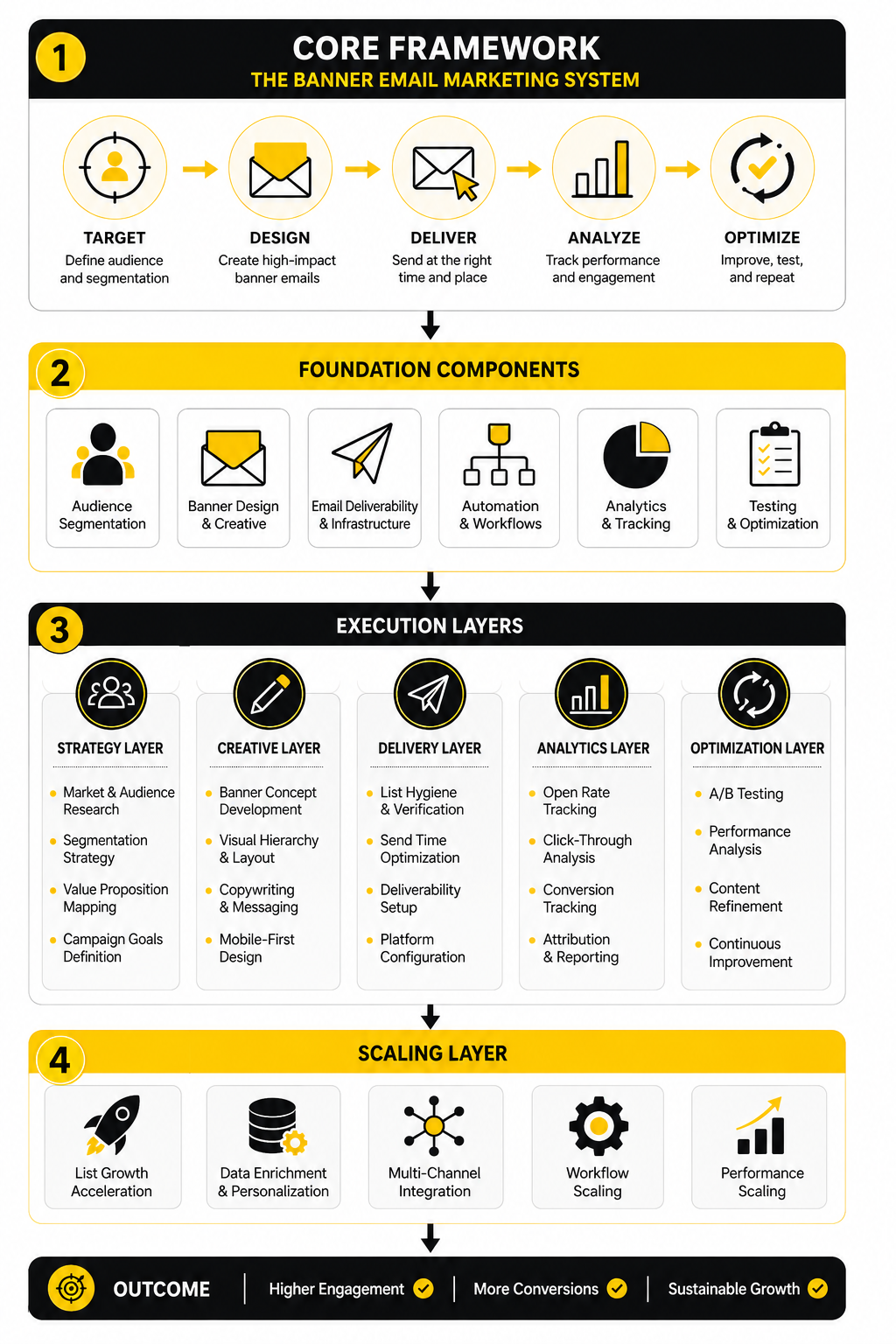
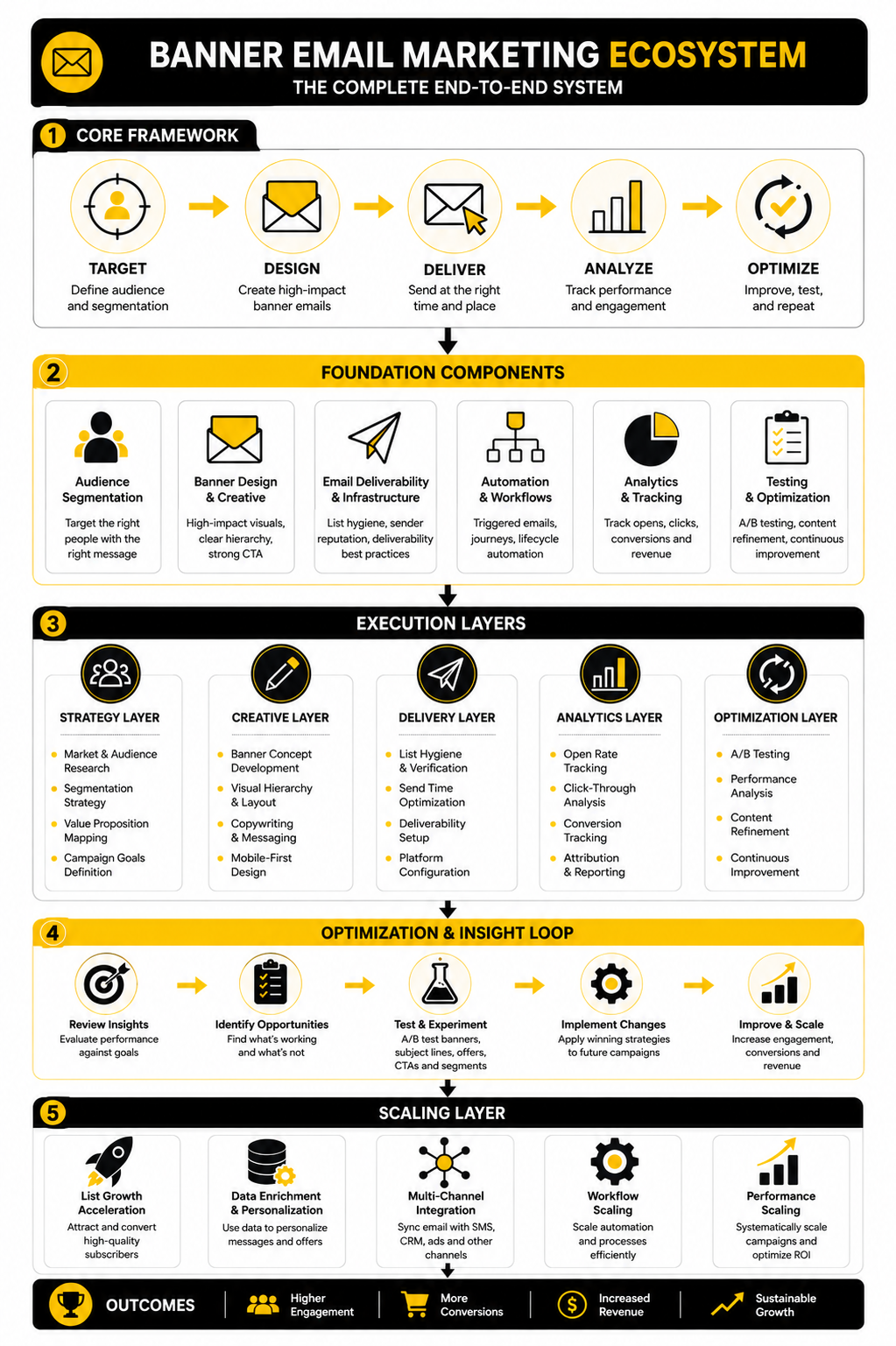
this guide breaks banner email marketing into a practical six-part system. The goal is not to make emails “look nicer.” The goal is to help you build banners that support the campaign objective, respect the inbox, match the customer journey, and turn attention into measurable action.
Banner Email Marketing Foundations
Banner email marketing is the practice of using a prominent visual and message block inside an email campaign to introduce the main offer, announcement, product, event, or content asset. In most campaigns, the banner appears near the top of the email because that is where attention is most fragile. It usually combines an image or graphic treatment, a headline, supporting copy, and a call to action.
The important part is that a banner is not just an image. It is a decision layer. It tells the subscriber what the email is about, why it is relevant now, and what to do next if they care.
That is why good banner email marketing sits between design, copywriting, segmentation, deliverability, and conversion strategy. A designer can make the banner attractive, but attractiveness alone does not create clicks. The banner has to connect the subscriber’s current intent with a clear business outcome.
Why It Matters
Email teams are under pressure from both sides. On one side, customers expect sharper relevance, better timing, and fewer generic blasts. On the other side, inbox providers are tightening expectations around authentication, unsubscribe practices, and spam rates, with Yahoo also telling senders to keep complaint rates below 0.3% in its sender best practices.
That makes the banner more than a creative asset. It becomes the first test of whether the email feels wanted. If the banner feels irrelevant, overhyped, or confusing, the subscriber may not scroll, click, or trust the next send.
There is also a measurement issue. Apple’s Mail Privacy Protection made open-rate data less dependable for many email programs, and analysis from email platforms such as Customer.io has pushed marketers to focus more on clicks, conversions, and downstream behavior. In that environment, the banner has to do real work because passive attention is harder to interpret.
Framework Overview
A practical banner email marketing framework starts with one question: what job should this banner do? Not every banner should sell immediately. Some need to announce, educate, segment interest, reactivate dormant subscribers, support a product launch, or move someone into a funnel.
Once the job is clear, the banner can be built around four connected decisions: audience, offer, message hierarchy, and next action. The audience defines what the subscriber already knows and what they need to believe. The offer defines the reason to care now. The hierarchy determines what gets noticed first. The next action turns the banner from a visual block into a measurable campaign asset.
This is also where tool choice starts to matter, but only after the strategy is clear. A business building automated lead nurture may need a broader CRM and automation setup such as GoHighLevel. A lean newsletter or ecommerce team may care more about email production, segmentation, and campaign sending through platforms like Brevo or Moosend. The tool should support the framework, not replace it.
Core Components
A strong email banner has four core components: the visual hook, the headline, the supporting message, and the call to action. The visual hook earns attention, but it should not carry the entire meaning of the banner because images may load slowly, be blocked, or be skimmed on small screens. The headline should make the promise clear even if the reader reads nothing else.
The supporting message gives enough context to reduce hesitation. It might clarify the discount, deadline, product category, event value, or reason the email matters now. It should not become a second email inside the banner.
The call to action should match the reader’s stage. “Shop now” can work for a warm retail audience, but it may be too aggressive for an educational campaign. “See the guide,” “Compare plans,” “Build your workflow,” or “Get the checklist” can be stronger when the banner is part of a longer customer journey.
Professional Implementation
Professional banner email marketing is built around consistency, not one-off creativity. The banner should match the subject line, preview text, email body, landing page, and campaign goal. If the subject line promises a limited offer but the banner introduces a vague brand message, the campaign creates friction before the click.
It also needs to work across devices. Mobile reading is unforgiving, so the banner cannot depend on tiny text inside an image, crowded product collages, or desktop-only spacing. The best banners usually have one dominant message, one clear action, and enough breathing room to make the next step obvious.
Finally, banner emails should be tested like campaign assets, not judged like artwork. Teams should compare offer angles, message hierarchy, CTA language, audience segments, and landing-page continuity. That is where banner email marketing becomes useful: not as a pretty header, but as a repeatable system for turning inbox attention into action.
Why Banner Emails Matter In Modern Campaigns
Banner email marketing matters because the inbox is not a quiet place anymore. Subscribers are sorting fast, deleting faster, and judging whether an email deserves attention before they read the full message. The banner is often the first real proof that the email is relevant, useful, and worth the next few seconds.
That does not mean every campaign needs a huge hero image or loud promotional strip. It means the top of the email needs a clear job. When the banner creates instant context, the reader understands the offer, the timing, and the reason to continue.
This is especially important because email still has commercial weight. Litmus reported that 35% of companies see email ROI between 10:1 and 36:1, with customer engagement emails, promotional emails, and newsletters among the highest ROI formats in its email ROI research. That kind of return does not come from sending more decoration. It comes from making the message easier to understand and act on.
The Inbox Has Become A Faster Decision Environment
A subscriber rarely opens an email with unlimited patience. They scan the sender, subject line, preview text, and then the first visible section of the email. If the banner does not quickly confirm that the message matches the promise, the campaign starts losing attention immediately.
That is why banner email marketing is not just a design problem. It is a clarity problem. The banner has to answer the reader’s silent question: “Why am I seeing this, and why should I care now?”
This becomes even more important on mobile, where screen space is tight and visual hierarchy has less room to recover from weak decisions. If the banner uses tiny text, too many elements, or a vague headline, the reader has to work too hard. Most people will not work hard for a marketing email.
Clicks Matter More Than Passive Attention
For years, many teams treated opens as the main signal of email success. That is less useful now. Privacy changes, image preloading, and inbox behavior have made open rates harder to interpret as a clean signal of human attention.
Apple’s Mail Privacy Protection is the obvious turning point because it can preload tracking pixels and make opens look higher than actual reader activity. Email teams now need to care more about clicks, conversions, replies, revenue, form submissions, booked calls, and other downstream actions. That shift makes the banner more important because it has to move the reader from passive viewing to deliberate engagement.
A strong banner does not chase curiosity clicks with vague hype. It sets up a qualified click. The reader should know where the button leads, what they will get, and why the action is worth taking.
Relevance Protects Deliverability
Deliverability is not only technical. Authentication, domain reputation, unsubscribe handling, and list hygiene matter, but subscriber behavior matters too. If people ignore, delete, or complain about campaigns, the sender’s future performance can suffer.
Google tells bulk senders to keep spam rates below 0.1% and avoid reaching 0.3% or higher in its email sender guidelines FAQ. That is a serious reminder that careless email marketing has a cost. A banner that overpromises, misleads, or attracts the wrong audience can increase friction instead of engagement.
This is where relevance becomes practical. The banner should match the segment receiving it. A new subscriber may need orientation, while a returning customer may respond better to a timely product drop, loyalty offer, or replenishment reminder.
The Banner Connects The Campaign Promise
The banner is the bridge between the subject line and the body of the email. If the subject line creates a promise, the banner has to pay it off immediately. If the preview text creates curiosity, the banner has to turn that curiosity into clear direction.
This is where many campaigns break. The subject line says one thing, the banner says another, and the landing page introduces a third message. The subscriber feels the disconnect even if they cannot explain it.
A better approach is simple: keep the campaign promise consistent from inbox to click. The subject line earns the open. The banner confirms the reason. The CTA moves the reader forward. The landing page completes the path.
Banner Emails Help Segment Intent
A good banner can also reveal what subscribers care about. When different segments click different banners, offers, categories, or CTAs, the brand learns more than whether the email looked nice. It learns which audience is showing intent.
That intent can shape the next campaign. Someone who clicks a product-category banner should not necessarily receive the same follow-up as someone who clicks an educational guide. Someone who ignores a hard offer may still respond to a softer value-first campaign later.
This is where automation platforms can be useful when the strategy is already clear. A business that wants to connect email clicks with pipeline stages, follow-up workflows, and sales conversations may use a platform like GoHighLevel. A creator or lean business building simpler automated paths may prefer something like Systeme.io when funnels, email, and pages need to stay under one roof.
Visual Consistency Builds Trust
People remember patterns. If your emails constantly change style, tone, layout, and message structure, subscribers have to re-learn how to read every campaign. That slows them down and weakens brand recognition.
Banner email marketing helps solve that when it is used as a system. The brand can keep consistent spacing, type hierarchy, image treatment, CTA placement, and offer structure while still changing the campaign message. The result feels familiar without becoming stale.
Trust also comes from restraint. Not every banner needs a countdown, a discount badge, three products, and a giant button. Sometimes the strongest banner is the one that makes the offer obvious and leaves enough space for the reader to breathe.
The Best Banner Supports The Next Step
A banner is successful when it helps the reader take the right next step. That step might be buying, booking, registering, reading, comparing, replying, or saving the offer for later. The point is that the banner should not exist separately from the campaign objective.
This is why professional teams do not judge banners only by visual taste. They look at click quality, landing-page behavior, conversion rate, revenue per recipient, unsubscribes, spam complaints, and performance by segment. The banner is part of a full system, not a standalone graphic.
That is the practical mindset behind banner email marketing. Start with the reader’s situation, clarify the campaign promise, design for fast comprehension, and measure the action that actually matters.
The Banner Email Marketing Framework
A strong banner email marketing process starts before anyone opens a design tool. The biggest mistake is treating the banner as the “creative part” that happens after the campaign has already been planned. By then, the offer, segment, landing page, and CTA may already be misaligned.
The better approach is to build the banner from the campaign logic outward. First define the reader and the moment. Then define the offer, message, visual hierarchy, CTA, and follow-up path. When those pieces are clear, the banner becomes easier to design because it has a job instead of just a mood.
This framework keeps the work practical. It gives you a repeatable way to plan banners for product launches, newsletters, seasonal promotions, webinars, lead magnets, abandoned-cart campaigns, reactivation emails, and customer education sequences without reinventing the structure every time.
Start With The Campaign Objective
Every banner needs one primary objective. Not two, not five, not a vague mix of “awareness and conversions and engagement.” One main job.
That objective might be to drive a product click, book a demo, announce a launch, push a discount, move readers to a landing page, or get subscribers to consume an important piece of content. Once the objective is clear, the banner can be judged against that outcome. If the goal is clicks to a category page, the headline, image, and CTA should all support that click.
This is where teams often overcomplicate banner email marketing. They add more copy, more buttons, more products, and more urgency because they are trying to make the banner work harder. Usually, the opposite is better: make the objective sharper so the banner has less confusion to fight.
Match The Banner To The Segment
The same banner should not automatically go to every subscriber. A new lead, repeat buyer, cold subscriber, trial user, and high-value customer are in different mental states. They need different levels of context before a CTA feels natural.
For example, a new subscriber may need a banner that explains the brand promise and invites them to explore a best-selling collection. A repeat buyer may respond better to a banner focused on a new arrival, loyalty perk, or personalized recommendation. A dormant subscriber may need a softer re-entry message before they are ready for a direct offer.
Segmentation does not have to be complicated at the beginning. You can start with simple groups such as new subscribers, active subscribers, customers, non-buyers, recent buyers, and inactive contacts. Tools like Brevo and Moosend can support that kind of practical segmentation when your lists and campaign goals are already organized.
Build The Message Hierarchy
The banner should tell the reader what matters first, second, and third. The headline carries the main promise. The supporting line explains the reason to care. The CTA gives the next step.
That order matters because most readers scan before they commit. If the discount badge is louder than the offer, or the image is stronger than the message, the banner may attract attention but fail to create action. Attention is not the same as intent.
A clean hierarchy usually beats a clever one. The reader should not have to decode the banner. They should be able to understand the campaign in a few seconds and decide whether the next step is relevant to them.
Turn The Process Into A Workflow
Once the objective, segment, and hierarchy are set, the process becomes much easier to execute. You are no longer asking, “What should this banner look like?” You are asking, “What is the clearest way to express this campaign promise to this reader?”
A practical workflow keeps the banner connected to the whole campaign. It prevents the design from drifting away from the subject line, the body copy, the CTA, or the landing page. This is the point where banner email marketing becomes an operating system, not a random creative task.
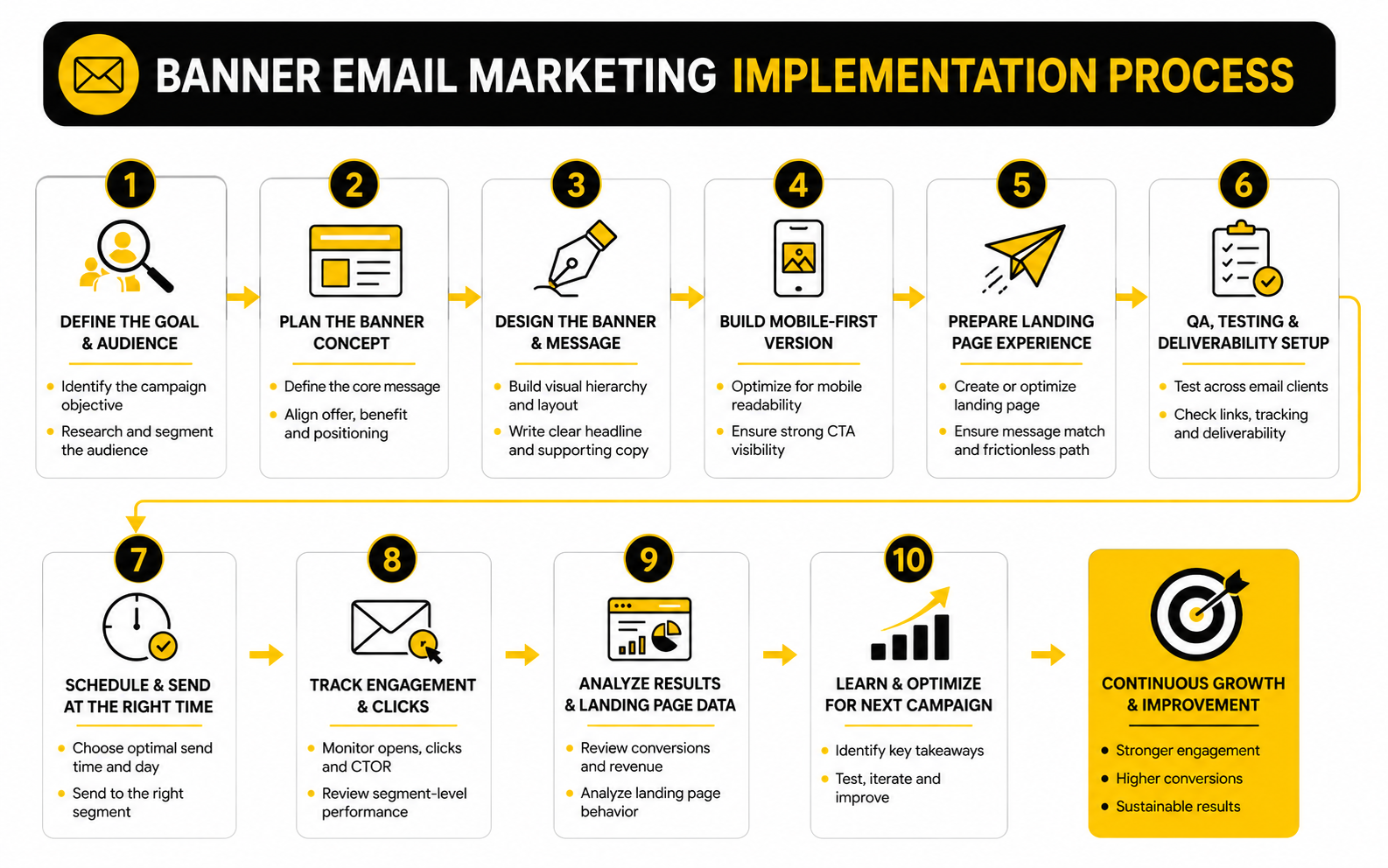
Use this workflow before every major campaign:
This sequence is simple, but it creates discipline. It forces the team to connect strategy, copy, design, and measurement before the campaign goes out. That is where better results usually come from.
Choose The Right Banner Type
Not every banner should use the same format. The right type depends on the campaign goal and the reader’s stage. A launch email may need a bold hero banner, while a newsletter may need a smaller editorial banner that introduces the main story without overwhelming the rest of the content.
Common banner types include promotional banners, product banners, event banners, editorial banners, announcement banners, onboarding banners, and reactivation banners. Each one has a different job. A promotional banner needs fast clarity around the offer, while an onboarding banner needs reassurance and direction.
The danger is using a sales banner when the reader needs education, or using an educational banner when the reader is ready to buy. Good banner email marketing respects timing. The banner should meet the reader where they are, not where the marketer wishes they were.
Connect The Banner To The Landing Page
The click is not the finish line. It is the handoff. If the banner promises one thing and the landing page feels like a different campaign, the reader loses momentum.
This is why the banner headline and landing page headline should usually share the same core promise. They do not need to be identical, but they should feel connected. The reader should instantly know they landed in the right place.
For campaigns built around sales pages, funnels, or dedicated landing pages, this connection matters even more. A platform like ClickFunnels can be useful when the banner click needs to flow into a structured offer page, order path, upsell sequence, or lead capture funnel. For ecommerce teams building more customized landing experiences, Replo can fit when the goal is to move from email traffic into high-intent product or campaign pages.
Make The CTA Specific
A weak CTA makes the reader guess. A specific CTA tells them what happens next. That tiny difference can change the quality of the click.
Generic buttons like “Learn More” can work, but they often leave too much uncertainty. Stronger CTAs usually connect the action to the outcome, such as “Shop The New Collection,” “Get The Guide,” “Reserve Your Spot,” “Compare Plans,” or “Build Your Funnel.” The point is not to be fancy. The point is to be clear.
The CTA should also match the level of commitment. A cold subscriber may not be ready for “Buy Now,” but they may click “See What’s Included.” A warm customer may not need a long explanation and can move straight to “Claim The Offer.”
Keep The Banner Technically Safe
A banner can look great in the editor and still underperform in the inbox. Large images can load slowly. Text embedded inside images can become unreadable on small screens. Image-only banners can break the message when images are blocked.
The safer approach is to keep critical copy as live text whenever possible. Use alt text for meaningful images, keep the file size reasonable, and test the email in the clients your audience actually uses. This is not glamorous work, but it protects the campaign.
Accessibility also belongs here. The banner should be understandable without relying only on color, tiny text, or image details. If someone cannot read the banner clearly, the campaign is leaving attention and revenue on the table.
Build A Feedback Loop
The first version of a banner is only a starting point. After the campaign runs, the real work is learning what the audience did. Clicks, conversions, revenue, unsubscribes, spam complaints, and segment-level behavior all tell a different part of the story.
Do not only ask whether the banner “won.” Ask why it won or lost. Was the offer strong but the CTA weak? Did mobile users click less than desktop users? Did one segment respond while another ignored it?
That feedback should shape the next campaign. Over time, banner email marketing becomes easier because you build a library of proven patterns. You learn which angles earn attention, which CTAs create action, and which visual structures help your audience move forward.
Statistics And Data
Measurement is where banner email marketing becomes honest. A banner can look clean, on-brand, and persuasive in a campaign preview, but the data shows whether subscribers actually understood it and cared enough to move. The point is not to collect more numbers. The point is to know which signal should change your next decision.
Benchmarks help, but they should not become excuses. A general email click-through rate between 2% and 5% is often treated as a reasonable range in email marketing benchmark guidance, while MailerLite’s 2025 data shows an average email click rate of 2.09% and an unsubscribe rate of 0.22% in its email marketing benchmark analysis. Those numbers are useful as orientation, not as a final verdict on your campaigns.
The more carefully move is to compare each banner against your own baseline. A campaign sent to cold subscribers should not be judged the same way as a campaign sent to recent buyers. A product launch should not be judged the same way as an educational newsletter. Context decides what the number means.
The Metrics That Actually Matter
The first metric most teams check is the open rate, but open rate is now a softer signal than it used to be. Apple Mail Privacy Protection can preload images and trigger tracking pixels without proving that a real person read the email, which makes open data less reliable for judging true engagement. That does not make open rate useless, but it does mean you should not optimize banner email marketing around opens alone.
Clicks are more useful because they show action. If the banner is the main visual and message block in the email, the click rate tells you whether the promise and CTA created enough intent. Click-to-open rate can also help because it shows how many openers decided to act, but it still depends on open data, so treat it carefully.
Conversions are the cleanest signal when the campaign has a commercial goal. A banner that gets many clicks but few purchases may be creating curiosity without enough buying intent. A banner with fewer clicks but stronger revenue per recipient may be doing a better job attracting the right people.
Read The Data In Layers
A single campaign report can mislead you if you read it too quickly. You need to move from surface metrics to behavior metrics to business metrics. That layered view prevents you from celebrating the wrong win.
Start with delivery and deliverability signals. If the email has unusual bounces, spam complaints, or inboxing issues, the banner may not be the main problem. Google’s sender guidance tells bulk senders to keep spam rates below 0.10% and avoid reaching 0.30% or higher in Postmaster Tools, so complaint behavior deserves serious attention.
Then review engagement signals. Look at clicks on the banner CTA, secondary clicks, scroll-depth data if your platform or landing page tracks it, and segment-level differences. Finally, review business outcomes such as purchases, bookings, signups, revenue per recipient, average order value, or qualified leads.
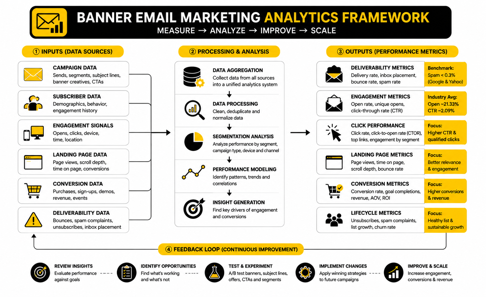
The simplest analytics system looks like this:
This structure keeps the team from obsessing over one number. It also makes it easier to diagnose the real issue. If clicks are low, the banner promise may be weak. If clicks are strong but conversions are low, the landing page or offer may be the problem.
Benchmark Against The Right Campaign Type
A promotional banner and a newsletter banner should not be measured the same way. A promotional banner is usually trying to generate a direct action. A newsletter banner may be trying to get readers into the main story, build trust, or create repeat engagement over time.
For ecommerce, revenue per recipient can be more useful than click rate alone. If one banner produces fewer clicks but higher purchase intent, it may outperform a flashier version that attracts casual traffic. For service businesses, booked calls or qualified form submissions matter more than raw email engagement.
For lead magnets, the main signal is usually opt-in completion after the click. If the banner gets clicks but the landing page does not convert, the promise may be too broad or the form may be asking for too much. If the banner gets weak clicks, the offer may not feel urgent or specific enough.
Segment-Level Data Beats Averages
Averages hide the most useful insights. A campaign may look mediocre overall while performing strongly with one segment and poorly with another. That is not failure. That is information.
Review banner performance by subscriber type. Compare customers versus non-customers, active readers versus inactive readers, new subscribers versus long-term subscribers, and high-intent visitors versus general list members. The same banner email marketing campaign can produce different lessons across each group.
This is where tagging and automation matter. If you can connect clicks to subscriber behavior, you can build better follow-up paths. A platform such as GoHighLevel can help when email engagement needs to trigger pipeline updates, sales tasks, or automated follow-ups, while a simpler funnel setup in Systeme.io can work when the goal is to connect email clicks with forms, pages, and offers in one place.
What Low Clicks Usually Mean
Low clicks do not automatically mean the banner design is bad. They may mean the offer was not compelling, the audience was wrong, the CTA was unclear, or the subject line attracted the wrong kind of open. You need to diagnose before redesigning.
Start with the offer. If the reader does not want the thing being promoted, no layout trick will save the campaign. Then check the headline. If the headline is vague, clever, or too brand-centered, the reader may not understand the value fast enough.
After that, check the CTA. A button that says “Learn More” may be too soft for a purchase-ready audience or too vague for a skeptical one. The banner should make the action feel obvious, not risky.
What High Clicks But Low Conversions Mean
High clicks with low conversions usually point to a broken handoff. The banner created enough curiosity to earn the click, but the next step did not satisfy the expectation. That can happen when the landing page headline does not match the banner, the offer details change, the page loads slowly, or the checkout path creates friction.
This is why banner data must be connected to landing-page data. If you only look at email clicks, you may think the campaign worked. If you only look at sales, you may miss that the banner did its job and the problem appeared after the click.
For campaign-specific landing pages, consistency matters. The banner headline, CTA, landing-page headline, hero section, offer details, and form or checkout path should all feel like one continuous journey. Tools such as ClickFunnels or Replo can support that workflow when the click needs to move into a dedicated funnel or ecommerce campaign page.
What Unsubscribes And Complaints Tell You
Unsubscribes are not always bad. Sometimes they clean the list and improve future engagement. But a sudden spike after a banner-heavy campaign is worth investigating.
Complaints are more serious because they signal that subscribers felt the email was unwanted, misleading, or too aggressive. If complaints rise, review the segment, frequency, subject line, banner promise, and unsubscribe visibility. Do not just blame the audience.
Banner email marketing can create this problem when it overuses urgency, makes the offer feel bigger than it is, or sends aggressive sales creative to people who have not shown buying intent. The fix is not to become timid. The fix is to match the message to the relationship.
Testing The Right Variables
Testing works best when each test has a clear reason. Do not test random colors because it feels productive. Test the elements that could actually change subscriber understanding or intent.
Useful banner tests include:
Only change one major variable at a time when the result needs to be clean. If you change the headline, image, offer, and CTA together, you may find a winner without knowing why it won. That makes the next campaign harder to improve.
Turn Reports Into Decisions
The final step is turning the report into a decision. Too many teams review email performance, nod at the numbers, and then build the next campaign from scratch. That wastes the learning.
After each banner campaign, write down one clear takeaway. For example: “Benefit-led headlines beat discount-led headlines for inactive subscribers,” or “Product-grid banners drove clicks but single-product banners drove more revenue.” Keep those insights in a simple testing log.
Over time, this becomes a practical advantage. You stop guessing what your audience prefers. You build a small library of proven banner patterns, CTA angles, segment rules, and landing-page handoffs that make every new campaign easier to plan.
Professional Implementation, Testing, And Optimization
At a basic level, banner email marketing is about clarity. At a professional level, it is about control. You need control over the creative system, the production workflow, the approval process, the subscriber experience, and the feedback loop that decides what changes next.
This is where many teams hit a wall. The first few banner campaigns are easy because everyone is excited and the list is fresh. Then the calendar gets crowded, segments multiply, creative requests pile up, and every email starts feeling urgent.
The solution is not to slow everything down with bureaucracy. The solution is to build a system that protects quality while still moving fast. Good implementation makes the right decisions easier to repeat.
Build A Banner System, Not One-Off Assets
A banner system gives your team reusable rules for layout, spacing, typography, CTA placement, image treatment, and message hierarchy. It does not mean every campaign looks identical. It means every campaign feels recognizable and easy to understand.
This matters because subscribers should not have to relearn your emails every time you send. Familiar structure reduces friction. It helps the reader quickly spot the promise, scan the offer, and decide whether to click.
The system should include a small set of banner templates for different campaign types. You might have one for promotional campaigns, one for editorial newsletters, one for product launches, one for webinars or events, and one for lifecycle automation. That gives the team flexibility without turning every send into a blank-page project.
Protect The Brand Without Killing Performance
Brand consistency matters, but it should not become an excuse for weak direct response. A beautiful banner that hides the offer is not doing its job. A high-converting banner that damages trust is not a win either.
The strategic tradeoff is simple: the banner has to feel like the brand while still making the action obvious. That means the design language should be consistent, but the message should be specific to the campaign. The reader should know who is speaking and why this email matters today.
This is where practical brand rules help. Define what can flex and what cannot. Colors, type hierarchy, logo placement, button style, and tone may stay consistent, while offer framing, headline angle, image selection, and CTA language can change based on the campaign.
Design For The Worst Inbox, Not The Best Preview
Email previews can be misleading. Your banner may look perfect in the builder and still break across inboxes, devices, dark mode settings, or image-blocking environments. Professional implementation assumes the inbox is messy.
Dark mode is a good example. Some email clients invert colors, some partially adjust them, and some leave elements alone, which is why Litmus warns that dark mode behavior differs across clients in its dark mode email guidance. If your banner depends on a very specific color contrast, it may lose readability for a large group of subscribers.
The safer approach is to design with resilience. Keep essential copy as live text when possible. Use enough contrast. Avoid putting critical details only inside an image. Test the email in the clients that matter most to your audience before sending.
Manage Creative Fatigue
Banner fatigue happens when subscribers keep seeing the same visual structure, offer style, and urgency language. Even if each campaign is technically different, the experience starts feeling repetitive. Over time, people stop noticing.
The fix is not constant reinvention. That creates production chaos and weakens recognition. The fix is controlled variation.
Rotate the campaign angle, not just the image. One send might lead with a practical benefit, another with a new product, another with a customer problem, and another with a deadline. Keep the brand system stable while changing the reason to care.
Use Personalization Carefully
Personalization can improve relevance, but only when it feels useful. A banner that reflects a subscriber’s category interest, lifecycle stage, location, or purchase history can feel helpful. A banner that overuses personal data can feel uncomfortable.
This is a real strategic line. The reader should think, “This is relevant to me,” not “Why do they know that?” Good banner email marketing uses personalization to reduce friction, not to show off data access.
Start with practical personalization. Show different banner messages to customers and non-customers. Change the CTA for trial users versus paid users. Promote replenishment, upgrades, or category-specific offers only when the data supports the timing.
Keep Automation From Becoming Robotic
Automated banner emails can be powerful because they respond to behavior. Welcome flows, abandoned-cart emails, post-purchase sequences, reactivation campaigns, and lead-nurture paths all benefit from structured banners. The risk is that automation can start sounding mechanical if every message follows the same formula.
The best automated banners feel timely, not automated. They acknowledge the subscriber’s stage and make the next step simple. They do not need to pretend to be personal if they are not.
For businesses that need email, CRM, pipeline, and follow-up actions connected, GoHighLevel can support more advanced automation around leads and sales conversations. For teams that want simpler funnel and email automation in one place, Systeme.io can be a lighter setup. The key is not the tool itself; it is whether the automation helps the reader take the next useful step.
Avoid Over-Optimizing The Wrong Thing
Testing can make a campaign better, but it can also make a team obsessive about tiny details. Button color, minor image swaps, and small wording changes may matter sometimes, but they rarely fix a weak offer or poor audience match. Do not confuse activity with progress.
The highest-impact tests usually happen closer to the strategy. Test the offer, the segment, the headline promise, the CTA commitment level, and the landing-page handoff. Those decisions shape intent before design polish can do much.
This is especially important when traffic or list size is limited. A small list may not produce enough data for every micro-test to be meaningful. In that case, use testing to validate big decisions and use qualitative judgment for smaller creative choices.
Scale Production With Clear Roles
As banner email marketing scales, unclear ownership becomes expensive. Copywriters wait for design. Designers wait for campaign strategy. Email managers wait for approvals. By the time the campaign ships, everyone is rushing.
A clean production process should define who owns the offer, who writes the copy, who designs the banner, who builds the email, who checks QA, who approves compliance, and who reviews performance after launch. This does not need to be complicated. It just needs to be explicit.
The workflow should also include a pre-send checklist. Check the segment, subject line, preview text, banner headline, CTA URL, tracking links, mobile rendering, alt text, unsubscribe link, and landing-page match. Small mistakes at this stage can turn a good campaign into a frustrating one.
Respect Compliance And Consent
Compliance is not just a legal checkbox. It is part of trust. If subscribers feel trapped, misled, or overwhelmed, they will ignore the brand, unsubscribe, or mark emails as spam.
Bulk sender rules have become stricter, and Google’s sender FAQ says senders with user-reported spam rates above 0.3% may become ineligible for mitigation until rates stay below that level for seven consecutive days in Postmaster Tools. Yahoo also tells senders to keep spam complaint rates below 0.3% in its sender best practices. That means aggressive banner campaigns can create deliverability problems if they push the wrong message to the wrong people.
The practical rule is simple. Make the sender clear, the offer honest, the unsubscribe easy, and the frequency reasonable. If the banner has to trick someone into clicking, the campaign is already weak.
Plan For Multiple Campaign Speeds
Not every banner email should move at the same speed. Some campaigns are planned weeks ahead, like seasonal launches, webinars, product drops, or major promotions. Others are reactive, like inventory updates, timely announcements, or deadline reminders.
A mature email program needs both. Planned campaigns benefit from stronger creative and deeper testing. Fast campaigns benefit from simple templates and tight approval rules.
The mistake is using the same production process for both. If every urgent campaign needs full creative approval, speed dies. If every major launch uses a rushed template, quality suffers. Separate the workflows so the team knows when to move fast and when to slow down.
Build A Learning Library
The most valuable output of a banner campaign is not always the immediate result. It is the pattern you can reuse. Over time, your team should know which messages work for each segment, which CTAs create qualified clicks, and which layouts perform best on mobile.
Keep a simple library of winning banners, losing banners, hypotheses, test results, and takeaways. Do not only save the creative. Save the reason the campaign was sent and what the data showed after launch.
This turns banner email marketing into a compounding asset. Every campaign teaches the next one. Instead of debating opinions every week, the team builds from evidence, context, and proven patterns.
Tools, Workflows, Mistakes, And FAQ
At this stage, the goal is to turn banner email marketing into a practical ecosystem. The banner is not separate from the list, the offer, the landing page, the automation, the analytics, or the follow-up. All of those pieces either reinforce the campaign or weaken it.
That is why the final system should be simple enough to use every week and strong enough to survive real campaign pressure. You need a clear creative process, reliable tools, honest reporting, and a repeatable way to improve after each send. Anything more complicated than that usually becomes shelfware.
A good ecosystem does not mean using every tool available. It means choosing the right tools for the job. Email platforms, funnel builders, landing page tools, CRM systems, form builders, and analytics tools all have a place when they support a clear campaign path.
Choosing The Right Tool Stack
The right stack depends on the campaign model. If the email banner drives people to a simple offer, you may only need an email platform, a landing page, and basic analytics. If the banner drives sales conversations, demos, pipeline movement, or multi-step nurture, you need stronger CRM and automation support.
For lean email campaigns, platforms like Brevo and Moosend can fit when segmentation, sending, automation, and reporting are the core needs. For funnel-heavy campaigns, ClickFunnels or Systeme.io can help connect email clicks with offer pages and conversion paths. For service businesses and agencies that need CRM, pipeline, automation, and follow-up in one place, GoHighLevel is often the more complete direction.
The mistake is buying tools before defining the workflow. A better stack starts with the campaign path: subscriber receives email, banner creates intent, CTA sends them to the next step, landing page continues the promise, automation follows up, and reporting shows what to improve. Choose tools only after that path is clear.
Common Mistakes To Avoid
The first mistake is making the banner too busy. More elements do not make the offer stronger. They usually make the decision harder.
The second mistake is hiding the real value behind clever copy. A banner can be creative, but it still needs to be instantly understandable. If a reader has to pause and decode the message, the campaign is already losing momentum.
The third mistake is treating the banner as the whole email. The banner opens the path, but the body copy, product block, proof, landing page, and follow-up still matter. Strong banner email marketing works because the entire journey is coherent.
A Practical Final Checklist
Before sending a campaign, use a short checklist that catches the mistakes that actually hurt results. This does not need to become a long approval ritual. It just needs to force a final review before the email reaches real inboxes.
Use this checklist:
This final pass is not glamorous, but it saves campaigns. Most banner problems are not caused by a lack of creativity. They are caused by skipped fundamentals.
What is banner email marketing?
Banner email marketing is the use of a prominent visual and message block inside an email campaign to introduce the main offer, announcement, product, event, or next step. The banner usually appears near the top of the email because that is where readers make fast decisions. A strong banner combines clear copy, visual hierarchy, and one focused call to action.
Is an email banner the same as a header?
Not exactly. A header often contains brand elements like a logo, navigation, or basic identity. A banner is more campaign-specific and usually communicates the main message of the email. In many campaigns, the header supports recognition while the banner carries the offer.
Where should the banner go in an email?
The banner usually works best near the top of the email, after the logo or basic header. That placement helps the reader understand the campaign quickly. However, the banner should not push every useful detail too far down, especially on mobile.
How big should an email banner be?
There is no universal perfect size because email clients, templates, and mobile layouts vary. The practical rule is to make the banner large enough to create hierarchy but not so large that it dominates the entire first screen without giving the reader a clear action. Mobile readability matters more than desktop decoration.
Should banner text be inside the image or live in the email?
Important text should usually be live text whenever possible. Text inside images can become hard to read on mobile, may not display if images are blocked, and can create accessibility problems. If image text is necessary, keep it minimal and support it with live copy nearby.
What makes a banner email convert better?
A better-converting banner usually has a specific audience, a clear offer, a strong headline, a simple visual hierarchy, and a CTA that matches the reader’s intent. The landing page also matters because the click is only the handoff. If the post-click experience does not match the banner promise, conversions will suffer.
How many CTAs should an email banner have?
Most banners should have one primary CTA. Multiple buttons can work in specific cases, but they often dilute the decision. If the campaign has one main goal, the banner should make that goal obvious.
How do I measure banner email marketing performance?
Measure the full path, not just one number. Review delivery health, clicks, click-to-open rate, landing-page behavior, conversions, revenue, unsubscribes, and spam complaints. The most useful metric depends on the campaign goal, so a sales campaign should not be judged the same way as a newsletter or onboarding email.
What is a good click rate for banner emails?
A good click rate depends on the industry, audience, list quality, offer, and campaign type. MailerLite’s 2026 benchmark report shows the average email click rate in 2025 was 2.09% in its email benchmark analysis, but your own baseline is more useful than a broad average. Compare similar campaigns to similar segments before making decisions.
How often should I test email banners?
Test whenever the result can teach you something useful. For regular campaigns, you can test major variables such as the headline promise, offer framing, CTA wording, or landing-page match. Avoid testing tiny details before you have enough traffic or a strong reason to believe the detail matters.
What are the biggest banner email marketing mistakes?
The biggest mistakes are vague headlines, crowded visuals, weak CTAs, poor mobile readability, image-only messaging, and a bad landing-page handoff. Another common mistake is sending the same banner to every subscriber without considering intent. Most problems come from unclear strategy before design begins.
Can banner emails hurt deliverability?
Yes, indirectly. The banner itself is not usually the deliverability problem, but misleading offers, poor targeting, aggressive frequency, and frustrated subscribers can increase unsubscribes or spam complaints. Google tells senders to keep spam rates below 0.10% and avoid 0.30% or higher in its email sender guidelines, so reader trust matters.
Should ecommerce brands use different banners than service businesses?
Yes. Ecommerce banners often need to drive product discovery, category clicks, seasonal offers, or purchase intent. Service businesses often need banners that create trust, explain value, and move readers toward a booking, consultation, demo, or lead form. The structure may look similar, but the psychology and CTA commitment are different.
Do newsletters need banners?
Newsletters can use banners, but they should be lighter and more editorial than aggressive sales banners. The goal may be to introduce the main story, highlight a featured resource, or guide readers into the issue. If the banner feels too promotional, it can weaken the newsletter experience.
What should I do after a banner campaign underperforms?
Do not redesign randomly. First check whether the segment was right, the offer was strong, the headline was clear, the CTA matched intent, and the landing page continued the promise. Then choose one major variable to improve in the next test.
Build a stronger local presence with BAAM AI
Turn your website, Google profile, social channels, and AI visibility into one growth engine
Most businesses do not need more random marketing activity. They need a consistent presence system that helps the right people find them, trust them, and take action. BAAM AI brings strategy, local SEO, website updates, Google Maps visibility, social content, AI-search readiness, media production, and reporting into one practical monthly engine.
If you want your marketing to keep working after the campaign ends, start with a free BAAM AI presence audit. See how your business shows up today and where the fastest visibility wins are at BAAM AI.